Last summer, I wrote a philosophical piece about how I use Experience Builder in which I discussed several apps I have built, one of which was an everything app. I explicitly said, "trying to build an everything app in Experience Builder is a very bad idea." Meanwhile, in the Custom Widgets Group, I've been releasing Custom Widgets developed for this everything app while dropping lessons learned in this group. Now, all the pieces are out there and maybe building an everything app isn't such a bad idea anymore. Experience Builder has been pretty much my full-time job for almost two years now and I am putting together almost everything I have learned into one post. 🎶Do you want to build any everything app?🎶
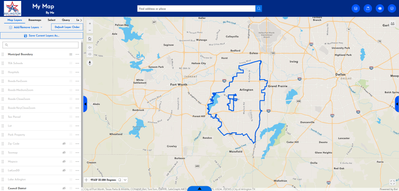
Maybe I should define what I mean by any everything app. Working in city government we want to have a central data repository where our employees can easily look up geographic information and do some light analysis. It needs to be flexible enough to handle data from many different departments without overwhelming the map visually or technologically. Advanced users should be able to make some complex queries, but it needs to be simple enough for users who are not technologically savvy. It must be everything to everyone. Is that Everclear? Does that sound like something you need or want to build? Then take a look at the Atlas Instant App. It's really good. But, maybe it's not quite what you need and it's also very new. I don't know if it made it into Enterprise 11.4, but it's not in 11.3. So, here's how to make one in Experience Builder...
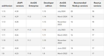
To make this work, you are going to need Developer Edition 1.14 or 1.16, hopefully higher versions will also work, or Enterprise Edition 11.3 or higher, again hopefully. (You may have noticed that 1.15 is conspicuously absent. That is because that version contains a bug that is incompatible with my Add/Remove Layers Widget. Also as the release version chart has not been updated, I cannot confirm compatibility with Enterprise 11.4.) If you're not on one of the compatible versions, well, you don't need to be a developer to use Developer Edition.
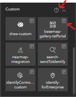
You will also need a handful of Custom Widgets:
*Before uploading the Add/Remove Layers Widget to your Enterprise, it is highly recommended to pre-load your layers and groups into the layers.ts file of the Widget.
**If your flavor of Experience Builder allows you to turn off Popups from the Map Layers Widget, you might not want to use that option instead.
We'll be building in Enterprise 11.3, so first I will register the Custom Widgets with my Enterprise Portal. Then, I will go to the Web Map Viewer and make seemingly blank map. I am making hybrid layers for my parcel and road layers. This will get me some advanced labeling features and I will also be able to use the secret Map Image Layers to set-up the Query Widget later on. I am using the Feature Layer With Map Image Layer Labeling flavor of hybridization, but I'm skipping the code enhancement in this build. At this point, I have all my Custom Widgets available in my Enterprise Portal and a Webmap that only visibly contains labels for a few layers. Now, it's time to boot up Experience Builder.
I will start by picking my favorite Template, Blank Fullscreen. We will be making a single-page application and, while this layout should be alright on a tablet in landscape mode, I will be making zero attempt at making this look good on a phone.
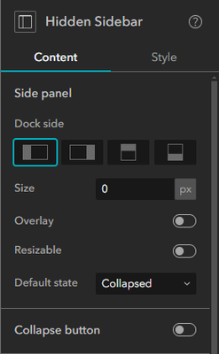
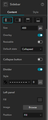
Oh, the tyranny of the blank page... How shall we start? Well, if you know my stuff, you know I'm probably going to use a Sidebar, actually this layout uses five Sidebars, each one in a slightly different way. The first one is to support our Hidden Widget Trick. I drag in a Sidebar and set it to Full Size. In the Collapsible side of the Sidebar, I drag in my Custom Font Widget. Back in the Settings Panel of the Sidebar Widget, I'm going to click on the Widget's title to change the name to something more descriptive. We're adding a lot of Sidebars and this will get confusing without some labels. Next, I'll set the Size to 0, turn off Resizable and the Collapse Button, and set the Default State to Collapsed. The Custom Font Widget is now hidden forever, but it's font changing powers will live on.

Next, we are going to add a "Header" and, since we are not planning to add another Page to this layout, we aren't going to use a Header. Instead of a real Header, we will use a previously unreleased trick by @MichaelGaigg: Sidebars make good Headers. I drag in a Sidebar and set it to Full Size. In the Settings Panel, I'll rename the Sidebar, set the Dock Side to the Top, Size to 80px, turn off Resizable and the Collapse Button, and set the Top Panel Fill to a dark blue. Our Sidebar is now a Header.

You know what we really need right now, ANOTHER SIDEBAR!!!!!!!!!! I'll drag this one in, but I won't go Full Size...for now. In fact, I'll make it smaller. I'll drag a Map Widget in the always open side of the Sidebar and set it to Full Size. I add the Webmap I set up earlier. I turn the Zoom, Home, Compass, Measure, Fullscreen, and Extent Navigate Tools on and the other Tools off. (If on a version with the Measure Widget, use that instead of the Measure Tool. If you don't understand the difference, click here.) I will also turn off Enable Pop-up. The Map Widget is done, we'll circle back to the other side of the Sidebar later. For now, just rename this Sidebar to Map Sidebar.

The next Sidebar will hold the Identify Widget, which will handle auto-opening and closing it and will be named Identify Sidebar. I drag in a Sidebar, shrink it a bit, rename it, and switch the Dock Side to the Right. Before going any further, I'm going to drag in the Identify Widget to the Collapsible side of the Map Sidebar. It's not going to stay there, but it's a convenient spot for now. The Identify Widget needs the widget_id number of the Sidebar Widget it controls, but there is no way to see this information in ArcGIS Enterprise, so the easiest way to find this information is to add the Identify Widget immediately after the Sidebar and subtract one from the Identify Widget's number. If you've been following along, the Identify Sidebar should be widget_id number 6. I'll also set connect the Identify Widget to the Map Widget. Next, I drag the Map Sidebar as a whole into the Always Open Side of the Identify Sidebar. Don't worry about how this all looks now, we'll fix it once we have the final Sidebar, which we will add next.
Drag in another Sidebar and name it Table Sidebar. Set the Dock Side to Down. Click back on the Identify Sidebar and drag it to the Always Open Side of the Table Sidebar. Now, we'll start fixing the appearance of our app. Set the Table Sidebar to Full Size. Then do the same for the Identify Sidebar and again on the Map Sidebar. Using the Outline in the Page Settings Panel will be helpful for this bit. If you've done this correctly, you now have five Sidebars around a Map Widget and none of them have The Sidebar Problem™.

Ok, we are done adding Sidebars. But before we are done saying Sidebar every fifth word, let's style some Sidebars. We'll start with the Map Sidebar. This Sidebar is intended to contain data related to the map as a whole like the Map Layers and Legend Widgets and a few other Widgets with large vertical outputs. It will be Expanded when the app loads and rarely if ever closed, so the defaults of Overlay off and Default State Expanded are good. I want to make the Size a bit larger though, so I set it to 400px. I also want to make the Collapse Button more visible, so I will make it larger and color it. I set the Icon to the Solid Triangle and increase its size to 20. I set the Background Default color to blue and the Background Hover color to red in accordance with my branding guidelines. I set the Width to 20, the Height to 80, and the Offset X to 20 and now I am satisfied with the way this Sidebar looks. To the Identify Sidebar...
We will also set the Size of the Identify Sidebar to 400px, but as this will be primarily controlled by the Identify Widget, it will be less jarring with Overlay on, and as it will be blank on load, Default State Collapsed makes more sense with this Sidebar. Now that the Right Panel is overlaying the map, it needs a background Fill color, the standard Light color (it's a very light silvery-grey) works well here. For the Collapse Button, we will do everything the same as we did for the Map Sidebar, but the Offset X goes in the negative direction.
Let's go back to the Table Sidebar. Add a Table Widget to the Collapsible Side of the Table Sidebar. Set it to Full Size and done. The Table Widget is configured. Back to the Table Sidebar Settings, I'll turn the Overlay on and the Default State to Collapsed. This drawer can be manually operated by the user after they use the Add To Table Action. Ideally, there would be a configurable Action that would auto-open this drawer, but that doesn't exist yet. The Collapse Button needs to be even larger as it's location and orientation make it less obvious on the screen and we are relying on the end-user to be able to find it. So, I set the Icon size and Height 25, the Width to 120, and the Offset Y to -25 with the same colors as the other Collapse Buttons. We are done with the Table Sidebar. So, click the Collapse Button on the Map to get it out of the way for the next steps.
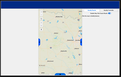
The Collapsible Side of the Identify Sidebar should be empty right now. Put a Grid Widget in it and make it Full Size. Next, grab the Identify Widget and drag it across into the Grid. Now, drag the Identify Controller Widget right on top of the Identify Widget. The Grid Widget should automatically make Tabs out of these Widgets. Connect the Identify Controller Widget to the Map Widget and it's good to go. In the Grid Widget Settings turn off Allow Resize and Allow Expansion. Maybe rename these Widgets to make the Tab titles a little more clear. If you've been following along, things should look like this now.

We are done working on the Identify Sidebar, so you can hit the Collapse Button on that as well.
Now, let's turn our attention to that empty Collapsible Side of the Map Sidebar. Put a Column Widget in it, set it to Full Size and the Gap to 0px. In the Column, add a Views Navigation Widget and pick a Quick Style. I'd recommend one of the top three as they show the View titles. Then add a Section Widget beneath it. It's a little backwards, but that's the easiest way to get the Section Widget to stack neatly under the View Navigation Widget in a Column. In the Section Widget Settings Panel, go to the Style Tab and set the Width and Height to Stretch, if necessary. And what should go inside the Section Widget? Another Column Widget, of course. I swear this isn't going to get out of hand like that Sidebar business earlier. Set the new Column Widget to Full Size and the Gap to 0px, as before.
So what should go inside this Column in a Section in a Column in a Sidebar in a Sidebar in a Sidebar in a Sidebar in a Sidebar? It's time for the Add/Remove Layers Widget. This is going to be the big time suck in building this application. Ideally, you took the time to pre-load all the layers and groups into the Widget before you uploaded it to your Enterprise. Sure, it is technically possible to use this Widget with just the Settings Panel, but adding or changing more than a handful of things in the Settings Panel is really going to suck. Honestly, changing things in the layers.ts file is going to suck too, but it will suck a little less. If you have everything pre-loaded as you like it, all you need to do is drop in the Widget and connect it to the Map Widget. If not, well here comes several hours to days of misery, depending on how many layers you need to put in. Setting up this Widget is not the most strait-forward thing either, so make sure to read the help text on the Widget's page.
If you are reading this, you presumably survived the last step. I commend you. Have a medal. 🏅 Now back to work, you slacker! We're not done, yet. The next thing to go in the Column in a Section in a Column in a Sidebar in a Sidebar in a Sidebar in a Sidebar in a Sidebar that swallowed the spider that swallowed the fly is a Map Layers Widget. Drop it in and connect it to the Map Widget. Turn on the Options as you see fit, I've got them all on except I'm sticking with the eyeballs for visibility and I'm not turning on the sub-option to show the legend by default. Enable Customize Layers and hide your hidden map layers. In the Style Tab, set the Height to Stretch.
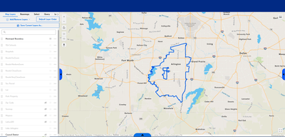
This is a good time to go into Preview Mode and test. The Add/Remove Layers Widget should add and remove layers. You should be able to use the Add To Table Action in the Map Layers Widget and see the data in the Table Sidebar. Clicking on the map should open the Identify Sidebar and show results. The Identify Controller should be able to turn on and off Identify on a per layer level. There should be no Sidebar Problem™. Good luck.
...I'm going to assume that all worked fine. Don't know what to tell you if it didn't. 🙃
Add a New View to the Section Widget. Drop in a Basemap Gallery Widget. Set it to Full Size and connect it to the Map Widget. Repeat, but drop in a Legend Widget this time.
Do it again with a Select Widget, but now there are a few more settings to worry about. Turn on Allow Selection of Data Generated At Runtime. You can turn Attribute Selection on or off. It does not matter Attribute Selection will be on either way because the Select Widget operates very differently when data is loaded at runtime and the runtime layers are way more powerful. Go into the Customize Layer options and remove the Webmap loaded layers and open up the Interactive Selection dropdown and turn on all the Select By options.
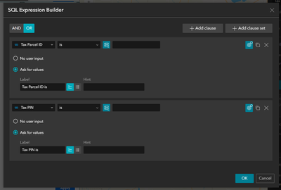
Add a New View. Then, drop in a Query Widget and make it Full Size. How exactly you configure this is just between you and your data, but I've got a Spatial Query for parcel data based on one of the videos in this series and a couple attribute queries set up on OR clauses (using OR clauses means that users only need to search in one field) for road and parcel data using the hidden layers from the Webmap. I know these layers are the ones my users are most likely to want to search through. I am using the Query Widget to make it easy to search questions I know my users are likely to ask, while the Select Widget and the Set Filter option in the Map Layers Widget allows the users to make arbitrary and more esoteric queries. In this way, I can satisfy both my low-end and high-end users. My pre-built queries look something like this.

I've also gone to the Action Tab and set up a Record Selection Changes > Map > Zoom To Action.
That's all I plan on putting in this Section Widget, if you want to add something with a lengthy output like the Near Me Widget or perhaps you want a List Widget, I would recommend adding them as a View in this space. Since I'm done adding content here, I'm going back to the Section Widget Settings Panel to rename my Views to reflect the Widgets they contain. I will also put them in a order I find more logical. I can rename my Views by clicking the three dots to the right of the current titles and I can re-order by dragging and dropping. Let's check-in on how this is all looking in Preview Mode.

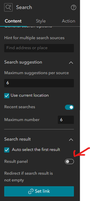
Hey, the "Header" is blank. Are we going to do anything with that? Yep, we're doing that next. We'll start by adding our Custom Search Widget. It's just a lightly modified version of the official ESRI Widget. Drop the Custom Search Widget into the Header and then use the Horizontal and Vertical Center options. You'll need to go back to the Identify Widget Settings Panel and to see it's id number (7 in my layout) and add it to the box in the Custom Search Widget Settings Panel. (Wow, ESRI, that's so much easier when the data isn't hidden.) This modified Search Widget is designed to trigger the Identify Widget we added earlier and is only designed for use with a Locator Source (it might work with a point-type Layer Source). The rest of the options under the Content Tab are up to you except Result Panel, which must remain on, but I highly recommend turning on Recent Searches and Auto Select The First Result. Another restriction with this Search Widget is that it must be used with a Map Widget and have a Record Selection Changes > Map > Zoom To Action set up, so I set up such an Action.
At this point, go to Preview Mode and test. Does it trigger the Identify Widget? Do you find all the data you expect? I needed to set a Custom Zoom Scale to 2000 to find my parcel data. Smaller numbers = closer zoom.
Now, I add a Widget Controller to my Header. Snap to Right and Vertically Center. I'm using a Floating Widget Panel Arrangement with the Icon Size set to Large. (I'd go extra-large if I could.) I turned off Indicator, as I don't really like how it looks and we'll handle it's function by turning on Advanced. After turning on Advanced, I set the Default Icon color to blue and the Selected and Hover color to red. The same blue and red I used for the Collapse Buttons on the Sidebars.
What goes in this Widget Controller? That's again in the up to you category. But I see these buttons as a menu, things that the user may not use everyday, but are useful to have access to. Widgets that don't have a large output and Widgets that encourage map interaction are also good candidates to go in here. My must haves up here are the Add Data, Bookmark, Custom Draw and Print Widgets. If you're on a version of Experience Builder with the Measure Widget, I'd put it here, too. Let's configure these.
In the Add Data Widget, go to the Action Tab and add a Data Added > Map > Add To Map Action. For the Bookmark Widget, I'm going with the simplest of the Simple Templates (the second one). Connect it to the Map Widget and turn on Allow To Add Bookmarks In Widget. This Bookmark Widget is here to help support our flexibility goal. It's up to the user to decide how they want to use it. If you want to add some points of interest as Bookmarks, go ahead, I'm not pre-loading any Bookmarks in my version.
Connect the Draw Widget to the Map and change the title. No one needs to know, it's a custom widget. Why the Custom Draw and not the OOTB Draw? Well, here in Enterprise 11.3, there is no text support, so that's a big factor, but I'm sticking with this @RobertScheitlin__GISP masterpiece in Developer Edition 1.16 because of the freehand draw options and the ability for users to edit their sketches after drawing. The latest versions OOTB Draw Widget has text support with more text options than the Custom Draw Widget, so if text is your primary need and you can, maybe pick the default option instead.
In the Print Widget, I connect it to the Map Widget and add a Print Service. The main problem with this Widget now is it's scrunched up in box that's too small and looks awful. Fortunately, that's a really easy fix. Just drag that little black right angle in the lower left of the Widget until it's the right size.
Other stuff that I've got in the real version of this application in this Widget Controller:
- A text box with helpful links
- A text box with help text
- This What3Words Widget
- This NearMap Widget by ESRI Australia that I strongly endorse. Note: NearMap is working on an official Experience Builder product that will include Oriented Imagery support. They are Beta testing now. Talk to your NearMap representative, if you want to take part. But, it better be good to catch up with this Widget that's been out for years now.
- This Rain Radar Widget by the same ESRI Australia team that I weakly endorse.
Let's add one more functional Widget before we finish the design. In the lower-left of the Map Widget, I drop in a Coordinates Widget and connect it to the Map Widget. By default, this Widget has a lot of blank space around it, if we don't do something about that we are going to get a variation on The Sidebar Problem™. In the Style Tab, set the Width and Height to Auto to prevent this issue. I also hit Snap To Left. I've seen some weird issues trying to set the default Output Coordinate System option. I haven't tested to see if they have been resolved in more recent versions, so if you want something other than Web Mercator in your Coordinates Widget, it might have to be as a secondary option.
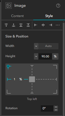
Ok, last thing, I promise. We need a title and some iconography to a make it all look good. I throw an Image Widget in the Header and pick an image. I set the Width to Auto and the Height to 90% and use the Vertical Center option. Then, I use that target box thing to give it a 1% margin from the left of the screen.

Next to the Image Widget goes a Text Widget for a title. I'm using Vertical Center again with Width and Height on Auto. I want a title and a subtitle with my subtitle about half the font size of my title, white text to stand out on the dark background and I'll use Right Justification because I'm cool. And yeah, it's done.

Look, I won't say it's perfect, but it is an everything app you can build right now, with no-code in less time than it took me to write up how to build it. So maybe you want to build it or maybe just do the Atlas Instant App?
