And we're back with the Customer Advocacy team sharing their comments below! If you missed the morning session, you could read the highlights Live from the 2018 User Conference Plenary: Morning Session.
- 10:55 a.m. - Act II – Opening Video
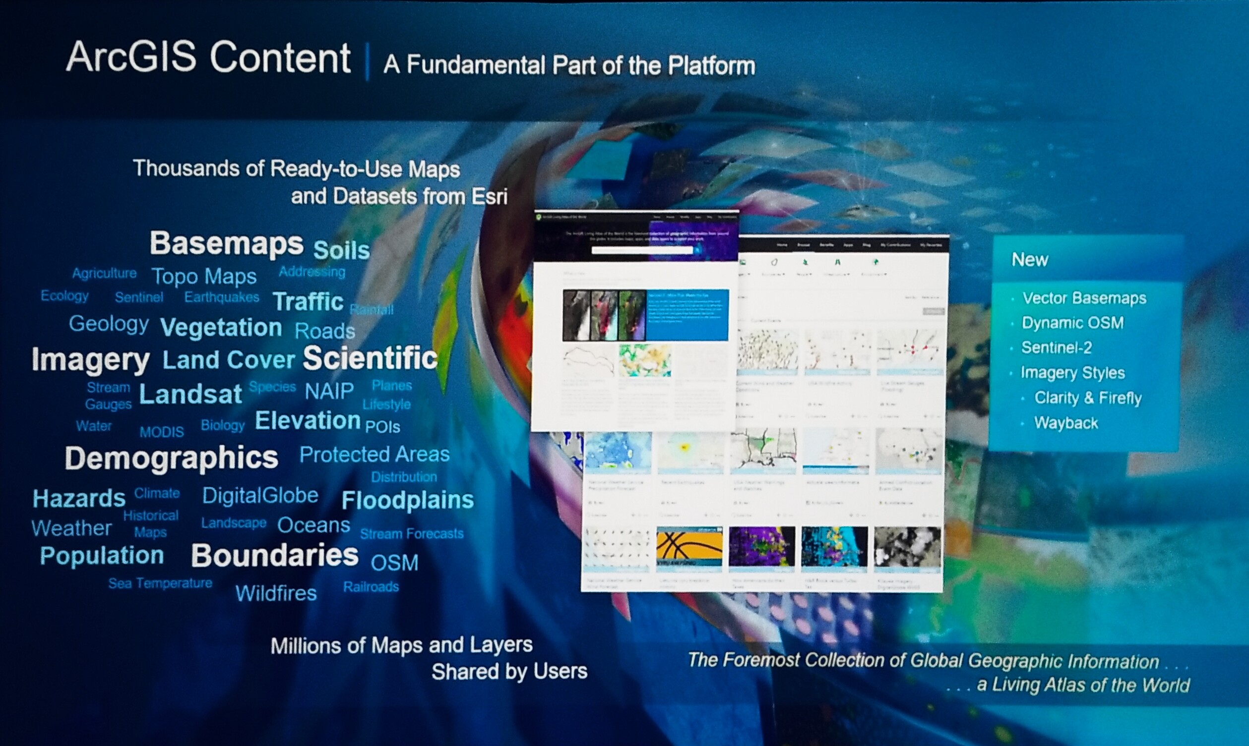
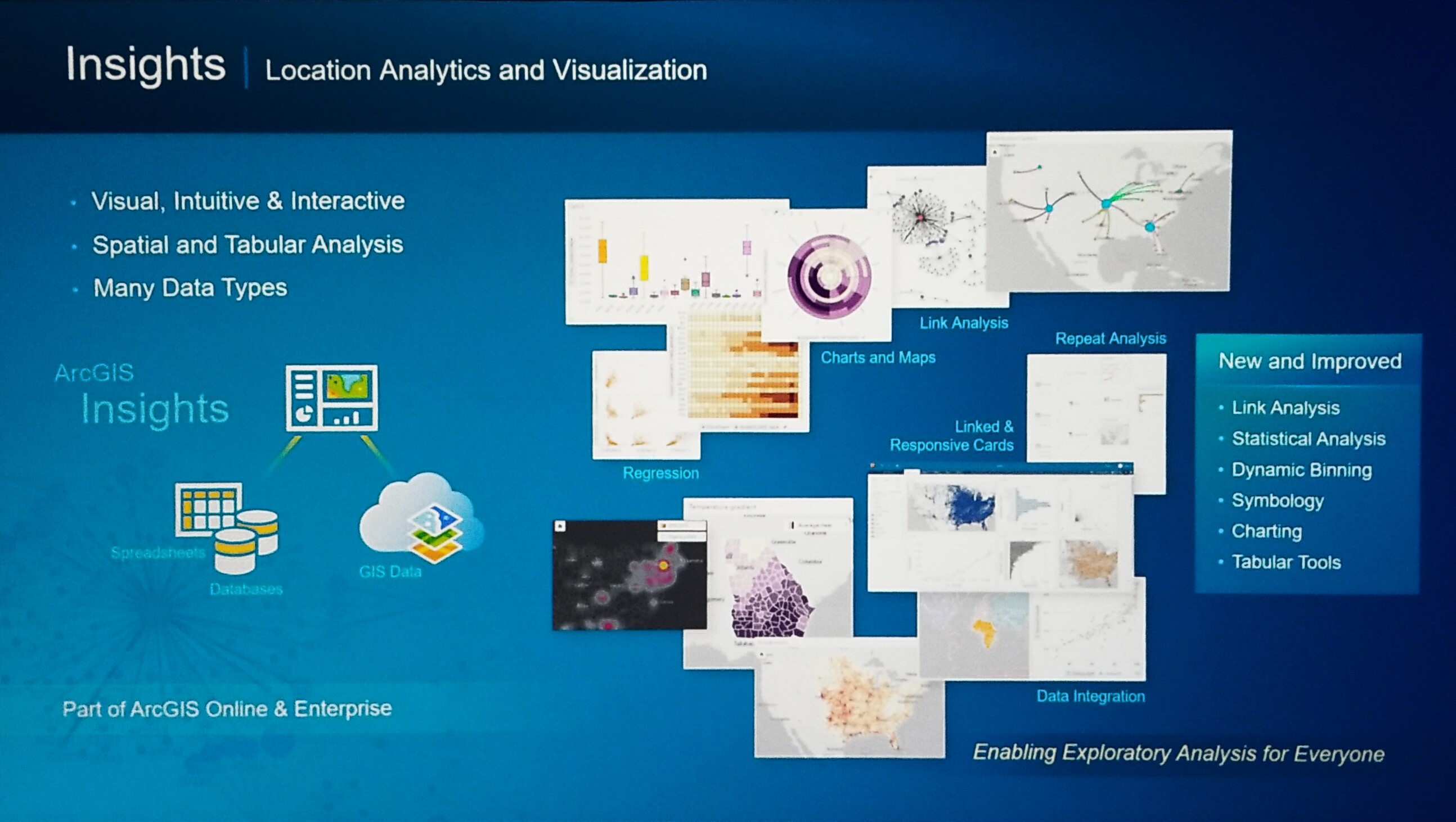
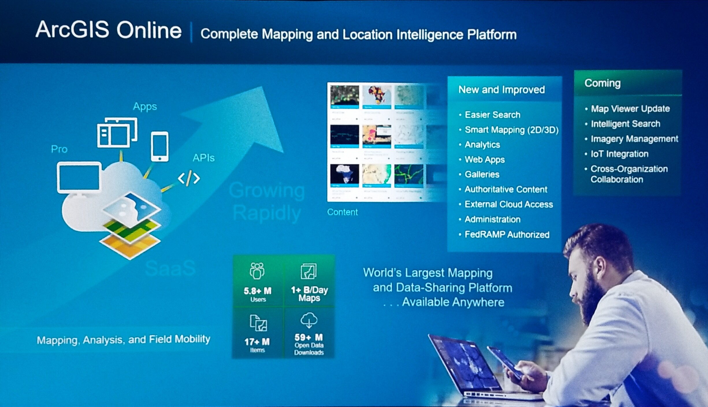
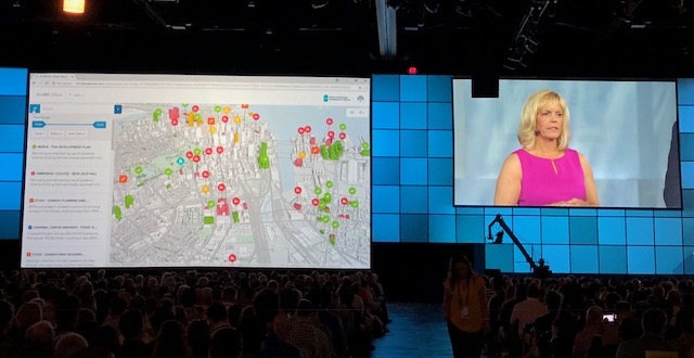
- 11:01 a.m. - ArcGIS Online
- Speaker: Jennifer Bell
- 11:12 a.m. - Enterprise GIS – Inspiring a New Era of Problem Solvers with Location Intelligence
- Company: Cobb County Government
- Speakers: Sharon Stanley, Felicia Alingu, Lynn Biggs, Jennifer Lana, and Lt. J.D. Lorens - Cobb P.D.
- 11:22 a.m. - ArcGIS Pro Editing and 3D
- Speaker: Madeline Schueren
- 11:28 a.m. - Enterprise Sites
- Speaker: Shannon Kalisky
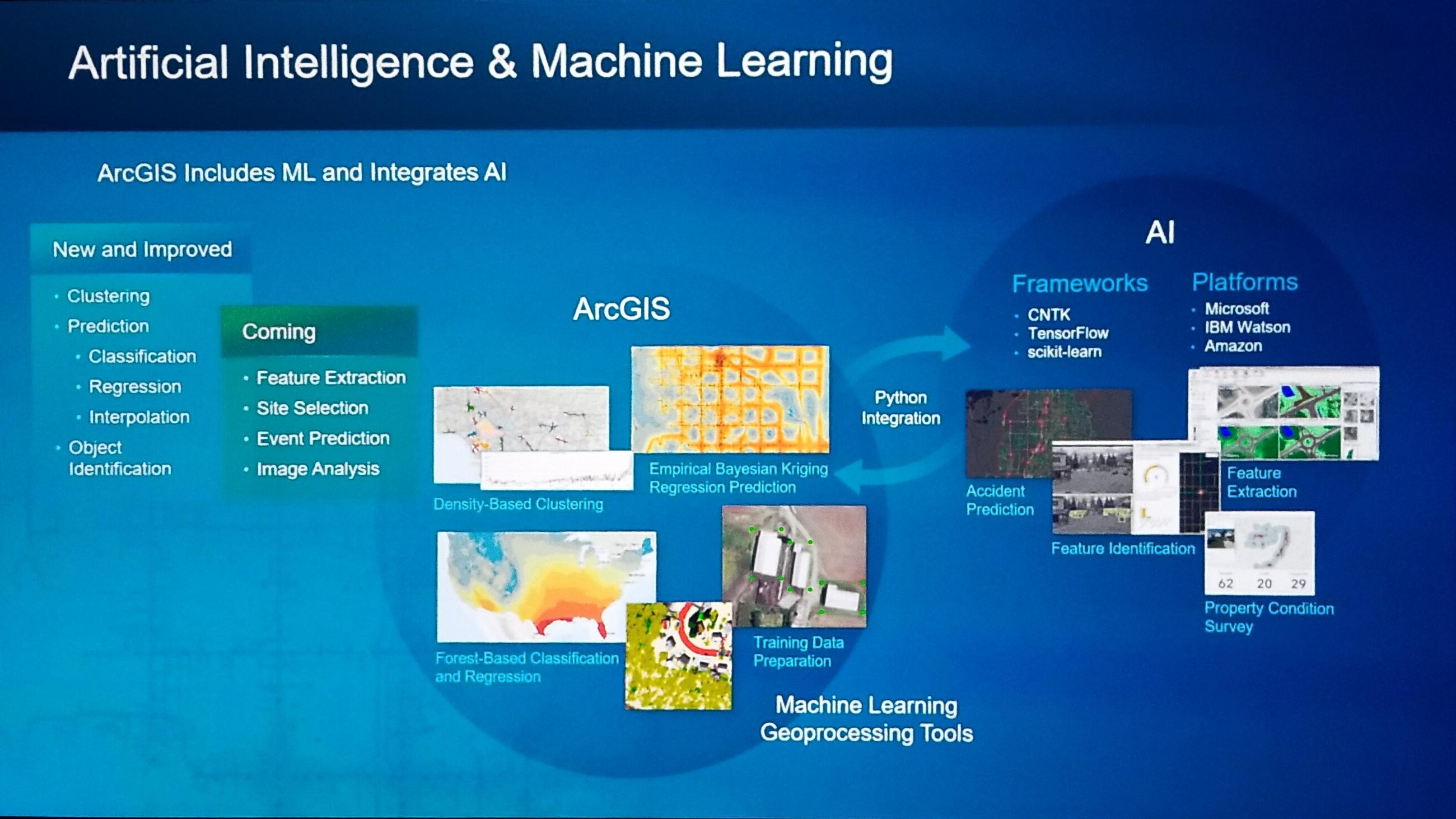
- 11:35 a.m. - ArcGIS Pro - Artificial Intelligence (AI)
- Speakers: Rohit Singh, Esri and Chris Buscaglia, Esri
- 11:40 a.m. - Restoring New York City’s Lower Catskill Aqueduct with GIS & BIM
- Company: Mott MacDonald
- Speakers: Cory Dippold and Anthony Renteria
- 11:49 a.m. - ArcGIS Utility Network Management
- Speakers: Remi Myers, Esri and Sarayana Kesavan, Esri
- 11:53 a.m. - Location Tracking
- Speaker: Craig Gillgrass
- 11:58 a.m. - ArcGIS Indoors
- Speaker: Madeline Schueren and Adrien Meriaux (demonstration)
- 12:03 a.m. - U-Spatial—Advancing Spatial Science and the Workforce of Tomorrow
- Company: University of Minnesota (UMN)
- Speakers: Len Kne, Coleman Shepard, Kevin Erhman-Solberg, Somayeh Dodge, and Tom Fisher
10:55 a.m. - Act II – Opening Video
Bernie Szukalski and Shannon Kalisky introduce Jennifer Bell for ArcGIS Online.
11:01 a.m. -
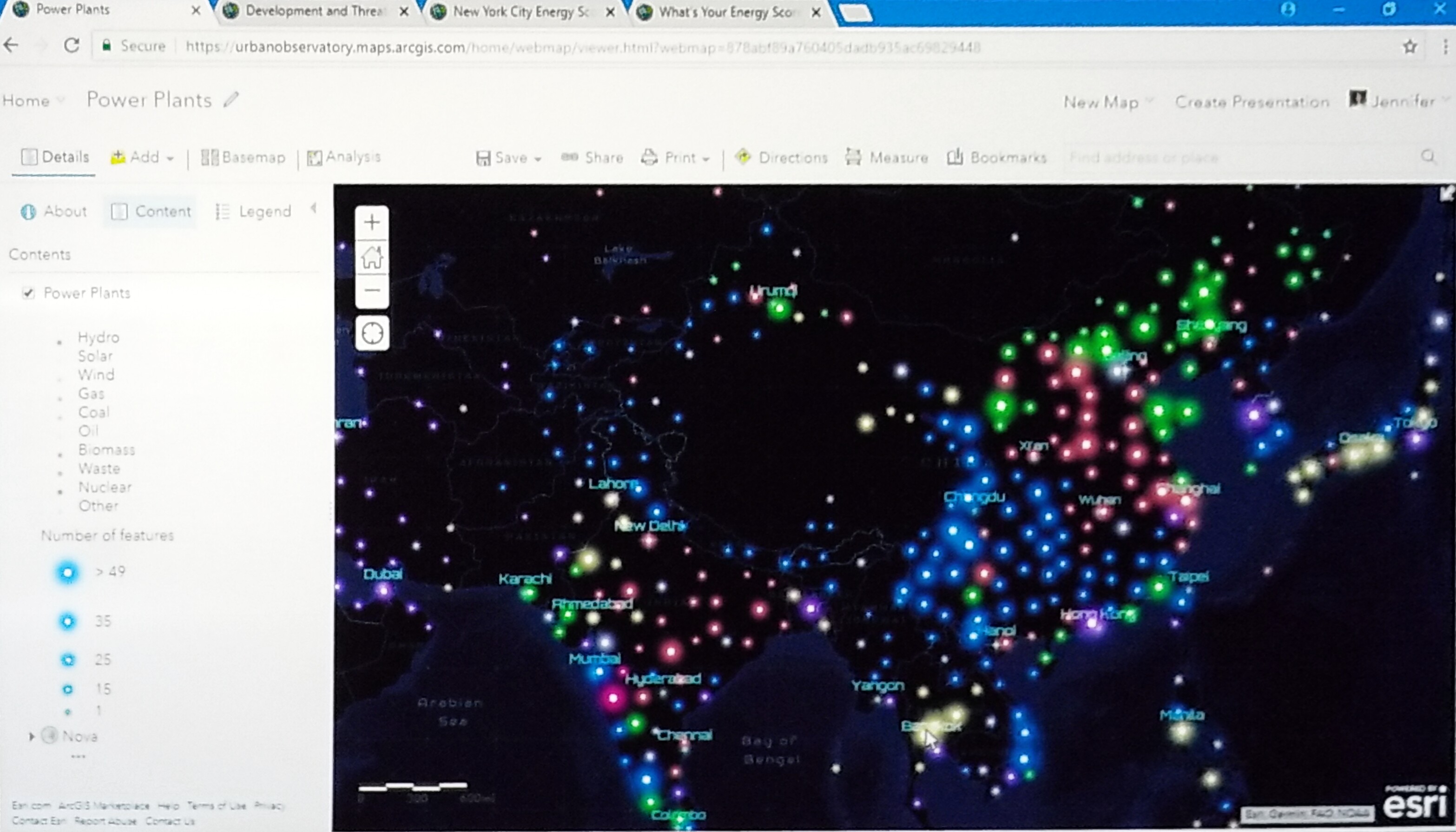
Jennifer begins with a demonstration of the power plants across the globe and uses clustering to show the different types of clustering between hydro plants and solar power plants in the United States and hydro, wind, and coal plants in Asia.
Using the tools and features, she continues the demo moving to a map of the Human Footprint Index to display more developed areas in comparison to less developed areas.
Smart Mapping provides numerous multi-variate drawing styles
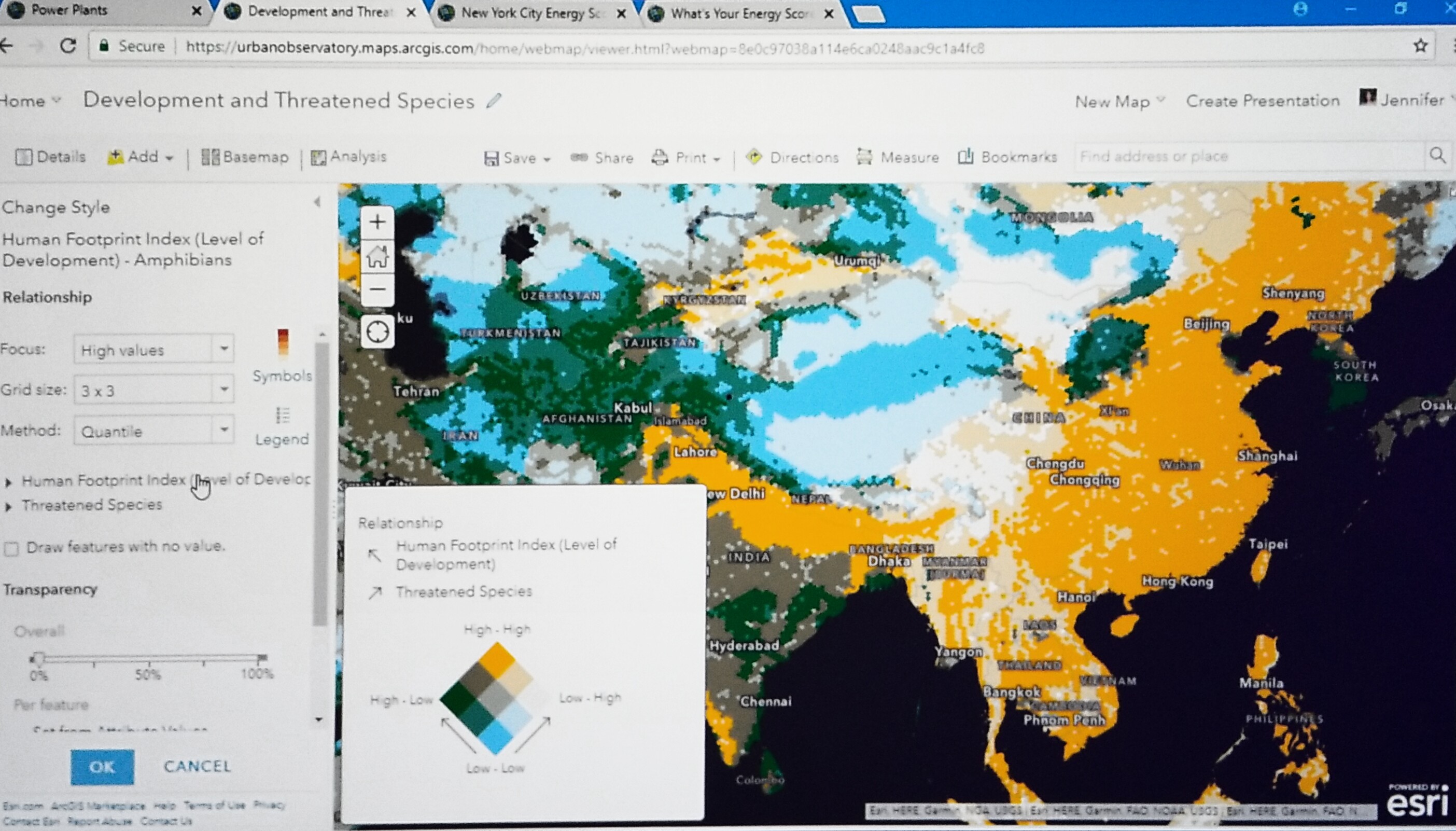 Using the Relationship drawing style, she demonstrates how this style evaluates two attributes to help explore relationships between attributes, in this case, comparing the level of development to the number of threatened species and showing where both values are high and low for human development that threatens other species of life.
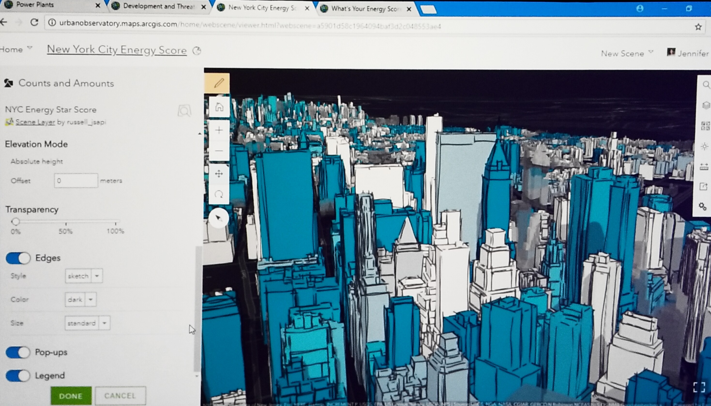 She moves on to tell the story using the Edges feature in for 3D Smart Mapping of the New York City Energy Score. Here she shows the grade that every building receives that represents how energy efficient it is.
11:12 a.m. - Enterprise GIS – Inspiring a New Era of Problem Solvers with Location Intelligence
Company: Cobb County Government
Speakers: Sharon Stanley, Felicia Alingu, Lynn Biggs, Jennifer Lana, and Lt. J.D. Lorens - Cobb P.D.
Bern introduces Sharon Stanley and her team of innovators. Sharon Stanley opens with explaining the ways Cobb County uses GIS. Sharon provides a demonstration of a map created by an Intern. The intern created a map of tour routes beginning with Distillery Tour. This map got executives excited and more engaged in GIS mapping. This started a dialogue between executives when they saw how the capabilities of mapping tourism sites could benefit Cobb County.
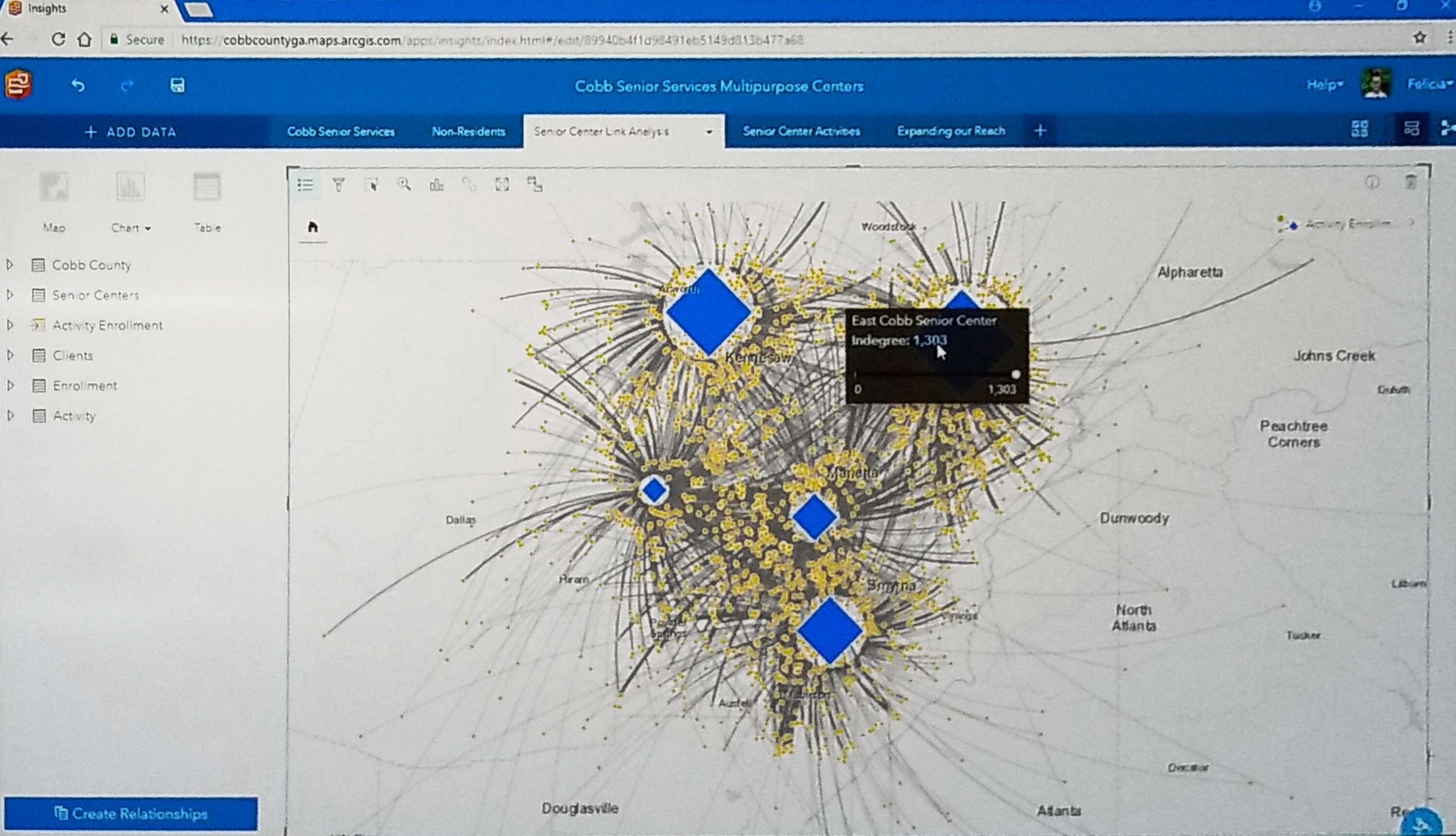 Felicia Alingu presents a demonstration of how she uses ArcGIS Online to create maps to evaluate Cobb Senior Service Multipurpose Centers including data that tells which centers are visited the most, what programs they offer and which programs are the most active. The most popular engagement activities include Bingo and an event about Patsy Cline.
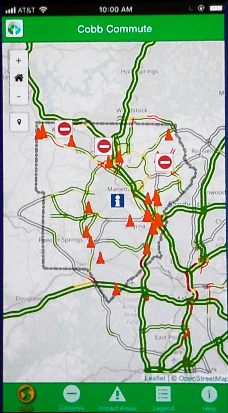
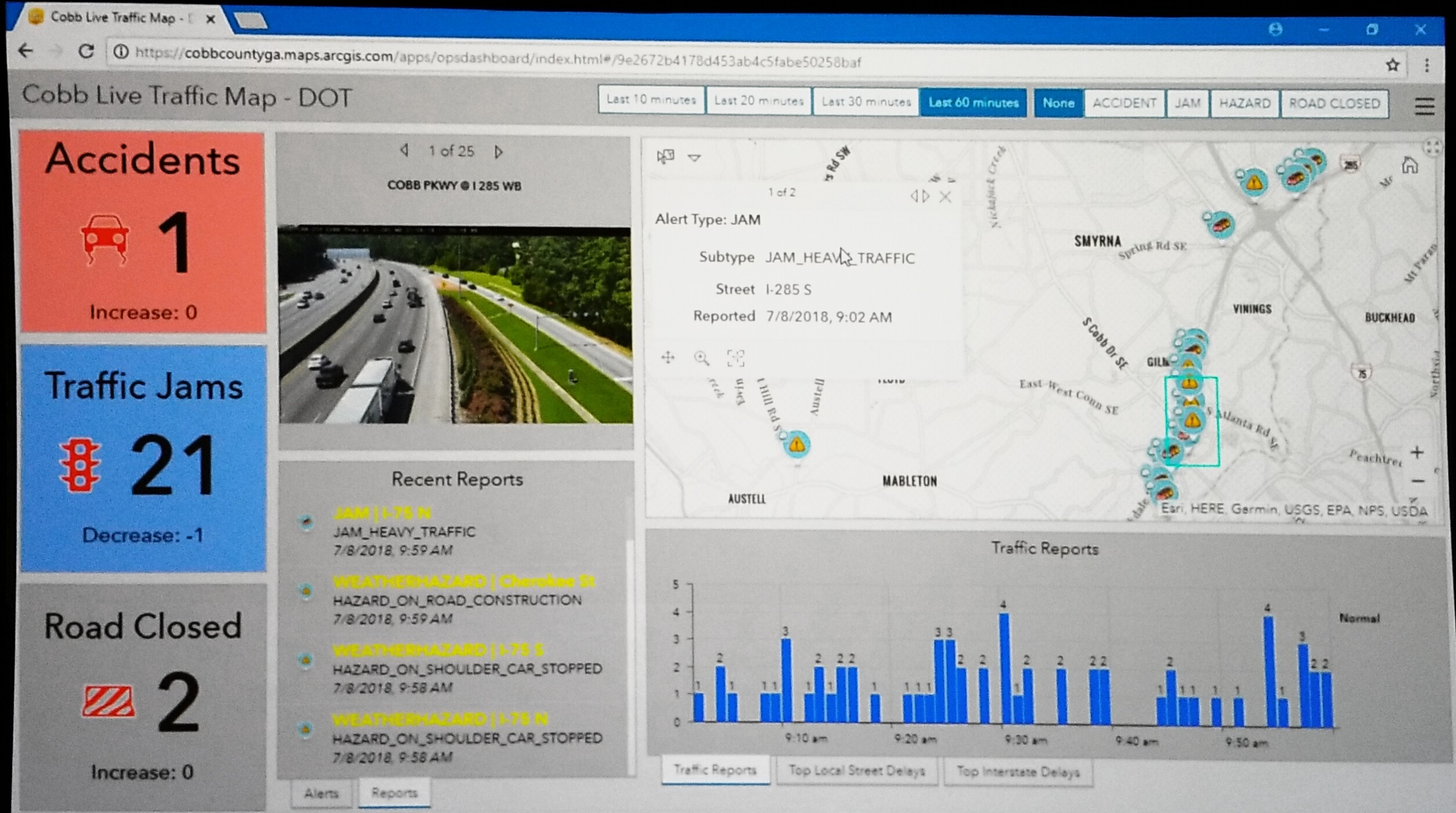
Lynn Biggs explains how Cobb County’s Department of Transportation uses GIS to develop an application for the Cobb citizens on the move, providing accurate, up-to-the-minute transportation updates. They demonstrate the use of this app by checking on the traffic. They can see traffic camera shots, check the traffic speed, and deter drivers from areas under construction to mitigate traffic congestion.
They developed a Waze Connected Citizen Partnership a year ago allowing them to share authoritative information about road status closure due to construction road closures.
Using ArcGIS Pro Forest classification and regression tools, Cobb DOT could collect crash data and analyze a hypothesis that specific types of crashes were more likely to occur on roads that are curvy, hilly or both.
The table created shows their hypothesis was correct. Slopes and curves are the top two contributing factors in fixed object crash with utility poles, trees, guardrails, etc.
| Cobb Commute App | In the Office Traffic Report |
|---|
 |  |
Austell Road and Windy Hill to the County Services Parkway. 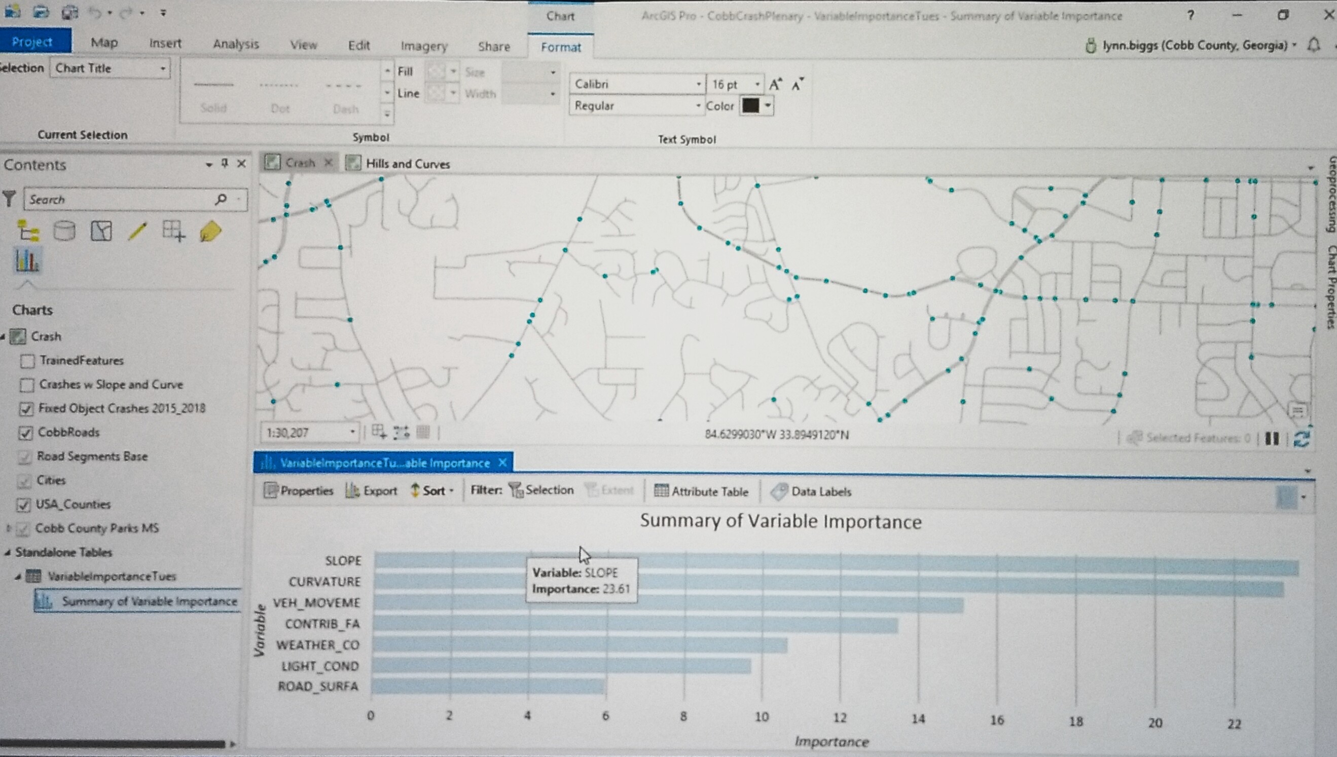
|
Jennifer Lana, Cobb GIS manager, demonstrates how they analyzed their crash theory for fixed object crashes.
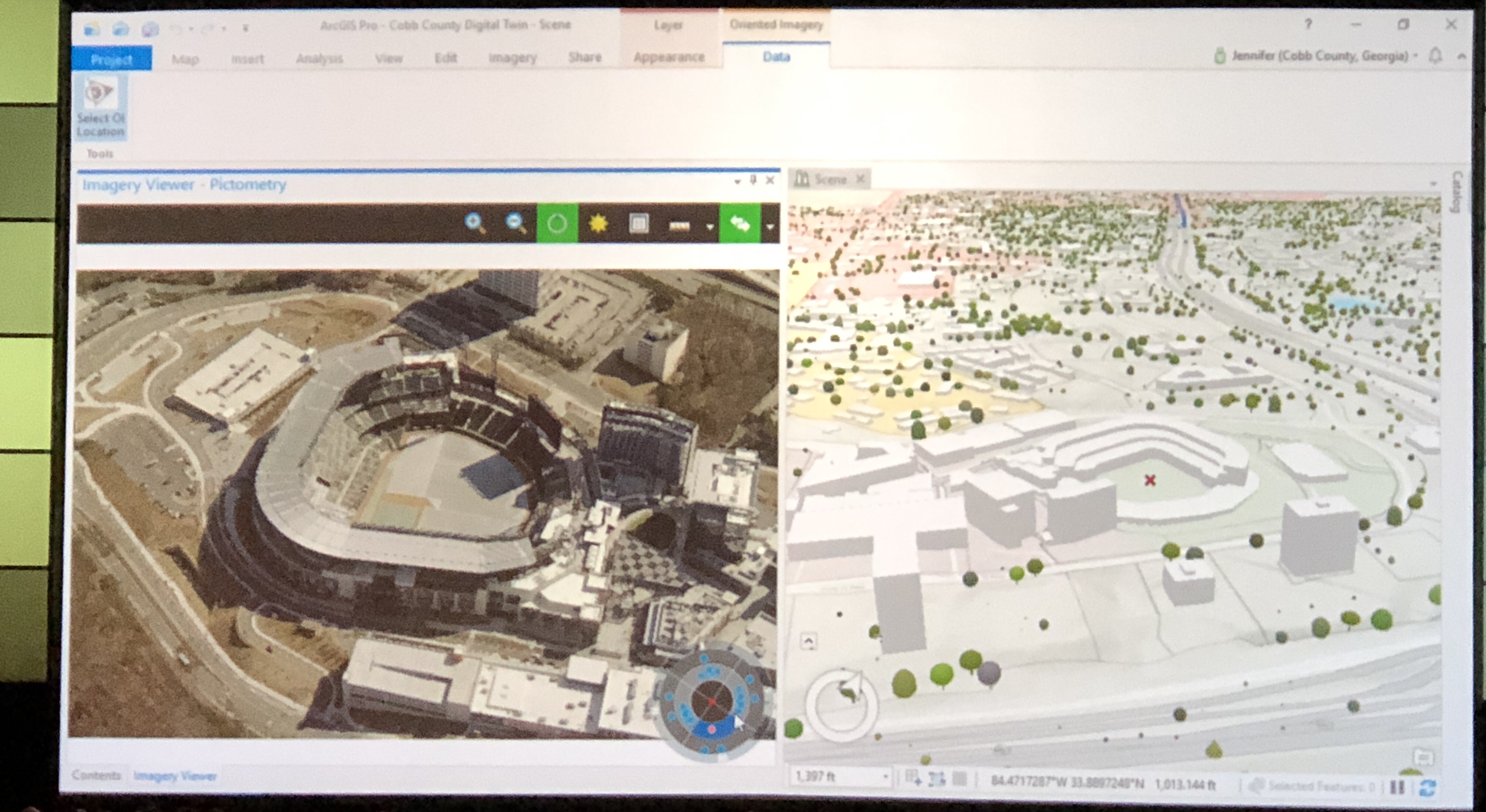
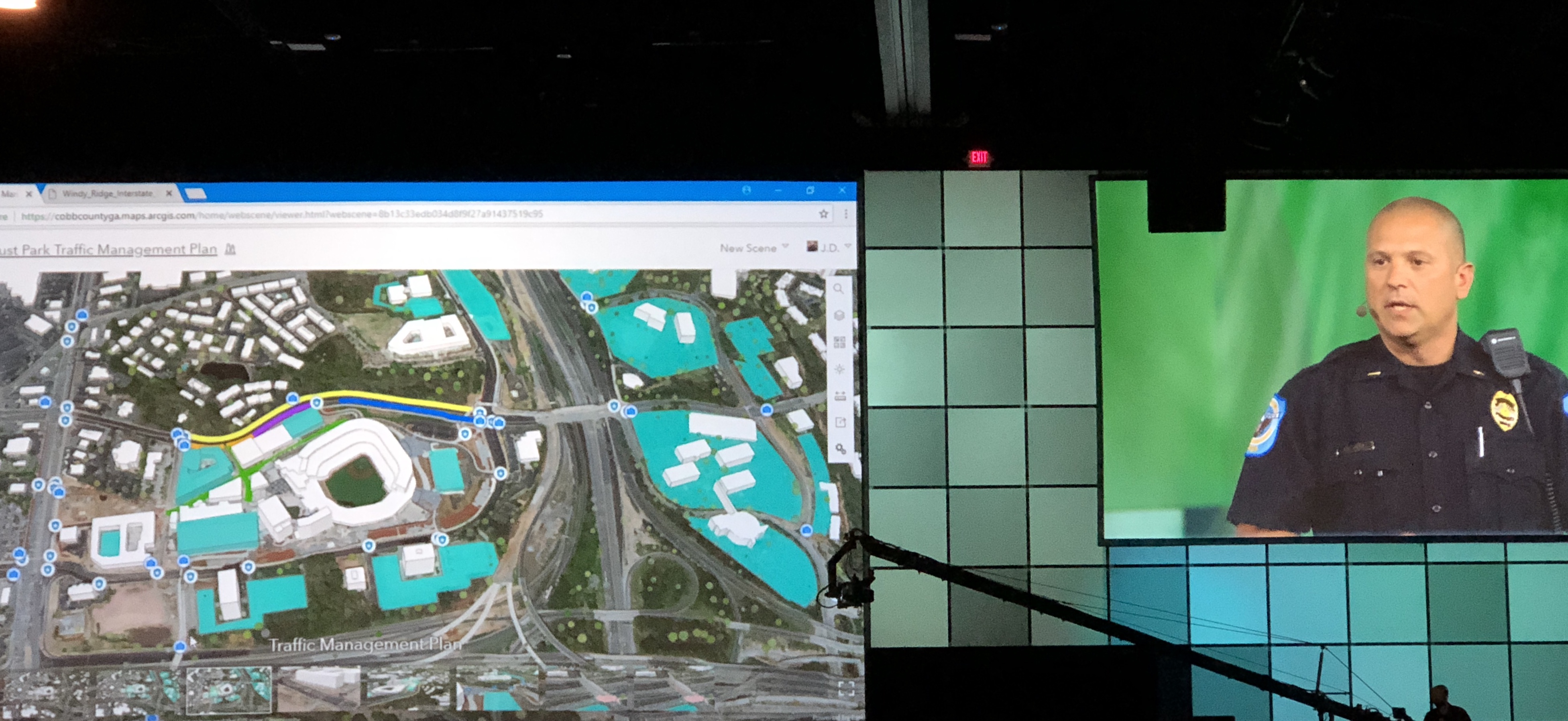
Lt. J.D. Lorens asked the GIS team to help with a problem they were having with traffic at a major interstate for pedestrian crossing. He was able to use the dashboard and GIS mapping to analyze traffic patterns before and after games. He was then able to teach his officers how to predict and plan for pedestrian and vehicle traffic when there are games at the stadium.
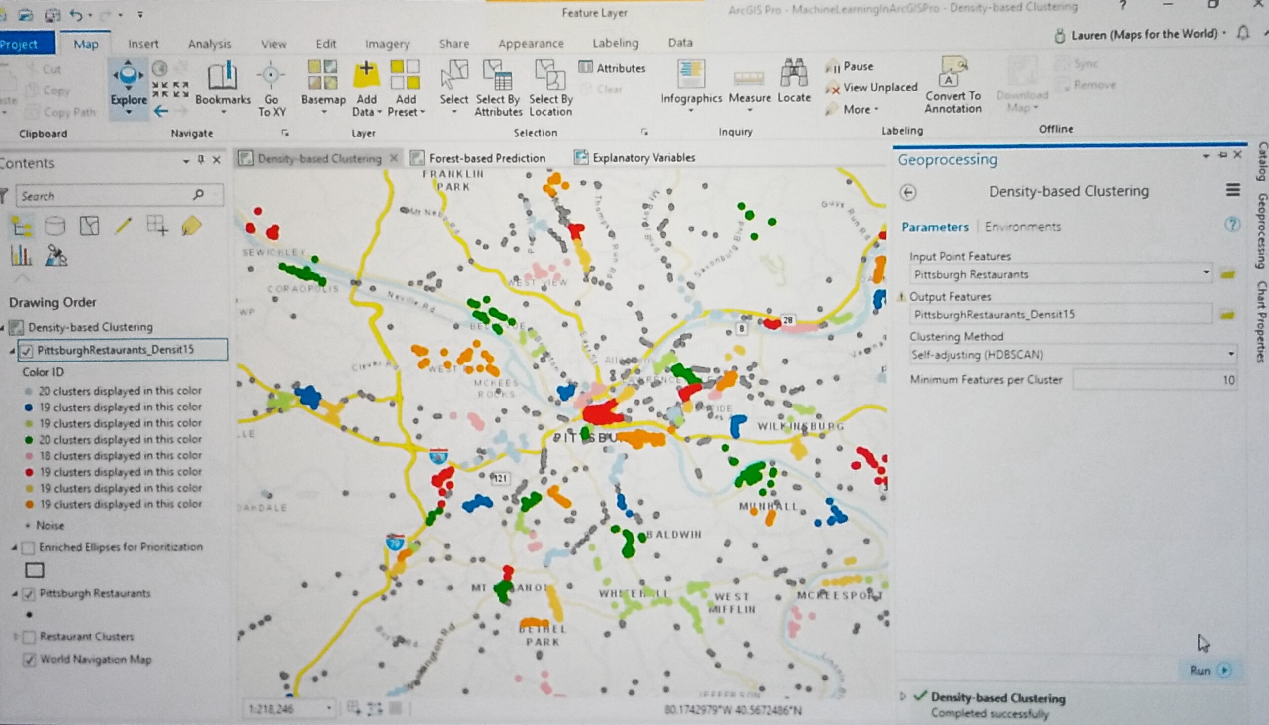
11:22 a.m. - Editing and 3D
Speaker: Madeline Schueren
Bern introduces Madeline.
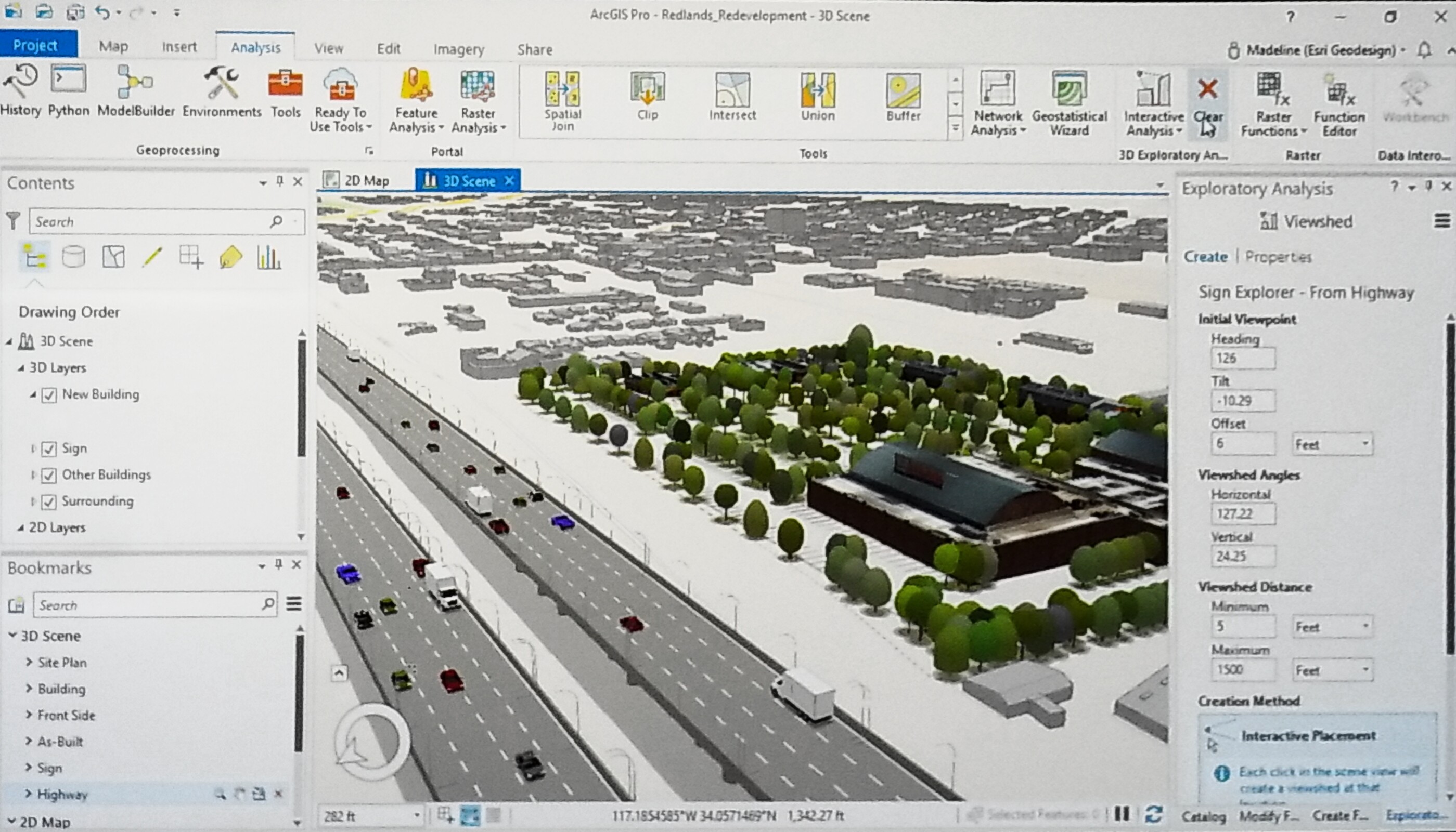
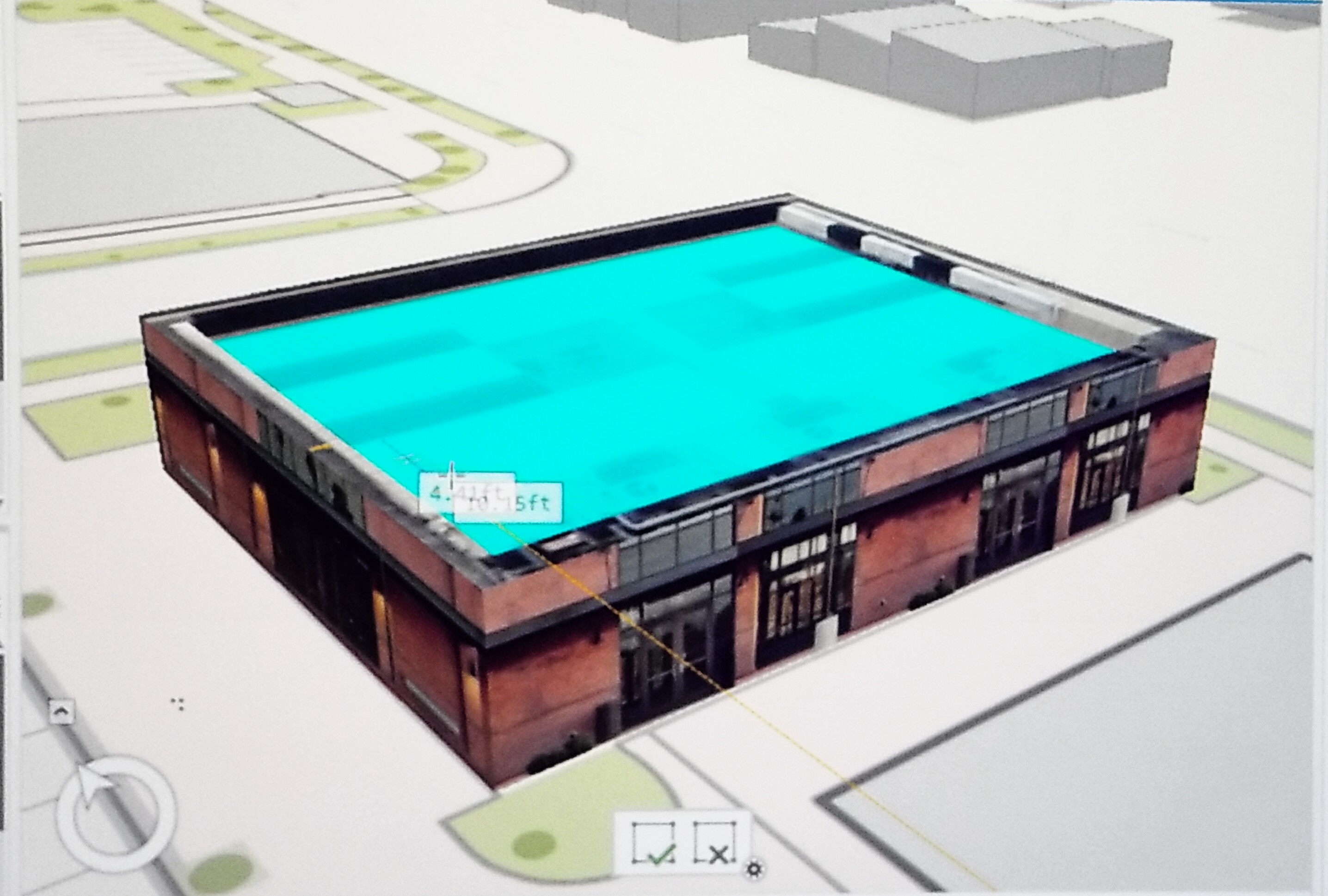 Madeline explains how using tools in ArcGIS Pro 2.2 can help proactively manage changes in population growth, traffic patterns and developing construction with a map demonstration of a construction site for a new commercial center in Redlands, CA. In only 5-minutes she adds labels to buildings, parking spaces, building layers, and depth to the building’s doors and ventilation systems to create a 3D model of the building. "Editing in 3D has never been easier with ArcGIS Pro 2.2."
11:28 a.m. - Enterprise Sites
Speaker: Shannon Kalisky
Shannon thanks Bern for his introduction and launches her presentation with a Portal developed for the city of San Antonio. We've added a new capability with ArcGIS 10.1 to allow you to enhance your existing portal called Enterprise Sites. This provides content, important information at the user's fingertips.
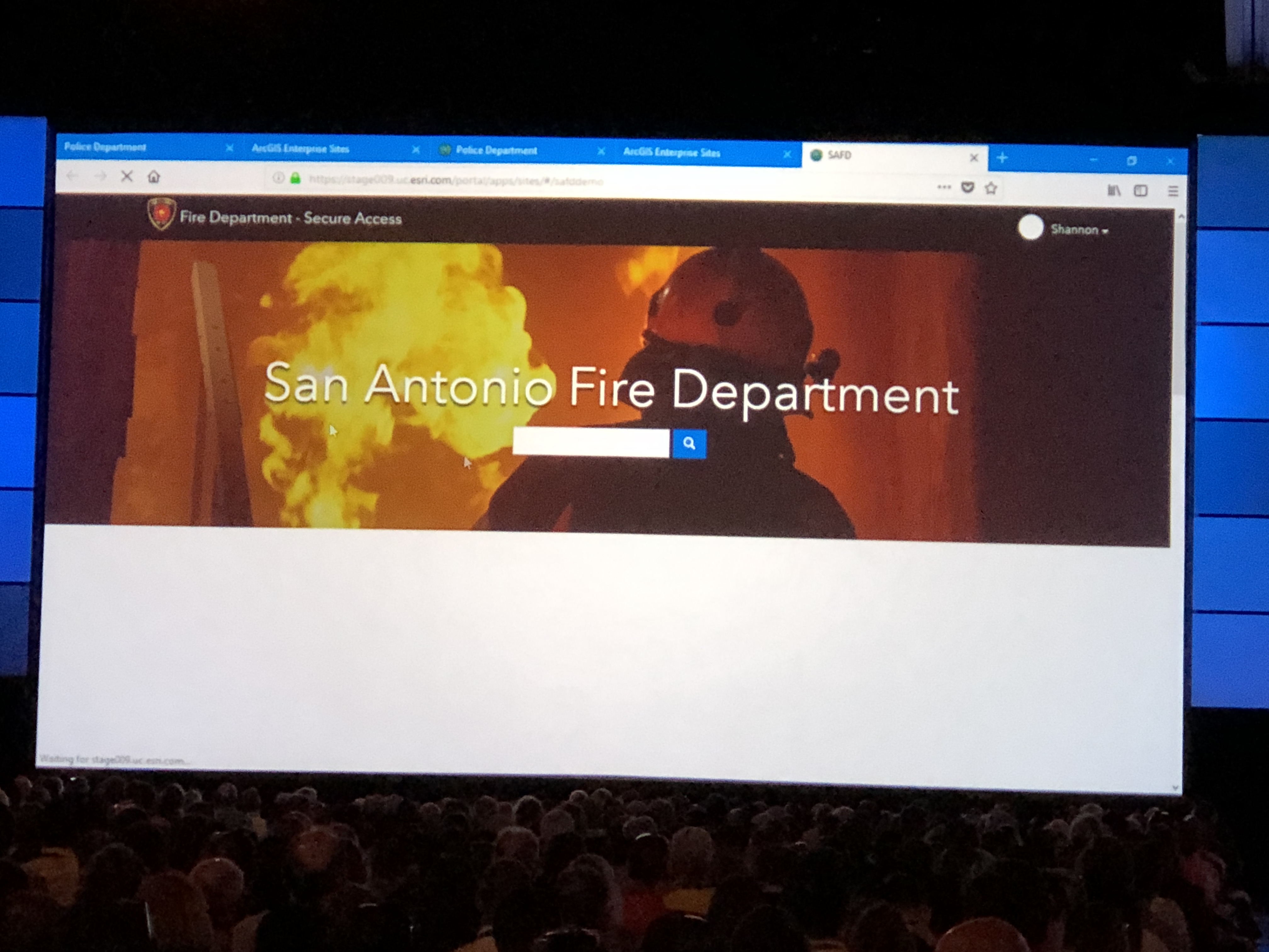
She demonstrates how quick and easy it is to create a portal site for the San Antonio Fire Department without having to do or know web code. In only 5-minutes she creates adds groups that can access the new site. She then adds widgets with web map for calls, dashboards, service data and categories.
11:35 a.m. - ArcGIS Pro - Artificial Intelligence (AI)
Speakers: Rohit Singh, Esri and Chris Buscaglia, Esri
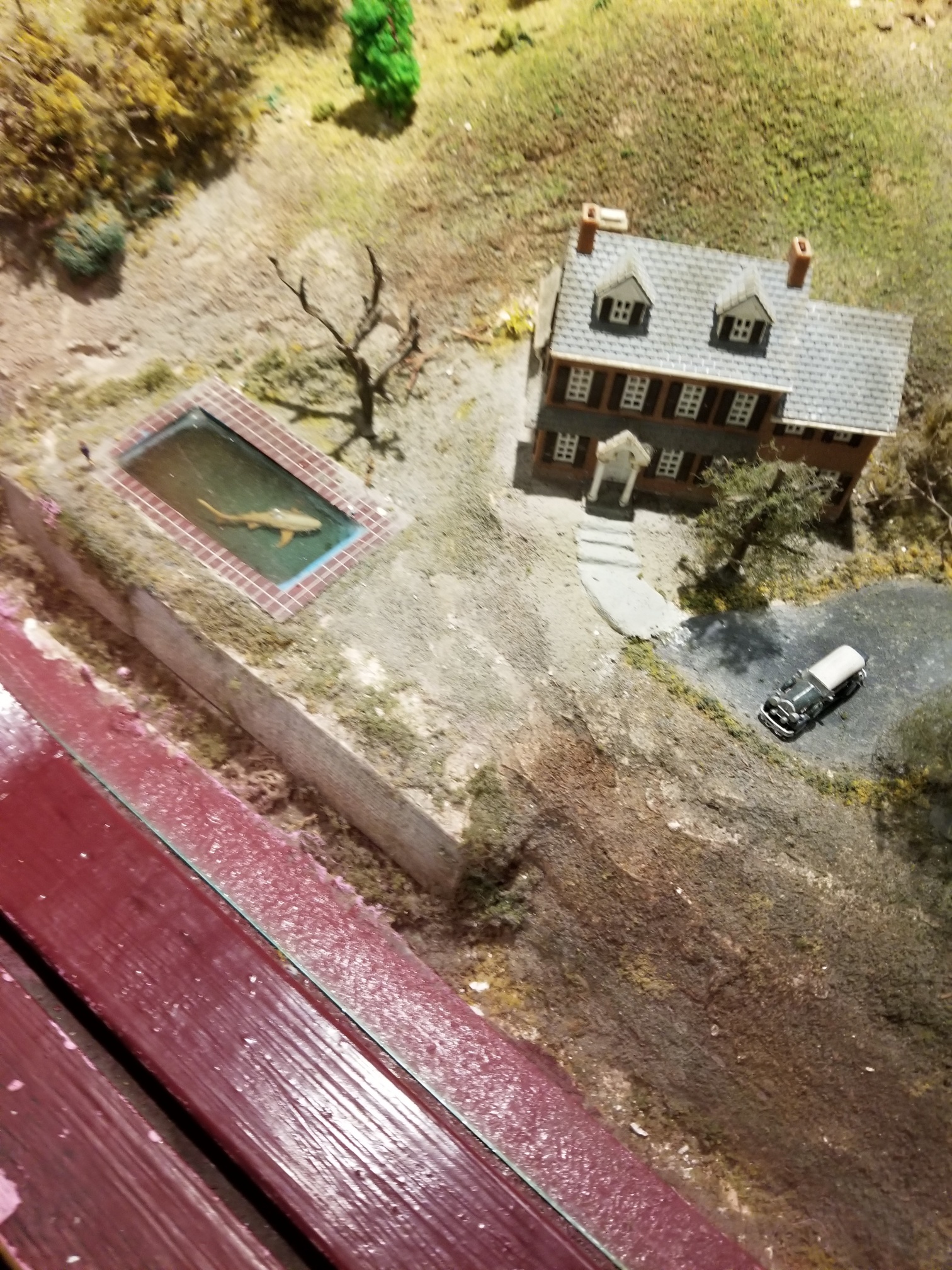
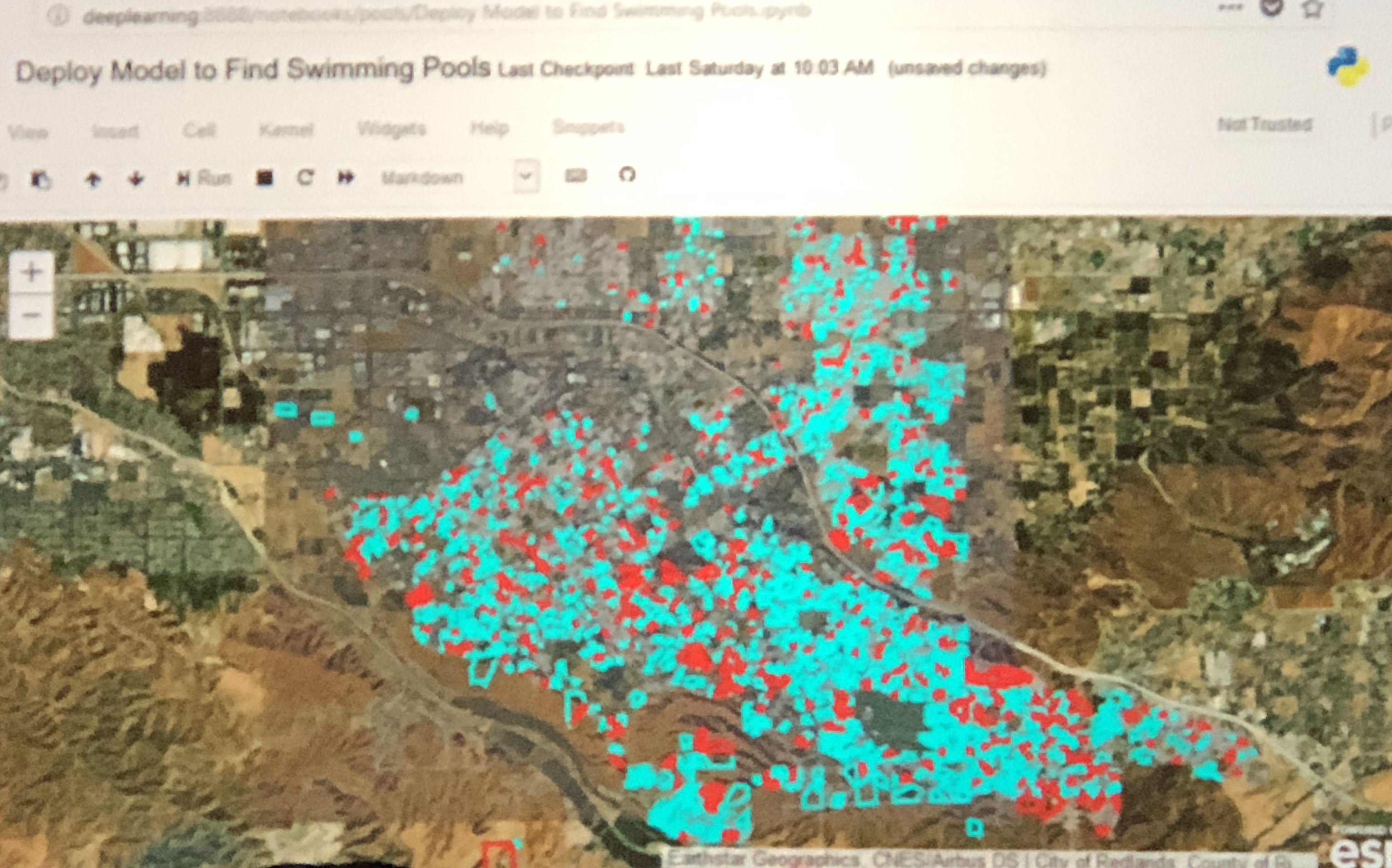 Rohit, thanks Bern and gives an example demonstration for detecting swimming pools using infrared imaging to develop training data and object detection to create the training model that provides information of what properties have swimming pools. Deep learning of this kind can also be used to detect neglected pools that are at risk for mosquito breeding.
Chris takes us on a trip to New Orleans with visuals of blighted properties since before Hurricane Katrina. Images captured by city contractors from the street level.
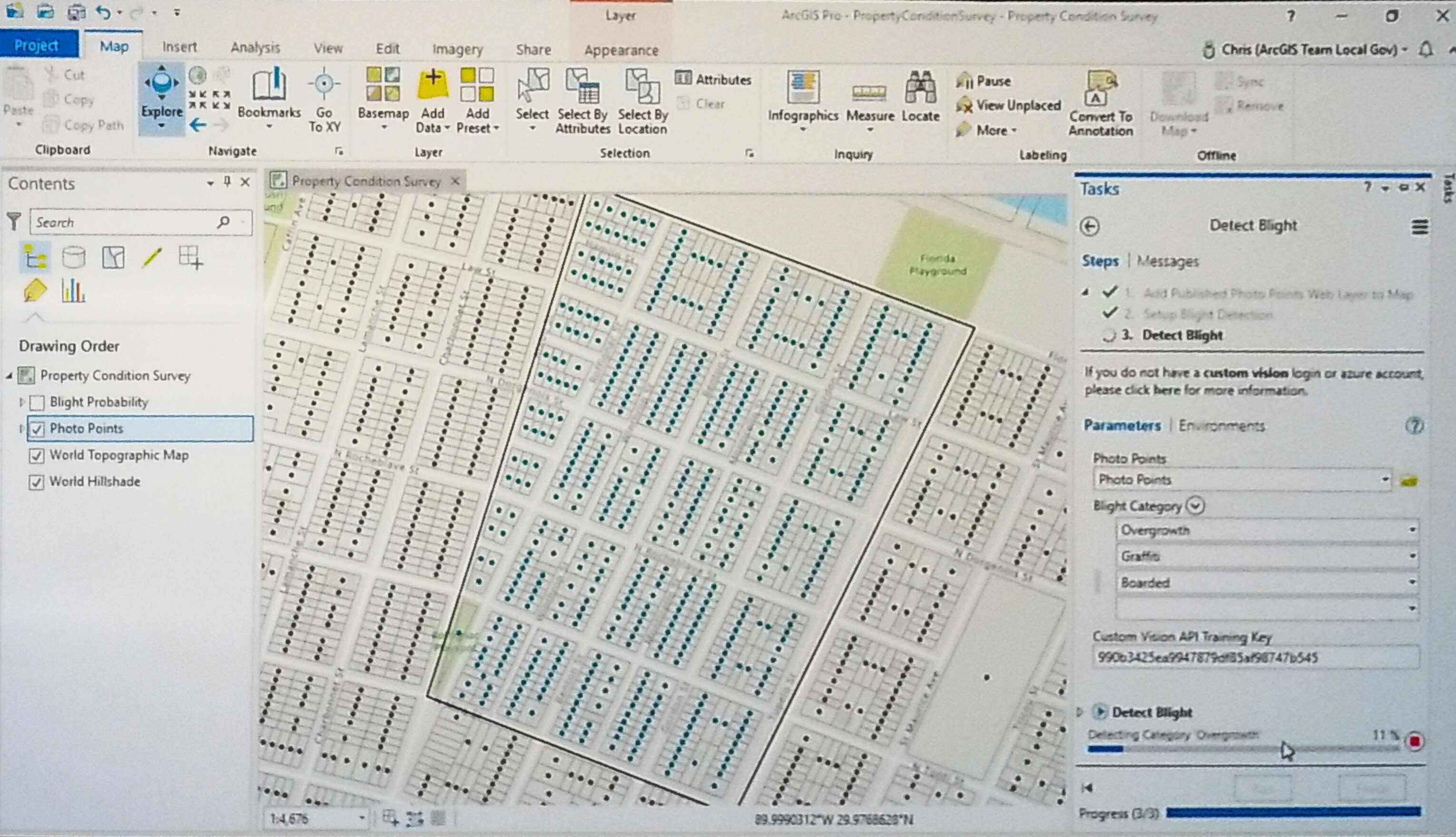
Using AI with the NEW Property Condition Survey and ArcGIS Pro, he can identify a neighborhood in New Orleans that has not been classified with blight categories. Integrating with the training key in Microsoft Custom Vision, using out-of-the-box training photos focused on graffiti, boarded windows, and overgrown yards, the AI can be trained with a blight model in Custom Vision, classifying these images with resulting layers that can be used in ArcGIS.
Looking at these specific properties shows the overall blight probability score, more effectively prioritizing neighborhoods needing assessments. In under one minute, Chris is able to classify 600 properties for less than one dollar by using ArcGIS and AI together to solve difficult problems to understand a variety of neighborhood conditions.
Written by Matt Ball, Esri Staff Writer
Using deep learning workflows, Rohit Singh demonstrated the automatic detection of swimming pools in residential areas in a city. Using ArcGIS Pro with NAIP imagery from the Living Atlas he began by labeling sample pools. Then this training sample data integrates with Jupyter Notebook and the ArcGIS API for Python to integrate with PyTorch and the FastAI library to train an object detection model. The model helps find the pools across the entire city. Analysis tools from ArcGIS online allow us to join the pools to parcels. Next, we look at the properties that haven’t recorded pools in the assessor’s database, helping the city generate a report with properties that need to be field verified.
Chris Buscaglia showed the identification of areas of blight in New Orleans, detecting graffiti, boarded windows, and overgrown yards. The result showed buildings that needed further field verification. Instead of taking hundreds of hours, he was able to classify hundreds of photos in minutes.
11:40 a.m. - Restoring New York City’s Lower Catskill Aqueduct with GIS & BIM
Company: Mott MacDonald
Speakers: Cory Dippold and Anthony Renteria
Written by Matt Ball
Cory Dippold and Anthony Renteria from Mott MacDonald showcased the integration of GIS and BIM for the planned maintenance of the Lower Catskill Aqueduct.
New York City’s water supply system starts well above the city in the watersheds that feed reservoirs managed by the Department of Environmental Protection (DEP). 500 million gallons of water flows each day through aqueducts that run over 120 miles. The last twelve miles of the Catskill Aqueduct, which is more than 120 years old, has been targeted for repair. Cracks and weathering in this segment, known as the Lower Catskill Aqueduct, will be repaired over a ten-year span.
The project is born digital with the creation of a digital twin. Mott MacDonald has surveyed the aqueduct’s subsurface and surface using LiDAR scanning to capture the details of the aqueduct. Existing conditions are loaded into ArcGIS Online along with original contracting documents from 1911. The process detailed known assets for engineering evaluations, and it also discovered some unknown assets, such as manhole access points that were covered over by vegetation in the ensuing years. Porting all the information to ArcGIS Online made it easy to share with DEP, and this sharing will be ongoing throughout the maintenance process, providing visibility into the progress and performance of the job.
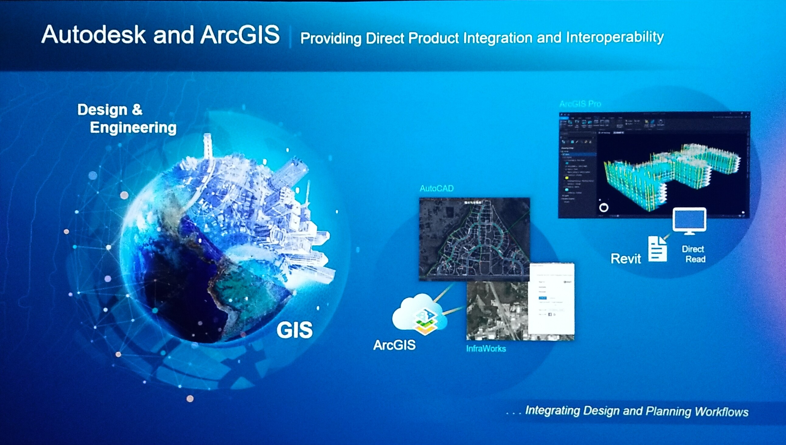
There’s a whole building information modeling (BIM) aspect to this project. The project context model is created in Autodesk InfraWorks with full asset information that aligns with the LiDAR data and satellite imagery. The data was imported into Autodesk InfraWorks to provide a project context model.
The BIM model is created in Autodesk Revit. The digital model is imported back to InfraWorks to create the context model. Now, for the first time, they can pull the Revit model into ArcGIS with a full-fidelity transfer. The model can be orbited and explored, looking at features both above and below grade.
New tools in ArcGIS Online allow Mott MacDonald to slice the GIS model and reveal the detailed BIM model below ground. These new tools allow the users to section and cut through the model like never before, removing the GIS data to reveal the planimetric data for a view of the engineering-grade model within GIS.
A small section of the aqueduct that’s no longer in use allowed Mott MacDonald to test the use of LiDAR to create a reality capture of the interior of the aqueduct. This information was loaded into GIS to examine defects and to quantify cracks and spalls to be sent to the contractors to repair them. This detailed information will help the contractor to expedite repairs while providing a database of all the defects to create a contractor job package.
Bringing the GIS and BIM data together, allows you to further explore the model. A single environment to navigate around the project. It allows those that aren’t practitioners of BIM or GIS to explore the engineering-grade model.
"Welcome to the new Workflow at Mott MacDonald." ~ Cory Dippold
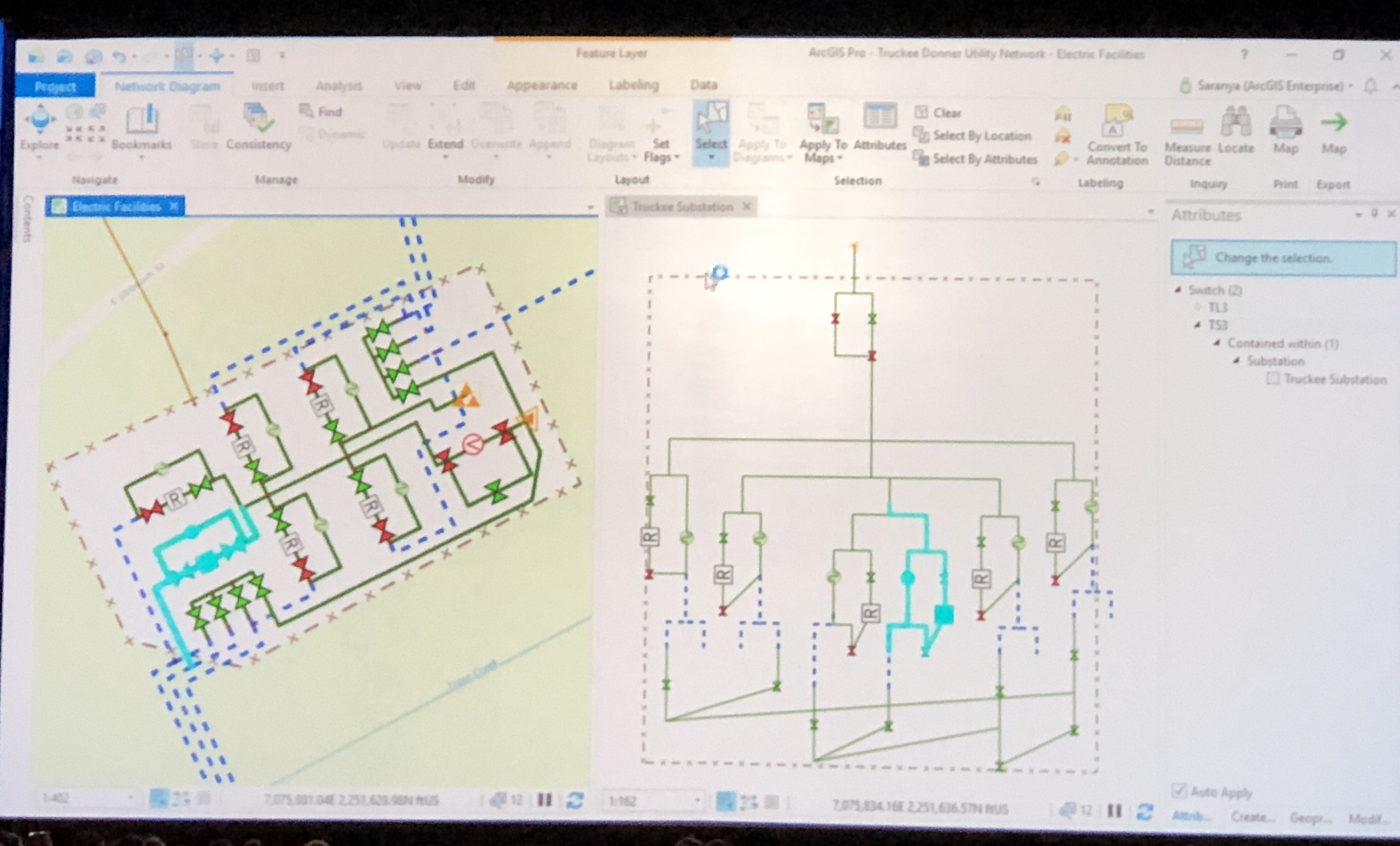
11:49 a.m. - ArcGIS Utility Network Management
Speakers: Remi Myers, Esri and Sarayana Kesavan, Esri
In a collaborative demonstration, Remi and Saranya show a Basemap using the ArcGIS Network Management Solution to help Truckee Donner Public Utility District deliver electric power and water to nearly 25,000 customers in northern California.
 Sarayana zooms into a neighborhood from above seeing electrical and water systems, valves, switches, transformer containment banks, connectivity lines, and how easily she can reconfigure a pole from one location to
another for a road widening project.
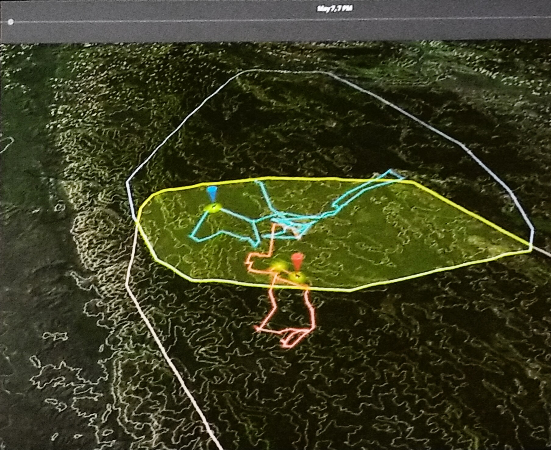
Remi explains how hospitals, such as the Tahoe Forest hospital, is served by multiple sources of power to reduce risks of accidents and equipment failure. By expanding the map views to review terrain and historical weather patterns using a historical marker, they can determine that an additional source of power can be routed from a nearby substation to the hospital.
Sarayana and Remi then demonstrate how easily they can map and create a template for power to a golf course and switch it to a 3D model to view potential terrain issues and any risk from the nearby water network.
Wrapping up their demonstration, they show how easily a field user can access the same data from a mobile device using Explorer.
Additional GeoNet resources:
Electric and Gas
Water Utilities
11:53 a.m. - Location Tracking
Speaker: Craig Gillgrass
Craig uses a location tracking the app to configure his profile for tracking when he is only working and turns off the tracking when he is off the clock.
11:58 a.m. - ArcGIS Indoors
Speaker: Madeline Schueren and Adrien Meriaux (demonstration)
Madeline gives a sneak peek into three mobile applications that are coming later this year.
The first new native app being released later in 2018 is ArcGIS Indoors. The demonstration of the day-in-the-life of an LAX gate agent, ArcGIS Indoors will bring efficiency to workflows by allowing users to look at facilities maps that include locations, routes, scheduling, detailed information, and help an employee such as our LAX gate agent to better plan the day and create reports as assignments are completed.
With assistance from Adrien Meriaux, She continues to demonstrate the ArcGIS Runtime AR/VR Beta app on a mobile device. Selecting the orange dot in the map locks the location and a model of LAX pops up. When you move to the mobile device, the map moves with you.
| Mobile View of LAX | 3D Street View |
|---|
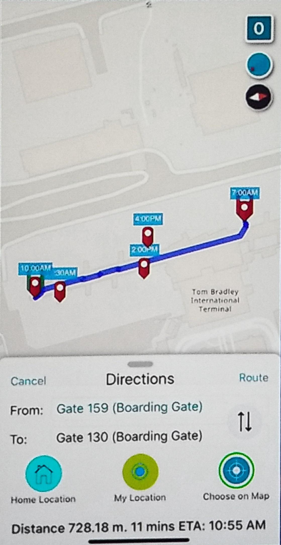 | 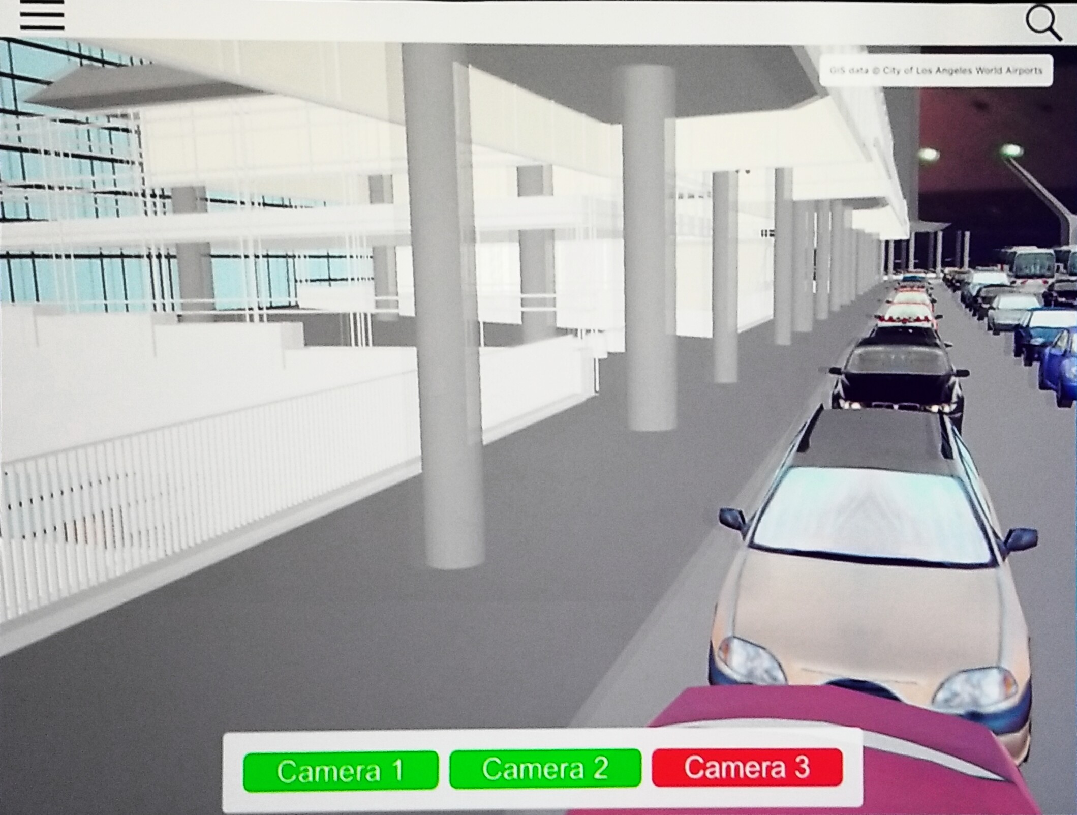 |
The first new native app being released later in 2018 is ArcGIS Indoors. The demonstration of the day-in-the-life of an LAX gate agent, ArcGIS Indoors will bring efficiency to workflows by allowing users to look at facilities maps that include locations, routes, scheduling, detailed information, and help an employee such as our LAX gate agent to better plan the day and create reports as assignments are completed.
With assistance from Adrien Meriaux, She continues to demonstrate the ArcGIS Runtime AR/VR Beta app on a mobile device. Selecting the orange dot in the map locks the location and a model of LAX pops up. When you move to the mobile device, the map moves with you.
“Navigating this 3D environment in AR is easy & natural.” ~ Madeline Schueren
12:03 a.m. - U-Spatial—Advancing Spatial Science and the Workforce of Tomorrow
Company: University of Minnesota (UMN)
Speakers: Len Kne, Coleman Shepard, Kevin Erhman-Solberg, Somayeh Dodge, and Tom Fisher
Len Kne opens with, “We are a spatial university,” and a map showing where GIS is located on the University of Minnesota campus. The entire campus uses GIS and often through ArcGIS Online for a variety of reasons, all focused on accomplishing the university’s mission: teaching, research, and outreach. Len continues to explain how the Enterprise GIS department supports the campus infrastructure for public safety, land care, building maintenance, and construction. The University now has 6,300 students, faculty and staff with named user account on ArcGIS Online.
In collaboration with The Ohio State University Byrd Polar & Climate Research Center, they plan to release a new DEM at 8 m spatial resolution that will be free and open to the public.
The charge for U-Spatial and everyone in higher education is to:
- Develop the GIS workforce of tomorrow,
- Ensure that everyone in the workforce is thinking spatially, and
- Advance the spatial sciences.
The future generation of GIS professionals will continue expanding these skill sets, as they maximize
creative problem-solving skills.
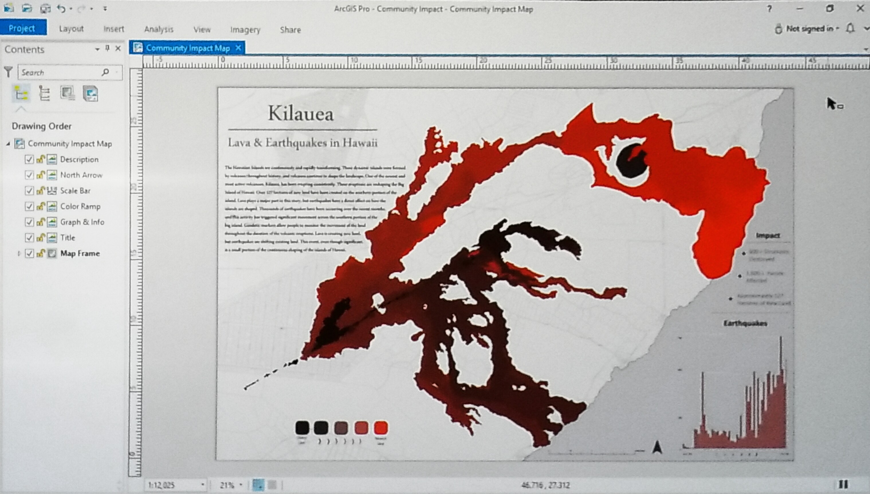
Len introduces Coleman Shepard and his current project to gain a deeper understanding of the activity happening right now with the eruption of Kilauea.
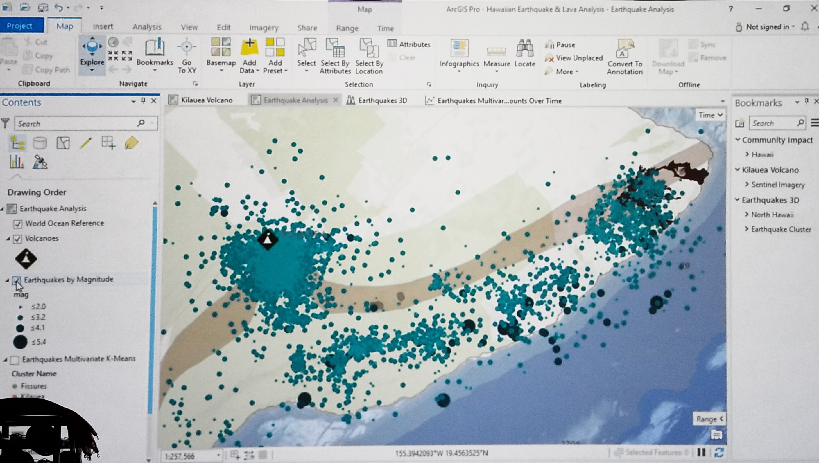
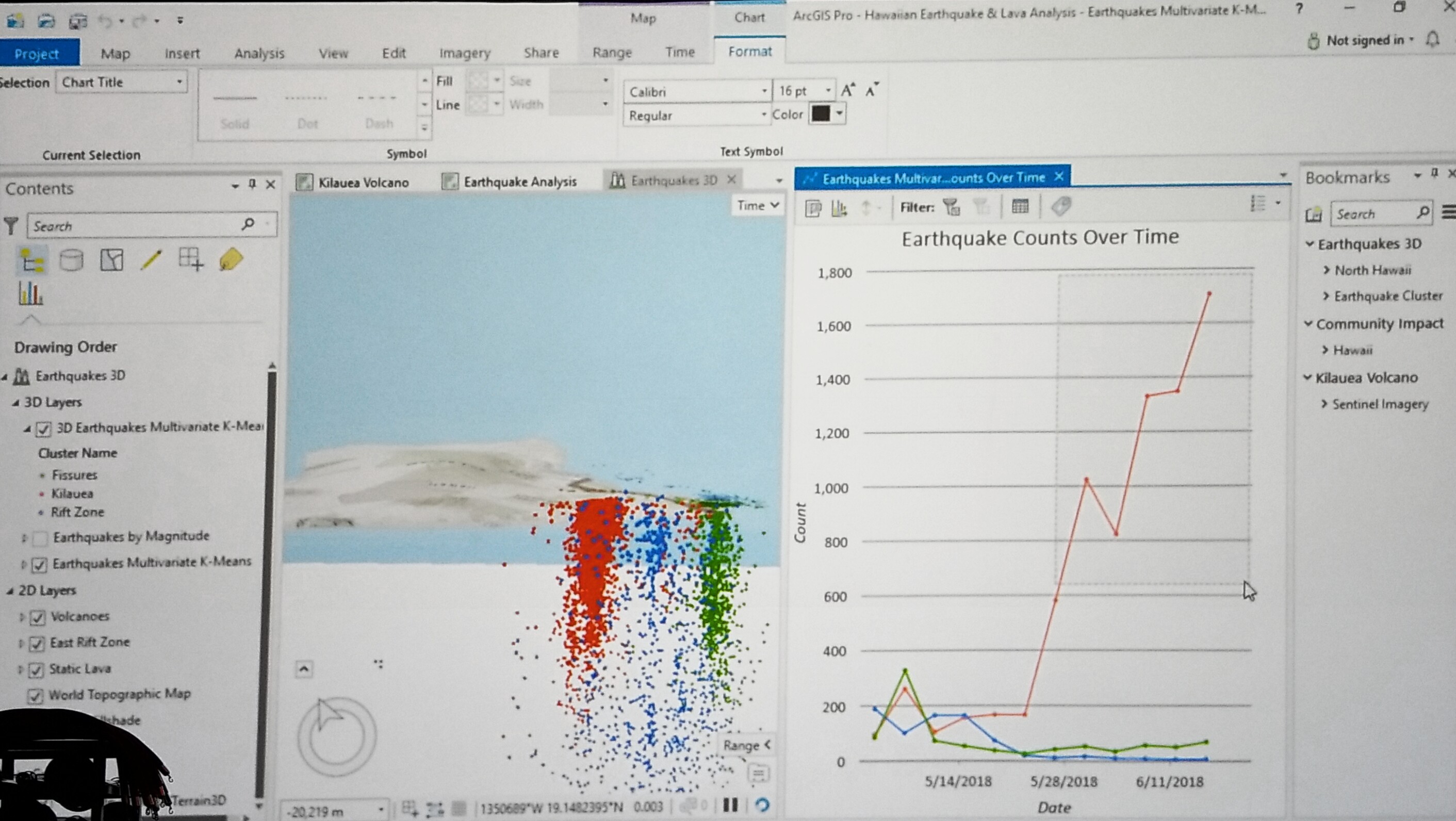
Coleman demonstrates the use of ArcGIS Pro 2D for earthquake analysis. More than 16,000 earthquakes have rumbled Kilauea since the start of the eruption. He conducted multi-variate clustering using K-means to cluster the earthquakes based on 4-dimensions revealing three distinct clusters representing zones of Kilauea.
Using ArcGIS 3D capabilities Coleman visualizes the depth of the seismic activity by cluster and over time was able to see the number of earthquakes near the volcano continuing to increase.
He wanted to know more so he extracted publicly available data of geodetic stations to measure the displacement of geodetic markers over time using Python in Jupyter Notebook. He was able to indicate the eventual collapse of the crater.
Coleman introduces Kevin Ehrman-Solberg, Ph. D. student in the Geography, Environment and Society department at the University of Minnesota. He is also the co-founder of the Mapping Prejudice Project creating a spatial database of racial covenants in Hennepin County.
Kevin explains the meaning behind the racial covenants as lines of text in warranty deeds for real estate. Using OCR to translate historic property records into searchable text documents, they can parse the text files using Python to flag deeds containing racial language.
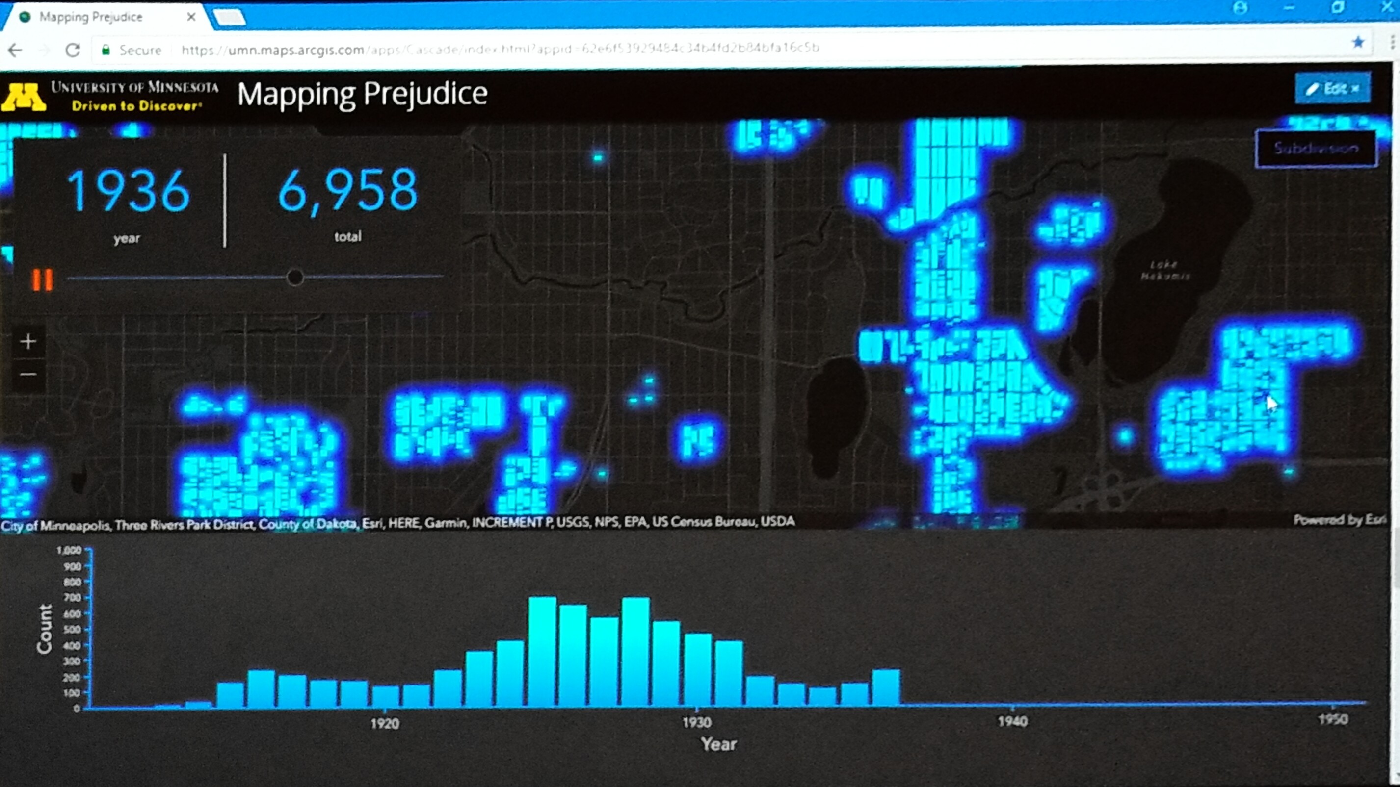
The flagged documents are then uploaded to Zooniverse to enter the attribute information necessary to build the map. This information is exported to JSON and joined with a spatial layer in ArcGIS Pro flagging over 30,000 deeds and mapping more than 15,000. The blue dots denote a property parcel in Hennepin County exclusively reserved for “white” Americans.
With historical census data and these maps, they can see the racial segregation of real estate in the Minneapolis area. These maps powerfully demonstrate how GIS can change our understanding of the world we live in.
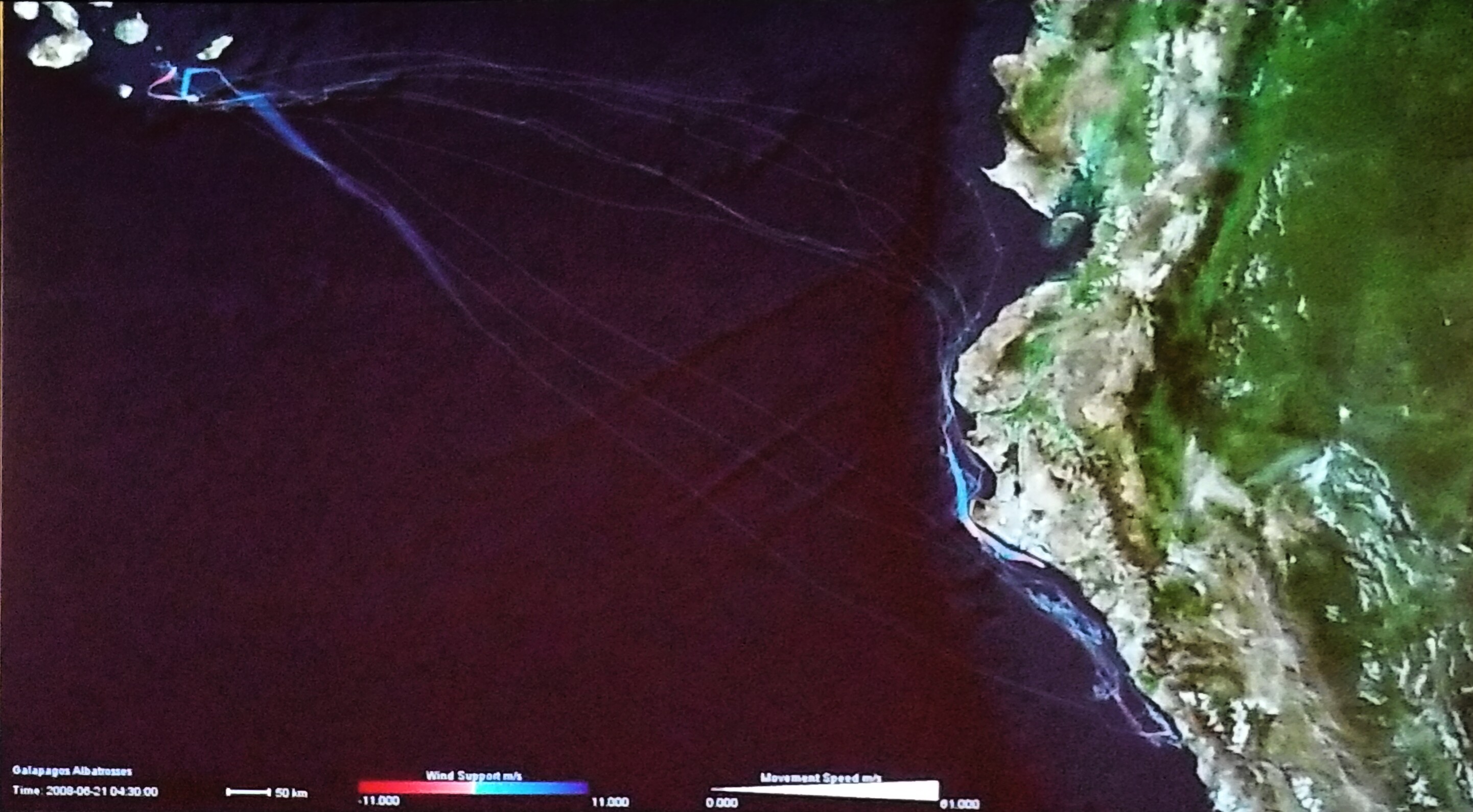 Following Kevin’s presentation, Somayeh introduces the study of movement (human and animal movement) predicting changes in the behavior of individuals in natural and human systems.
Somayeh tells how UMN is using GPS enabled data tracking to track the migratory behavior of the albatross and how the albatross use the wind patterns and chlorophyll concentrations to know exactly where the ocean productivity is highest near Peru. Maps in Motion help scientists to better understand and develop the hypothesis of tiger behaviors.
"By advancing our knowledge of movement, we can develop better strategies to protect wildlife populations, and prevent human-wildlife conflicts., ” expresses Someyah.
Tom Fisher begins with a history lesson describing how as a human society we spent most of our history living nomadically, moving from place to place. It is only a fragment of our history that we have become permanent settlers living in fixed structures and infrastructures that can be mapped.
He continues to explain that once more, our society is becoming nomadic because of the ability to freely travel, use mobile devices, spatial tools, and digital apps too, access what we need when we need it while paying for only what we use without having to own it.”
Companies offering short-term services such as Airbnb, Uber, Lyft, Lending Club, Task Rabbit, and others have prospered by offering convenience, lower prices, and increased efficiency.
With a call to action, Tom expresses that GIS Professionals have a leadership role to play in the transformation of an economy that demands spatial thinking and locational skills. With the growth of a sharing economy, a need for spatial analysts, geo-designers, and the GIS community’s creative use of spatial thinking in boardrooms, council chambers, and corner offices. “Ours is a leadership role that we owe the customers and citizens we serve – and that we owe to ourselves.”
Stay tuned for Part III of the https://community.esri.com/community/events/user-conference/blog/2018/07/09/live-from-the-2018-user-....


 Q&A - Open Discussion


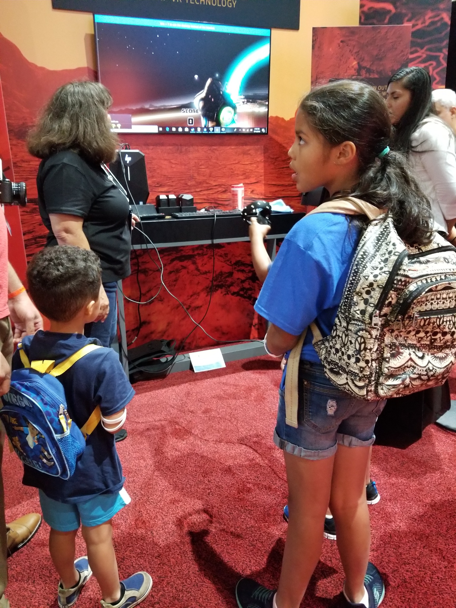
 We stopped to play at the Kids Fair. Many activities and learning opportunities for families to bond over GIS. Check Out the
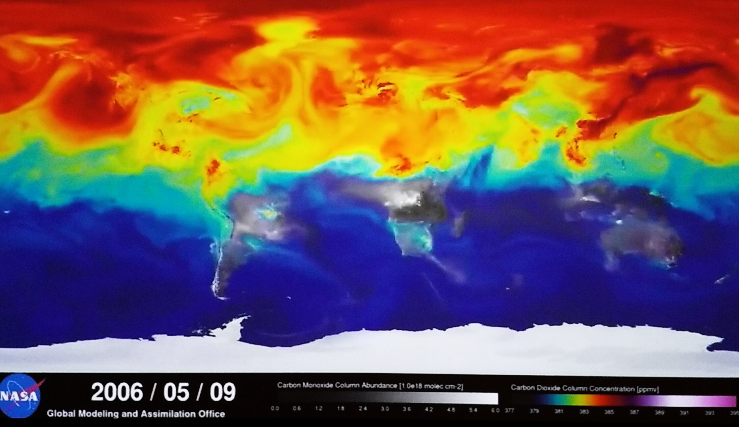
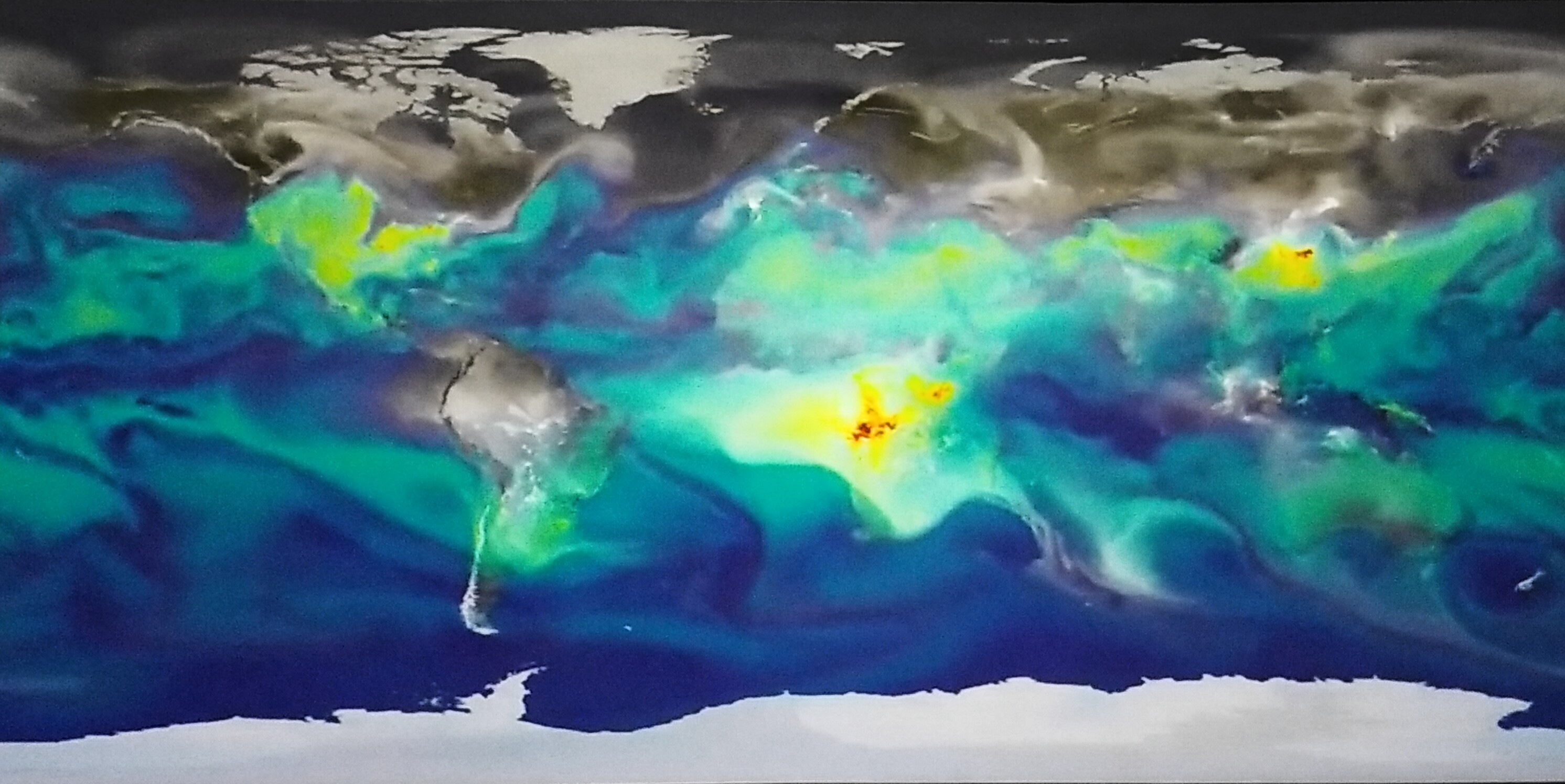 The map to the right shows the amount of carbon dioxide in the atmosphere during the winter months (in red) in comparison to the Spring when trees are in full bloom (in blue).
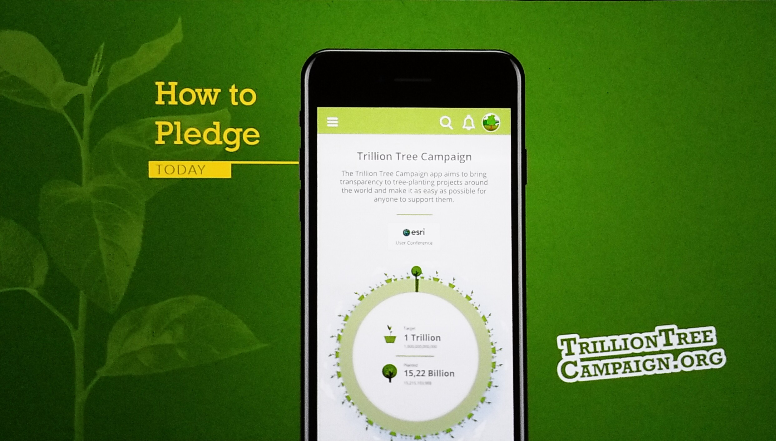 With this app, you can record the trees you plant and if you can't plant trees, you can donate for the cause. You can track other countries to see how many trees they are planting. You can see what others are doing and follow them as well as gift them a tree to help them reach their target goal for trees.
 We see shifts in blue-collar to white-collar manufacturing jobs, poverty shifts, drug poisoning from opioids. What surprised them is the increase in advanced higher-learning across the U.S. and the role that community colleges are providing new opportunities for those seeking to advance their education or careers. And last slide James shares is how the refugee arrivals are the U.S. is declining.
 After the video, the audience gives a roar of cheers. With tears of joy, both Alice and Mariana share their thanks for the partnership with Jack and Esri and what they desire.

.jpg)

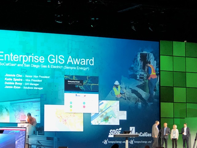
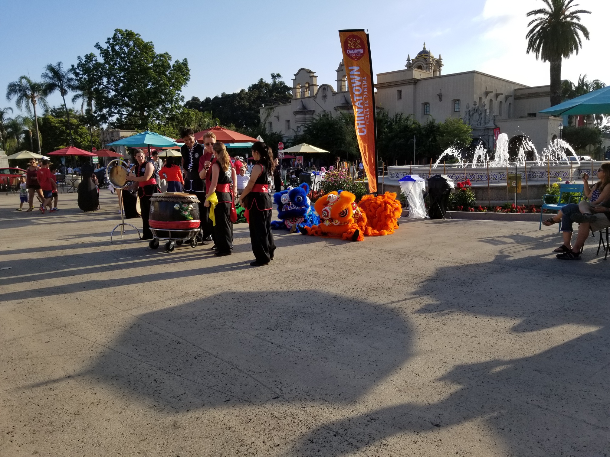
 In San Diego
 8:33 a.m. -