Education Blog - Page 43

cancel
Showing results for 
Show  only  | Search instead for 
Did you mean: 

Latest Activity

(1262 Posts)
CharlieFitzpatrick
Esri Alum

Last week, Minnesota lost a key player in the rise of GIS in K12 education. Scott Freburg retired from the MN Dept of Education. But the state hasn't lost as much as it might seem. Freburg has been a difference-maker, and such folks often stick around, making more waves.

He had his first experiences with remote sensing and GIS in college in the mid-1980s, and started going to conferences and getting to know people. After doing GIS for several organizations, he joined MDE in 2006. In addition to building a strong enterprise GIS, over the years he has helped a number on staff get into using GIS regularly. A quiet and behind-the-scenes guy, he played a key role in getting a state license started for MN just as ArcGIS Online Organizations were becoming available to states.

His "cannonball into the swimming pool" event was in fall of 2013, talking to the MN GIS/LIS group, asking who might be willing to help local teachers by running a simple workshop. The next summer, 25 volunteers ran 40 events across the state, for almost 300 teachers. That wave still ripples today.

Scott Freburg

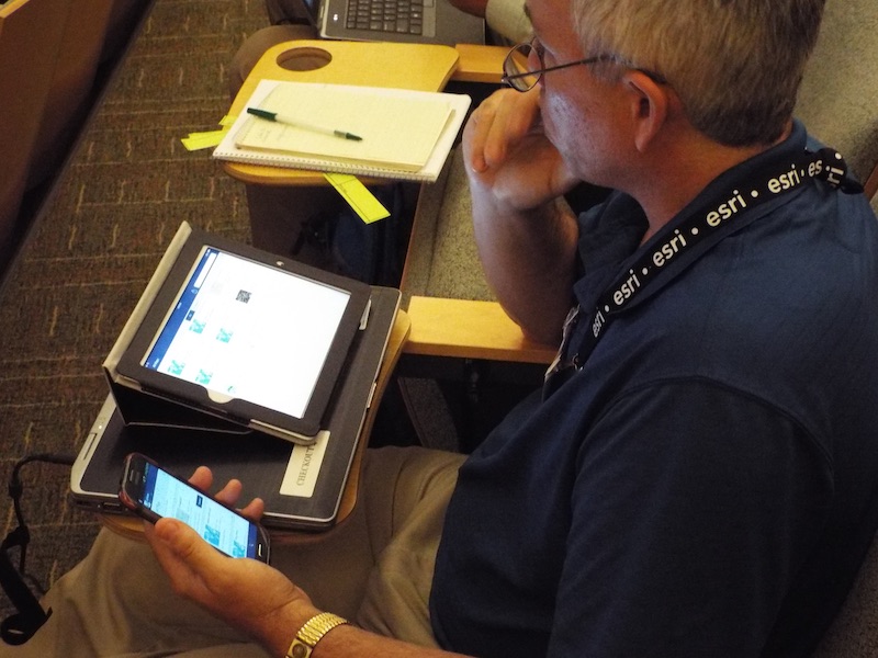
At Esri's 2014 T3G educator institute, Freburg temporarily closes the laptop to focus on tablet and smartphone.

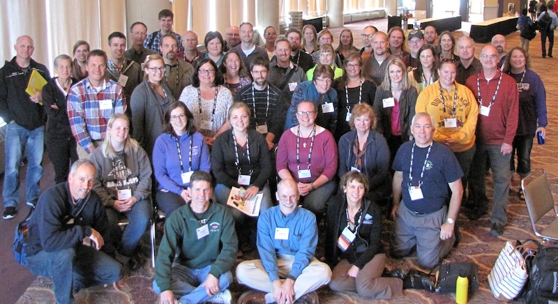
In fall of 2015, Freburg's dream took a next big step, launching the Minnesota GIS Educators' Day, a one-day training for educators, during the school week, at the front end of the state GIS/LIS event. Teachers' substitute costs and travel costs are paid by the GIS community, and GIS professionals join the teachers for lunch, hear educators and students and mentors speak, and hear the call again to join forces. The 2015 event was a success, which grew in 2016, and again in 2017, and bigger still in 2018. Through quiet conversations, helping people over the years, sharing good ideas, and showing up, Freburg has fostered in Minnesota's professional GIS community a commitment to the K12 teachers who bring thousands of students into GIS.

2015 MNGISED

Freburg (front right) and teachers at 2015 MN GIS Educator Day

"The GIS/LIS group had a scholarship fund for higher ed folks for years, so it wasn't hard to get agreement on allocating funds for K12 as well," he said. "Four of those scholarship winners in eight years have become teachers. And, y'know, one is the teacher whose kids won Esri's national high school competition both years. So it all comes around. It's gonna keep building." (See also AAG's GeoMentor profile.)

What's in store for Freburg? Maybe a little more baseball and golf, a little less database management. There's a first grandchild soon. But there are also teachers to visit, all over the state. "We'd like to visit all the state parks in Minnesota … and … maybe schedule some trainings around them." Could be even bigger waves ahead.

more
3 1 2,287
JosephKerski
Esri Alum

Effective teaching and learning about demography and population change is enriched through the use of web mapping tools and spatial data.  These tools and data sets foster critical thinking and spatial thinking, learning about content, scale, change, and systems. In the attached document, I describe 8 short activities: Comparison of urban areas around the world, exploring population change at multiple scales, and investigating community demographic characteristics using a variety of spatial analytical tools and interactive online maps and charts.  Feel free to use these tools in your own instruction from secondary to university level. These activities and a thorough description of each will soon be published in a special issues about the 2020 Census in The Geography Teacher journal.

These activities have 6 common themes:  They all use interactive maps; freely accessible with no log in via the web.  They all focus on real-world investigations, inquiry and problem solving, use a variety of themes and scales, highlight change over space and time, and foster learning about interconnected systems (the carbon cycle, weather and climate, population dynamics, commerce).  

--Joseph Kerski

more
1 0 1,882
JosephKerski
Esri Alum

I recently created or updated my activities for secondary and university students focused on the following themes, indicating starting point links for each.  It is my hope that these activities, data layers, and interactive maps are useful to many educators and students.  I have also compiled a "why and how to use GIS in education" set of slides to use as an introduction to these lessons and activities as an attachment to this blog essay.

Change over space and time

Change Matters Viewer

Wayback Imagery comparison

Landscape

Population density and ecoregion analysis.

Create a terrain profile

Create a viewshed

Create a trace downstream

Natural Hazards

New Zealand Cracked Plates

County natural hazards investigation

3D cyclones of Western Pacific Ocean

Sentinel-2 imagery investigation

Human Health

1854 Cholera study

Human Development Index investigation

Demography

Starbucks coffee study

3D cities investigation

Compare cities using the Urban Observatory

Analyze international migration in 2D and 3D

New Zealand Schools study

New Zealand Purchasing Power (log in required)

Weather and Climate

Water Balance app

Real-time weather analysis (log in required)

Potential sea level rise in 3D

Fieldwork

6 methods to map your own data

Campus vegetation survey and map

Community

Build a map tour storymap.

Build a map journal storymap.

more
0 0 2,395
GeriMiller
Esri Regular Contributor

We wanted to ensure that everyone saw the below, and communicated it to your IT collaborators, as it will impact anyone using ArcMap versions prior to 10.7, and ArcGIS Pro versions prior to 1.3, when making connections to ArcGIS Online.  ArcGIS Enterprise, some client apps and custom third-party applications built on ArcGIS Runtime, depending on versions, may get affected also.


Though unfortunately this important security update does not comply with our academic calendars, action must be taken to ensure smooth transition… please visit the main TLS page for further details and next steps.


Thank you and feel free to post any questions on GeoNet – this is a page dedicated to this update.


  • Q. I have ArcGIS Pro 2.3, am I ready to go for April 16?
  • A. Yes.


  • Q. I have ArcGIS Pro 1.2 and earlier, am I ready to go for April 16?
  • A. No, action must be taken.


  • Q. I have ArcGIS Map 10.7, am I ready to go for April 16?
  • A. Yes.


  • Q. I have ArcGIS Map 10.6.1 and earlier, am I ready to go for April 16?
  • A. No, action must be taken.
  • A2. Perhaps an opportunity to update workflows to ArcGIS Pro.


  • Q. I have ArcGIS Enterprise version 10.6, am I ready to go for April 16?
  • A. It depends, likely action must be taken. Version of Portal for ArcGIS higher than 10.4.1 are unaffected. Versions of ArcGIS Server are dependent on underlining OS.

From: Esri <newsletter@esri.com>
Subject: Reminder! Immediate Action Required — ArcGIS Security Update


On April 16, 2019, we are making an important configuration change to ArcGIS for TLS support.


View email in web browser.

Important Update for ArcGIS and TLS

Esri is committed to providing strong security for the ArcGIS platform by using the latest industry standards and best practices for security protocols. To meet these requirements, starting April 16, 2019, we are updating ArcGIS Online to enforce the use of TLS (Transport Layer Security) version 1.2 only. This date has been adjusted due to the partial shutdown of the US Federal Government and customer feedback.

This update is likely to affect most ArcGIS software and customer solutions. If you have not updated and validated your system's support for TLS v1.2 only, you may lose your ability to connect to ArcGIS Online.

More details about Esri's support for TLS, including patches and instructions for updating software, can be found by visiting
support.esri.com/en/tls.

Who Is Affected?
Users of most ArcGIS software or custom solutions using Esri technology may be affected by this planned update to TLS protocol v1.2.

What Do I Need to Do?
Go to the
Esri TLS Support page for information, patches, and instructions for updating software for TLS v1.2. Patches for all versions of ArcGIS Desktop back to 10.2.1 are now available.

How Do I Validate My Systems Beforehand?
Esri is providing a validation web service that can be used to quickly verify that ArcGIS Desktop will work when TLS v1.2 only is enforced. Esri is also providing validation services for customers utilizing third-party apps and custom components including map services, geocoding services, and basemap services. Information about these validation services is available on the support site link above.

If this email is not applicable to you, please forward it to the one who manages your ArcGIS software or custom solutions using Esri technology.

Read More

You received this because of the impact of this announcement on your organization.

Update your subscription preferences.

Esri.com | Privacy | Contact Us

Copyright © 2019 Esri. All rights reserved.

Esri, 380 New York Street, Redlands, CA 92373, USA.

more
0 1 837
JosephKerski
Esri Alum

I wrote the Foreword to this book, just published:


https://www.amazon.com/GIScience-Teaching-Perspectives-Geographic-Information/dp/3030060578


GIScience Teaching and Learning Perspectives (Advances in Geographic Information Science) 1st ed. 2019 Edition

The authors have done a stellar job of advancing GIS teaching and learning, and I highly recommend investigating this book.

Some of the chapters are in the graphic below.

--Joseph Kerski 

Selected chapters in the new GIScience teaching and learning book.

more
2 0 1,417
JosephKerski
Esri Alum

Tell your story!  I taught the following free webinar through the American Geosciences Institute on Thursday 14 March 2019.  Telling your Geoscience Story with Story Maps.  Fee free to share with colleagues!

Here are the recordings:

The main session:  45 minutes:  Telling your Geoscience Story with Story Maps - YouTube 

The Questions and Answer portion:   15 minutes:   Telling your Geoscience Story with Story Maps: Question & Answer Session - YouTube  


Communicating results of geoscience investigations to a diverse set of audiences will grow in importance in our 21st Century World. Communicating science is and will remain important to the entire community. GIS will continue to expand as an important tool for spatial analysis and visualization.  Story maps are web mapping applications that provide geoscientists with the ability to combine 2D and 3D maps, audio, video, photographs, and narrative that can be shared with research colleagues, or the general public, and embedded in web pages and online presentation tools. This webinar will quickly give you the knowledge, skills, and confidence to make your own maps for telling your own story.


Speaker: Joseph Kerski, PhD, GISP, Education Manager, Esri


Joseph Kerski

more
3 0 1,263
JosephKerski
Esri Alum

As I frequently teach hands-on workshops so that people can see for themselves the power and data that is at their fingertips using modern GIS technologies, I wanted to share the workshops and short courses below.  These are chock-full of activities and I invite you to use these activities in your own courses. 

For activities inside a Architecture Engineering and Construction program, let us focus on the following:

1.  See attached presentation on the intersections and forward movement of GIS, CAD, BIM, and AEC. 

2.  Tools:  ArcGIS Urban, City Engine, ArcGIS Pro.

For activities inside a Computer Science program, let us focus on the following:

1.  Tools:   ArcGIS Pro, the ArcGIS API, Javascript, ArcPy, and Python.  Jupyter notebooks.

2.  Resources:  The Labs on https://developer.arcgis.com, the Arcade scripting language in ArcGIS Pro and ArcGIS Online. 

3.  What are the chief programming topics (knowledge, skills, practices) and software that are necessary in the geospatial industry?   · Using Jupyter Notebooks within ArcGIS Pro, scripting (Python with ArcPy, ArcGIS), GIS database programming, GIS algorithm implementation & optimization, desktop application development (C#, Java, ArcGIS Runtime SDKs, GDAL), mobile app development (ArcGIS Runtime SDKs and ArcGIS API for JavaScript, web application development (JavaScript with APIs from ArcGIS, Leaflet, Mapbox, OpenLayers), statistics (R, Matlab, the ArcGIS - R bridge), big data analytics (Tensorflow, Hadoop, Spark).  

4.  How many GIS programming courses of different levels should be provided, and which levels should be required for the completion of the degree?   Some of the differences might include broad troubleshooting skills for a variety of systems. The ability to adapt and change based on requirements from management or budgetary-related is critical. The ability to inherit, improve or maintain systems that you didn’t necessarily create and which may be outdated and potentially involve unsupported implementations or implementations that don’t use best practices. 

5.  When creating courses, consider the following important topics and course listing:  Intro to programming concepts, segments that focus on debugging skills, Intro and Intermediate courses on JavaScript, Intro and Intermediate courses on Python; other computer science courses as electives (e.g. algorithms).  Again, use ArcGIS Pro with the new Jupyter notebooks embedded capability!

6.  How to convince others that GIS Programming courses are important?  GIS is simply map-enabled computer science, however, there is some overlap between GIS and CS for certain job requirements. Some skills are critical for all GIS students such as Python, for example. Understanding basic programming concepts and modern web GIS architecture only helps to ensure student success when they graduate.  Every student needs to be proficient in building websites or native applications, but if they have the basics then they will be more adaptable.  There is a spectrum of needs in GIS that ranges from little-to-no-programming-skills-needed to fully custom application building. The fundamentals of “how” programming languages work may not have changed much (e.g. variables, data structures, control structures, etc), and these fundamentals can be applied across a variety of languages.  What is changing very rapidly are the programming languages themselves. Web browsers and JavaScript are examples of unbelievable rapid change.  One challenge is to keep curriculum current with the latest that languages have to offer. One goal is to teach students flexibility in how to learn programming languages and to learn how to adapt. Also, with programming languages, you really only learn by doing it, in hands-on mode. It’s not something most people can read in a book and then successfully apply it.


For activities inside a business course, let us focus on the following:

1.   My presentation - Spatial and Critical Thinking in Research and Instruction: Why and How   Spatial and critical thinking in business research and instruction - why and how.  Includes links to interactive web maps and tools.

2.  See attached regional convenience store activity.

3.  Exploring the demographics of 50 states using infographics:  https://esribizteam.maps.arcgis.com/apps/MapJournal/index.html?appid=bdfc563d4eac45b8a0e2aa350b95df9...  

4.  Top 10 features about Infographics:  Top 10 Business Analyst Infographic Features.

5.  Tools:  Business Analyst Web, ArcGIS Online, Survey123, ArcGIS Pro.

6.  See attached slides on why the WHERE matters in business. 

For activities in a remote sensing course, let us focus on the following:

1.  Change Matters viewer:  ChangeMatters :: Using Landsat Imagery to Map Change   to analyze change over space and time:  Aral Sea, Mt St Helens, Dallas-Fort Worth TX, and elsewhere. 

2.  Wayback high resolution historical imagery:  https://community.esri.com/community/education/blog/2018/10/18/analyzing-change-over-space-and-time-...   Examine how these places have changed:  Lake Mead, Plano Texas, Beachy Head England, the Three Gorges Dam in China, and your own community.  

3.  Landsat 8 app:  Landsat Explorer    Analyze different spectral bands, create a swipe comparison map, filter data, and more. 

4.  Sentinel-2 imagery to analyze the eruptions in Kilauea:  https://community.esri.com/community/education/blog/2018/06/29/using-two-new-tools-to-analyze-the-er...   Add data from the Living Atlas:   Sentinel-2 views, bands 12, 11, 2, Filter on Acquisition Date of 23 May 2018, Image display as Geology with DRA, stretch, analyze. 

5.  Tools:   ArcGIS Pro, ArcGIS Online.  Data:  Imagery and other content in Living Atlas of the World.

For the environmental science course, let's focus on the following activities that I created:

A new Higher Education GIS Immersive Hands-On Workshop - Joseph Kerski, Ph.D. - GeographerJoseph Ker...    These include examining the global water balance, stormwater, ecoregions, population change, migration, field surveys, and much more. 

For a crime analysis course, let's focus on analyzing crime in Lincoln Nebraska, as follows:  Search ArcGIS Online for crime Lincoln Nebraska and open the following web map: https://www.arcgis.com/home/item.html?id=d0506cc0f18e4e19a771f84319e24773.   You will see crime point locations, city limits, police stations, and police districts.  Change style for police stations to Safety-Health - Badge.  Change style for districts to unique symbol - color.  Label the districts by number.  Use Proximity to create 5 minute drive time around stations with dissolve option.  Next, calculate the percentage of crime within 5 minute drive times using the Aggregate Points tool.  For Choose layer containing points to aggregate into areas, choose Crime. For Choose layer containing aggregation areas, confirm that Five-Minute Drive-Time from Stations is chosen.  Change style on crime to map specific crimes, such as theft.  Change style on crime to see crime as heat map.  Examine imagery with labels to determine areas where more crime seems to be occurring.  Create hot spot map of areas of significant clustering of crime.

For a GIS in the Humanities course, let's focus on the following:

1.  Explore the Digital Humanities map collection:  Story Maps and the Digital Humanities   

2.  Build your own story map:  https://community.esri.com/community/education/blog/2017/07/26/10-things-you-can-do-with-arcgis-onli...   > Scroll down to #2:  Story Maps.  Build a map tour, then, time permitting, a map journal.

3.  5 Forces acting in society to bring us to this pivotal moment in geospatial technology and spatial and critical thinking:  https://denverro.maps.arcgis.com/apps/MapJournal/index.html?appid=fb060544d4bc4d15a1b8bed38048859b 

4.  Data quality and societal issues:  https://spatialreserves.wordpress.com  My co-authored data book and blog. 

5.  Collect, map, and analyze field data with Survey123:  Use this form to collect tree height, tree species, and tree condition:  https://survey123.arcgis.com/share/933b03f8109e411cab344453dbd7a865   Examine the resulting map on:  http://arcg.is/1COi0z .  If you need the long URL, it is:

http://www.arcgis.com/home/webmap/viewer.html?webmap=434cbc3ca6a342eca3122f08414e2be4&extent=9.9432,... 

After uploading a test point to this Survey and seeing your results on the map, create your OWN survey on this or another topic (historical sites, homes, something else in your community) using the web form method via http://survey123.arcgis.com/When your survey is finished, create a map from your survey and examine the pattern of your results. Save and share as appropriate.

For activities in a Digital Earth, Geography, or Smart Planet course, let's focus on the following:

1.  10 things you can do with ArcGIS Online:  10 Things You Can Do with ArcGIS Online in Education  

2.   Teaching with web apps:  apps_teaching_with_activity.pdf - Box   These include examining Pacific typhoons in 3D, demographics of Zip Codes, creating viewsheds and buffers, and much more.  These apps are easy to use and yet very powerful.

3.  Introduction and Advanced Work with Story Maps:  Slides with core content with short activities and longer hands-on exercises.   These activities and exercises include how to build a story map from a web map, and how to build map tours, map journals, swipe, series, and other types of story maps.

4.  6 methods to map your own data:  https://community.esri.com/community/education/blog/2019/02/18/4-methods-to-map-your-own-data-a-work... 

For examining the topic of Data Quality, Data Sources, and Spatial Analysis in ArcGIS Online, let us focus on:

1.  Why data quality matters, now more than ever:  Why Data Quality Matters More Now Than Ever 

2.  Data sources, data quality, and societal issues:  https://spatialreserves.wordpress.com  

3.   Trace downstream.  First add World Hydro by Esri, data to ArcGIS Online map. 

4.  Examine county health rankings, practice Arcade scripting:  https://www.arcgis.com/home/webmap/viewer.html?useExisting=1&layers=c2d611adace94b488bfbf280dd591a7c  

5.  Analyze zebra mussels from 1986-2011:  https://denverro.maps.arcgis.com/home/webmap/viewer.html?webmap=a5cc4d8c8e9547ccaa76d70018f30fa2    Summarize center and dispersion.

6.  Boulder County Hazards starting point:  https://www.arcgis.com/home/webmap/viewer.html?webmap=d19b5a39eb3446a299e1e2f5dd25a44d    Determine which areas are in floodplains AND in major geologic hazards, enrich final results with group quarters. 

7.  Cholera 1854 study starting point:  http://esrit3g.maps.arcgis.com/home/webmap/viewer.html?webmap=87c0f79108e246d49f97a6cfe4fce157  Determine which water pump had the most cholera cases within 500 feet, determine optimal walking route for Dr Snow to visit each well. 

8.  Real time weather analysis:  https://denverro.maps.arcgis.com/home/webmap/viewer.html?webmap=8fbd18ed975f49c8a59b9f25f2b9f7a6   Symbolize data, create interpolated surface of temperature.  The full lesson I authored is here:  Predict weather—Predict Weather with Real-Time Data | ArcGIS  

9.  Join data to the Living Atlas of the World.   Start with this world earthquakes map:  http://denverro.maps.arcgis.com/home/webmap/viewer.html?webmap=63a6261d7afa48878a52a4c7127f624e   and join contents to the Living Atlas of the world to understand the number of earthquakes by country.  The full lesson I authored is here:  https://community.esri.com/community/education/blog/2018/09/17/spatial-joins-with-arcgis-online-and-...  

10.   The world of 3D analysis and visualization is also at your fingertips with cloud-based tools, as I show here of earthquakes:  Scene Viewer  
more
2 0 3,663
JosephKerski
Esri Alum

Today, there is no shortage of data available on open data portals, including those on ArcGIS Online (such as the Living Atlas of the World, and via ArcGIS Hub, and in many cities such as Cambridge Massachusetts and many countries such as Germany) and those we test and describe on our data blog http://spatialreserves.wordpress.com.  But there will always be a need for people to map their own data.  Great instructional value is inherent in doing so, including connectedness to the community, examining real world issues, field planning and methods, the use of data collection tools, outdoor education, and much more. 

If you are new to GIS, especially to web GIS, I encourage you to start with this HDI map of world countries, and this world plate tectonics map.

Thus, there is no shortage of methods in which to collect your own data.  In recent GIS workshops for faculty, I focus on the following 6 methods:

  1. Add data via a GPX file.  GPX files can come from a variety of sources, including GPS receivers and smartphone fitness apps.  Attached to this essay is a GPX file I collected in and around the University of Hamburg, Germany, using the RunKeeper app.  Save this file to your device, and add this to ArcGIS Online or Pro using the Add data tool. Symbolize the points and line as you see fit, and select your basemap of choice.  Note the "zinger" that appears in the GPX file.  I on purpose did not remove this, because these occasional spikes in the field path provide useful teachable moments.  This particular one occurred while I was inside St Michaels Church, gazing around at all the beauty, with the track "collecting" the whole time but losing some Wi-Fi hotspots, cell phone towers, and/or GPS satellites; hence guessing at my true position and, for a time, being a few hundred meters off.
  2. Add data via a simple table in Comma Separated Value (CSV) or text file (separated by commas).  Attached to this essay is a text file "fieldwork_hamburg_ped_counts.txt" in text format that I collected at 5 locations.  The data I collected was the number of pedestrians in one minute at each location, on a Sunday afternoon in winter. Symbolize the points as graduated symbol on pedestrian count.  Select a basemap of your choice.   Save and share as you see fit. Pedestrian counts is one useful set of data that you can collect with students, comparing different times of day, days of the week, and seasons of the year.  Note the high number of pedestrians at point #3 enjoying ice skating!
  3. Add data via an expanded table in text format for the same locations, but with a URL of a picture I took at each location.  FYI, my Flickr photos for this activity are from this set here.  After adding the data, click on each point, noting the "more info" for each popup that points to the photo.  Symbolize as you see fit, and practice customizing the popup.   Select a basemap of your choice.  Save and share as you see fit. 
  4. Use Survey123 to collect data in the area.  Use this form to collect tree height, tree species, and tree condition:  https://survey123.arcgis.com/share/933b03f8109e411cab344453dbd7a865   Examine the resulting map on:  http://arcg.is/1COi0z .  If you need the long URL, it is:  http://www.arcgis.com/home/webmap/viewer.html?webmap=434cbc3ca6a342eca3122f08414e2be4&extent=9.9432,... .  After uploading a test point to this Survey and seeing your results on the map, create your OWN survey on this or another topic using the web form method via http://survey123.arcgis.com/.  When your survey is finished, create a map from your survey and examine the pattern of your results. Save and share as appropriate.   See attached slides for more information on this powerful field data collection tool.  
  5. Create a story map of the data collected.  Several ways exist to do this, but start with the simplest one:   Go to https://storymaps.arcgis.com > Apps > Create Map Tour > Sign in to your ArcGIS Online account > add images from Flickr > access my images of the University of Hamburg and waterfront in the folder  joseph_kerski (note underscore) > Done.  In the story map, note the photo captions are read from the Flickr header information.  Add the number of pedestrians at each point as follows, from points 1 through 5 (with 1 being the northernmost point, 2 to its southwest, and then 3, 4, and 5 progressively closer to the harbor front).  Then, customize the color, basemap, logo, and extent.  Save and share as you see fit.  Under My Stories, edit the map for this story map and add the GPX file that you used earlier.  Change one of the photo to an embedded Hamburg video from among the Hamburg choices on my channel:  Our Earth - YouTube   Re-save.  Once you understand this method, use the map tour template as a guide to creating a tour table, for an even faster way of creating a story map.
  6. Use Mapillary to collect your own street view scenes and map them.  Download the app and begin collecting on a path on your campus or in your community.   Mapillary is an Esri business partner and I love using their tools for professional results without a great deal of work.  See my essay here for more information:  https://community.esri.com/community/education/blog/2017/03/24/examining-mapillary-views-in-arcgis-o....     

The capabilities of these tools continue to become more powerful and easier to use with each update.  Get out there into the field!

--Joseph Kerski

more
1 1 3,132
JosephKerski
Esri Alum

Greetings Everyone:

Perhaps this article I wrote about the status and perspectives surrounding GIS in higher education will be helpful in your own efforts as you continue to champion the cause of why teaching, learning, research, and administrative use of GIS makes a positive contribution to academia and society:

https://www.xyht.com/spatial-itgis/gis-in-higher-education/

--Joseph Kerski

GIS in higher education article

GIS workshop at a university, attended by those from the library, IT, engineering, data science, geography, humanities, biology, and other disciplines.

more
0 0 444
JosephKerski
Esri Alum

Perhaps this experiment that I conducted 4 years apart will be useful for all those teaching GIS and teaching with GIS, on the topics of GIS, GPS, and spatial resolution:

Track on Track, Revisited: Spatial Accuracy of Field Data | Spatial Reserves 

Track on track

Track from 2014 (left) and 2018 (right) gathered from a smartphone and a fitness app.

Back in 2014, I tested the accuracy of smartphone positional accuracy in a small tight area by walking around a tr....  During a recent visit to teach GIS workshops at Carnegie Mellon University, I decided to re-test, again on a running track.  My hypothesis was that triangulation off of wi-fi hotspots, cell phone towers, and the improved GPS constellation would have improved the spatial accuracy of my resulting track over those intervening years.

After an hour of walking, and collecting the track on my smartphone with a fitness app (Runkeeper), I uploaded my track as a GPX file and created a web map showing it in ArcGIS Online.  Open this map > use bookmarks > navigate to the Atlanta and Pittsburgh (Carnegie Mellon University) locations (also shown on the graphic below on the left and right, respectively).   Once I mapped my data, my hypothesis was confirmed:  I kept to the same lane on the running track, and the width of the resulting lines averaged about 5 meters, as opposed to 15 meters on the track from four years ago.  True, the 2014 track variability was no doubt in part because I was surrounded by tall buildings on three sides (as you can see in my video that I recorded at the same time) , while the building heights on the Carnegie Mellon campus were much lower.  However, you can measure for yourself on the ArcGIS Online map linked above and see the improvement over those two tracks taken just 4 years apart.

I did another test while at Carnegie Mellon University–during my last lap on the track, I moved to the inside lane.   This was 5 meters inside the next-to-outer lane where I completed my other laps.  I wanted to see whether this shift would be visible on the resulting map.  It is!  The lane is clearly visible on the map and on the right side of the graphic below, marked as “inside lane.”

To explore further, on the map above, go to > Contents, to the left of the map, and turn on the World Imagery Clarity layer.   Then use the Measure tool to determine how close the track is to the satellite imagery (which isn’t perfect either, but see teachable moments link below).  You will find that at times the track was 0.5 meters from the image underneath Lane 1, and at other times 3.5 meters away.

Both tracks featured “zingers” – lines stretching away from the actual walking tracks, resulting from points dropped as I exited the nearby buildings and walked outside, as my location based service first got its bearing.  But again, an improvement was seen:  The initial point was 114 meters off in 2014, but in 2018, only 21.5 meters.  In both cases, as I remained outside, the points became more accurate.  When you collect data, the more time you spend on the point you are collecting, typically the more spatially accurate that point is.

To dig deeper into issues of GPS track accuracy and precision, see my related essay on errors and teachable moments in collecting data, and on comparing the accuracy of GPS receivers and smartphones and mapping field collected data in ArcGIS Online here and here.

Location based services on the smartphone still do not yet deliver the spatial accuracy for laying fiber optic cable or determining differences in closely-spaced headstones in cemeteries (unless a device such as Bad Elf or a survey-grade GPS is used).  Article are appearing that predict spatial accuracy improvements in smartphones.  Even today, though, I was quite pleased with my track’s spatial accuracy, particularly in 2018.  I was even more pleased considering that I had the phone in my pocket most of the time I was walking.  I did this in part because it was cold, and cold temperatures tend to rapidly deplete my cell phone’s battery (which is unfortunate, and the subject of other posts, many of which sport numerous adds, so they are not listed here).   Happy field data collection and mapping!

--Joseph Kerski

more
1 0 942
192 Subscribers