- Home
- :
- All Communities
- :
- Industries
- :
- Education
- :
- Education Blog
- :
- Spatial Joins with ArcGIS Online and the Living At...
Spatial Joins with ArcGIS Online and the Living Atlas of the World
- Subscribe to RSS Feed
- Mark as New
- Mark as Read
- Bookmark
- Subscribe
- Printer Friendly Page
As I recently wrote in the guidelines and essay, More Power for Your GIS Analysis through Joining Features to ArcGIS , the paradigm that GIS users have been operating under for decades is being challenged in new and exciting ways. One way, as I wrote above, is the standard workflow of "downloading data > joining the attribute tables of two data layers > performing analysis." I demonstrated how you can join your data to layers in ArcGIS, and specifically, the Living Atlas of the World, an authoritative rich body of content, and thus bring that diverse content to bear on the analysis of patterns that may be inherent in your data.
Let's take another, related standard workflow--spatial joins. A spatial join is a GIS operation that affixes data from one feature layer's attribute table to another according to its location. Spatial joins begin by selecting a target feature and comparing it spatially to other feature layers. Spatial joins have been used for years, for example, to determine how many water wells are in a drainage basin, or businesses in a census tract, or the number of earthquakes that fall within specific countries over specific time periods. Let's take this last example and apply it to the rapidly advancing web GIS paradigm.
Let us say that I want to determine how many earthquakes occurred in the past 30 days according to the USGS National Earthquake Information Center. The way I have done this for years in ArcGIS Desktop was to gather two data layers - a point layer for earthquakes, and a polygon layer for world countries, and perform a spatial join. Nothing is wrong with that method, and it continues to work well in ArcGIS Pro, for example. But let's say I want to do that in ArcGIS , and I don't want to download anything. This is accomplished with an analysis tool in ArcGIS --Join Features. To use the analysis tools, you have to be signed in to ArcGIS and have a publisher role.
To begin, I start with my web map:
http://denverro.maps.arcgis.com/home/webmap/viewer.html?webmap=63a6261d7afa48878a52a4c7127f624e - the
Earthquakes starting point map. It contains data layers that are streaming from the USGS earthquake center, in my case, the last 30 days of earthquakes.
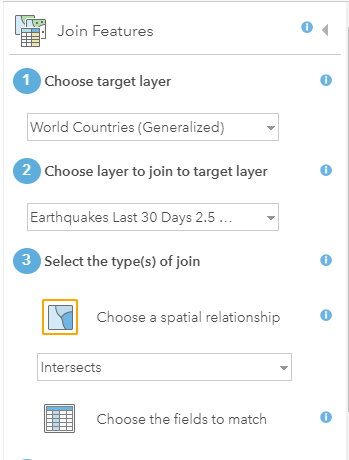
Once the Join Features analysis tool is engaged, I find World Countries (generalized) in the Living Atlas of the World. This is my target layer, so named because my goal or "target" is to create a choropleth map by country polygons. The layer to join to these polygons is my earthquakes layer that is streaming from USGS. My type of join is "intersect"--if an earthquake is inside or "intersects" the country polygon, I want it to be considered.
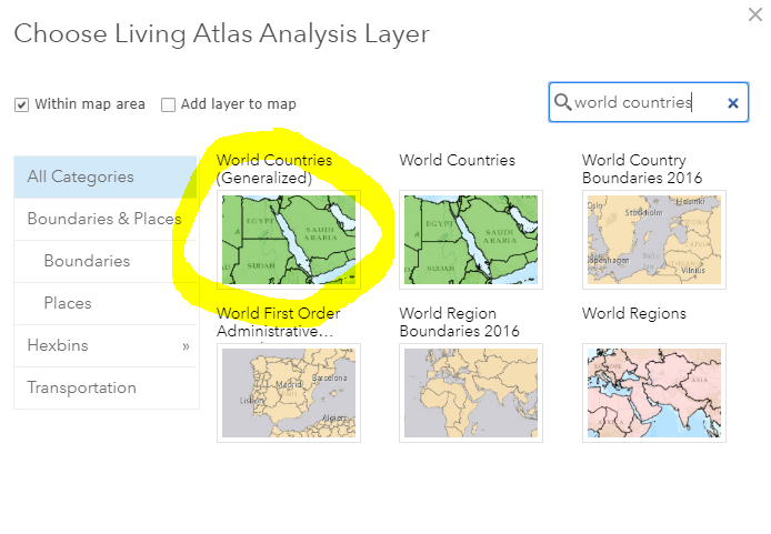
Here is how I found the Living Atlas content, after searching on World Countries, I selected the generalized data set:
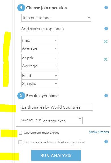
I filled in the remainder of the Join Features dialog box as follows: I chose the one to one operation; I added statistics so I could determine average magnitude and depth by country, which I thought would be interesting (always be curious! This drives you forward in your use of GIS as I explain in this video); I named my resulting layer and I unchecked "use current map extent" just in case my current extent happened to be cutting off any outlying islands in the South Pacific, for example, and then > Run Analysis:
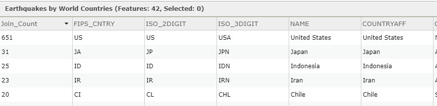
My results are below, with all countries defaulting as single symbol.
I will change the style shortly, but before I do, let's examine the new table of data. The "join count" field contains the number of earthquakes by country:
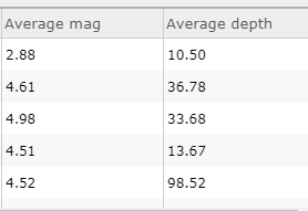
The average magnitude and average depth have been saved as fields in the new layer:
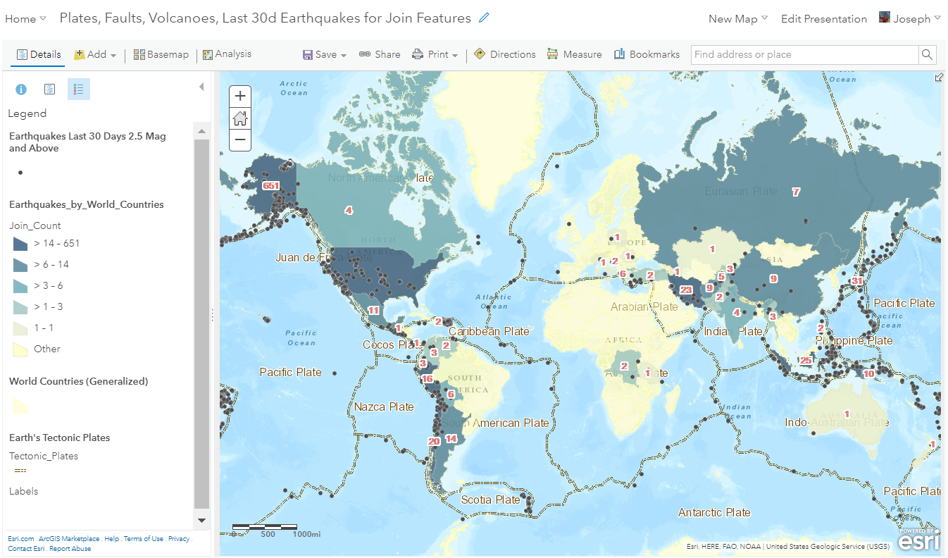
Next, I used Change Style to symbolize the countries on Join_Count, as follows:
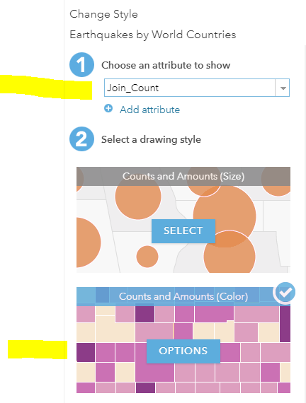
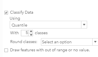
Because the USA contains so many earthquakes, the default Counts and Amounts symbology lumps most countries into one category. The reason why is in part because the USGS earthquake center is in the USA. It is in Golden Colorado; I used to give tours there as a USGS employee; a fascinating place that I recommend highly for you to take a tour in next time you're in Colorado. The earthquake center receives transmitted signals of information from the global seismic network, but it also senses ground motion from nearby earthquakes in the western USA. So, it senses more small earthquakes in the USA than it does for other countries, resulting in a higher number for the USA. This is all a critical part of knowing your data, as I write about weekly on the Spatial Reserves data blog. So, under Options, I changed the classification to Quantile with 5 classes, as follows:
The result is below. Now I have a better sense, with a choropleth map, of the frequency of earthquake by country. Given a ocean polygon layer, I could even map oceans by earthquake frequency.
I would like to make just a few adjustments. Because over the last 30 days, according to the USGS, earthquakes had occurred in only 42 countries, and 254 polygons exist in the generalized world countries data set, countries with no earthquakes have no symbol or color:
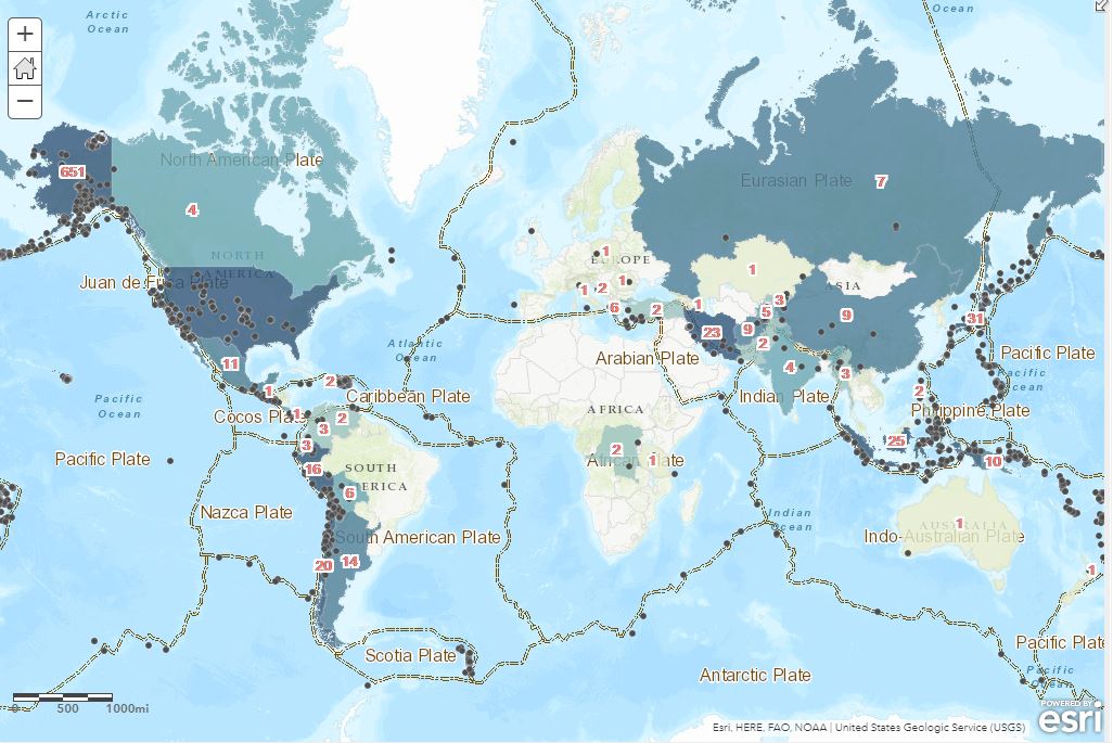
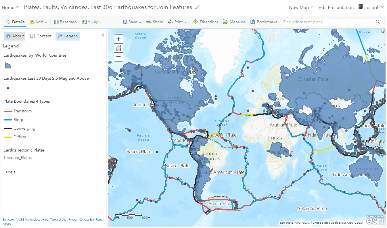
This looks a bit odd. My goal is to show countries with no earthquakes over the past 30 days with a pale yellow color. This is easily remedied with a few keystrokes. The easiest way to do this is to use the Add Data button, add the generalized world countries from the Living Atlas of the World, and change its style to pale yellow with a yellow outline. Once done, I moved its position to be located underneath my joined earthquakes layer. I also moved the earthquakes to the top of the contents so that my map users could more clearly see them. I also labeled the countries with the number of earthquakes that occurred within each one. The resulting map is here.
Try the Join Tables to ArcGIS on other data sets. It can be accomplished in just a few steps but the results are powerful. Think of ArcGIS and the Living Atlas as a vast storehouse of data that you can join your own data to for rich analysis.
You must be a registered user to add a comment. If you've already registered, sign in. Otherwise, register and sign in.
-
Administration
76 -
Announcements
77 -
Career & Tech Ed
1 -
Curriculum-Learning Resources
252 -
Education Facilities
24 -
Events
69 -
GeoInquiries
1 -
Higher Education
592 -
Informal Education
281 -
Licensing Best Practices
88 -
National Geographic MapMaker
32 -
Pedagogy and Education Theory
223 -
Schools (K - 12)
282 -
Schools (K-12)
264 -
Spatial data
34 -
STEM
3 -
Students - Higher Education
245 -
Students - K-12 Schools
124 -
Success Stories
36 -
TeacherDesk
1 -
Tech Tips
115
- « Previous
- Next »