ArcGIS Dashboards Blog

cancel
Showing results for 
Show  only  | Search instead for 
Did you mean: 

Other Boards in This Place


Latest Activity

(89 Posts)
HannahOlpinski
Esri Contributor

Register for Esri Academy's next live training seminar to learn how ArcGIS Dashboards can create data visualizations and that can simplify decision-making.

Read more...

more
3 0 375
MartinCopping
Esri Contributor

The November 2024 update for ArcGIS Dashboards introduces several exciting enhancements, bug fixes, and performance improvements.

Read more...

more
2 5 731
JenniferAcunto
Esri Regular Contributor

Tips for getting started with ArcGIS Dashboard's new Theme capability from a "professional dashboard builder".

Read more...

more
5 0 1,381
Soobin-Choi
Esri Contributor

Over the last few releases, ArcGIS Dashboards has made some changes to how data visualizations work behind-the-scenes. With the June 2024 release, that effort will be completed, meaning we will have set ArcGIS Dashboards up to bring far more chart types and features than ever before to users. 

Read more to check out what's new and how you might be impacted. 

(June 2024) 

Read more...

more
5 9 3,019
JenniferAcunto
Esri Regular Contributor

Tips and tricks for adding embedded content to your ArcGIS Dashboards from a professional dashboard builder.

Read more...

more
3 0 2,063
FriederikeAlschner
Esri Contributor

With the June 2023 update of ArcGIS Dashboards, we’ve made map selection workflows much more intuitive for dashboard viewers. When layer actions are configured, users simply need to click a feature on the map to select it.

Here are the highlights of what's changed.

(last update Jun 22)

Read more...

more
4 11 4,580
DavidNyenhuis1
Esri Contributor

Creating feature sets with date fields has gotten easier in data expressions. No longer do you have to convert dates to EPOCH.

Read more...

more
8 2 4,449
JenniferAcunto
Esri Regular Contributor

Learn when to use bar charts in your ArcGIS Dashboards, as well as best practices from a "professional dashboard builder". 

Read more...

more
6 4 3,755
jcarlson
MVP Esteemed Contributor

Do you have any "to do" dashboards in your organization? I do! These often come with a big indicator: items left to do. I like to use conditional formatting in those indicators to make getting to 0 more satisfying. It's a small thing, but it's surprising how often I hear about it from my users.

Judging by the feedback I receive, this is really all the people want.Judging by the feedback I receive, this is really all the people want.

Now, I get it. Most dashboards (especially public-facing ones) probably ought to be more professional. But if nobody's forcing you to make a dry and soulless infographic, why not loosen up a little?

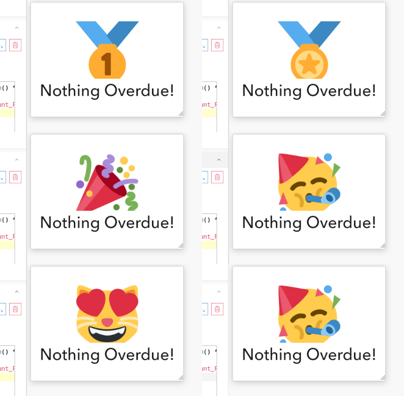
Believe it or not, I actually got a feature request recently to take the emoji idea further: could I make the emoji change randomly?

Of course I can!

Get your indicator set up the way you want, and just slip this little bit of Arcade into your Advanced Formatting code block, adjusting the list of emojis to your liking:

var emojis = [
    '😻',
    '🏆',
    '🏅',
    '🥇',
    '🎉',
    '🥳',
    '🙌🏾',
    '🥂',
    '🎂',
    '🍾'
]

var emoji = emojis[Floor(Random() * (Count(emojis)-1))]

Then reference the emoji variable in the returned middleText property.

Here it is with a short refresh interval:

Peek 2023-04-03 13-03.gif

Now go make your dashboard a little more fun to look at!

more
8 2 910
jcarlson
MVP Esteemed Contributor

Plus a custom linebreaking function for long strings!

Read more...

more
5 4 3,299
305 Subscribers
Labels