- Home
- :
- All Communities
- :
- Products
- :
- ArcGIS Dashboards
- :
- ArcGIS Dashboards Blog
- :
- Configure your first dashboard
Configure your first dashboard
- Subscribe to RSS Feed
- Mark as New
- Mark as Read
- Bookmark
- Subscribe
- Printer Friendly Page
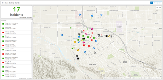
With the latest release of Operations Dashboard, you can create and use dashboards on the web without downloading an authoring app. In 5 steps, we’ll have a dashboard that combines a map and some elements to get information out to the public. This particular dashboard is going to show reports of incidents occurring around Redlands, CA. Your dashboard will look like this once you finish: Redlands Incidents dashboard.
If you'd like to follow along while reading, go to my Redlands Earthquake Response (Blog) map, click Modify map, and save it as your own. This is similar to the map you create if you follow the Monitor Real-Time Emergencies lesson on Learn ArcGIS, although here I used a copy of the data that includes open and closed incidents.
- Create a dashboard.
Log in to your ArcGIS organization and use the app switcher to go to Operations Dashboard.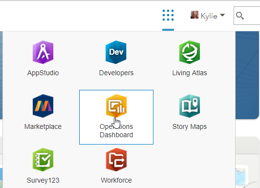
Click Create Dashboard. Provide a title (like "Redlands Incidents"), tags (like "incidents"), and a summary (like "Incidents in Redlands") and click Create Dashboard.
If you don't see the Create Dashboard button, make sure you have the privilege to create content in your organization. - Add elements.
For this dashboard, we're going to have a map of where the incidents are happening, a list of the incidents, and a count of incidents.
We'll start with adding the map. Click Add, choose Map, and select the map you saved from my shared map. By default, the layers honor the refresh intervals from the map and are selectable.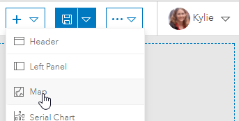
Add in some map tools, including Basemap and Layer Visibility, and click Done. The map is added to your dashboard.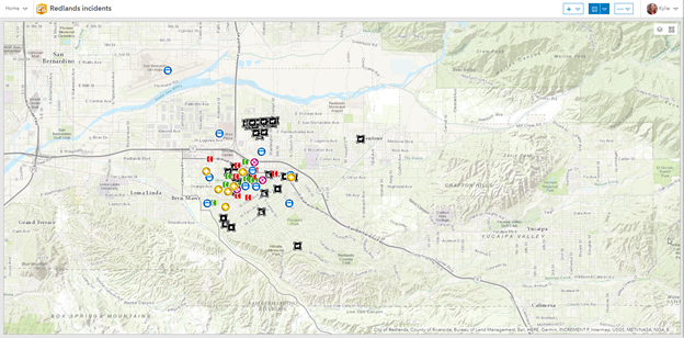
Use the Add button to add an Indicator that you’ll use for the incident count. Select the Reported Incidents - Dispatch layer. On the Indicator tab, set the middle text (where the value displays) to be green, and provide “incidents” as the bottom text. Click Done. The indicator is placed to the left of the map.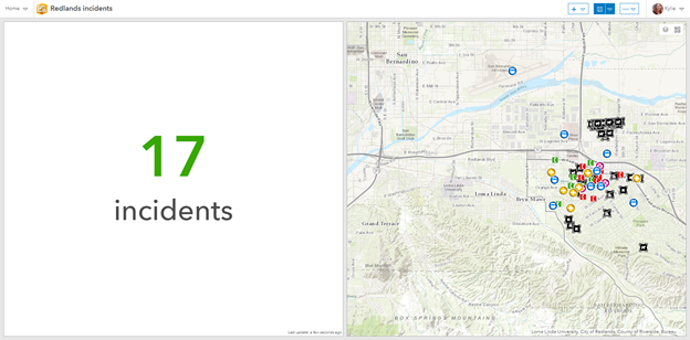
Add a List and select the Reported Incidents - Dispatch layer. On the General tab, give it a title “Incidents” and on the List tab set the Line Item Text to have icon, type, and open date: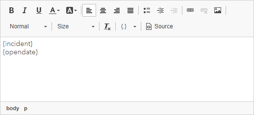
On the Data tab, click Sort and sort descending on the Open Date.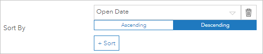
Click Done, and the list is placed to the left of the indicator.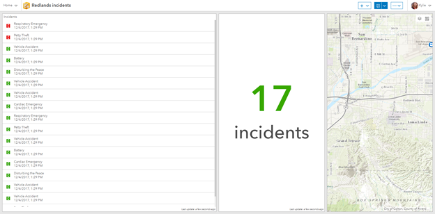
- Set layout.
While the elements we want are in place, they don’t look very good at all. Next, we’ll arrange the layout so that the list is below the indicator and the map gets most of the screen.
Hover over the blue bar in the upper-left corner of the list to get its menu and choose Drag Item. Place the list under the indicator, and resize the list and indicator so the map gets most of the space. Then resize the indicator so that the list gets more space. - Build interactivity.
Sometimes we want to see all the incidents, but at other times only the open incidents are of interest. You can add a selector that lets you filter the dashboard to show all incidents, only open incidents, or only closed ones.
Use the Add button to add a Header and click Done – that’s where we’ll place the selector. In the header, use the menu and choose Add Category Selector.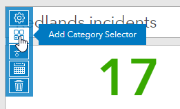
Since we want to use an attribute value that applies across multiple incidents, set Categories From to Grouped Values and select the Reported Incidents – Dispatch layer. Set the Category Field to Operational Status.
To show a button for each option, set Preferred Display Type to Button bar. To allow the user to show all incidents, enable None Option and set the Label for None to All.
In the Actions tab, add a When Selection Changes action that filters the Reported Incidents – Dispatch layer. Add additional actions so that the filter is also applied to the list and indicator.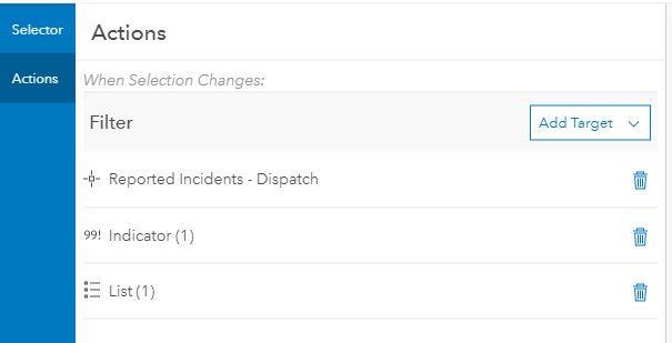
Click Done. - Save, test, and share.
Save and try out your Dashboard, making sure the selector filters the map, list, and indicator. Then share it with those who need access. In this case, we want the public to see what is going on, so we’ll share publicly.
Click Home and choose Dashboard Item Details to go to the item page for your newly created dashboard.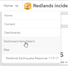
On the right side of the page, click Share, enable Everyone (public), and click OK. If your map isn’t shared publicly yet, make sure to share it, too, or users will be prompted to sign in when they open the dashboard.
You've now created an interactive dashboard that lets the community see the current incidents. Think about the kinds of dashboards you could build for your organization, and get started with your own dashboards.
You must be a registered user to add a comment. If you've already registered, sign in. Otherwise, register and sign in.