Education Blog - Page 82

cancel
Showing results for 
Show  only  | Search instead for 
Did you mean: 

Latest Activity

(1234 Posts)
TomBaker
Esri Regular Contributor

"By the end of day one with enterprise logins, I'd saved an entire teaching day! I'm never going back to the old, manual way of creating student accounts!" 

      —Matt Winbigler, Science Teacher, Cloquet Middle School (Cloquet, Minnesota)


For teachers that have already requested a free ArcGIS Online organizational account for their school, know that managing student accounts in ArcGIS Online is an important part of successfully using ArcGIS Online in classrooms, but it doesn't have to be difficult.

Why Have Student (and Teacher) Accounts?
Many schools have an ArcGIS Online organization subscription, which can hold 500 or more accounts for students or teachers. Student accounts are great for letting students create, save, and share maps and apps. Student accounts can be used to complete Level 2 GeoInquiries or even make apps to compete in the ArcGIS Online School Competition.

How Do I Make Student Account Management Easier?
ArcGIS Online allows for enterprise logins, which provide a way for ArcGIS Online to talk to your school's or district's student login system. ArcGIS Online supports the two largest student login systems used in US schools today: Microsoft and Google. Teachers will need the help of your school or district IT staff to connect ArcGIS Online with a preexisting login process. 

Share this post or send the link below to your school or district IT staff and tell them you'd like to share ArcGIS Online with all the students in the school or district. Ask them to enable enterprise logins, which is a quick process when following the guidelines detailed in the link below. Keep in mind, this will create new accounts for all students. Depending on your situation, you may wish to keep using any existing student or teacher accounts through the end of the school year.

more
2 0 987
JosephKerski
Esri Alum

Perhaps this experiment that I conducted 4 years apart will be useful for all those teaching GIS and teaching with GIS, on the topics of GIS, GPS, and spatial resolution:

Track on Track, Revisited: Spatial Accuracy of Field Data | Spatial Reserves 

Track on track

Track from 2014 (left) and 2018 (right) gathered from a smartphone and a fitness app.

Back in 2014, I tested the accuracy of smartphone positional accuracy in a small tight area by walking around a tr....  During a recent visit to teach GIS workshops at Carnegie Mellon University, I decided to re-test, again on a running track.  My hypothesis was that triangulation off of wi-fi hotspots, cell phone towers, and the improved GPS constellation would have improved the spatial accuracy of my resulting track over those intervening years.

After an hour of walking, and collecting the track on my smartphone with a fitness app (Runkeeper), I uploaded my track as a GPX file and created a web map showing it in ArcGIS Online.  Open this map > use bookmarks > navigate to the Atlanta and Pittsburgh (Carnegie Mellon University) locations (also shown on the graphic below on the left and right, respectively).   Once I mapped my data, my hypothesis was confirmed:  I kept to the same lane on the running track, and the width of the resulting lines averaged about 5 meters, as opposed to 15 meters on the track from four years ago.  True, the 2014 track variability was no doubt in part because I was surrounded by tall buildings on three sides (as you can see in my video that I recorded at the same time) , while the building heights on the Carnegie Mellon campus were much lower.  However, you can measure for yourself on the ArcGIS Online map linked above and see the improvement over those two tracks taken just 4 years apart.

I did another test while at Carnegie Mellon University–during my last lap on the track, I moved to the inside lane.   This was 5 meters inside the next-to-outer lane where I completed my other laps.  I wanted to see whether this shift would be visible on the resulting map.  It is!  The lane is clearly visible on the map and on the right side of the graphic below, marked as “inside lane.”

To explore further, on the map above, go to > Contents, to the left of the map, and turn on the World Imagery Clarity layer.   Then use the Measure tool to determine how close the track is to the satellite imagery (which isn’t perfect either, but see teachable moments link below).  You will find that at times the track was 0.5 meters from the image underneath Lane 1, and at other times 3.5 meters away.

Both tracks featured “zingers” – lines stretching away from the actual walking tracks, resulting from points dropped as I exited the nearby buildings and walked outside, as my location based service first got its bearing.  But again, an improvement was seen:  The initial point was 114 meters off in 2014, but in 2018, only 21.5 meters.  In both cases, as I remained outside, the points became more accurate.  When you collect data, the more time you spend on the point you are collecting, typically the more spatially accurate that point is.

To dig deeper into issues of GPS track accuracy and precision, see my related essay on errors and teachable moments in collecting data, and on comparing the accuracy of GPS receivers and smartphones and mapping field collected data in ArcGIS Online here and here.

Location based services on the smartphone still do not yet deliver the spatial accuracy for laying fiber optic cable or determining differences in closely-spaced headstones in cemeteries (unless a device such as Bad Elf or a survey-grade GPS is used).  Article are appearing that predict spatial accuracy improvements in smartphones.  Even today, though, I was quite pleased with my track’s spatial accuracy, particularly in 2018.  I was even more pleased considering that I had the phone in my pocket most of the time I was walking.  I did this in part because it was cold, and cold temperatures tend to rapidly deplete my cell phone’s battery (which is unfortunate, and the subject of other posts, many of which sport numerous adds, so they are not listed here).   Happy field data collection and mapping!

--Joseph Kerski

more
1 0 916
JosephKerski
Esri Alum

Greetings everyone:

I would like to announce an online course that I am teaching:  

 **Telling Your Story using Esri Story Maps** - This course led by Joseph Kerski will enable you to understand and incorporate interactive web-based story maps to include sound, video, photographs and other multi-media in your teaching about ecoregions, natural hazards, river systems, urban change, demographics, and much more. 

This course is aimed at:  The educator who is just starting out with web mapping and story maps.  So, if you know an educator that fits this description, this course would be particularly relevant to them.

This course is 5 weeks in length and includes hands-on activities, discussion, assessments, and readings.  You will learn through hand-on activities using the ArcGIS maps to enhance your curriculum for your students.  To register, click here. 

Here is the link:

https://www.enetlearning.org/register-for-courses/telling-your-story-with-esri-story-maps-2/

Here is the link to all of eNet’s February courses:

http://www.enetlearning.org/course-catalog-and-descriptions/

There is a small fee for the course to support the good folks at eNet Learning and the work they do to offer courses for educators.  There is an option for university credit as well.


--Joseph Kerski

Story map

more
0 0 771
CanserinaKurnia
Esri Regular Contributor

ArcGIS Pro 2.3 is here! Available now for download on My Esri.  Existing ArcGIS Pro users will start getting update notifications when they start the app.  This is the biggest release of ArcGIS Pro to date, packed with new capabilities, including those requested in User Ideas.

List of resources to get familiar with ArcGIS Pro 2.3:


For ArcGIS Pro developers:


In addition,  visit Learn ArcGIS Pro and select ArcGIS Pro to try free online courses.

User ideas matter!  Please keep submitting your ideas to make ArcGIS Pro (and other Esri products better).  The ideas that get high votes will be likely be included in next releases.

more
0 0 559
CharlieFitzpatrick
Esri Alum

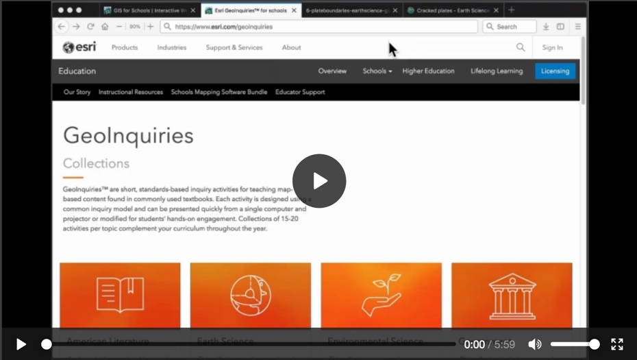
GeoInquiries are free, short, pre-constructed classroom activities on standard classroom content using ArcGIS Online. They are easy for teachers to use as is or to adapt. "Level One" activities require a device with internet connection but no install, no download, no login, just choose and use; "Level Two" activities require at least one login with publishing privileges in order to do analysis. GeoInquiries work in a vast range of learning situations, from the one-device-plus-presentation classroom on up to totally individualized approaches.


GeoInquiries video


A newly revised 6-minute video introducing GeoInquiries is now viewable and downloadable. It provides guidance sufficient so even those brand new to ArcGIS Online can teach effectively with GeoInquiries.


Anyone seeking to modify GeoInquiries, or construct locally-focused versions, or see other strategies for using them, should see the GeoInquiries zone on GeoNet. It's also a great place to ask questions or post ideas for designers.


Share the video with colleagues! Help them discover how to take advantage of great content and tools, all free for schools and enticing to students.

more
3 0 996
TomBaker
Esri Regular Contributor

This short article describes a process where Python was used to harvest metadata from a list of identified ArcGIS Online maps and the maps’ data services. The data were logged to MySQL (with pymysql); a PHP web search and discovery page was created.  The process allows for keyword searching in titles and descriptions of maps and data layers. 

Read more >>

more
0 0 1,075
AdenaSchutzberg1
Esri Regular Contributor

Happy 2019! Ready to learn? 


These massive open online courses are free and those who complete a course receive a certificate. Students work at their own pace when they have time. Come join us!


Going Places with Spatial Analysis is a six week course that covers why geography matters and how to think like a geographer to solve problems that involve location.


Do-it-Yourself Geo Apps is a four week course that introduces code-free ways to turn a map into an interactive application on the Web or a mobile device.

more
0 0 659
CharlieFitzpatrick
Esri Alum

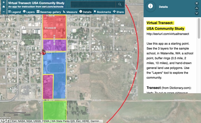
A transect is a path across an area. Geographers, both formal and informal, often follow a transect across an area to explore the changes between here and there. Sometimes the changes are close together and dramatic; other times a transect must cover a long distance before yielding a significant change in landform, land use, building style, population density, and so on.


Educators can't always go on actual field trips. Limits in time, spending, and permissions may constrain what a class can do in real life. But a class that knows how to use ArcGIS Online can conduct a virtual transect, looking at many characteristics visible in the field and some that are invisible in the field. The Virtual Transect app shows you how.


Virtual Transect app


First, look at the example, a tiny town in central Washington, then think about building your own. Mark a corner of the school grounds with a map note, then create rings of a distance that one might experience on foot (0.5 miles), by bicycle (2 miles), or in a car (10 miles). Using the imagery layer (as basemap or as an added layer), mark out changes in the land radiating outward. Then add some layers from the Living Atlas to find additional changes in the patterns of land and people.


I did a similar description of this process years ago, when ArcGIS Online was just getting started. It is so much more powerful now, with more data, more analysis tools, more presentation options, more collaboration possible using an ArcGIS Online Organization. These tools let explore, analyze, illuminate, and describe patterns, and then determine actions to make the world a better place. While the best experience is clearly from mixing the real thing with the digital, you can begin right there in the classroom, doing a Virtual Transect.

more
2 0 1,835
JosephKerski
Esri Alum

We on the Esri education outreach team receive regular inquiries from instructors who want to see examples of the use web maps and applications as instruments for students to communicate the results of their learning and their research.  They also want to see maps that at the same time serve as assessment instruments for the instructor to gauge student learning.  One of the best examples I have seen lately is the work that Dr Karen R. Lips at the University of Maryland's Department of Biology has been doing.  I was even more impressed because this was her first use of story maps, and yet the resulting maps and her approach were extremely innovative!  I also liked the fact that in her assessment rubric, she placed weight on the content, but also in the students' effective means of communication.  And in her story map instructions, she provided what I thought was just the right amount of information--she didn't bury the students with too much, but gave them enough to get started and become confident, with links for them to keep learning and growing. 

I asked Dr Lips to share her work so that the entire GIS education community could benefit, and she has graciously done so, including the attached instructions and rubrics, selected examples that follow, and her instructional reflections below.  Selected examples from the students include the life and death of coral reefs, Biodiversity:  A Cure for Going Bananas, the Unsung Utility of Oysters, the Path from Monoculture to Sustainability, Of Mice and Men:  How Habitat Fragmentation Facilitates the Spread of Lyme DiseaseHaiti's environmental chaos, biodiversity and poverty in the nation's capital, Biodiversity Hotspots:  Nigeria, and Getting Ticked off by Deforestation.   

Dr Lips said, "At the University of Maryland College Park, I teach a non-majors Honors course called Biodiversity Matters, in which we do a variety of readings and activities to show how dependent humans are on biodiversity in every aspect of their lives, from food, to medicine and bioengineering, to clothing and housing, to large scale coastal protection, national security, and international relations. Essentially the course demonstrates the many kinds of goods and services provide by nature (“Natural Capital”) and how those goods and services contribute to human health and well-being. My goal was to show that biodiversity is not a special interest dependent on philanthropy, but should be viewed as the foundation of life on earth that provides sustaining resources to human society. I directly link course topics to the majors of the students to show them how biodiversity intersects their lives and how they have a role in
conserving biodiversity. 


The secondary theme of the course is communication. We learn about using the Compass MessageBox to articulate our
message and describe the “So What”, and we compare writing styles of scientific papers to the media coverage of the same studies. We met with a science writer from a major publication to understand the publishing process and how to write for science news, and we compared the differences in the approaches and techniques to science communication in scientific articles, popular articles, and in videos. I designed three major assignments to assess students’ abilities to communicate the importance of biodiversity: (a) in writing through an initial Op-Ed piece, (b) in using visuals and audio by producing an end-of-semester video, and (c) at the midway point, through a combination of writing and visuals with an Esri Story Map. My goals were to demonstrate a continuum of communication styles, show how images can often make a point better than words, and encourage students to think about data visualization.


Developing a Story Map Assignment: This summer I learned that the UMD library has a GIS lab, with full time staff that are available to offer training to faculty and students in the use of ArcGIS. Before the semester began, I met with Dr. Kelly O’Neal and together we identified Story Maps as an easy-to-use platform for students without any GIS experience. This would allow them to make maps, import them into a Story Map, and add images and text to produce an attractive project. I searched the web for examples of how other faculty had used Story Maps in classes, but found few examples (but see https://oceansolutions.stanford.edu/education-and-teaching-resources), and even fewer teaching resources for faculty (i.e., syllabi, lesson plans, project descriptions, grading rubrics). I wrote to Dr. Dawn Wright to see if Esri might
have teaching materials that I had missed. She introduced me to Dr. Joseph Kerski who suggested sharing my resources in a blog post.


Once the semester began I met with students individually to identify topics of interest to them that related to the course theme and which were likely to have available data layers, and introduced them to the Story Map platform. The UMD GIS lab taught ArcGIS basics to my class during a one hour workshop. This was followed by a final one-on-one meeting between each student and the GIS lab staff to identify data that would illustrate their report. I met with students on an as-needed basis while they completed their Story Map. 


Assessment: Students really enjoyed this assignment. Students were very creative in their choice of topics and in how they presented data visually. They thought it was a very useful way of producing an illustrated report, and could see how to apply it in some of their other courses. None of them had ever used GIS before, and only a few had ever heard of GIS before they did this assignment. They thought that it was relatively easy to use and most had no major problems with the system. As the instructor, I thought that this format was much more interesting than the traditional format of a written report, and thought it allowed a much greater immersion into the topic. I encouraged several students to submit their Story Map to the annual student competition. I think that with additional time working with ArcGIS, and learning how to import and manipulate data students of any background or in any major could produce high quality Story Map projects.

Resources: I include the Lesson Plan with Instructions for the assignment. I incorporated some of the introductory material from information found on the Stanford website (see above), but the majority of instructions are adapted from previous assignments in my earlier Honors Courses. My grading rubric is based on the text of the instructions, and language adopted from various online grading rubrics. A huge thanks to Dr. Kelly O’Neal and her staff at UMD Libraries
for their assistance and guidance – I definitely plan to do this again in my other classes.
more
4 0 7,909
JosephKerski
Esri Alum

The USGS poster "Geographic Information Systems" has been scanned and is now available online in the following location:  https://pubs.er.usgs.gov/publication/70201216

Though dated, it still provides some of the fundamentals of what GIS is and why it matters (Disclaimer:  I am also proud to say that I was the major author of this poster during my tenure at the USGS). 

--Joseph Kerski 

more
0 0 939
189 Subscribers