- Home
- :
- All Communities
- :
- Products
- :
- ArcGIS for Power BI
- :
- ArcGIS for Power BI Questions
- :
- ARCGIS drive time layers not overlapping
- Subscribe to RSS Feed
- Mark Topic as New
- Mark Topic as Read
- Float this Topic for Current User
- Bookmark
- Subscribe
- Mute
- Printer Friendly Page
ARCGIS drive time layers not overlapping
- Mark as New
- Bookmark
- Subscribe
- Mute
- Subscribe to RSS Feed
- Permalink
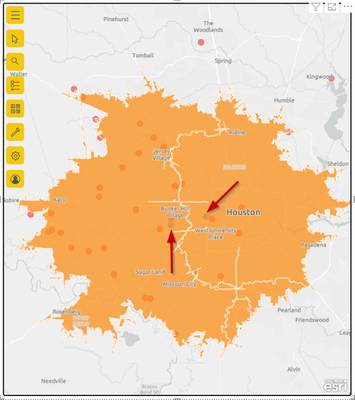
I am trying to use the ARCGIS map visual to show the number of addresses with a 30 min drive of either of 2 locations (that are less than 30 minutes apart). This video https://youtu.be/DNBWN5UGvvY showed how to set up the drive time analysis for multiple, and the result I got was this (red arrows indicate the reference points).
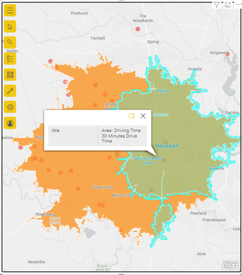
The white line in that graphic is acting as a "border" between the two analyses, implying that there is no overlap. If I select one area it gives me everything up to the line, same with the the other area
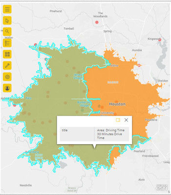
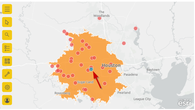
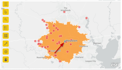
However, if you look at the drive time analysis for a single location, visually you can tell that there should be considerable overlap.
Am I doing something wrong, or does the ARCGIS map visual not work the same way in Power BI Feb 2022 release (2.102.845.0) as it did in 2017 when that video was created?
Thanks,
David
