- Home
- :
- All Communities
- :
- Products
- :
- ArcGIS Dashboards
- :
- ArcGIS Dashboards Questions
- :
- Including blank values for a serial chart in Dashb...
- Subscribe to RSS Feed
- Mark Topic as New
- Mark Topic as Read
- Float this Topic for Current User
- Bookmark
- Subscribe
- Mute
- Printer Friendly Page
Including blank values for a serial chart in Dashboard
- Mark as New
- Bookmark
- Subscribe
- Mute
- Subscribe to RSS Feed
- Permalink
Hi, I am using the serial chart widget in a dashboard and while it is easy to bring in values of existing features, I want to show all in my domain, even if it is blank. That might not make sense.I'll try to include a screenshot.
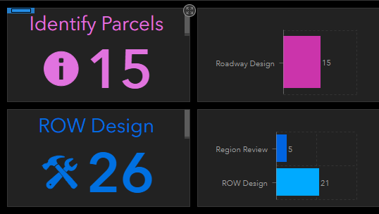
In my two serial charts on the right, for the above one, I want to show the 'roadway design' and another bar, but that other bar needs to have zero (0) for its value. Same for the bottom chart - I want to add one more attribute with a zero value so users will know it's there. Is that possible?
It seems that I can add as many categories as I want but it the category has zero features, then it won't show. Am I missing a check box somewhere that says "show even if it has zero features"?
Thanks in advance. Tagging the dashboard mastermind Derek Law
- Mark as New
- Bookmark
- Subscribe
- Mute
- Subscribe to RSS Feed
- Permalink
Hi Adrian,
If the attribute table does not have any data, then the serial chart can't display a "zero" value. Sorry.
Can you provide some more details/context on how the feature layer table is structured?
- Mark as New
- Bookmark
- Subscribe
- Mute
- Subscribe to RSS Feed
- Permalink
Derek,
Thanks for the reply. This is the link for the web map:
https://www.arcgis.com/home/webmap/viewer.html?webmap=5fb6211052a5476c96d2dd412741563f
And this is the link for the dashboard:
The map is showing parcels in Utah that are going through the right of way process. They are signified by two categories, a "stage" and a "status" which are hierarchical. The map has two layers that are symbolized by these attributes - the parcels (called ownerships), which are larger land ares are symbolized by the stage (and only has like 5 colors). And then when you zoom in far enough, those turn off and the "takes" turn on which are symbolized by the "status" and has more than 5 colors (maybe like 15?). Both layers have basically the same fields as each other.
Anyways, the dashboard is getting a count of all the records that fall into a certain stage on one side and ideally, we wanted to show a bar graph (serial chart) of all the statuses on the other side, including zero values. Both these fields are in 'domains'.
I hope that makes sense.
Thanks!
- Mark as New
- Bookmark
- Subscribe
- Mute
- Subscribe to RSS Feed
- Permalink
Hi Adrian,
Nice dashboard, thanks for sharing.
I've double checked with the Dev team and unfortunately, there isn't a workaround for what you want to render in the chart. Sorry. The charts in dashboard only show categories that have a non-zero value. Please submit an enhancement request on the ArcGIS Ideas site for ArcGIS Dashboards.
Hope this helps,
- Mark as New
- Bookmark
- Subscribe
- Mute
- Subscribe to RSS Feed
- Permalink
Thanks for the feedback. The idea is here:
- Mark as New
- Bookmark
- Subscribe
- Mute
- Subscribe to RSS Feed
- Permalink
Hi Adrian!
Did you ever receive any follow up regarding this subject?
I've got the same issue. I've created a dashboard of bar graphs showing vegetation land classes and have linked them to each other as well as a category selector. I would like the classes to remain the same when selection changes
Thanks!
- Mark as New
- Bookmark
- Subscribe
- Mute
- Subscribe to RSS Feed
- Permalink
Hi Arthur Poon, no I have not. Please vote up the Idea here:
https://community.esri.com/ideas/18658-include-blank-values-for-a-serial-chart-in-dashboard
- Mark as New
- Bookmark
- Subscribe
- Mute
- Subscribe to RSS Feed
- Permalink
Hey Adrian,
In case you haven't already found a solution, I fixed this problem by using the "DefaultValue" function in Arcade for my dashboard.
My dashboard has an indicator that displays all of the locations on the loaded map with a number to represent weekly customer amounts for each location. Sometimes the entry for the weekly customer amount for a specific location is "null" in the data table. This would result in just the title of the location being displayed and nothing else which is very confusing from the perspective of a regular user. I used the DefaultValue function to force the indicator to list null values as "No Data." The DefaultValue function works by assigning a value of your choosing to a feature when there is no value present.
From my perspective as a total layman to coding, it doesn't make sense such a useful setting would require coding to enable. It took me a couple hours of research as well as corresponding with a few different coworkers to make my indicator display this tiny piece of info whereas it would take someone affluent in coding mere moments to tailor an indicator in this manner. If this were a built-in feature of dashboards, there would be no time loss from either party. I will share my thoughts on the ideas page you linked to earlier in this thread.
Best regards,
James
- Mark as New
- Bookmark
- Subscribe
- Mute
- Subscribe to RSS Feed
- Permalink
Hey James -
Did you use Arcade in a Web Map for the given layer style to allow for this or did you do it in the Bar Chart gadget on Ops Dashboard?
Figured it out.
Added the same function you did for the for the layer styling in the Web Map.
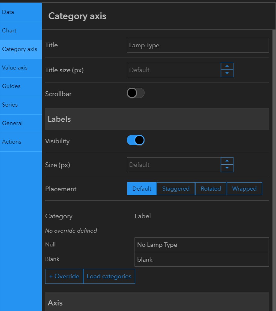
I also had to change the "null" label from "null" to "No Lamp Type" in my case.
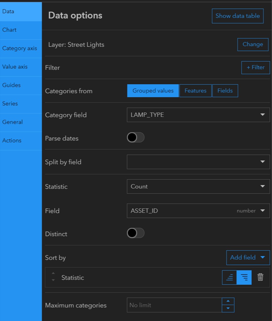
I also had to choose a number field for my "count" statistic vs the "Lamp_Type" (string) field in my data.
Thanks for the post. This is lame that code is required for such things.
Thank you,
Nate
- Mark as New
- Bookmark
- Subscribe
- Mute
- Subscribe to RSS Feed
- Permalink
Hey Nate,
Sorry for the late reply. I am glad you were able to figure out your problem.
I implemented this solution directly to an indicator using the "advanced formatting" option. Deciding where to implement expressions to dashboards always depends on what function(s) you are trying to use and how you are trying to abstract your data. I was lucky and did not have to use any fancy expressions because indicators have advanced formatting built in. If your chosen data element does not have advanced formatting, you will have to program the data element from scratch using an expression written in Arcade.
It is important to note that "Arcade" is literally just javascript with an expanded library of functions. If one knows javascript, one basically already knows Arcade, it's just a matter of understanding and implementing the functions offered by the expanded library.
To hopefully help any users who may need assistance implementing DefaultValue, the exact code I used was this:
DefaultValue($datapoint["CUST_COUNT"], 'No Data')
As stated before, my indicator needed to display weekly customer counts. The data is uploaded by individuals/individual groups and thus there is noticeable margin of error at times. In the case of CUST_COUNT, this error would arise as a blank or "null" string entry in the .csv when there should be a zero integer.
DefaultValue works by checking a field of your choosing for null and blank entries and then returns a text string of your choosing upon encountering such an entry. It leaves "0" (zero integer) entries as is. All you need to do to implement the function is to insert the name of your field into square brackets with quotation marks as I did. After the comma, type what you want your dashboard element to display upon encountering a blank entry in quotation marks. It does not matter if you use single or double quotations for either/both inputs.
Hope this helps. Thanks Nate for your input!
-James