Applications Prototype Lab Blog - Page 3

cancel
Showing results for 
Show  only  | Search instead for 
Did you mean: 

Latest Activity

(68 Posts)
RichieCarmichael
Esri Contributor

Experimental Water Effects

At last year's Developer SummitJesse van den Kieboom demonstrated how realistic water effects can be applied to a JavaScript based web application (see slides, demo and source).  The Prototype Lab modified Jesse's code to work with coastal inundation areas hosted in an AGOL feature service.  This sample is based on version 4.3 of the ArcGIS API for JavaScript and three.js.

Click here for the live application.

Click here for the source code.

more
6 16 3,538
DavidJohnson5
Esri Contributor

Annual number of lethal heat days if global carbon emissions are not reduced

In the Spring of last year Dr. Camilo Mora of the University of Hawaii Manoa contacted our team.  He wanted to know if we would be interested in developing an interactive web map to display the results of a research project he was leading into the effect of rising global temperatures on climatic conditions resulting in human mortality due to heat stress.  We were glad to hear from Dr. Mora again.  The year before we had developed a web map to display the results of his research into how climate change could affect the length of plant growing seasons.  For this new study, Dr. Mora’s team analyzed 1763 documented lethal heat events and identified a global threshold beyond which daily mean surface air temperature and relative humidity became deadly.  Using Earth Systems Models to predict daily values for temperature and humidity across the globe up to the year 2100, they estimated the likely number of lethal heat days annually under low, moderate, and high carbon emissions scenarios.

Although his new research project was still in it's early stages, we found the initial results to be very compelling and we agreed to move forward with the project.  Using preliminary data from their research, we explored some ideas for how to present the data and developed a couple of prototype applications.  Several months later, we heard from Dr. Mora again. His team had completed their research, and he was ready to share his finalized data with us and to collaborate on the design of the final application.   The time-frame was short.  Dr. Mora and his team were writing the final drafts of a paper for publication in the journal Nature Climate Change.   So we rolled up our sleeves, reviewed our initial prototypes, explored the finalized data, and then got straight to work. 

The application Heatwaves: Number of deadly heat days leverages the robust capabilities of the ArcGIS platform to distill complex scientific data into intuitive maps that enable users to interact with and understand the data.  This was an interesting development project, not only for it's subject matter, but also on a technical level.  So we thought it would be worthwhile to share some details about how we built the application.

Heatwaves: Number of deadly heat days

At the front-end of the application is a web map developed using jQuery, Bootstrap, and the ArcGIS API for Javascript.  The map contains an image service layer which displays the number of lethal heat days at any location over land using a color ramp with a range from white to yellow to red to black representing 0 - 365 days respectively for any year from 1950 - 2100.  You can select the year from a slider control or from a drop down list.  The data on the annual number of lethal heat days for the years 1950 – 2005 are based on historic climate records. 

RCP List

The data for the years 2006 - 2100 are based on the average of 20 Earth System Models developed for the Coupled Model Intercomparison Project Phase 5, under low, moderate, and high (i.e. "business as usual") carbon emissions scenarios (i.e. Representative Concentration Pathways, RCPs 2.6, 4.5, and 8.5 respectively).  By selecting from a drop-down list of RCPs you can view the modeled results for the different carbon emissions scenarios.

Heatwaves App Identify WindowWhen you click on a location over land, a window appears with a line chart and a scatter plot that reveal further insights into the study results for that location.  The line chart displays the trend in the annual number of lethal heat days at the location for each year of the study period.  The scatter plot displays the temperature and humidity for each day of the selected year over a curve which represents the lethal heat threshold.

Now let's take a look at some of the deeper technical details of this application.  On the back-end of the application are two web services that deliver the data from the study results to the web application for display.  These services are hosted on the Esri Applications Prototype Lab's GIS Portal. 

An image service provides the web application with the data for the annual number of lethal heat days for each year of the study period.  The data source of the service is a mosaic dataset that defines a single point of access to a collection of single-band raster datasets of global extent.  Each raster dataset contains the number of lethal heat days across the globe for a given year.  For the historical period 1950–2005, the data for each year are stored in a single raster dataset.  For the future period 2006–2100, the data for each year are stored in 3 raster datasets – one for each of the carbon emissions scenarios. 

The image service has two roles: 1). to provide the images showing the annual number of lethal heat days for display in the web map  2). to provide the data for the graph of the trend in time of the annual number of lethal heat days.  To generate the images for the map layer, the mosaic dataset applies a raster function chain that dynamically clips the source raster datasets to the coastlines and applies a color ramp to convert the single-band source data into three-band color RGB output images. To provide the data for the trend graph, the service delivers the pixel values at a given location from each of the historic rasters and from the future rasters for the selected carbon emissions scenario.

A geoprocessing service provides the data for the chart that plots the temperature and relative humidity for each day of a given selected year.  The source data for this service are a collection of 36 NetCDF files that contain the daily values for temperature and relative humidity for the study period and for each carbon emissions scenario.  Each file contains data for a twenty year period for either temperature or relative humidity for the historic period, or for one of the three carbon emissions scenarios.  In total, the files use 17 GB of storage and contain 12,570,624 unique points of data.  To build this service, we started by developing a Python script with input parameters for the selected year, the selected carbon emissions scenario, and the coordinates of the location where the user clicked on the map.  The script obtains the requested data from those files in four steps:

  1. The NetCDF files containing the relevant temperature and humidity data are identified from the first two input parameters.  
  2. In-memory tables are created from the files using the Make NetCDF Table View geoprocessing tool.
  3. Queries are crafted to obtain the temperature and humidity values from the tables for each day of the selected year at the specified location. 
  4. The results of the queries are sorted by day of the year and returned the to client application.

The python script was then wrapped into a Python script tool and published as a geoprocessing service.

The application also includes links three video animations showing the increase in lethal heat days over time for each of the carbon emissions scenarios.  These videos were created using the animation tools in ArcGIS Pro.  The videos representing rcp2.6, rcp4.5, and rcp8.5 can be viewed here, here, and here.  Links to the videos and the source code of the application are also available from the application when you click the "About" button at the top right corner.

In conclusion, we'd like to thank Dr. Mora and his team for their very important research and for the opportunity to contribute in our way towards helping to extend the reach of their findings.  We enjoyed working with Dr. Mora and hope to collaborate with him on his future projects.

In the news

Deadly heat waves becoming more common due to climate change | CNN

Deadly Heat Waves Could Threaten 3 in 4 People by 2100 | HUFFPOST

Half of World Could See Deadly Heat Waves By 2100 | Climate Central

Study shows deadly heat waves are becoming more frequent | Chicago Tribune

A third of the world now faces deadly heatwaves as result of climate change | The Guardian

By 2100, Deadly Heat May Threaten Majority of Humankind | National Geographic

Deadly heatwaves could affect 74 percent of the world's population | University of Hawaii News

Deadly Heat Waves Could Endanger 74% of Mankind by 2100, Study says | inside climate news

Billions to Face 'Deadly Threshold' of Heat Extremes by 2100, Study Finds | EcoWatch

Killer Heat Waves Will Threaten Majority of Humankind by Century's End | Alternet

more
1 0 4,470
by Anonymous User
Not applicable

The ArcGIS Runtime SDK for iOS makes it easy to create applications that take advantage of the iOS Core Motion Framework. As the user moves the device, we can change the orientation of the camera to pan the map toward the location the user intents to view.

The 2 videos below show the result of the using the Core Motion framework output values to change the camera position on the Runtime SceneView

A closer look, just recording the screen. We can turn off the Gyro and stop the Core Motion delegate to use touch to zoom out and pan to see the satellites from space instead of looking up from earth.

Its as simple as creating a CMMotionManager object and changing the interval where the handler will be called, we are setting the interval to 0.1, better to avoid missing a position and making the movement buttery smooth. We need to create the AGSCamera that requires a GPS position to start, I would recommend to pass you CLLocation, for the demo, we set it manually for the demo.

By calling 'startDeviceMotionUpdates, when data is available, the handler will be called with the roll, yaw and pitch

Handle Motion from device

We can set the new camera rotation using the data return from core motion after converting them to degrees (*180 / M_PI)

The camera will pan the AGSSceneView to show the features added on the Graphic Overlays. You can use this to display features around you, they don't need to be just satellites, on the AGSSceneView you can place features at any altitude you desire, including underground features.

This short blog post, shows how to use the AGSCamera and Apple's Core Motion to create a 3D with motion app on your device. 

You can download the ArcGIS Runtime SDK for iOS here

more
2 0 741
RichieCarmichael
Esri Contributor

(click here for complete video)

We are happy to announce the availability of the HoloLens Terrain Viewer tutorial. This tutorial provides step-by-step instructions for the creation of a HoloLens application that can construct holographic terrains dynamically from voice commands. The tutorial describes how to config the preset list of named locations. The tutorial includes scripts that automate the conversion of AGOL content (imagery and elevation) to Unity terrain objects.

GitHub - Esri/hololens-terrain-viewer: Holographic mapping powered by ArcGIS 

more
5 0 1,951
MarkDeaton
Esri Contributor

What is it?

This ArcGIS Pro Add-in is a rebuild of an old Flex web application of mine; its intent is to answer the question “How far can I drive on a dollar worth of fuel?”. Notice the word “fuel”, because even passenger vehicles don’t run on just gasoline anymore; there are hybrids, diesels and electric vehicles out there. Fuel economy data for this application is taken from the United States Environmental Protection Agency, where you can also find information on their data and methodologies.

How to use it

Make sure you have ArcGIS Pro 1.4 or 1.4.1 installed.

  • Download the add-in file here (for ArcGIS Pro 1.4 or 1.4.1) or here (for ArcGIS Pro 2.0).
  • Double-click the add-in file to install it.
  • Start ArcGIS Pro; make sure to insert or open a map.
  • Click the “Miles Per Dollar” button on the Add-In pane.
  • Choose one to five vehicles and add them to the list.

The user interface makes you choose a year, make, model, and type, in that order.

The user interface makes you choose a year, make, model, and type, in that order.

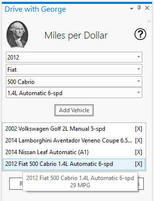
  • Click “Start Analysis”, then click a point on the active map
  • Results are placed on the map as graphics

They’re ordered from highest to lowest efficiency (longest to shortest driving distance).

Results are ordered from highest to lowest efficiency

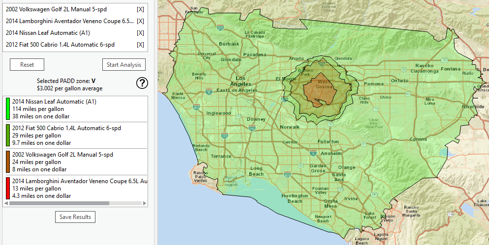
  • Click “Save Results” to save the analysis graphics to a feature class

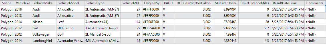
All data about the vehicles and results are saved as attributes in the feature class.

All data about the vehicles and results are saved as attributes in the feature class

Technical details

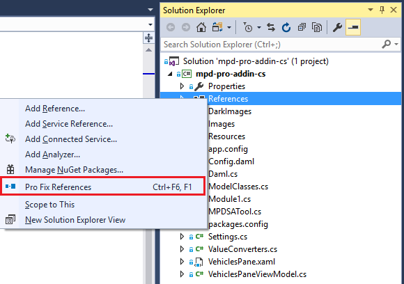
First, here’s an important step you’ll probably need to take before you can use the Visual Studio project for ArcGIS Pro 1.4. My Pro 1.4.1 development machine has ArcGIS Pro installed on the E: drive, so the assemblies referenced in the project all have paths on that drive. You will probably need to run the “Pro Fix References” tool in Visual Studio before you can compile the project. My Pro 2.0 development machine has everything installed on C: and you’ll likely be fine using that version of the code.

Pro fix references tool

This is an SDK project, implemented as an add-in button and DockPane. Here are some of the patterns and techniques it uses.

  • MVVM control enabling/disabling based on state

I tried to guide the user as much as possible, hiding or disabling buttons and dropdowns that aren’t meant to be used at a given time. This is a standard MVVM tactic; you can see it in use in the ComboBox items in VehiclesPane.xaml; check out the {Binding} statements for the ComboBox IsEnabled properties; you’ll find the referenced properties and ValueConverters in VehiclesPaneViewModel.cs. The buttons are mostly bound to ICommand (delegate command) items defined in VehiclesPaneViewModel.cs; note the use of Boolean methods to enable or disable the buttons (CanAddSelectedVehicle(), CanStartSAAnalysis(), etc.).

  • Using a REST geoprocessing service

ArcGIS Pro documentation calls for creating and using a local *.ags file and using it to run geoprocessing services. In this case, I didn’t want to have to distribute such a file with the add-in, so I opted to make the HTTP calls directly from the .NET code. For simplicity, I made my GP service publicly shared, so I didn’t have to worry about getting authorization tokens first.

One complication I found is that not all geoprocessing parameters have .NET objects that can be populated and then serialized for HTTP execution. You’ll see some inline JSON string construction in the PerformAnalysis() method.

sStartLocParam = "{\"geometryType\":\"esriGeometryPoint\",\"features\":
   [{\"geometry\":" + sStartGeom + "}]}";

Application state is mostly represented in model-level properties and classes. The Start Analysis button isn’t enabled until there’s at least one vehicle in the SelectedVehicles list; Save Results isn’t enabled until there’s at least one analysis result in the Results list. That all worked fine off the bat, but I found that values for the Vehicle and Result classes weren’t showing up in text boxes and tooltips. Eventually, I discovered that these classes needed extra plumbing to make them notify the binding mechanisms when their values changed; changing their base type from object to PropertyChangedBase did the trick.

  • Programmatically invoking a custom MapTool on the user’s behalf

I wanted a simple, guided workflow: choose one or more vehicles, navigate to an area of interest, and then click a start location to run the analysis. After much searching, though, I found only one way to get a mouse click location on a map: through a MapTool.  These tools usually live as buttons on ArcGIS Pro’s toolbar—you mouse over, click it, and then click the map to do what needs doing. This kind of implementation would be awkward for the user, I thought: select some vehicles, then somehow know to go back to the toolbar to click a button up top to kick off the analysis? Instead, I opted not to provide a MapTool button, but rather to search for the undisplayed MapTool and invoke it from the Start Analysis button on the DockPane. You can find this logic in VehiclesPaneViewModel.cs in the StartSAAnalysis() method.

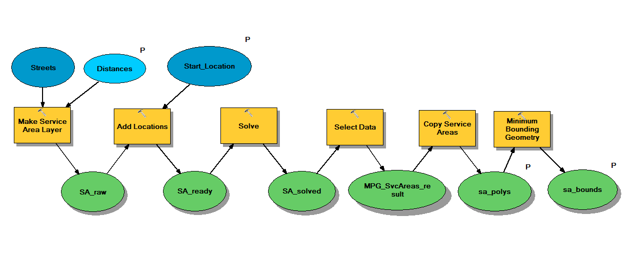
  • About the analysis service

The service that computes the drive areas is, basically, a Network Analyst service area operation. It uses an optimized hierarchy of street data for the United States only (since that’s the area for which we have gas price information). The add-in converts fuel economy and fuel price data to meters and sends those distances to the service as parameters. Once the service generates the drive area polygons, it also generates bounding circles around them; while I don’t currently use those circles, I may do so in the future.

Drive distance model

Next Steps

This idea could be extended. It might be useful to apply a color ramp to the saved feature class automatically, rather than letting ArcGIS Pro apply a random, single-color symbology.

I’ve considered extruding the polygons in 3D space as a more graphical way of viewing and comparing the results with each other. The REST geoprocessing service also returns minimum-bounding circles, which are currently ignored, but could also provide some 2D or 3D context for the results.

For purposes of exploring lots of analyses more quickly, I leave the Miles per Dollar analysis MapTool active after an analysis completes. Users of touchscreens, however, might want to pan or zoom once results are available. With the MapTool active, this initiates a new analysis, which probably isn’t what the user wants. An enhancement might check for a touch input device and activate the navigation tool after an analysis is complete.

Resources/Links

Add-in

For ArcGIS Pro 1.4/1.4.1:
https://apl.maps.arcgis.com/home/item.html?id=10b707923f1a485eb61249945cc44e0c

For ArcGIS Pro 2.0:
https://apl.maps.arcgis.com/home/item.html?id=a92f391d071b4fbc8b7eb22d79e19d40

Source code

https://github.com/markdeaton/milesperdollar-pro-addin-cs

There are two branches in this repo. “master” is the Visual Studio 2015 project and code for Pro version 1.4x. “Pro_2.0” is the Visual Studio 2017 project and code for Pro version 2.0.

more
3 0 1,014
RichieCarmichael
Esri Contributor

Landsat Lens

Landsat Lens is a touch and mouse friendly application for browsing past and present Landsat satellite imagery hosted by Esri.

Click here for the live app.

Click here for the source code.

Using a mouse, a lens can be moved around the map with a standard left mouse click and drag operation. Scrolling the mouse wheel will enlarge or decrease the size of a lens depending on the direction.

With a touch device like an iPad, a lens can moved with an intuitive press and drag. To resize, pinch or expand two or more fingers within a lens. Likewise, rotating a lens is achieved by twisting two or more fingers. Unlike with a mouse, touch screens allow the user to manipulate two or more lenses concurrently.

By default, the app starts with a lens dated 2017 located close to the Palm Jebel Ali in Dubai. To pick a preset location choose from one of the entries from the Bookmarks dropdown menu. Alternative you can pan or zoom to any area of interest.

For one of the preset locations, or your own area of interest, you may want to view changes over time. To do so, use the Windows dropdown menu to add a window showing 2002, 2005, 2010, 2015 or 2017 imagery. By swiping lenses over the basemap and one another you can easily see changes in vegetation, coastlines, rivers and human activity. Use the last option in the dropdown menu to removal all lenses from the map.

Known Issues:

  • Support for W3C's touch events is extremely varied across browsers and operating systems. However the author notes that the most consistent behavior has been with Chrome browsers.
  • The Esri hosted Landsat image services ms and ps currently contain imagery from the year 2000 til present. However the imagery is not uniformly distributed over time. Imagery prior to 2014 is fairly sparse. This will likely change over time.

more
7 9 2,854
RichieCarmichael
Esri Contributor

Animation of building interaction sample

This developer sample demonstrates how to interact with a multi-level building in three dimensions using Esri's ArcGIS API for JavaScript version 4.3. With a simple click/tap and drag operation a building can be intuitively and smoothly repositioned on the Earth's surface. Note that each floor is a separate graphic but are treated as a single entity when manipulated.

Click here for the live application.

Click here for the source code.

It is important to note that the sample uses a few undocumented API calls to achieve this behavior. As such we caution against using these calls in a production environment as they are unsupported and will very likely change in the near future.

The code may seem overly or unnecessarily complicated, below is a summary of what the code does:

  • Building Construction
    For portability reasons, building floors are constructed from a set of hardcoded values. It is important to note that each floor is an individual graphic attributed with a building identifier. This identifier is used to group all adjacent floors for highlighting and spatial translation.
  • Dragging
    The code is using the SceneView's drag event to respond to the three phases of a pointer's drag operation, namely start, update and end. During the "start" phase, a hittest is performed to identify the building floor (if any) under the pointer. If a floor is found, adjacent floors are identified and highlighted. In the "update" phase, two undocumented methods SceneView._stage.pick and SceneView._computeMapPointFromIntersectionResult are used to tracking pointer displacement in real world coordinates. These methods return the map location directly beneath the pointer, ignoring features and graphics.
  • Disabling/Enabling Pointer Interaction
    When a building is dragged to a new location, it is necessary to disable map interaction so that map does not pan. To achieve this we used another undocumented method, SceneView.inputManager, to add and then restore handlers.
  • Moving
    At present, it is not possible to update the geometry of an existing graphic. In order to show a graphic moving it must be deleted and then re-added. This may seem somewhat cumbersome but the performance hit is negligible.
  • Throttling
    It is likely that the rate of the drag event is fired will exceed the display frame rate. If the display is performing at 60 frames per second (or better) then excessive drag events are ignored.

Once again I would like to stress that this is a developer sample specifically for version 4.3 of the Esri JavaScript API. It is very likely that some of the code used is this application will be either obsolete or redundant (or both) in future releases.

Special thanks to Johannes Schmid‌ for his technical expertise!

more
1 9 1,461
ThomasEmge
Esri Contributor

Welcome to the Applications Prototype Lab’s new web demo page: https://apl.esri.com.

APL web demo landing page

Our new home page for web applications has an updated, fresh look that we hope is easier to navigate and explore. Discover demos by visually exploring the thumbnails and hovering over an item for more information or long-press on a touch screen device.


In the default Grid View, hover over a demo's name to get a short description. Hover over the thumbnail to view quick access linked to resources like a video, comments, source code, and other documentation. Click or tap the thumbnail to launch the application into a new tab.

Explanation of portal item links
Change to a List View with the icon in the upper right side of the page. In List View, resource information about the demo are shown next to the thumbnails. This is the view you can use to rate an application or share an application with social networking site or forward to a friend or colleague via email.

In both views, items can be filtered by a plain text search of an application's title, summary, or description or by one or more tags.  Clicking the "x" button will remove all filters. You can also sort filtered items by publication date, rating or author, by clicking the appropriate icons at the upper right hand corer of the view.

At present, there are more than 50 prototype applications for you to explore. Many of these applications have shared source code and accompanied demonstration videos. We encourage you to rate these apps, provide feedback and share socially. Esri employees and Esri distributors are also welcome! 🙂 You will be treated with access to a few extra applications that are either still in testing or have certain restrictions.

Enjoy and welcome again to the new Prototype Lab Portal.

more
9 3 2,140
BobGerlt
Esri Contributor

This Spring we released a new version of the 3D Fences python tool box.  The new release works in both ArcGIS Pro and ArcMap. The 3D Fences Toolbox was introduced in November 2015 and originally ran only in ArcMap.  For detailed description of the toolbox and how it works please read Transforming 3D Data into Fences and Curtains with Geostatistical Tools,  ArcUser Winter 2016 article. 

This python toolbox now consists of two tools enabling the interpolation of point data in the Z (vertical) dimension.   The Parallel Fences tool creates equally spaced fences parallel to the X, Y or Z dimension. X and Y dimension fences will run East-West and North-South respectively in the Z dimension.   Z dimension fences will  be stacked in the standard XY "flat" (horizontal) planes at regular Z intervals.  The Feature-Based Fences tool creates vertical fences in the Z dimension along features in a polyline feature class and,  in Pro, it can also use Map Notes line layers as input.   The Map Notes line layers enable users to create ad hoc features along which fences will be interpolated.  An added benefit of using the toolbox within Pro is that it can be used with either a Scene or Map.  The primary output is a 3D point feature class, optionally time enabled.

The original toolbox also contained a third Interactive Fence tool that only works in ArcMap.  This tool is not needed in Pro because use of Map Notes features provides a new way to achieve the same functionality using the Feature-Based fence tool with better control of fence location, creation, selection and symbology.


Using Map Notes in an ArcGIS Pro Scene to create 3D fences

Insert either a Scene or Map in your Pro project and add your point data to the TOC. (I am working in a scene below. My TestPts layer represents a fictional oil leak in the Gulf of Mexico.)

Insert Map Notes, and remove point and polygon map note layers to avoid confusion.

Open the Edit tab, select Create Features, and then select your Map Notes line feature in the Create Features pane.

Digitize line features in you Map or Scene and save Edits.

Run the 3D Fences, Feature-Based Fences tool.

Style your output layers and view.


In the screenshot above, I symbolized the points used in the interpolation as red dots.  You can also see the end of the Map Notes base fence protruding past the interpolated fence.  This is because the tool limits interpolation to the extent of the data, not the fence.  I would be interested in hearing your opinions about enabling  extrapolation to the full length of the fence and limiting the results to the minimum bounding area of the sample points instead of the minimum bounding envelope of the sample points. 

All feedback is welcome and I hope you find the toolbox helpful.

more
1 0 3,317
RichieCarmichael
Esri Contributor

Arctic Dem is a prototype app developed a few years ago in conjunction with President Barack Obama's executive order calling to "enhance coordination of national efforts in the Arctic" . With a small preliminary dataset from the Polar Geospatial Center we created this proof of concept. Our intention was to experiment with the dynamic rendering of ArcGIS Image Services. For example, the first two sliders define the sun's position used by the image service to dynamically generate a hillshade from the elevation dataset. The second group of sliders are used to highlight a subset of elevation pixels that satisfy the height, slope and aspect criteria. Likewise, this rendering is performed dynamically using out-of-the-box rendering functions.

Easter Egg: Click the "hillshade" label to toggle between the standard hillshade function and a multi-directional hillshade custom function. Please click here to access a global multi-directional hillshade.

For a detailed description of the data and a user guide please click the orange buttons in the lower left hand corner of the application.

Click here for the live application.

Click here for the source code.

For the production application please visit the ArcticDEM Explorer and read the associated press release. Special thanks to David Johnson‌ for preparing and republishing this service.

more
0 0 664
18 Subscribers