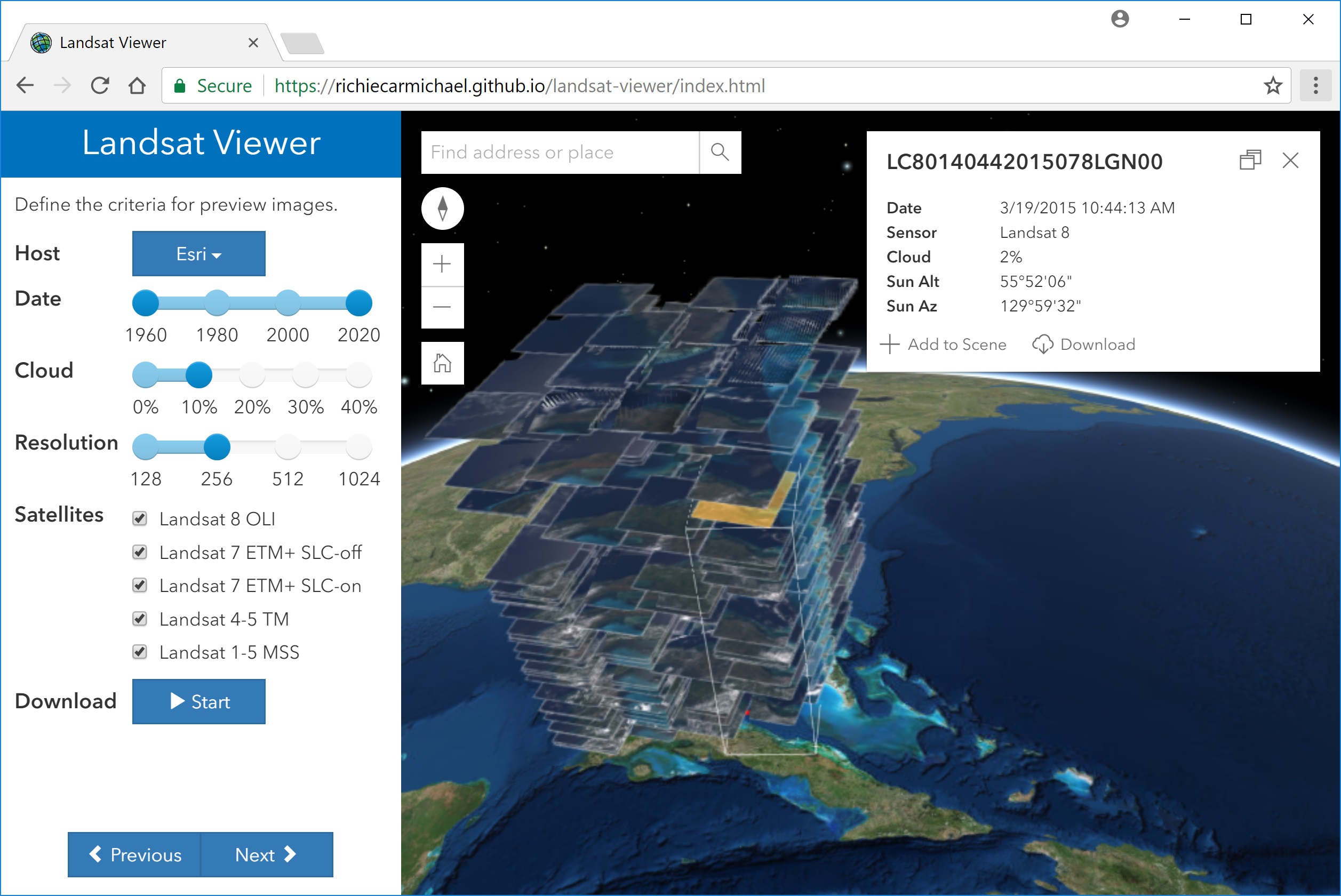
Applications Prototype Lab Blog - Page 2

cancel
Showing results for 
Show  only  | Search instead for 
Did you mean: 

Latest Activity

(68 Posts)
by Anonymous User
Not applicable

At the 2018 Esri DevSummit in Palm Springs, Omar Maher demonstrated how to predict accident probability using artificial intelligence (AI). The Applications Prototype Lab (APL) has built an iOS application allowing drivers to route around accident prone areas, suggesting the safest route available. The safest route has the lowest probability of an accident occurring on it.

Imagine that you could drive to your destination on a route that is the fastest, shortest and safest path available, knowing that the path will be clear of potential accidents, knowing that you will not become part of an accident study that month. 

Parents could choose the safest route for their teen drivers, to avoid common issues and spots on the road network that are potentially dangerous. 

This demo does not compute the AI prediction results itself but rather consumes a probability prediction that has been computed using a gradient boosting algorithm in Azure using 7 years of historical data. The demo shows a routing engine considering the accident probability as an input and it tries to route around areas with high accident probability.

In the future, the prediction will use real time inputs in its probability prediction.

Compare the screenshots below with 2 different probability inputs. The first image shows the routing information for a chosen accident probability of about 38%.

Reducing the chances of an accident to about 23% will cause the route to be longer in time and length.

Here is a video showing how decreasing the probability of accidents will return a safer route:

The application uses the ArcGIS Runtime SDK for iOS routing engine `AGSRouteTask` that considers different barriers in the form of lines and polygons. Using the generated probability lines as barriers, the routing task will generate a route around the areas of the specified acceptable accident probability. All code is available upon request, but the feature service and credentials are private at this time.

In summary, we have shown the impact of accident probability on routing computations. Using the prediction models trained by artificial intelligence using historical and current road conditions we hope that in the near future accident probabilities will become an additional input for all routing engines. 

more
3 0 5,394
MarkDeaton
Esri Alum

Intro

The Applications Prototype Lab was asked to create an app that would collect and record cellular signal strength at various locations around the new Jack and Laura Dangermond Preserve. Two of us did just that: my colleague Al Pascual wrote the iOS version, and I wrote the Android version.

Though we used very different approaches—some of them dictated by the differences between the two mobile platforms—the app performs the same basic function on each operating system. It very simply gathers the device's location and the strength of its cellular connection at specified time and space intervals, and saves those observations to a feature service layer hosted on ArcGIS Online.

Once the app was done, we realized that it could be adapted to collect more than just cell signal strength; it can save just about anything a mobile device is capable of detecting. So we’re making the source available to those interested in modifying it.

Note: it’s built to save results to a feature layer hosted on ArcGIS.com. Unless you want to modify it to save to a different back-end storage mechanism, you’ll need to create and publish your own hosted feature layer in your ArcGIS Online organization.

Preparation: Create a hosted feature layer to hold the results

You'll need a hosted feature layer to hold the collected data. We’ve provided an empty template database to hold location, cell signal strength, and a few device details.

  1. Download the template file geodatabase here: https://www.arcgis.com/home/item.html?id=a6ea4b56e9914f82a2616685aef94ec0
  2. Follow the instructions to publish it here: https://doc.arcgis.com/en/arcgis-online/share-maps/publish-features.htm#ESRI_SECTION1_F878B830119B44...


iOS: how to use it

1. Requirements

- Fork and then clone the repo. Don't know how? Get started here.

- Build and run the project to create a single app containing all of the samples.

2. Settings

Go to device settings, find the app CellSignal in the list to change the feature service layer you've created and hosted. The User ID and password settings are for using the service services.

3. Features

The app needs to be running on the foreground to work, will measure the cell coverage and will send that information to your feature service or, when offline, store it in the device until, connection to the feature service is being restored. The user does not need to interact with the app, only needs to make sure the app is running on the foreground.

The chart will show a historical view of the measurements. The scale is from 0 to 4, depending on the cell bars received. A custom map can show the intended extent as well as a simple rendering of the data.

To change how we capture the cell service information, please refer to this function.

private func getSignalStrengthiOS11() -> Int {
   let application = UIApplication.shared
   if let statusBarView = application.value(forKey: "statusBar") as? UIView {

   for subbiew in statusBarView.subviews {

   if isiPhoneX() {

      return getSignalStrengthiPhoneX()

    } else {
      if subbiew.classForKeyedArchiver.debugDescription == 
            "Optional(UIStatusBarForegroundView)" {
      for subbiew2 in subbiew.subviews {

         if subbiew2.classForKeyedArchiver.debugDescription == 
               "Optional(UIStatusBarSignalStrengthItemView)" {

          let bars = subbiew2.value(forKey: "signalStrengthBars") as! Int
          return bars
          }
        }
      }
    }
  }
 }

 return 0 //NO SERVICE
}

4. Source code

For more information and for the source code, see the GitHub repository here:

https://github.com/Esri/CellSignal

Android: how to use it

1. Requirements

  • Android Studio 3+
  • An Android device running Android 18 or above (JellyBean 4.3) and having GPS hardware

2. Installing and sideloading

This app will run on devices that are running Android 4.3 (the last version of "Jelly Bean") or above. It will only run on Google versions of Android--not on proprietary versions of Android, such as the Amazon Kindle Fire devices. If you're running Android 4.3 or later on a device that has the Google Play Store app, you should be able to run this. (Oh, you'll need a functional cell plan as well.)

One way to run the app is to build and run the source code in Android Studio and deploy it to a device connected to the development computer.

If you don’t want to build it, you can download the precompiled .apk available in the GitHub releases section; you'll need to install this app through an alternative process called "sideloading".


3. Settings

Tap the Feature Service URL item and enter the address of the feature service layer you've created and hosted. There are two settings affecting the logging frequency. You can set a distance between readings in meters and you can set a time between readings in seconds. Readings will be taken no more often than the combination of these settings. For example, a setting of ten meters and ten seconds means that the next reading won't be taken until the user has moved at least ten meters and at least ten seconds have passed. If you want to only limit readings by distance, you can set the seconds to zero. Please don't set both time and distance to zero.

The User ID and password settings are for using secured services. If you are using your own ArcGIS Enterprise Portal (not ArcGIS.com), and you want to log to a secured service, you'll need to enable enter your own portal's token generator URL into the Token Generator Service URL setting.

Start logging by tapping the switch control at the top of the settings page. You should see a fan-shaped icon (a little like the wifi icon) in the notification bar. That tells you that the app is logging readings in the background.

It will continue logging until you tap the switch control again to turn logging off. The notification item also displays the number of unsychronized local records. As the app gathers new readings, it will update a chart on the main activity showing the last fifteen signal strength readings.

You can turn the screen off or use other apps during logging, since it runs as a background service. An easy way to get back to the settings screen is to pull down the notification bar and tap the logger notification item. Features are logged to a local database, and then sent to the feature service when the internet is available.

4. Synchronization

There are three events that cause a synchronization:

  • There is a setting for the synchronization interval; the app will sync whenever that many minutes have passed;
  • When internet connectivity has been lost and then restored;
  • When the logging switch is turned off

5. Source code

For more information and for the source code, see the GitHub repository here:

https://github.com/markdeaton/SignalStrengthLogger-android/

more
5 2 5,338
MarkDeaton
Esri Alum

I built this app to show some of the capabilities of the recently released ArcGIS Quartz Runtime 100.2.1 SDK for Android—specifically its 3D capabilities. The 3D and runtime teams have put in a lot of work to make 3D data and analyses run smoothly on the latest mobile devices.

What does it do?

Esri’s I3S specification covers three kinds of scene layers: 3D Objects, Integrated Meshes, and Point Clouds. Currently, 3D Objects and Integrated Meshes can be displayed in the Quartz runtime. The web scene this app loads by default shows examples of both those layer types.

The app uses a web scene ID to load a list of scene layers, background layers, and slides (3D bookmarks). You’ll find that web scene’s ID in the identifiers.xml source code file. If you want to open a different web scene than the default one, use the Open button in the toolbar to enter your ArcGIS.com credentials. It will then find out which web scenes your account owns and let you open one of those instead. Note that it will only show the web scenes you have created—not all the web scenes that others have created and made available to you.

The Bookmarks button will show a list of slides in the web scene; tapping one will take you to the slide location. The Layers button shows a checkbox list of all scene layers defined in the web scene.

Standard navigation

First, get familiar with panning, zooming, rotating, and tilting the display. The SDK uses the device’s GPU to accelerate graphics computation and make navigation smoother. You can find more information on supported out-of-the-box gestures and touches here: https://developers.arcgis.com/android/latest/guide/navigate-a-scene-view.htm

This app’s tools can all be found under the rightmost toolbar icon; tap it and you will see a pop-up menu. Standard Navigation will disable any currently chosen tool and return the view to its standard, out-of-the-box navigation gestures as documented in the link above.

Measure tool

This tool is straightforward to use; activate it and tap a location. It calculates a distance and heading from your observation point in space to the location you tapped on the ground. The location and bearing are simple Pythagorean and trigonometric calculations; the point here was not about the calculations, but about using 3D graphics and symbols to display the results.

Line of Sight

Line of Sight and Viewshed are two new onscreen visibility analysis tools; there is detailed information on what that means here: https://developers.arcgis.com/android/latest/guide/analyze-visibility-in-a-scene-view.htm

Line of Sight is simple to implement; just set a start point and an end point, and add the analysis overlay to the scene. Updating the analysis is no more difficult than updating the end point location.

Viewshed

The Viewshed analysis does some extra work beyond what the SDK provides. First, each analysis is limited to a 120° arc; each tap invokes three analyses for complete 360° coverage. I also wanted a put the user right in the middle of the analysis, as if they’re standing on the ground—and that’s what the zoom floating action button does.
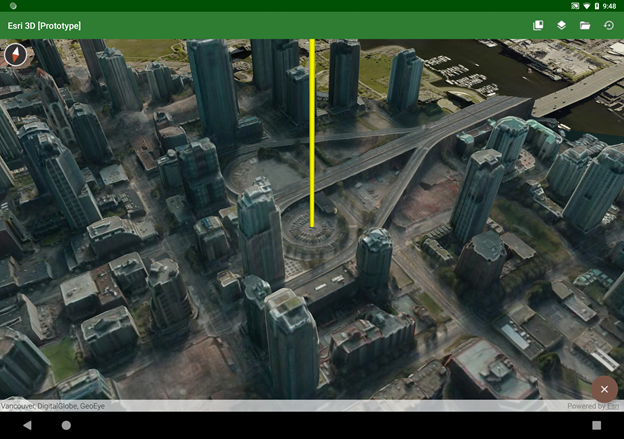
Once the camera moves down into the scene, the floating action button becomes a return button, which will take the camera back to its original point in space. There’s also a slider in the lower left of the screen which lets you interactively change the viewshed distance. You can use it to explore different visibility scenarios in different scenes; you might want to use a smaller value for dense urban areas or a much larger value for unimpeded rural landscapes.


I wanted to make the analysis experience more interactive by letting you watch the analysis move as you drag your finger around the screen. This can be an interesting exercise, but it uses the same gesture that’s normally used to pan the view. You may reach a point where you want to pan the view without having to go back into standard navigation mode first. If you long-press—tap and hold a finger down without moving it for a second or so—you should see a four-arrows icon show up underneath the compass. That means the view is now in pan mode, and the display will pan (instead of re-running the viewshed) until you lift your finger.

Sensor Navigation mode

Once I was in the shoes of an observer in the middle of a viewshed, I thought it would be fun if I could tilt and rotate the device itself to move the view—kind of like a physical viewport into a virtual scene. And that’s what Sensor Navigation mode does. It listens to the device’s gyroscopic sensors to know when you’ve moved the device, and it moves the scene accordingly. The downside with this mode is that it can request so much scene data that the device, network connection, or scene service may not be able to keep up.

Pivot lock

If you see a building or other feature of special interest, you can use Pivot Lock to focus on that location and rotate around it. Activate the tool, then tap or drag a point, and the view will begin to rotate around it. Return to standard navigation by tapping the floating action button. 
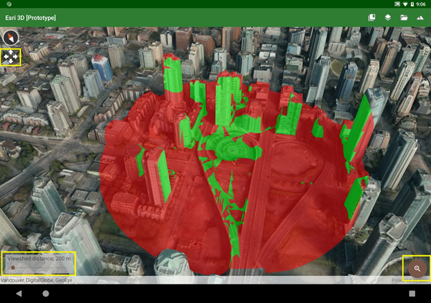
You can stop the rotation by tapping anywhere on the display; then you can tap or drag a new point to start again. This tool uses the SDK’s OrbitCameraController to provide this functionality without a lot of custom code.

Technical notes

All the tools extend the https://developers.arcgis.com/android/latest/api-reference/reference/com/esri/arcgisruntime/mapping/... class. When one is selected, it’s just one line of code to set the new touch listener on the Scene View and let it take over responsibility for all touch gestures until a new tool is chosen.

While the manifest requires OpenGL ES 3.0 or above, that’s not a strict requirement of the runtime SDK (although that could possibly become a requirement in a future release). This will run on devices using OpenGL ES 2, but those devices are generally older and don’t have the GPU, memory, or processor power to run 3D apps smoothly anyway.

I did use a couple of open-source libraries that are licensed under the Apache 2.0 license.

Availability

The source code for this app is available in a public Github repo; find it at https://github.com/markdeaton/esri-3d-android

Feel free to clone or fork the repo and use it as you like. Also, I’ll probably be making a one-time major update for the next release of the Esri SDK, as that release will probably make obsolete much of the custom web scene parsing code in the app.

more
2 1 2,344
RichieCarmichael
Esri Contributor

This is an experimental project to test the effectiveness of using a Microsoft Xbox controller to navigate in 3d web applications built using Esri's ArcGIS API for JavaScript.  This work was inspired by a customer that illustrated the difficulty of navigating underwater in a custom web application.

Click here for the live application.

Click here for the source code.

To date we have only testing the app on Windows 10 desktops.  We suspect that drivers for both Xbox 360 and Xbox One controllers are bundled with Windows 10.

How Do I Fly?

Button/AxisDescription
Left AxisHorizontal movement. Adjust to move the observer forward, back, left and right.
Right AxisLook. Adjust to change the horizontal and vertical angle of observation.
Left TriggerDescend.
Right TriggerAscend.
Left BumperZoom to previous web scene slide.
Right BumperZoom to next web scene slide.
A Button (green)Perform identify on the currently selected scene layer object.
B Button (red)Hide identify window.
Menu ButtonShow controller button map.
Start ButtonReset controller. This is used to reset the "at rest" values for the controller.

Don't Like This Map?

By default, the application loads this San Diego web scene.  This can be customized with a webscene url argument, for example.
https://richiecarmichael.github.io/gamepad/index.html?webscene=f85419bfd3414e1696c389dd9b6e9360

Known Issues

  • When the app starts, the camera may spontaneously creep without any controller interaction. Occasionally it may be an erratic spin. To correct this, after a few seconds press the start button. This will reset the controller.
  • Occasionally when the app starts, scene layers (e.g. buildings) may no fully load. To correct this refresh the browser and wait 5-10 seconds before using the controller.

Caveats

  • The app is experimental. The app is based on draft implementations of the gamepad API in modern browsers (see W3C and MDN for details).
  • The app has not been tested with a Sony PlayStation controller.

more
4 3 3,004
ThomasEmge
Esri Contributor

Introduction

The most common technique for indoor location, determining an observer location inside an enclosed space, is the blue dot tracking approach. A client-side algorithm is actively tracking signals in its environment to determine the observer’s location in the context of the received signals. The types of received electronic signals can range from 802.11.x signals (WiFi, Bluetooth, etc.) to detecting magnetic anomalies. This method is considered an active client-side location approach.

A different method is to perform the positioning server side. The environment itself is configured to seek out surrounding signals and to correlate the matching signals from various points within the environment. This is a called a passive server-side approach.

We (the Applications Prototype Lab) wanted to explore the passive approach a little further as it allows for greater flexibility in the types of devices that can be recorded. Since no additional software needs to be installed on a device of interest, we can detect new hardware in our in-situ environment. However, since we must receive multiple recordings from our environment, a proper hardware layout is required to guarantee an adequate amount of coverage.

We do see potential for the server-based location services in the context of determining the digital footprint and traffic flow within a given location. For a business, this approach could be helpful for planning and design efforts as well as to provide on-demand information in contingency situations.


Prototype Layout

Here is the general strategy we implemented. The blue dot in the diagram represents a scanning device (blue box) actively seeking out signals. For this prototype we focused on detecting smart watches, wireless routers, cell phones, and laptops.

Detectable devices by wireless scanning

Using multiple blue boxes, we built out an environment keeping track of the signals in our office area. The blue boxes submit signals that are recorded by a central service in the cloud. In addition to providing a central collection service, the cloud service keeps us informed about the current state of the blue box hardware and provides a software update mechanism.

General layout of blue boxes and cloud service.


Hardware

In building our blue box prototype, we used a Raspberry Pi Zero W board running Raspian Jessie 4.9.24. The Zero hardware is nice as it already has a Bluetooth and WiFi chip onboard. Since we are using the onboard chip for communication with the cloud service, we need one more wireless adapter ( seen as the dongle) to act as the scanner module.

For simplicity, we distributed the blue boxes around our office area and kept them connected to a power outlet to get a continuous 24 hours data collection.

To give the blue boxes a spatial identity, we wrote an ArcGIS Runtime based application that allows us to place the blue box in the context of the building.

Closed blue box case.

Blue box open with Raspberry Pi board exposed.


Methodology

When the Raspberry Pi starts up, it registers itself with the central cloud service. Upon registration, the blue box is assigned a unique identifier based on the MAC address, and client-side scripts ensure that the existing software is in sync with the version provided by the cloud environment.

After the initial handshake, the blue box assumes its scanning role and is ready to receive WiFi MAC addresses and record the RSSI (received signal strength indicator) for Bluetooth and WiFi devices. This information is sent to the cloud service from where we can use a trilateration algorithm to position the recorded signals. The location information is stored as a time-enabled point feature in ArcGIS Online.


Results

The screen capture below shows the distribution and the location of received signals. The blue dots are recorded Bluetooth signals and the amber colored dots are WiFi signals. The red squares show the location of the blue boxes in the context of the building with their associated unique identifier. Using the time awareness of the feature service, we can show the live data as a layer in ArcGIS Pro or in a web map.

Time enabled device collection visualized by ArcGIS Pro.

Time enabled device collection visualized in ArcGIS Online.


We also developed an ArcGIS Pro Addin to view the archived content distribution by date and device type. We can see the start and the end of a work day as the numbers of devices increase throughout the day. Another interesting observation is the drop-off of Bluetooth devices during the nights and the weekends.

Analyzing archived data of collected devices by date and type in ArcGIS Pro.

Conclusion

We prototyped a server-based location service and we integrated our solution into ArcGIS Enterprise. For our blue box prototype, we used a low-cost hardware approach that has the potential to scale beyond our testing environment. We have written helper applications for the ArcGIS Runtime (iOS) and the ArcGIS Pro application to facilitate the setup and analysis of the recorded information. With the described approach, we see the potential for ubiquitous presence detection offering an indoor accuracy of about 8 – 20m / 24 – 60 ft.

more
17 4 4,698
DavidJohnson5
Esri Contributor

Among the best resources for learning the ArcGIS API for Python are the sample notebooks at the developers website. A new sample notebook is now available that demonstrates how to perform a network analysis to find the best locations for new health clinics for amyotrophic lateral sclerosis (ALS) patients in California. To access the sample, click on the image at the top of this post.

I originally developed this notebook for a presentation that my colleague Pat Dolan and I gave at the Esri Health and Human Services GIS Users conference in Redlands, California in October. Although network analysis is available in many of Esri's offerings, we chose the Jupyter Notebook, an open-sourced browser-based coding environment, to show the attendees how they could document and share research methodology and results using the ArcGIS API for Python.  This sample notebook provides a brief introduction to network analysis and walks you through our methodology for siting new clinics, including accessing the analysis data, configuring and performing analyses, and displaying the results in maps. 

more
0 0 1,674
RichieCarmichael
Esri Contributor

This blog posting was first published in August 2013 on the previous blog infrastructure.

In the 2008 article ‘Where Did Water Flow on Mars? Modeling Mars’ surface in search of ancient rivers and oceans’ Witold Fraczek demonstrated how GIS can furnish support for the theory that at some time in the past, water did flow on the Martian surface. By utilizing NASA’s available Martian DEM and other supporting data layers, a hydrologic network was created by running a series of hydro functions. For this analysis, a selected section of the Martian DEM was treated in exactly the same way that a DEM from Earth would have been handled. A series of cylindrical projections were then exported from ArcMap and wrapped around 3D spheres to represent Mars. These 3D planet models were then imported into CityEngine as Collada where small selectable domes were added to represent the many probes that have successfully landed on Mars. Finally this model was exported as a 3D Web Scene and uploaded to ArcGIS online to easily share with the public. Since 3D Web Scenes are based on WebGL technology, no plug-in is required for most browsers.

To read more about how GIS helped to derive the Martian Ocean click here,

Exporting to a 3D Web Scene is currently available for CityEngine, ArcGlobe and ArcScene. 3D scenes and the ability to publish directly on the web is revolutionizing the way we share, collaborate, and communicate analysis results or design proposals with decision makers or the public. After all, our world is in 3D.

ArcMap is used to analyze the digital terrain model for Mars’ hydrological network.

The cylindrical projection is then wrapped around a 3D sphere and imported into CityEngine as Collada.

more
0 0 1,193
RichieCarmichael
Esri Contributor

First published on 14 January, 2013.

Motion Mapper is an application built using Esri’s ArcGIS Runtime for WPF and Microsoft’s Kinect for Window'SDK. The application uses Kinect’s audio and motion recognition to interact with the map and exploit Landsat satellite imagery without the use of a keyboard or mouse.

The source code is available here.

The video embedded in this post shows a person gesturing and speaking to a desktop mapping application. The text within the black banner represents voice commands available to the user. Below is a detailed description of the operations being performed by the operator in the video (spoken commands in bold😞

  1. The user activates the pan tool and navigates from the Middle East to Europe by pointing in the intended direction of travel,
  2. The user activates the zoom tool and moves his hands away from the screen to zoom out.
    Pointing directly at the screen with either (or both) hands will zoom in.
  3. The user displays the bookmark menu and then zooms to the Dubai preset extent.
  4. The user activates the swipe tool and selects the year 2005. As his hands move across the screen, Landsat imagery from 2005 clearly shows the impressive Palm Jebel Ali and Palm Jumeira archipelagos.
  5. Then the user selects 2000 to reveal that these engineering marvels did not exist five years earlier!
  6. The user zooms out to a smaller scale and activates the Landsat tool that commences a download of all individual Landsat scenes that overlap the map display. Details about each image appear in the upper left hand corner of the screen whenever his hand hovers over an image. Information boxes are colored blue and yellow to represent images selected with the left and right hands respectively.
  7. The rotate tool is activated so that the map can be pivoted in three dimensions revealing the chronological order of imagery. Older imagery is located at the bottom close to the map and newer imagery is located near the top.
  8. Lastly, the user places his hand over a single image and says open to view the image at full resolution. The image is traversed using the same panning technique described in (1) above.


Just over a year ago we published an add-in for ArcGlobe that allowed a user to navigate in three dimensions using hand gestures. When observing other people using this app we quickly realized that the hand and arm rules were too complicated and clearly not as intuitive as they could be. Based on these observations and recommendations from Microsoft we researched alternative techniques of Kinect integration.

Inspired by Netflix and other apps for the Xbox 360 gaming console we decided that speech was the key to compartmentalizing mapping tools. Rather than using complicated gestures to differentiate between mapping operations we choose to use speech to switch between panning, zooming and other tools. Overall this meant that hand gesturing could be much simpler but at the cost of a slightly more time consuming experience.

The Kinect sensor features a directional four microphone audio array, ideal for noise cancellation. Within our offices, speech recognition works very well but we have yet to test its proficiency in a noisy environment such as an exhibition hall at a large a conference.

The stacked temporal view of Landsat Imagery is achieved using WPF’s Viewport3D and Esri’s Map hosted in a Viewport2DVisual3D visual. This works well with no significant performance degradation but coding in three dimensional space is considerably more difficult than 2D! One must define texture coordinates, vertex mapping and odd things like ambient lighting. Something that needs additional work is better management of 2D scaling of the map in the 3D viewport.

In summary, developing Kinect-based apps is both challenging and rewarding. Challenging because Microsoft technology does not natively support “motion”. Developers must interpret and present raw video, depth and skeleton feeds for themselves. A developer’s job would be a lot easier if Microsoft extended the Kinect SDK to support fundamental gestures like “swipe left” and include fingers in the skeleton model. It is unlikely our trusted keyboard and mouse will be redundant anytime soon but it is very rewarding to experiment with technology that may augment our lives in the near future.

more
3 0 1,169
RichieCarmichael
Esri Contributor

Landsat Viewer Demonstration

The lab has just completed an experimental viewer designed to sort, filter and extract individual Landsat scenes. The viewer is a web application developed using Esri's JavaScript API and a three.js-based external renderer.

Click here for the live application.

Click here for the source code.

The application has a wizard-like workflow. First, the user is prompted to sketch a bounding box representation the area of interest. The next step defines the imagery source and minimum selection criteria for the image scenes. For example, in the screenshot below the user is interested in any scene taken over the past 45+ years but those scenes must have 10% or less cloud cover.

Finally, once preview scenes have been downloaded the user can advance to the final step of sorting, filtering and interrogating individual Landsat images. In the screenshot below the images have been sorted by cloud cover with cloudless images located at the top of the stack. Also, on the right hand side of the screenshot below one image has been identified. From the identify window one can naturally peruse the image's attribution but also add the image to the map as a normal image layer.

For more information about Landsat imagery hosted by the USGS and Esri and associated apps, please visit:

more
6 3 11.9K
DavidJohnson5
Esri Contributor

One of the great things about working in the Lab is you get to experiment with the new goodies from our core software developers before they are released.  When I heard that version 1.2 of the ArcGIS API for Python would include a new module for raster functions, I could not wait to give it a try.  Now that v.1.2 of the API is released, I can finally show you a Jupyter Notebook I built which has an example of a weighted overlay analysis implemented with raster functions.   The following is a non-interactive version of that notebook which I exported to HTML.  I hope it will give you some ideas for how you could use the ArcGIS API for Python to perform your own raster analysis.


Finding Natural and Accessible Areas in the State of Washington, USA

The weighted overlay is a standard GIS analysis technique for site-suitability and travel cost studies. This notebook leverages the new "arcgis.raster.functions" module in the ArcGIS API for Python 1.2 to demonstrate an example of a weighted overlay analysis.  This example attempts to identify areas in the State of Washington that are "natural" while also being easy to travel within based on the following criteria:

  • elevation (lower is better)
  • steepness of the terrain (flatter is better)
  • degree of human alteration of the landscape (less is better)

The input data for this analysis includes a DEM (Digital Elevation Model), and a dataset showing the degree of human modification to the landscape.

In general, weighted overlay analysis can be divided into three steps:

  1. Normalization: The pixels in the input raster datasets are reclassified to a common scale of numeric values based on their suitability according to the analysis criteria.
  2. Weighting: The normalized datasets are assigned a percent influence based on their importance to the final result by multiplying them by values ranging from 0.0 - 1.0. The sum of the values must equal 1.0.
  3. Summation: The sum of the weighted datasets is calculated to produce a final analysis result.

We'll begin by connecting to the GIS and accessing the data for the analysis.

Connect to the GIS

In [1]:
# import GIS from the arcgis.gis module
from arcgis.gis import GIS

# Connect to the GIS.
try:    
   web_gis = GIS("https://dev004543.esri.com/arcgis", 'djohnsonRA')    
   print("Successfully connected to {0}".format(web_gis.properties.name))
except:    
   print("")
Enter password:········ 
Successfully connected to ArcGIS Enterprise A

Search the GIS for the input data for the analysis

Human Modified Index

In [2]:
# Search for the Human Modified Index imagery layer item by title
item_hmi = web_gis.content.search('title:Human Modified Index', 'Imagery Layer')[0]
item_hmi
Out[2]:
Human Modified Index 
A measure of the degree of human modification, the index ranges from 0.0 for a virgin landscape condition to 1.0, for the most heavily modified areas.Imagery Layer by djohnsonRA 
Last Modified: July 06, 2017 
0 comments, 2 views

Elevation

In [3]:
# Search for the DEM imagery layer item by title
item_dem = web_gis.content.search('title:USGS NED 30m', 'Imagery Layer')[0]
item_dem
Out[3]:
USGS NED 30m 
The National Elevation Dataset (NED) is the primary elevation data product of the USGS. This version was resampled to 30m from source data at 1/3 arc-second resolution and projected to an Albers Equal Area coordinate system.Imagery Layer by djohnsonRA 
Last Modified: July 06, 2017 
0 comments, 8 views

Study area boundary and extent

In [4]:
# Search for the Ventura County feature layer item by title
item_studyarea = web_gis.content.search('title:State of Washington, USA', 
                                        'Feature Layer')[0]
item_studyarea
Out[4]:
State of Washington, USA 
State of Washington, USAFeature Layer Collection by djohnsonRA 
Last Modified: July 07, 2017 
0 comments, 2 views
In [5]:
# Get a reference to the feature layer from the portal item
lyr_studyarea = item_studyarea.layers[0]
lyr_studyarea

Get the coordinate geometry of the study area

In [6]:
# Query the study area layer to get the boundary feature
query_studyarea = lyr_studyarea.query(where='1=1')
# Get the coordinate geometry of the study area.
# The geometry will be used to extract the Elevation and Human Modified Index data.
geom_studyarea = query_studyarea.features[0].geometry
# Set the spatial reference of the geometry.
geom_studyarea['spatialReference'] = query_studyarea.spatial_reference

Get the extent of the study area

In [7]:
# Import the geocode function
from arcgis.geocoding import geocode
# Use the geocode function to get the location/address of the study area
geocode_studyarea = geocode('State of Washington, USA',
                            out_sr= query_studyarea.spatial_reference)
In [8]:
# Get the geographic extent of the study area
# This extent will be used when displaying the Elevation, Human Modified Index, 
# and final result data.
extent_studyarea = geocode_studyarea[0]['extent']
extent_studyarea
Out[8]:
{'xmax': -1451059.3770040546,  
'xmin': -2009182.5321227335,  
'ymax': 1482366.818700374,  
'ymin': 736262.260048952}

Display the analysis data

Human Modified Index

In [9]:
# Get a reference to the imagery layer from the portal item
lyr_hmi = item_hmi.layers[0]
# Set the layer extent to geographic extent of study area and display the data.
lyr_hmi.extent = extent_studyarealyr_hmi
Out[9]:

Elevation

In [10]:
# Get a reference to the imagery layer from the portal item
lyr_dem = item_dem.layers[0]
# Set the layer extent to the geographic extent of study area and display the data.
lyr_dem.extent = extent_studyarealyr_dem
Out[10]:

Slope (derived from elevation via the Slope raster function)

In [11]:
# Import the raster functions from the ArcGIS API for Python (new to version 1.2!)
from arcgis.raster.functions import *
In [12]:
# Derive a slope layer from the DEM layer using the slope function
lyr_slope = slope(dem=lyr_dem,slope_type='DEGREE', z_factor=1)
# Use the stretch function to enhance the display of the slope layer.
lyr_slope_stretch = stretch(raster=lyr_slope, stretch_type='StdDev', dra='true')
# Display the stretched slope layer within the extent of the study area.
lyr_slope_stretch.extent= extent_studyarealyr_slope_stretch
Out[12]:

Extract the data within the study area geometry

Use the Clip raster function to extract the analysis data from within the study area geometry

Human Modified Index

In [13]:
# Extract the Human Modified Index data from within the study area geometry
hmi_clipped = clip(raster=lyr_hmi, geometry=geom_studyarea)
hmi_clipped
Out[13]:

Elevation#Elevation

In [14]:
# Extract the Elevation data from within the study area geometry
elev_clipped = clip(raster=lyr_dem, geometry=geom_studyarea)
elev_clipped
Out[14]:

Slope#Slope

In [15]:
# Extract the Slope data from within the study area geometry
slope_clipped = clip(raster=lyr_slope, geometry=geom_studyarea)
# Apply the Stretch function to enhance the display of the slope_clipped layer.
slope_clipped_stretch = stretch(raster=slope_clipped, stretch_type='StdDev', 
                                dra='true')
slope_clipped_stretch
Out[15]:

Perform the analysis

Step 1: Normalization

Use the Remap function to normalize each set of input data to a common scale of 1 - 9, where 1 = least suitable and 9 = most suitable.

In [16]:
# Create a colormap to display the analysis results with 9 colors ranging 
# from red to yellow to green.
clrmap=  [[1, 230, 0, 0], [2, 242, 85, 0], [3, 250, 142, 0], [4, 255, 195, 0], 
         [5, 255, 255, 0], [6, 197, 219, 0], [7, 139, 181, 0], [8, 86, 148, 0],
         [9, 38, 115, 0]]
In [17]:
# Normalize the elevation data
elev_normalized = remap(raster=elev_clipped,
                        input_ranges=[0,490, 490,980, 980,1470, 1470,1960, 1960,2450, 
                                      2450,2940, 2940,3430, 3430,3700, 3920,4100],
                        output_values=[9,8,7,6,5,4,3,2,1], astype='U8')

# Display color-mapped image of the reclassified elevation data
colormap(elev_normalized, colormap=clrmap) 
Out[17]:
In [18]:
# Normalize the slope data
slope_normalized = remap(raster=slope_clipped,                          
                        input_ranges=[0,1, 1,2, 2,3, 3,5, 5,7, 7,9, 9,12, 12,15, 
                                      15,100],
                        output_values=[9,8,7,6,5,4,3,2,1],  astype='U8')  

# Display a color-mapped image of the reclassified slope data
colormap(slope_normalized, colormap=clrmap)
Out[18]:
In [19]:
# Normalize the Human Modified Index data
hmi_normalized = remap(raster=hmi_clipped,                  
                      input_ranges=[0.0,0.1, 0.1,0.2, 0.2,0.3, 0.3,0.4, 0.4,0.5,
                                    0.5,0.6, 0.6,0.7, 0.7,0.8, 0.8,1.1],                  
                      output_values=[9,8,7,6,5,4,3,2,1],  astype='U8')

# Display a color-mapped image of the reclassified HMI data
colormap(hmi_normalized, colormap=clrmap)
Out[19]:

Step 2: Weighting

Use the overloaded multiplication operator * to assign a weight to each normalized dataset based on their relative importance to the final result.

In [20]:
# Apply weights to the normalized data using the overloaded multiplication 
# operator "*".
# - Human Modified Index: 60%
# - Slope: 25%
# - Elevation: 15%
hmi_weighted = hmi_normalized * 0.6
slope_weighted = slope_normalized * 0.25
elev_weighted = elev_normalized * 0.15

Step 3: Summation

Add the weighted datasets together to produce a final analysis result.

In [21]:
# Calculate the sum of the weighted datasets using the overloaded addition 
# operator "+". 
result_dynamic = colormap(hmi_weighted + slope_weighted + elev_weighted, 
                          colormap=clrmap, astype='U8')
result_dynamic
Out[21]:

The same analysis can also be performed in a single operation

In [22]:
result_dynamic_one_op = colormap(    
   raster=    
   (
      # Human modified index layer        
      0.60 * remap(raster=clip(raster=lyr_hmi, geometry=geom_studyarea),
         input_ranges=[0.0,0.1, 0.1,0.2, 0.2,0.3, 0.3,0.4, 0.4,0.5,
                       0.5,0.6, 0.6,0.7, 0.7,0.8, 0.8,1.1],                     
         output_values=[9,8,7,6,5,4,3,2,1])        
      +          
      # Slope layer        
      0.25 * remap(raster=clip(raster=lyr_slope, geometry=geom_studyarea),
         input_ranges=[0,1, 1,2, 2,3, 3,5, 5,7, 7,9, 9,12, 12,15,
                       15,100],                     
         output_values=[9,8,7,6,5,4,3,2,1])          
      +        
      # Elevation layer        
      0.15 * remap(raster=clip(raster=lyr_dem, geometry=geom_studyarea),
         input_ranges=[-90,250, 250,500, 500,750, 750,1000, 1000,1500,
                       1500,2000, 2000,2500, 2500,3000, 3000,5000],                    
         output_values=[9,8,7,6,5,4,3,2,1])        
   ),    
   colormap=clrmap,  astype='U8')
result_dynamic_one_op
Out[22]:

Generate a persistent analysis result via distributed server based raster processing.

Portal for ArcGIS has been enhanced with the ability to perform distributed server based processing on imagery and raster data. This technology enables you to boost the performance of raster processing by processing data in a distributed fashion, even at full resolution and full extent.

You can use the processing capabilities of ArcGIS Pro to define the processing to be applied to raster data and perform processing in a distributed fashion using their on premise portal. The results of this processing can be accessed in the form of a web imagery layer that is hosted in their ArcGIS Organization.

For more information, see Raster analysis on Portal for ArcGIS

In [23]:
# Does the GIS support raster analytics?
import arcgis
arcgis.raster.analytics.is_supported(web_gis)
Out[23]:
True
In [24]:
# The .save() function invokes generate_raster from the arcgis.raster.analytics
# module to run the analysis on a GIS server at the source resolution of the 
# input datasets and store the result as a persistent web imagery layer in the GIS.
result_persistent = result_dynamic.save("NaturalAndAccessible_WashingtonState")
result_persistent
Out[24]:
NaturalAndAccessible_WashingtonState 
Analysis Image Service generated from GenerateRasterImagery Layer by djohnsonRA 
Last Modified: July 07, 2017 
0 comments, 0 views
In [25]:
# Display the persistent result
lyr_result_persistent = result_persistent.layers[0]
lyr_result_persistent.extent = extent_studyarea
lyr_result_persistent
Out[25]:
Data Credits:
A measure of the degree of human modification, the index ranges from 0.0 for a virgin landscape condition to 1.0 for the most heavily modified areas. The average value for the United States is 0.375. The data used to produce these values should be both more current and more detailed than the NLCD used for generating the cores. Emphasis was given to attempting to map in particular, energy related development. Theobald, DM (2013) A general model to quantify ecological integrity for landscape assessment and US Application. Landscape Ecol (2013) 28:1859-1874 doi: 10.1007/s10980-013-9941-6
USGS NED 30m:  
Data available from the U.S. Geological Survey. See USGS Visual Identity System Guidance for further details. Questions concerning the use or redistribution of USGS data should be directed to: ask@usgs.gov or 1-888-ASK-USGS (1-888-275-8747). NASA Land Processes Distributed Active Archive Center (LP DAAC) Products Acknowledgement: These data are distributed by the Land Processes Distributed Active Archive Center (LP DAAC), located at USGS/EROS, Sioux Falls, SD.
State of Washington: Esri Data & Maps

more
13 2 3,650
21 Subscribers