Applications Prototype Lab Blog

cancel
Showing results for 
Show  only  | Search instead for 
Did you mean: 

Other Boards in This Place

Latest Activity

(68 Posts)
RalucaNicola1
Esri Contributor

In this blog post I want to show you how you can steal some of John Nelson's watercolor styles and use them on an interactive web globe. I used this style to depict happy moments collected for a research about happiness. You can check out the application here: What makes us happy?

For the countries I used Dylan Moriarty's hand drawn style of country boundaries from Project Linework. I applied John's styles on the country polygons (orange for countries that have happy moments and gray for the ones that don't). Publishing them as a feature layer or a vector tile layer will not work because the symbols use multiple picture fill symbol layers which are not supported on the web or as vector tile styles. So I published them as a tile layer, you can find it here

For the graticule I used John Nelson's Firefly grid data (Oceans 5 degrees). And for the ocean, I created a rectangular polygon with the extent of the whole world and then I applied the Pairwise erase tool in the Analysis toolbox. Finally I applied John's Pacific Blue symbol.

The final globe looks like this and you can interact with it here

screenshot.png

Hope that this inspired you for some painted mapping projects,

Raluca

more
4 0 522
RalucaNicola1
Esri Contributor

Create a 3D winter basemap that you can use to show your winter adventures on a map.

Read more...

more
7 0 837
CarolSousa
Esri Contributor

Lidar provides a fascinating glimpse into the landscape of the Jack and Laura Dangermond Preserve. Using a ground elevation service and a point cloud created from lidar, and natural color imagery, we created an interactive routing application that allows users to virtually drive through the Preserve.

This article will tell you how we created this application and a few things we learned along the way.

The Jack and Laura Dangermond Preserve

In 2018, the Jack and Laura Dangermond Preserve was established after a philanthropic gift by Jack and Laura enabled The Nature Conservancy to purchase the over 24,000 acre tract of land around Point Conception, California. The Preserve protects over eight miles of near-pristine coastline and rare connected coastal habitat in Santa Barbara County, and includes the Cojo and Jalama private working cattle ranches. The land is noted to be in tremendous ecological condition and features a confluence of ecological, historical, and cultural values across Native American, Spanish and American histories that have co-evolved for millennia. The area is also home to at least 39 species of threatened or special status. The Preserve will serve as a natural laboratory, not only for studying its biodiversity and unique habitats, but also as a place where GIS can be used to study, manage, and protect its unique qualities.

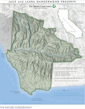
      Map is courtesy of The Nature Conservancy and Esri


Lidar and Imagery

Soon after the Preserve was established, Aeroptic, LLC, an aerial imagery company, captured aerial lidar and natural color orthomosaic imagery over the Preserve.

Lidar (light detection and ranging) is an optical remote-sensing technique that uses lasers to send out pulses of light and then measures how long it takes each pulse to return. Lidar is most often captured using airborne laser devices, and it produces mass point cloud datasets that can be managed, visualized, analyzed, and shared using ArcGIS. Lidar point clouds are used in many GIS applications, such as forestry management, flood modelling, coastline management, change detection, and creating realistic 3D models.

When imagery is captured at the same time as lidar, as Aeroptic did, complementary information is obtained. The spectral image information can be added to the 3D lidar information, allowing for more accurate analysis results. More about the imagery later; we received the lidar first, while Aeroptic was still  processing the imagery.


Original lidar

Esri obtained the lidar and we began to work with it. The original lidar was flown in three passes: one North-South, one East-West, and another Northwest-Southeast. The average point density was 11.1 points per square meter. Estimated vertical accuracy was about +/- 6 cm. Average flight height was 5253 feet (1640 meters) GPS height.  Data was in UTM Zone 11 coordinate system. The original files were checked for quality, then tiled and classified for Ground by Aeroptic. We received 121 LAS files with a total of over 7 billion las points – 7,020,645,657.

We did more quality control to search for inconsistent points (called outliers). One way we checked for outliers was to create a DSM from a LAS dataset, and look for suspect locations in 2D, then use the 3D Profile View in ArcMap to find the problem points. Another method we used was to create a surface elevation from the ground-classified points, then did spot checking in ArcGIS Pro, especially around bridges. We unassigned many ground-classified points that caused the road surface to look too sloped (see the screenshots in the Surface Elevation section.) Then we created a new surface elevation service and a point cloud scene layer service.


Surface Elevation from the lidar

Creating the surface elevation was a big task. The ArcGIS Pro Help system describes the process to do this, and we followed that process. Here are the tools in the order in which we used them. Note that parameters listed for the tools do not include all tool parameters, just the most specifically important ones.

ArcGIS Pro tools

Create Mosaic Dataset

Add Rasters to Mosaic Dataset – very important to specifically set the following parameters:

  • Raster Type  LAS Dataset
  • Raster Type Properties, LAS Dataset tab:
    • Pixel size  2
    • Data Type – Elevation
    • Predefined FiltersDEM
    • Output Properties, Binning, Void filling – Plane Fitting/IDW.  (Lesson learned: without this void fill method, there were holes in the elevation.)

Manage Tile Cache

  • Input Data Source  the mosaic dataset
  • Input Tiling Scheme  set to Elevation tiling scheme (Lesson learned: do not forget this!)
  • Minimum and Maximum Cache Scale and Scales checked on  the defaults that the tool provided were fine for our purpose. Attempts to change them always resulted in tool errors. (Lesson learned: use the defaults!)

Export Tile Cache

  • Input Tile Cache  the cache just created with Manage Tile Cache
  • Export Cache As  set to Tile package (very important!)

Share Package  to upload the tile package to ArcGIS Online

  • Default settings

ArcGIS Online tools

Publish – the uploaded package to create the elevation service.

The surface elevation created from the lidar created a more realistic scene than the ArcGIS Pro default surface elevation, particularly noteworthy over places like this small bridge, shown here with the Imagery basemap:


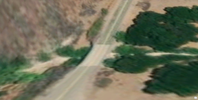
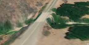
       Elevation source: WorldElevation3D/Terrain 3D                   Elevation source: lidar-derived surface


Point Cloud Scene Layer Package from the lidar

The first point cloud service that we made included all the lidar points. But when viewed in the tour app, we noticed that the ground points visually conflicted with the elevation surface, which becomes coarser at far-away distances. To remove this visual disturbance, we filtered the LAS dataset to exclude the ground classified points and any points that were within 1.5 meters of the ground surface. (Lesson learned: not all lidar points need to be kept in the point cloud scene service.) The 1.5-meter height was enough to remove ground points but keep small shrubs, fences and other features. The number of points that remained for the point cloud scene layer package was a little over 3 billion, less than half of the original 7 billion points. We used the Create Point Cloud Scene Layer Package tool and set it to Scene Layer Version 2.x. The package was uploaded with Share Package, and then published in ArcGIS Online.


Orthomosaic imagery

The tour application was already working by the time we received the new imagery, but we were very excited when we saw it! We made an image service to use as the “basemap” in the tour app, and we used it to colorize the lidar point cloud.

The Aeroptic imagery was 10 cm natural color orthomosaic, collected at the same time as the lidar, given to us in 50 TIFF files. The first step towards building an image service from this data was to add the files to a mosaic dataset to aggregate them into a single image. The imagery appeared a little too dark, so we applied a stretch function to the mosaic dataset to increase its brightness. To ensure that applications could access the pixels at high performance, we generated a tile cache from the mosaic dataset using the Manage Tile Cache tool.  To preserve the full detail of the original 10 cm imagery, we built the cache to a Level of Detail (LOD) of 23, which has a pixel size of 3.7 cm.  Finally, we generated a tile package from the cache using the Export Tile Cache tool, uploaded the package to ArcGIS Online, and then published the uploaded package as an imagery layer.

We used the Colorize LAS geoprocessing tool to apply the red, green and blue (RGB) colors from the imagery to the lidar files. The RGB colors are saved in the LAS files, and can be used to display the points, along with other methods like by Elevation, Class and Intensity. Displaying the LAS points with RGB creates a very realistic scene, except for a few places such as where a tree branch hangs over the road yellow centerline and then becomes the bright yellow color.

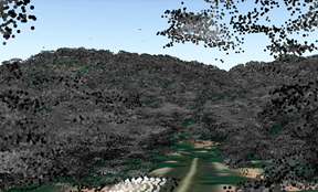
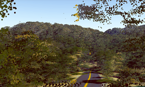
     Lidar before colorizing                                                        Lidar after colorizing


The imagery also helped with manual classification of the lidar points around bridges. We edited many points and recreated the surface elevation so that it matched better with the imagery. Here is the same bridge as in the screenshots above in the Surface Elevation section:


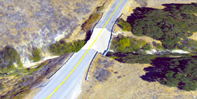
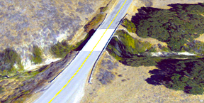
       New RGB imagery and original lidar as surface elevation           New RGB imagery and further-processed lidar as elevation


Road Network

The Nature Conservancy provided a dataset of the vast road network in the Preserve, which includes over 245 miles of roads, with over 10 miles of paved road and over 230 miles of dirt roads and paths.

When we displayed the roads data over the newly acquired imagery, some of the road lines didn’t match up with the imagery, so we edited the road vertices to better match. We then created a custom route task service that included elevation values from the new elevation service, which enabled the elevation values to then be part of the resulting routes when a route is created.


Preserve boundary

The boundary line that outlines the Preserve is on ArcGIS Online as a feature service. We did not create the boundary from the lidar, but did add the service to the web scene as described below.


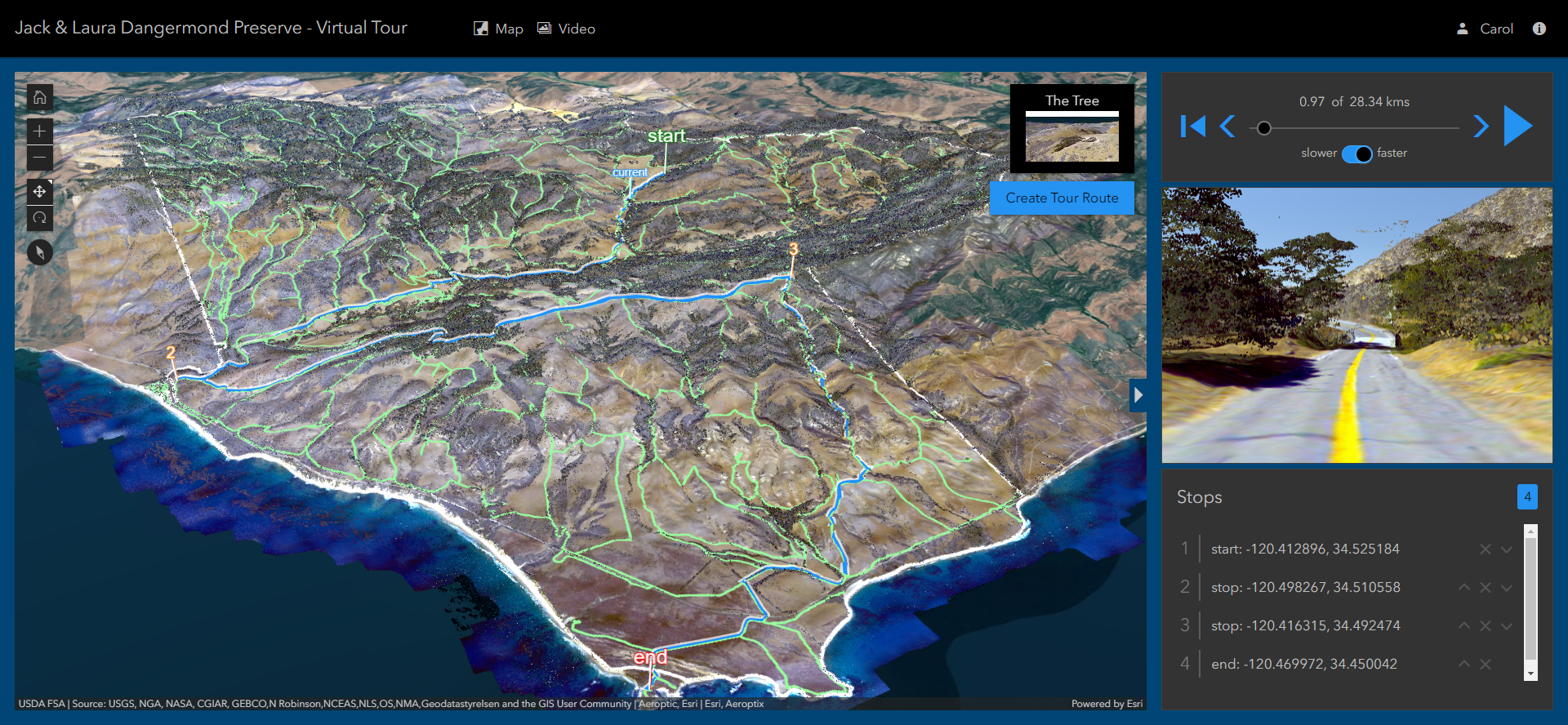
The Virtual Tour Application

A 3D web scene containing the roads, point cloud, imagery, and the Preserve line was created in ArcGIS Online, and the new elevation service was added as the ground elevation layer. The web scene was incorporated into the Jack and Laura Dangermond Preserve Tour Application, which was built using the latest version of the ArcGIS API for JavaScript.

The application is a virtual tour over roads and trails in the Preserve. The person who is using the app can choose two or more locations to create a route. A Play button starts a virtual ride from the first location and drives along the trails to the next points. The main view of the application shows the trails and the locations, and a marker moves along the trails. An inset map shows the view of the ground imagery and the lidar points from the perspective of the virtual vehicle as it moves along the trail.

This application was created with secure access for The Nature Conservancy as it provides a new tool for the TNC staff to explore and visualize the Preserve. As such, it is not publicly available.


More information


more
9 2 4,147
BobGerlt
Esri Contributor

Diversity Tools is a bit of an experimental python toolbox that currently contains only a single tool, Focal Diversity. 


The tool can calculate two diversity indexes for rectangular focal areas based on a single band raster input.  The Shannon Diversity Index, often referred to as Shannon-Weaver or Shannon-Wiener Index and Simpsons Index of Diversity or Inverse Simpsons Index are both popular diversity indexes in ecology applications and are commonly used to provide a measure of species or habitat diversity for non-overlapping areas. Like the Centrality Analysis Tools published last year, Diversity Tools is based on work performed during the Green Infrastructure project a few years back.  The ArcGIS Focal Statistics tool, available with Spatial Analyst, calculates several statistics for raster focal neighborhoods, including variety, but not diversity.  Both Focal Statistics with the Variety option and Focal Diversity calculate a value for the central pixel in a sliding rectangular window based on the unique values within the focal window. Unlike Focal Statistics, Focal Diversity does not require a Spatial Analyst license.

.

I look forward to hearing of your use cases and suggestions for improvements.  I am already thinking about a Zonal Diversity tool similar to Zonal Statistics if there is interest.

more
5 1 5,325
BobGerlt
Esri Contributor

A new version of  the Distributive Flow Lines (DFL) tool is now available. (Dec 15 , 2022)  updating compatibility to ArcGIS Pro 3.0. A couple of enhancements were made and some code cleanup.  The tool now uses the new Distance Accumulation tool.   If you want to use the tool in ArcMap, the previous version of the DFL and the previous blog are still available.  The previous blog also contains a little background on distributive flow maps and some details about the internal workings of the tool.  Here I will focus on how to use the new Pro tool and a couple details about the inputs and flow “direction”.  The example in this blog shows the flow of federal education tax dollars from Washington D.C. to the lower 48 state capitals.  If you would like to follow along, the tool and test data used to produce the maps in this blog are available at the first link above. 

Note: To use the tool you need ArcGIS Pro and the Spatial Analyst extension.  If you do not have access to a Spatial Analyst license, a 30-day no cost trial can be obtained through the Esri Marketplace.  The tool will with a base license level of Basic.  If you want to use the Create smoothed output option available in the tool then a Standard or Advanced base license will be required.

Usually, flow maps depict the flow of something from a single source to many destinations. They can also show stuff flowing from many destinations to a single source.  The DFL tool can be used for both cases.   Within the interface the point of convergence is named Source Feature.   Behind the scenes the “something” always flows from the Destinations to the Source.  This is because the tool uses ArcGIS hydrology GP tools and the flow lines are more akin to a stream network with the mouth of the largest stream terminating at the Source node.  The Source Feature is just the location where the flow lines will terminate and does not need to have any specific fields describing the “something” flowing through the network.

Figure 1: New Distributive Flow Lines Tool

Figure 1: New Distributive Flow Lines Tool


The Destination Features in Figure 1 must have an integer field indicating the amount of “stuff” received from the Source.  In Figure 1, the Source Feature, DC Point, is a point feature over Washington DC.  StateCaps represents the lower 48 state capitals.  Edu_Dollars is a field in the StateCaps feature class representing federal education tax dollars supplied to the states. Figure 2, below, is the output generated based on the inputs in Figure 1.

Figure 2: Output based on Figure1 input values. California and Nevada flow southward to avoid the red barrier.

Figure 2: Output based on Figure1 input values. California and Nevada flow southward to avoid the red barrier.

Note: The tool output lines will automatically be added to the map with a Single Symbol style.  To make the output have lines with increasing thickness it is necessary to change the symbology of the features using the Symbology pane.  The output features will contain a field with the same name as the input Distributed quantity field from the Destination features.  Use this field as the symbology Field.  Additionally you will want to experiment with the Method,  Classes, Minimum size, Maximum size and Template input parameters in the Symbology pane to achieve the effect you like.

In previous versions of the DFL, the optional inputs, Impassable Features and Impedance Features, also caused some confusion because they are similar but treated much differently by the tool. Both provide some control over where the flow lines will be placed. In Figure 2, the large red line in the western half of the US is the Impassable Features input.  The blue buffers around the capitals are the Impedance Features input.  Impassable features will not be crossed or touched by flow lines.  They will be slightly buffered and the lines will appear to flow around them.  The Impedance Features may be crossed by flow lines but in most cases the tool will also avoid these features unless there is no other less “expensive” path toward the Source Feature.  Figure 3 represents the output where no Impassable Features are specified. Note the flow lines from California and Nevada change from southward to northward.

Figure 3:  Impedance Features input specified but no Impassable Feature input. Now flow lines generally go around the intermediate state capitals.

Figure 3:  Impedance Features input specified but no Impassable Feature input. Now flowlines generally go around the intermediate state capitals.

Tip:  It is not necessary to turn on, or even add the Impedance and Impassible features to the map.  They are shown here for clarity.  Depending on the application of the tool you may wish to show them because they are significant to the story you are trying to communicate, but often they are just used for aesthetic purposes to control the shape of the output and have nothing to do with the story being told.

In Figure 4 below, neither Impassable nor Impedance features were specified.  As you can see, flow lines pass through the intermediate state capitals.  This is sometimes desired, but in the case of federal tax dollars, the dollars do not flow through intermediate states, so this might be confusing.  Providing an Impedance feature reduces this confusion.  If the buffers around the state capitals were specified as Impassable Features, the flow lines could not flow away from the states and no solution would be possible. 

Figure 4: Output generated without specifying Impassable or Impedance Features.  California and Nevada flow northward. Flow lines flow through intermediate state capitals

Figure 4: Output generated without specifying Impassable or Impedance Features.  California and Nevada flow northward. Flow lines flow through intermediate state capitals


The output in Figure 5 below used the same inputs as Figure 4 except the “Split flow lines close to” parameter was changed from Destination to Source. The result is that California has a dedicated line all the way into Missouri, and several things change in the Northeast.  This may be less aesthetically pleasing but does a better job of highlighting which individual states receive more tax dollars.

Figure 5: Split flow lines close to Destinations, Neither Impedance nor Impassable features specified.

Figure 5: Split flow lines close to Destinations, Neither Impedance nor Impassable features specified.


Figure 6 is a closeup of what is going on in the Northeast. There are a few things worth pointing out. The first is the treatment of the Impedance Features, StateCaps_Buffer.  Notice how the flow lines pass through the New York and Connecticut buffer features. This is happening because the direct route is less “expensive” than going around those buffers.  Purple labels indicate where the values on the flow lines are coming from. The green flow line labels emphasize the additive nature when individual tributary flow lines converge as they get closer to the Source feature.  Lastly, the Massachusetts flow line goes directly through Rhode Island. This is because it is located within the Rhode Island StateCaps_Buffer. This is a case where some manual editing may be needed to clarify that Massachusetts tax dollars are not flowing through Rhode Island.

Figure 6: Note the flow line pass through the buffers around New York and Connecticut as well as Rhode Island. Also note the additive nature of the flow lines.

Figure 6: Note the flow line pass through the buffers around New York and Connecticut as well as Rhode Island. Also note the additive nature of the flow lines.


I hope you will find the tool useful in creating flow maps or other creative applications.  I also look forward to reading your comments, suggestions and use cases.  If you missed the link to the tool and sample data, here it is again.  Distributive Flow Lines for Pro.

more
9 27 20.4K
DavidJohnson5
Esri Contributor

In June of 2017 we began another collaboration with Dr. Camilo Mora of the University of Hawaii, Department of Geography. This came on the heels of our previous project with Dr. Mora to develop a web mapping application to display his team's research on climate change and deadly heatwaves. For their next project they had expanded their research to include multiple cumulative hazards to human health and well-being resulting from climate change.  These hazards include increased fires, fresh water scarcity, deforestation, and several others. Their new research was recently published in the journal Nature Climate Change.  Several news outlets published stories on their findings, including these from The New York Times, Le Monde, and Science et Avenir. For our part, the Applications Prototype Lab developed an interactive web mapping application to display their results. To view the application, click on the following image. To learn how to use the application, and about the research behind it, click on the links for "Help" and "Learn More" at the top of the application.

Cumulative Exposure to Climate Change

In this post I'll share some of the technical details that went into the building of this application.  

The Source Data

For each year of the study, 1956 - 2095, the research team constructed a series of global data sets for 11 climate-related hazards to human health and well-being. From those data sets they built a global cumulative hazards index for each year of the study. For information about their methods to generate these data sets, refer to their published article in Nature Climate Change. Each data set contains the simulated (historical) or projected (future) change in intensity of a particular hazard relative to a baseline year of 1955. For the years 2006 - 2095, hazards were projected under three different scenarios of greenhouse gas (GHG) emissions ranging from a worst-case business-as-usual scenario to a best-case scenario where humanity implements strong measures to reduce GHG emissions. In total, they produced 3828 unique global data sets of human hazards resulting from climate change.

Data Pre-processing

We received the data as CSV files which contained the hazard values on a latitude-longitude grid at a spatial resolution of 1.5 degrees. The CSV data format is useful for exchanging data between different software platforms. However, it is not a true spatial data format. So we imported the data from the CSV files into raster datasets. This is typically a two-step process where you first import the CSV files into point feature classes and then export the points to raster datasets. However, since the data values for the 11 hazards were not normalized to a common scale, we added a step to re-scale the values to a range of 0 - 1, according to the methodology of the research team, where:  

  • 0 equals no increase in hazard relative to the historical baseline value.
  • 1 equals the value at the 95th percentile or greater of increased hazard between 1955 and 2095 for the "business-as-usual" GHG emissions scenario.

With a spatial resolution of 1.5 degrees, each pixel in the output raster datasets are approximately 165 Km in width and height. This was too coarse for the web app, because the data for land-based hazards such as fire and deforestation extended quite a distance beyond the coastlines. So we added another processing step to up-sample each dataset by a factor of ten and remove the pixels from the land-based hazards raster datasets whose centers were outside of a 5 Km buffer of the coastlines.  

upsampling and clipping

We automated the entire process with Python scripts, using geoprocessing tools to convert the source data from CSV to raster dataset, build the coastal buffer, and up-sample and clip the land raster datasets.  To re-scale the data values, we used mathematical expressions. At the end of these efforts we had two collections of raster datasets - one for the 11 hazards indexes, and another for the cumulative hazards index.

Data Publishing

We built two mosaic datasets to organize and catalog each collection of raster datasets. From each mosaic dataset we published an image service to provide the web application with endpoints through which it could access the data. On the application, the map overlay layer is powered by the image service for the cumulative hazards index data. This layer is displayed in red with varying levels of transparency to indicate the level of cumulative hazards at any location. To support this type of rendering, we added a custom processing template to the image service's source mosaic dataset. The processing template uses the Stretch function to dynamically re-scale the floating-point data values in the source raster datasets to 8-bit integers, and the Attribute Table function to provide the color and transparency values of the exported image on a per-pixel basis.

The Animations

We built short video animations of the change in cumulative hazards over time using the Time and Animation Toolbars in ArcGIS Pro. You can access those animations from the application by clicking on the "Animations" link at the top of the application window. We used the cumulative hazards index image service as the data source of the animation. This service is time-aware, enabling us to define a timeline for the animations. Using the capabilities in the Animations Toolbar, we defined properties such as the time-step interval and duration, total duration, output format and resolution, and the various overlays such as the legend, watermarks, and dynamic text to display the year. We filtered the data in the image service by GHG emissions scenario using definition queries to create three separate animations of the change in cumulative hazards over time.

The Web Application

We built the web application using the ArcGIS API for JavaScript. To render the cumulative hazards map layer, the application requests the data from the image service in the LERC format.  This format enables the application to get the color and transparency values for each pixel from the attribute table to build a client-side renderer for displaying the data. The chart that appears when you click on the map was built with the Dojo charting library. This chart is powered by the image service with the 11 individual human hazards index data. To access the hazards data, the web application uses the Identify function to get the values for each of the 11 hazards at the click location with a single web request to the service. 

In Summary


Building this application gave us the opportunity to leverage many capabilities in the ArcGIS platform that are well suited for scientific analysis and display. If you are inspired to build similar applications, then I hope this post provides you with some useful hints. If you have any technical questions, add them into the comments and I'll try to answer them. I hope this application helps to extend the reach of this important research as humanity seeks to understand the current and projected future impacts of climate change.

more
3 2 2,035
BobGerlt
Esri Contributor

The map above shows some spider diagrams. These diagrams are useful for presenting spatial distribution, for example, customers for a retail outlet or the hometowns of university students. The lab was recently tasked with creating an automated spider diagram tool without using Business Analyst or Network Analyst. The result of our work is in the Spider Diagram Toolbox for use by either ArcGIS Pro or ArcGIS Desktop.

Installation is fairly straight forward. After downloading the zip file, decompress and place the following files on your desktop.:

  • SpiderDiagram.pyt,
  • SpiderDiagram.pyt.xml,
  • SpiderDiagram.Spider.pyt.xml, and
  • SpiderDiagramReadme.pdf

In ArcGIS PRO or ArcMap you may connect a folder to this the desktop folder so that you access these files.

Running the tool is also easy. The tool dialog will prompt you for the origin and destination feature classes as well as the optional key fields that will link destination points to origin points. In the example below, the county seats are related to state capitals by the FIPS code.

Result:

Leave one or both key fields blank to connect each origin point to every destination point.

Result:

Which is the origin and which is the destination feature class?  It really doesn’t matter for this tool – either way will work.  If you want to symbolize the result with an arrow line symbol, know that the start point of each line is the location of points in the origin feature class.

Script and article written by Mark Smith‌.

Please direct comments to bgerlt-esristaff‌.

more
16 9 14.9K
SiddharthMenon
Esri Contributor

Motivation

Amazon recently released a deep learning enabled camera called the DeepLens (https://aws.amazon.com/deeplens/). The DeepLens allows developers to build, train, and deploy deep learning models to carry out custom computer vision tasks. The Applications Prototype Lab obtained a DeepLens and began to explore its capabilities and limitations.

One of the most common tasks in computer vision is object detection. This task is slightly more involved than image classification since it requires localization of the object in the image space. This summer, we explored object detection and how we could expand it to fit our needs. For example, one use case could be to detect and recognize different animal species in a wildlife preserve. By doing this, we can gather relevant location-based information and use this information to carry out specific actions.

Animal species detection was tested using Tensorflow’s Object Detection API, which allowed building a model that could easily be deployed to the DeepLens. However, we needed to scale down our detection demo to make it easier to test on the ESRI campus. For this, we looked at face detection.

The DeepLens comes with sample projects, including those that carry out object and face detection.  For experimentation purposes, we decided to see if we could expand the face detection sample to be able to recognize and distinguish between different people.

Services and Frameworks

Over the course of the summer, we built a face recognition demo using various Amazon and ESRI services. These services include:

  • The AWS DeepLens Console (to facilitate deployment of the projects onto the DeepLens)
  • Amazon Lambda (to develop the Python Lambda functions that run the inference models)
  • Amazon S3 (to store the trained database, as well as the models required for inference)
  • The AWS IoT Console (to facilitate communication to and from the DeepLens)
  • A feature service and web map hosted on ArcGIS  (to store the data from the DeepLens’ detections)
  • Operations Dashboard (one for each DeepLens, to display the relevant information)

To carry out the inference for this experiment, we used the following machine learning frameworks/toolkits:

  • MxNet (the default MxNet model trained for face detection and optimized for the DeepLens)
  • Dlib (a toolkit with facial landmark detection functionality that helps in face recognition)

Workflow

The MxNet and Dlib models are deployed on the DeepLens along with an inference lambda function. The DeepLens loads the models and begins taking in frames from its video input. These frames are passed through the face detection and recognition models to find a match from within the database stored in an Amazon S3 bucket. If the face is recognized, the feature service is updated with relevant information, such as name, detection time, DeepLens ID, and DeepLens location, and the recognition process continues.

 If there is no match to the database, or if the recognition model is unsure, a match is still returned with “Unidentified” as the name. When this happens, we are triggering the DeepLens for training. For this, we have a local application running on the same device as the dashboard. When encountering an unidentified object, the application prompts the person to begin training. If training is triggered, the DeepLens plays audio instructions and grabs the relevant facial landmark information to train itself. The database in the S3 bucket is finally updated with this data, and the recognition process resumes.

Demo Workflow

Results

The face recognition model returns a result if its inference has an accuracy of at least 60%. The model has been able to return the correct result, whether identified or unidentified, during roughly 80% of the tests. There have been a few cases of false positives and negatives, but this has been reduced significantly by tightening the threshold values and only returning consistent detections (over multiple frames). The accuracy of the DeepLens detections can be increased with further tweaking of the model parameters and threshold values.

The model was initially trained and tested on a database containing facial landmark data for four people. Since then, the database has increased to containing data for ten people. This has led to a reduction in the occurrence of false positives.The model is more likely to be accurate if there are more people that are trained and stored into the database.

Object or animal species detection can be implemented on the DeepLens if we have a model that is trained on enough data (related to the object(s) we intend to detect). This data should consist of positives (images containing the object to be detected) as well as negatives (images that do not contain the object) for the best accuracy. Once we have the models ready, the process to get it running on the DeepLens is very similar to the one used to run the face detection demo.

Limitations

The DeepLens currently only supports Lambda functions written in Python 2.7, but Amazon seems to be working on building support for Python 3.x.

The model optimizer for the DeepLens only supports optimizing certain MxNet, Tensorflow, and Caffe models for the in-built GPU. Other frameworks and models can still be used on the DeepLens, but the inference speed is be drastically reduced.

Future Work

We discovered that the DeepLens has a simple microphone. Although the DeepLens is primarily designed for computer vision tasks, it would be interesting to run audio analysis tests and have it run alongside other computer vision tasks, for example, to know when a door has been opened or closed.

more
6 0 3,052
DavidJohnson5
Esri Contributor

CityEngine Station-Hand model

Every now and then a really unique and out-of-the-box idea comes our way that expands our conceptions about the possible applications of the ArcGIS platform. This was one of those ideas. Could GIS be used to map the human body? More specifically, could we use CityEngine to visualize the progress of physical therapy for our friend and Esri colleague Pat Dolan of the Solutions team? Pat was eager to try this out, and he provided a table of measurements taken by his physical therapist to track his ability to grip and extend his fingers over time. With the help of the CityEngine team, we developed a 3D model of a hand, and used CityEngine rules to apply Pat's hand measurements to the model. We thought it would be fun to show a train station in a city that would magically transform into a hand. Our hand model is not quite anatomically correct, but it has all the digits and they are moveable!

Click the image above to view a short video of this project. Pat and I showed this application, and others, at the 2017 Esri Health and Human Services GIS Conference in Redlands. Click here to view a video of that presentation.

more
0 0 2,181
BobGerlt
Esri Contributor

The graph theory concept of Centrality has gained popularity in recent years as a way to gain insight into network behavior. In graph or network theory, Centrality measures are used to determine the relative importance of a vertex or edge within the overall network. There are many types of centrality. Betweenness centrality measures how often a node or edge lies along the optimum path between all other nodes in the network. A high betweenness centrality value indicates a critical role in network connectivity. Because there are currently no Centrality tools in ArcGIS, I created a simple ArcGIS Pro 2.1 GP toolbox that uses the NetworkX Python library to make these types of analyses easy to incorporate in ArcGIS workflows.  

 Centrality Analysis Tools

  Figure 1 Centrality Analysis Tools (CAT)

The terms network and graph will be used interchangeably in this blog. Here, network does not refer to an ArcGIS Network dataset. It simply means a set of node objects connected by edges. In ArcGIS these nodes might be points, polygons or maybe even other lines. The edges can be thought of as the polylines that connect two nodes. The network could also be raster regions connected by polylines traversing a cost surface using Cost Connectivity.


Figure 2 A few mid-western urban areas connected by major roads. Cost Connectivity was used to find

"natural" neighbors and connect the towns via the road network.

As it turns out, the output from Cost Connectivity (CC) is perfect input for the Centrality Analysis tools. Let’s take a look at the CC output table.

Figure 3 Cost Connectivity output with "out_neighbors_paths" option selected.

Now let’s see how this lines up with CAT Node Centrality input parameters.

 Figure 4 Node Centrality tool parameters 

There are a couple things worth mentioning here. The Starting Node Field and Ending Node Field do not indicate directionality. In fact, the tool assumes cost is the same to move in either direction. I used Shape_Length but could have used PathCost or some other field indicating the cost to move from node to node. This table and its associated feature class are created by Cost Connectivity when you select the “out_neighbor_paths” option. While the minimum spanning tree option will work, the Neighbor output seems more reasonable for centrality analysis. It is also important to make sure you do not have links in your graph that connect a node to itself and that all link costs are greater than zero.

Figure 5 Options for Node Centrality type

Both the Node and Edge Centrality tools require “connected” graphs, which means all the nodes in the graph must be connected to the rest of the network. If you have nodes that are not connected or reachable by all the other nodes, some functions will not work. This can happen when you have nodes on islands that are unreachable for some reason. If this happens, you will have to either make a connection and give it a really high cost or remove those nodes from the analysis.

Because these tools require some specific input, I included a Graph Info tool so that users could get information about the size and connectedness of their input data before trying to run either the Node or Edge centrality tools.

Figure 6 Graph Info tool provides critical information about potential input

data without having to run one of the tools first.

One last thing to keep in mind -- many of the centrality measures available within these tools require the optimum path between all nodes in the network to be calculated. This is quite compute intensive, and execution time and computer resource requirements grow exponentially. It is best to try the tool out on a fairly small network of 1000 nodes and maybe 5000 connectors before trying to run on larger datasets, just to get a feel for time and resource requirements. The example shown above runs in less than five seconds but there are only 587 nodes and 1469 connectors.

Please download the toolbox, try it out, and let me know what you think.  I would like to hear about your use cases.

more
4 1 6,840
16 Subscribers