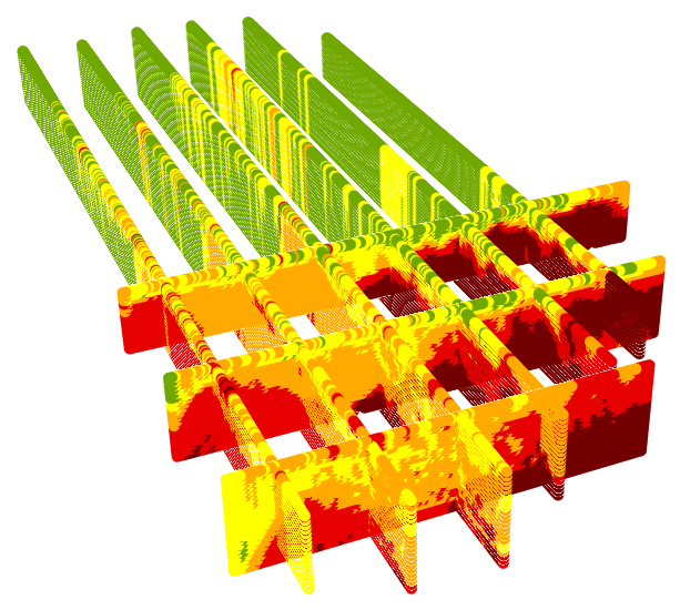
The parallel fences generated in the X and Y directions by two separate runs of the Parallel Fences tool.
Note:
The 3D Fences Toolbox was updated Feb 28, 2017. This article introduces and discusses a geoprocessing toolbox that can perform geostatistics on vertical slices of three dimensional point clouds.
Click here to download the toolbox.For years the users of ArcGIS and its Geostatistical Analyst extension have been able to perform sophisticated geostatistical interpolation of the data samples in two dimensions. With that, the creation of continuous maps of any phenomenon that was measured only at selected locations was feasible. With the growing popularity of analysis in 3D and the availability of 3D data, the necessity of an option to perform geostatistics on 3D data is in demand. Studies of atmospheric cross-sections, geologic profiles, and bathymetric transects became an integral part of GIS. In each one of these three classical elements (air, earth and water), we can measure natural phenomena, such as the gradient of air temperature, the content of an ore at various depth of the geologic strata, or the salinity of the ocean along adjacent vertical transect lines.
In GIS we analyze not only the natural phenomena, but also those that are man-made. Human impacts on air, earth, and water are also measured. Among those human contributions to the environment that could be analyzed in 3D are plumes of air pollution and oil spills. The later may migrate down in the ground and be moved by the ground water drift, or migrate from the bottom of an ocean up to its surface while sometimes being dragged by ocean currents. Having an insight into such occurrences can greatly increase our understanding of the phenomena. This was the motivation for creating the
3DFences Toolbox.
A
slice is a vertical subset of the 3D data analogous to a slice of bread from a loaf. While typically narrow in one dimension it still is a 3D object. A
fence is a 2D representation of a slice of 3D data. All points which belong to a slice are projected, or pressed onto a 2D plane. The term of a fence diagram, or a fence, is used in geology to illustrate a cross section of geologic strata generated from an interpolation of the data coming from a linear array of vertical drillings. The equivalent of a fence in the atmospheric sciences is usually referred to as a
curtain.
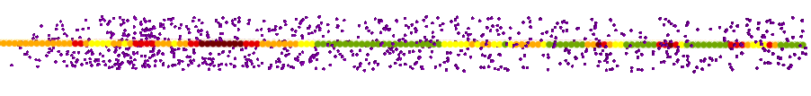
Top view of a slice of points shown in purple, and the resulting fence presented as a colored line in the center of the input points.
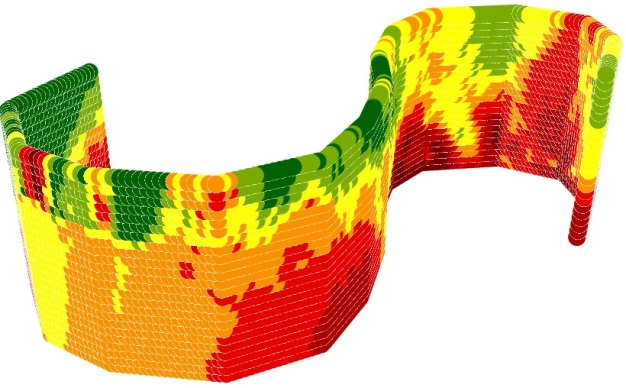
Side view of the input slice points located on one side of the resulting fence. The points are the measurements of oil in sea water after an oil spill.
To be explicit, the tools in the 3D Fences toolbox do not perform 3D interpolation. The approach offered by the 3DFences Toolbox does not implement geostatistical analysis directly on the vertical slices of the 3D data. Instead, the tools transform a slice of the 3D data, with its X, Y, Z, and the measure of a phenomenon component by rotating it by 90° to a horizontal 2D plane. The geostatistical interpolation method of
Empirical Bayesian Kriging (EBK) is performed on these points producing either the geostatistical surface of Prediction, which is a continuous map of the concentration or intensity of something, or a map of the Prediction Standard Error, which can be explained as a map of a degree of confidence in the Prediction map at each location of the map. The resulting output is converted to a point dataset where the points represent the interpolated value at the center of the raster cells. The points are then placed back into the original coordinate space as a regular matrix of points resembling a fence. The fence is positioned in the center of the selected points of the initial slice, when displayed in ArcScene or ArcGIS Pro. The raster is converted to a point dataset because ArcGIS does not currently support display of raster data as a vertical plane and point symbology options provide added flexibility in displaying results.
Any of the ArcGIS standard or geostatistical point interpolation tools could have been implemented in the tools. For the prototype, we have chosen the Empirical Bayesian Kriging (EBK) geostatistical method known for its best fitting default parameters and accurate predictions.
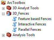
The
3DFences toolbox consists of three separate tools to support different methods of generating fences. The
Parallel Fences tool can generate sets of parallel fences in the directions that are related to either longitudes, latitudes or depths. In other words, the output sets of parallel fences stretch from N to S, W to E, or through the Z dimension. The number of these fences in each set is determined by the user. All of the tools support selection sets to create fences from a subset of sample point features.
A fence created along digitized "S" shape.
The
Interactive Fences tool can generate fences based on lines digitized on the map. The user sets the buffer distance from the digitized line. All points that are located within the buffer will be used for the geostatistical analysis. The user may digitize multiple lines and even self-intersecting lines with many vertices. The third tool, called
Feature based Fences, creates fences based on existing features in a polyline feature. In this case the fence shape is determined by the existing feature(s) and extends through the Z dimension of the selected sample points. As an example, it might be applied to investigate for oil leaks above an oil pipeline placed on the sea floor.
All of the tools contain options enabling the user to determine the minimum number of sample points and fence size required to generate a reasonable geostatistical surface. The tools are also time aware. If the sample data contains a date-time field and the option is enabled, a fence will be generated for each time interval if the samples for that interval and location meet the minimum requirements set by the user. The resulting fences representing consecutive time windows are positioned at the same locations. Thus, to enable better visual analysis, these should be displayed as time animations.
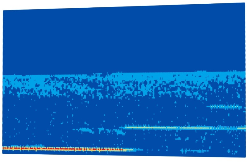
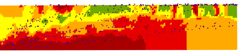
An example of an atmospheric curtain created from backscatter data acquired by NASA from its Calipso satellite orbiting at 32 km above the Earth's surface.
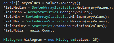 There are lots of statistics libraries available for .NET. I was looking for something simple, reliable, and free. Some research led me to the
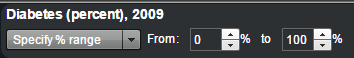

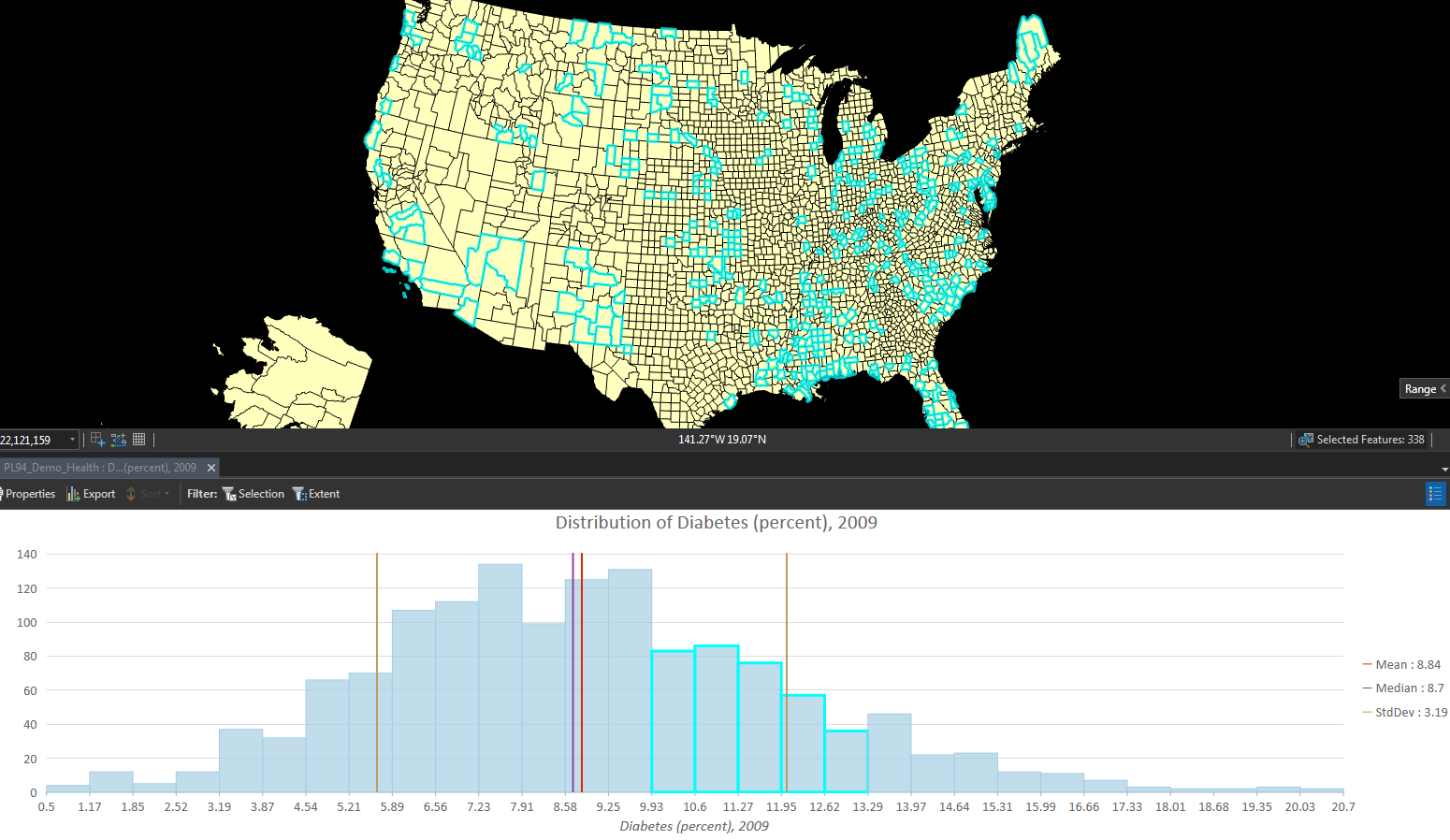
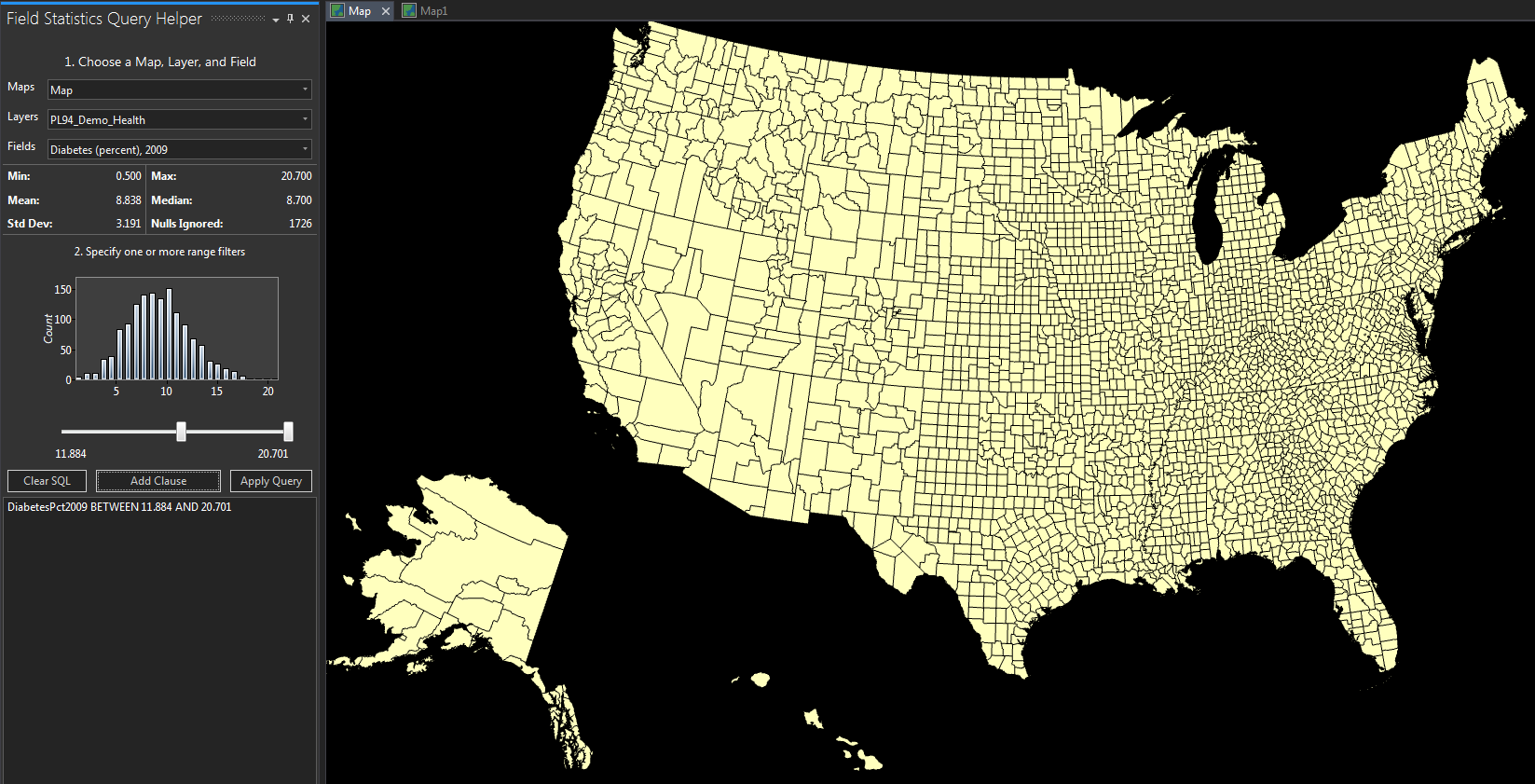
 I'm currently working on a new add-in toolkit for ArcMap 10.4 to analyze and display rates of disease occurrence in a map. This is a work-in-progress and I will provide more details about it in the coming months. But in the meantime I want to share with you the result of a smaller project that was borne out of the disease mapping project.


