Image services are not only for serving imagery; they can also perform dynamic pixel-level analysis on multiple overlapping raster datasets using chained raster functions. Image services deliver blazing fast performance with pre-processed source imagery, especially when it is served from a tile cache. Dynamic image services, on the other hand, may not respond as quickly because of the additional processing demands they place on the server. High performance is important for dynamic image services because the data is re-processed automatically each time the user pans or zooms the map. Dynamic image services typically produce sub-second responses for simple types of analysis. But more complex analysis may take much longer depending on the complexity of the processing chain and the number of input datasets involved. How can we get better performance in those situations? To answer that question I ran a series of tests to see how the following factors affect the performance of dynamic image services:
- Map scale and source data resolution
- Source data format and compression
- Project on-the-fly
- Request size
In this article I present the results of those tests along with some suggestions for maximizing performance. My testing machine is a desktop computer running Windows 7 SP1 and ArcGIS 10.2.1 with 18GB of RAM and a quad-core Intel Xeon W3550 processor running at 3 GHZ. The test data was stored on an otherwise empty 2 TB SATA hard drive that I defragmented and consolidated prior to testing. The tests were configured to determine the average response times of services under various conditions. By “response time” I mean the time it takes a service to retrieve the source data, process it, and transmit an output image. Transmission time was minimized by running the testing application directly on the server machine.
This information is written with the intermediate to advanced GIS user in mind. I assume the reader has a general understanding of image services, raster data and analysis, raster functions, geoprocessing, mosaic datasets, map projections, and map service caching.
Map Scale and Source Data Resolution
The pixels that are processed for analysis by dynamic image services are generally not identical to the pixels stored in the source datasets. Instead, the source data pixels are first resampled on-the-fly to a new size based on the current scale of the map. This formula shows the relationship between map scale and resampling size when the map units of the data are meters:
Resampled pixel size = map scale * 0.0254/96
The resampled pixel size is analogous to the “Analysis Cell Size” parameter in the Geoprocessing Framework and is sometimes referred to as the “pixel size of the request”. As you zoom out to smaller map scales, the resampled pixel size increases until eventually the service resamples from the pixels in the pyramids. Resampling from pyramids helps to keep the performance of the service relatively consistent over a range of map scales.
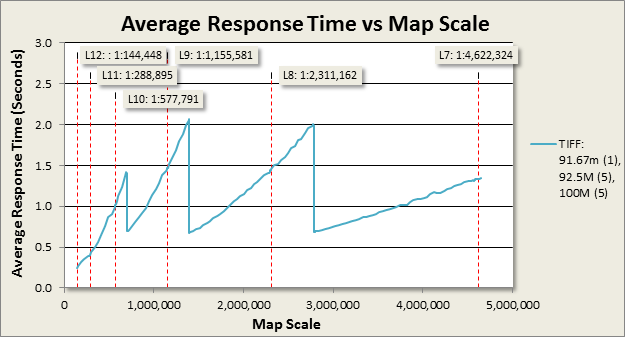
Chart 1. Performance of an image service that performs a binary overlay analysis over a range of map scales.
Performance still varies depending on map scale and typically looks similar to chart 1. I generated these results using an application configured to simulate a single user panning the map 100 times in succession at specific map scales. The chart shows the average time the service took to process and transmit the output images for different map scales. This particular service was configured with a raster function template to perform a binary overlay analysis on eleven overlapping rasters in a mosaic dataset. The pixel sizes of the source datasets ranged from 91.67 to 100 meters. The raster function template was configured to return a binary result, where each output pixel is classified as either “suitable” or “unsuitable” based on the analysis parameters.
Take a look at the three points along the horizontal axis where the response time drops abruptly. At those map scales the resampled pixel size is the same as the pixel sizes of the pyramids in the source data. The processing time for resampling is the lowest at those scales because there is nearly a 1:1 match between source data pixels and resampled pixels. Client applications which use this particular service will see dramatically faster response times if they are limited somehow to only those scales. One way to do this is to use a tiled basemap layer. Web mapping applications which use tiled basemaps are generally limited to only those map scales. The most commonly used tiling scheme is the ArcGIS Online/Bing Maps/Google Maps tiling scheme (referred to hereafter as the “AGOL tiling scheme” for brevity). The red-dotted vertical lines in the chart indicate the map scales for levels 7 – 12 of this tiling scheme. Unfortunately those scales are not very close to the scales where this service performs it’s best. There are two options for aligning source data pixels and tiling scheme scales:
- Build a custom basemap with a custom tiling scheme that matches the pixels sizes of the data.
- Sample or resample the data to a pixel size that matches the tiling scheme of the basemap.
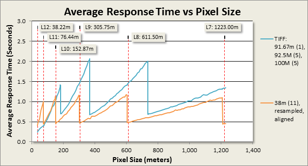
Chart 2. Performance of the binary overlay analysis service with different source data pixel sizes
The horizontal axis in chart 2 represents the "pixel size of the request" rather than map scale as in chart 1. The orange graph shows the response times of another service configured identically to the first one in blue, except it uses source datasets that were up-sampled to 38 meter pixels using the Resample geoprocessing tool. Up-sampling to 38 meters aligned the service’s fastest response times with the AGOL tiling scheme scales, which resulted in a significant decrease in processing time at those scales from approximately 1.5 seconds to about 0.5 seconds. Furthermore, notice that performance is improved at nearly all scales except for the very largest. This is most likely due to having all the source data at the same resolution (38m) instead of three (91.67m, 92.5m, 100m), and/or because the source data pixels are also aligned between datasets (accomplished by defining a common origin point for each resampled raster using the “Snap Raster” environment setting).
Admittedly, using the Resample tool to prepare data for analysis is not ideal because it results in second-generation data that is less accurate than the original. This may be perfectly acceptable for applications intended to provide an initial survey-level analysis;however, it’s best to generate new first-generation data at the desired pixel size whenever possible. For example, if you have access to land-class polygons, you could use them to generate a new first-generation raster dataset at the desired pixel size using the Polygon to Raster tool, rather than resampling an existing land-class raster dataset.
To determine by how much performance improved with 38 meter pixels, I calculated the percentage change in average response times for each scale and averaged the values over multiple scales.
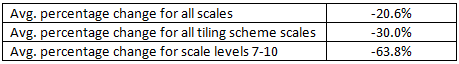
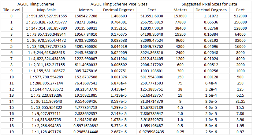
Up-sampling the source data to 38 meter pixels reduced response times by 63.8% at the poorest-performing -target map scales! 38 meters was not my only option in this example. I could have chosen a size that corresponded to one of the other tiling scheme scales. The following table lists all the map scales of the AGOL tiling scheme, and the corresponding pixel sizes in units of meters, feet and Decimal Degrees. The three columns on the right provide suggested values for sampling raster data. These suggestions are not set in stone. It’s not necessary to sample your data to exactly these recommended sizes. The key is to choose a size that is slightly smaller than one of the sizes of the target tiling scheme scales.
Map Scales and Pixel Sizes for the ArcGIS Online/Bing Maps/Google Maps tiling scheme
By the way, matching the pixel sizes of your data with a basemap tiling scheme is also useful for workflows that involve static imagery overlaid onto a tiled basemap. For those cases, you can build mosaic dataset overviews for viewing at smaller scales instead of raster pyramids. One of the great things about mosaic dataset overviews is that you can define the base pixel size of overviews as well as the scale factor to match your target tiling scheme. This way you don't have resample the source data to a new base pixel size in order to cater to any particular tiling scheme.
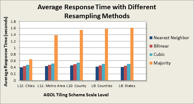
Resampling Method
The resampling method specified for an image service request also has an impact on performance. The choice of which one to use should be based primarily on the type of data used in the analysis. Chart 3 shows the performance of the binary overlay analysis service (with 38 meter data) with different resampling methods.

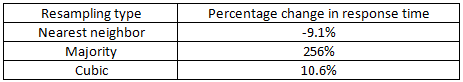
Chart 3. Response times of the binary overlay analysis service with different resampling methods
Bilinear resampling is the default method. Here is how the response times for the other methods compared to bilinear averaged over the five map scales tested:
Raster Format
The storage format of the data can have a huge impact on performance. For example, the response time of the binary overlay analysis service averaged over all map scales was 36% lower when the data was stored in the GeoTIFF format versus file geodatabase managed raster. The Data Sources and Formats section of the Image Management guide book recommends leaving the data in its original format unless it is in one of the slower-performing formats such as ASCII. GeoTIFF with internal tiles is the recommended choice for reformatting because it provides fast access to the pixels for rectangular areas that cover only a subset of the entire file.Pixel Type and Compression
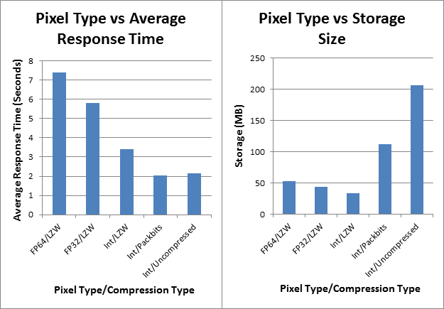
The pixel type determines the precision of the values stored in the data and can have a huge impact on performance. In general, integer types are faster than floating-point types, and lower-precision types are faster than higher-precision types. Compression of imagery can potentially increase or reduce performance depending on the situation. For more information about the affect of compression on file size refer to the Image Management guide book section on Data Sources and Formats. To assess the impact of pixel type and compression on the performance of data stored on a local hard drive, I tested a group of image services configured to perform an extremely intensive overlay analysis on 15 raster datasets. The services were configured identically except for the pixel and compression types of the analysis data. The tests were run at the map scale corresponding to the pixel size of the data.

Charts 5 & 6. Avg. response time and storage size vs. compression type for an image service that performs a complex overlay analysis
The following table shows the percentage change in response times with the reformatted datasets versus the original double-precision floating-point dataset.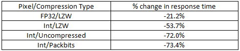
On-the-fly Projection
On-the-fly projection is a very important feature of the ArcGIS platform. It has saved GIS users like me countless hours of work by eliminating the need to ensure that every dataset in a map is stored in same coordinate system. However, in some cases this flexibility and convenience may be costly when ultra-fast performance is required. The following chart shows one of those cases.
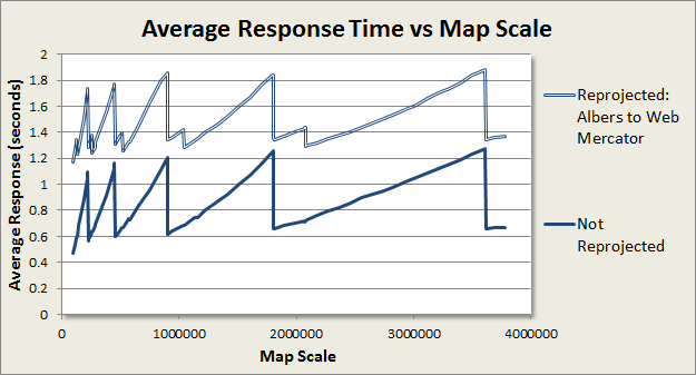
Chart 8. Performance of a dynamic image service configured to perform a weighted overlay analysis.
Chart 8 shows the performance of a service which performs a weighted overlay analysis on six datasets in an Albers projection. The upper graph shows the performance when the output of the service is set to Web Mercator (Auxiliary Sphere). The lower graph shows the performance when the output of the service is the same coordinate system as the data. Performance without reprojection to Web Mercator improved by an average of 45% over all map scales. This is a fairly extreme example. The performance cost of reprojection is related to the mathematical complexity of the input and output projections. Equal-area projections such as Albers are mathematically complex compared to cylindrical projections such as Mercator. I have not run tests to prove this, but I expect that the performance cost of reprojection between two cylindrical projections such as UTM and Web Mercator would be less costly than seen in this example, and that a simple projection from geographic coordinates to Web Mercator would be even less costly.
To avoid on-the-fly projection you must ensure that all of your data is in the same coordinate system, including the basemap. Most of the basemap services currently available from Esri on ArcGIS Online are in Web Mercator (auxiliary sphere). So if you are going to use one of those basemaps, you would have to convert your data to the same coordinate system. This can be an acceptable solution for some situations, but keep in mind that it results in second-generation data with less positional accuracy than the original source data. Alternatively, you can create your own basemap in the same coordinate system as your data, and either publish it to an ArcGIS Server site or upload it to ArcGIS Online as a hosted map service. If you take this approach, I recommend caching the basemap using a custom tiling scheme with scale levels that match the pixel sizes of your data.
Request Size
Request size is directly related to the size of the map window in the application and is specified in the REST API as the number of rows and columns of pixels in the output image. To measure its impact on performance, I ran a series of tests at different request sizes on the weighted overlay analysis service that I used for the reprojection-on-the-fly tests. I measured the average response times for request sizes ranging from 400x400 to 2200x2200, increasing at 100 pixel increments (e.g. 500x500, 600x600, etc…). All of the tests were run at the map scale of 1:113386, which corresponds to the 30 meter pixel size of the source raster datasets.
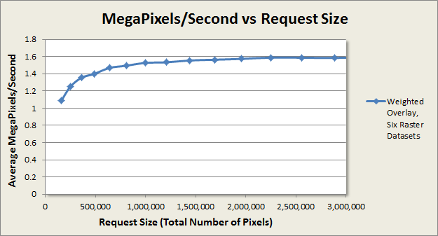
Chart 9. Average response in MP/s for different request sizes for the weighted overlay service.
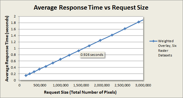
Chart 10. Average response time at different request sizes for the weighted overlay service.
Chart 9 shows that the throughput for this service levels off at a request size of approximately 1000x1000 pixels to about 1.5 – 1.6 MP/s. Chart 10 shows that request size has a linear impact on performance. This service is capable of providing sub-second response times for requests up to about 1,440,000 pixels, or a request size of 1200x1200.
Summary
Raster analysis can involve many stages of data processing and analysis. Complex on-the-fly processing chains can place heavy processing loads on a server and contribute to sluggish performance. Huge performance improvements can be achieved in some cases by pre-processing the data into a more efficient format for resampling and on-the-fly processing.
For applications which use tiled basemap layers, the greatest performance improvements are likely to be achieved by aligning the pixel sizes of the data with the scales of the basemap tiling scheme. The section “Map Scales and Source Data Resolution” describes the theory behind this approach and provides a table with recommended pixel sizes for applications which use basemaps with the ArcGIS Online/Bing Maps/Google Maps tiling scheme. Alternatively, developers can build basemaps with custom tiling schemes to align with the existing pixel sizes of the analysis data.
Another way to significantly reduce the processing load on a server in some cases is to avoid on-the-fly projection of the analysis data. This is accomplished by ensuring that the basemap and the analysis data are in the same coordinate system. The performance impact of on-the-fly projection varies depending on the input and output coordinate systems and is discussed in the section titled “On-the-fly Projection”.
The file format, pixel type, and compression type of the analysis data can also have a huge impact on performance. GeoTIFF with internal tiles is recommended for situations where it’s necessary to re-format the data from a slower format. Lower-precision pixel types give better performance than higher-precision types. Pixel compression has the potential to either increase or decrease performance depending on the how the data is stored and accessed by the server. These topics are discussed in the sections titled “Raster Format” and “Pixel Type and Compression”.
Client applications can also play a role in dynamic image service performance. Service response times are the lowest when applications specify nearest neighbor resampling, followed by bilinear resampling. And there is a direct relationship between service performance and the size of the map window in an application. These topics are discussed in the sections titled “Resampling Method” and “Request Size”.


