- Home
- :
- All Communities
- :
- Industries
- :
- Education
- :
- Education Blog
- :
- Teaching international migration with Spatial Tech...
Teaching international migration with Spatial Technology
- Subscribe to RSS Feed
- Mark as New
- Mark as Read
- Bookmark
- Subscribe
- Printer Friendly Page
Teaching international migration with Spatial Technology: Introduction.
Why teach about migration? Migration is inherently a geographic issue. It touches on themes of physical geography (such as climate and landforms), cultural geography (political systems, political instability, political boundaries, demographic trends past and present), sociology (perception, push and pull factors), and many more. It changes over space and time and is an excellent way to teach spatial concepts and skills. Since the dawn of humankind, migration has always been present; thus, it ever remains a current issue. It is also relevant, causing deep and long-lasting changes in culture, language, urban forms, food, land use, social policy, politics, and much more. Migration is a global issue that affects our everyday lives. It also impacts the formation, change, and rate of change of cultural regions. It is also a personal issue, because each of us has a migration story to tell about our own ancestors and families.
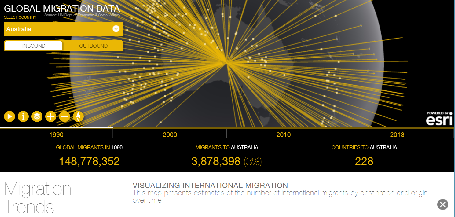
Begin investigating migration with the International Migration Map. One of the maps in the Esri Coolmaps gallery enables you to visualize migration data over time and space in a 2D and 3D tool that is a powerful and effective tool but yet is responsive in a web browser.
Open the map. The map opens in 3D mode and in Play mode, showing a set of data for selected countries (the UAE, Mexico, China, and Singapore during the 1990s, 2000s, 2010, and 2013. This selected set provides a good introduction for teaching about the patterns, relationships, and trends in the data. The time periods are shown below the lower part of the map, with the out-migration and in-migration available for each of the four time periods. The thickness of the lines coming out from or going to each country selected indicates the amount of migration, and the end points of each line indicates the countries sending people to or receiving people from each country. For each country, the raw number of out- and in-migrants is indicated, along with the percentage of that country’s total population for each time period.
After viewing the introductory data, use the “pause“ button to stop the Play mode and to select among the list of the world’s countries. The capability of selecting countries and time, the cartography, and the ability to switch between 2D and 3D combine to make this a useful teaching and research tool.
Teaching with the international migration map. In keeping with our Module theme, ask, “Where did the data come from? Can you trust it?” In this case, the data came from the United Nations Trends in International Migrant Stock: The 2013 Revision is provided by the UN Department of Economic and Social Affairs. Use the “i” button to go to the data’s source. Encourage students to investigate the data at its source, and to study how and when it was collected. According to this data set, how long does a migrant have to live in a country before he or she is no longer considered a “migrant”?
Use this map to help them understand migration patterns and number. As elsewhere in this Module, this map could serve as an excellent supplement to other sources that you may use. For example, ask, “How has Australian immigration changed in amount and in the countries sending migrants to Australia over the past 25 years? What are some of the social and political changes that are occurring in the country with the changes in migration? What do you think Australia will be like in 25 years if current trends continue?” These questions illustrate that the visualizations help students understand geographic phenomena, but can also be used in tandem with other sources – such as journal and newspaper articles, the US Census Bureau’s international database, ArcGIS maps and story maps from Esri, and other resources that could shed light on the topic, changes in demographics in cities and rural areas, and much more.
Teaching with maps often confirms certain hypotheses and preconceived notions and yet shatters others. For example, observe the high percentage of Reunion Island’s population moving to the USA. Is it part of climate-induced sea-level rise migration? The number of countries that sent people to Somalia is small, and the number of countries receiving Somalians somewhat higher. But discuss with students: What keeps most of the population in Somalia, given ongoing political, health, and economic challenges? Consider financial resources required to move, and sense of place.
Focus part of the investigation on Australia (or another region of interest). If the 3D interferes with teaching rather than enhances it, the 2D, particularly for countries like Australia with long international migration patterns, might be more effective. Note that Australia has one of the highest percentages of migrants living there of any country over 10 million people, at nearly 50% of the total population. Has Australia’s in-migration changed over time in terms of country of origin? If so, how? Has Australia’s out-migration patterns changed over time? If so, how and why? What will the pattern look like in 25 years?
Now let us build on the knowledge and skills gained from the international migration study to examining inter-state migration within Australia.
Teaching about Australia inter-state migration with ArcGIS. Let’s explore one more lesson to supplement the international migration activity you just completed.
Open the interstate activity and map, and begin investigating. Start with the Esri Australia library of lessons here: https://esriaustralia.com.au/gis-for-schools/learning-materials and select Australia’s interstate migration. You should now be at the following location, a PDF lesson document: https://gis-for-schools.maps.arcgis.com/sharing/rest/content/items/26cb3a5051d448ee8e21ebdfc4646657/.... Open the URL of the web map identified in the PDF: https://gis-for-schools.maps.arcgis.com/home/webmap/viewer.html?webmap=dbeddd602255495cbcd44703f535a...
The lesson begins with a discussion you can have with your students about push and pull factors influencing where people moved from and where they moved to among states in Australia. Using data from the Australian Bureau of Statistics from 2017, begin by examining the map layer indicating where people moved to. At this point, the map will look similar to the following:
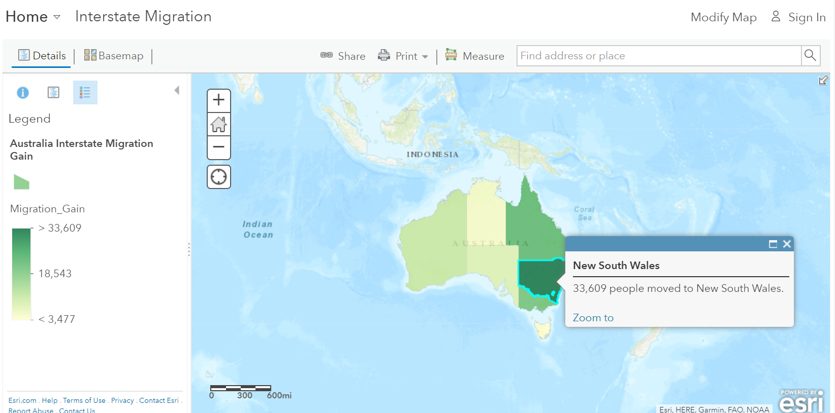
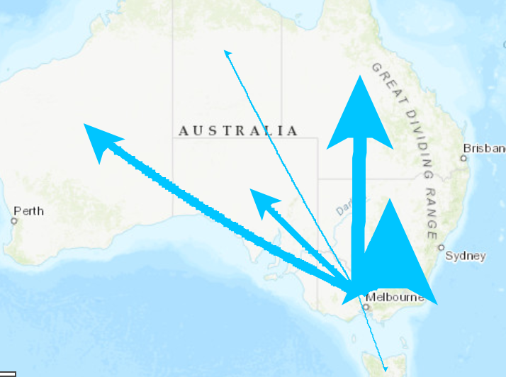
By working through the lesson, and examining population gain, loss, net migration, and movement (for example, movement from Victoria, below), you are integrating mathematics, history, economics, and technology with geography. Did any of the interstate migration patterns surprise you? What would you like your students to gain from the use of this lesson? How could interstate migration change over the next decade? Considering the international migration activity you completed in the last section, how does international immigration and emigration affect state-by-state population change?
Digging Deeper with ArcGIS by extending the lesson. Like the other lessons in this gallery, neither you nor your students need to log in to use the lesson, but with the skills you already have gained in Spatial Technology, you know that you can log in if you choose, which will allow you and your students to save the map, add additional data layers to the map, and share the map.
You must be a registered user to add a comment. If you've already registered, sign in. Otherwise, register and sign in.
-
Administration
90 -
Announcements
88 -
Career & Tech Ed
1 -
Curriculum-Learning Resources
288 -
Education Facilities
24 -
Events
78 -
GeoInquiries
1 -
Higher Education
620 -
Informal Education
286 -
Licensing Best Practices
102 -
National Geographic MapMaker
44 -
Pedagogy and Education Theory
243 -
Schools (K - 12)
282 -
Schools (K-12)
311 -
Spatial data
40 -
STEM
3 -
Students - Higher Education
261 -
Students - K-12 Schools
149 -
Success Stories
45 -
TeacherDesk
1 -
Tech Tips
130
- « Previous
- Next »