- Home
- :
- All Communities
- :
- Industries
- :
- Education
- :
- Education Blog
- :
- Mapping Real-time Air Quality Data: Using the Purp...
Mapping Real-time Air Quality Data: Using the PurpleAir API with Velocity
- Subscribe to RSS Feed
- Mark as New
- Mark as Read
- Bookmark
- Subscribe
- Printer Friendly Page
Modern GIS is about dynamic, real-time data. Static data is important… but there should be more focus on skills and experience with ‘living’ datasets.
When I looked around for datasets to test; querying, visualizing, analyzing, and archiving real-time air quality data sounded like a good plan to me. If you are not familiar with PurpleAir – they build air quality sensors that private and public entities have deployed across the globe. They also provide an API that lets users send data requests to poll their sensors.
In this blog – I wanted to run through how I configured ArcGIS Velocity to read the PurpleAir API and then built a dashboard from the data feed (along with historical information!) that can then be combined with your own data, or anything in the Living Atlas.
In my short example – I wanted look at real-time air quality and pull in historical redlining data. Then, I added US Census American Community Survey (ACS) data related to poverty.
Overall, the ease of use of the ArcGIS Velocity feed configuration, as well as the amazing documentation in the PurpleAir API (as well as the wealth of data) made this a really fun project.
PurpleAir Maps and Data
First off, thanks to the folks at PurpleAir for their great API and sensors. I have no affiliation with PurpleAir other than an interest in getting their data mapped!
The PurpleAir website includes a map to explore sensor locations and data fields.
The map shows all of the sensors that have been marked as ‘public’, thereby letting anyone see the data getting captured across the world for all of these sensors… it’s an amazing dataset. Based on the PurpleAir documentation, these sensors are recording data every 2 minutes for attributes like air quality, temperature, humidity, etc. (for the full list, just refer to the API documentation).
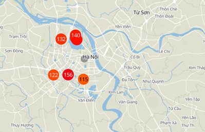
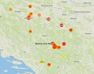
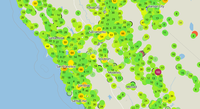
Here are a couple screen shots from the PurpleAir map:
Vietnam...
Bosnia...
California...
PurpleAir API – Getting Started
To get started, you need to send an e-mail request to PurpleAir for an API Key – once you have a key, you can send READ and WRITE requests to the API. You’ll need an API key to do anything going forward from here.
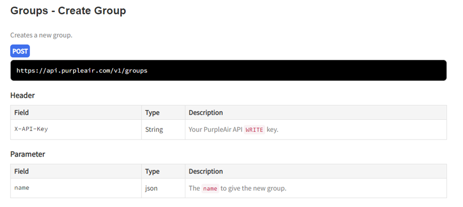
The first thing that I needed to do (the best practice in the API), was to create a group, and then add sensors to that group. In that way, I could send one request to poll multiple sensors. In my use case, I wanted to get all of the data for New Haven, CT sensors.
After creating the group (which will generate a unique ID for your group, write this down!), you then need to add sensors to that group.
To get the sensor_index for the sensors you are interested in (for a specific geography), you first need to send a request over to the ‘sensors’ API – I ended up using ‘nwlng, nwlat, selng, selat’ to define a bounding box for New Haven.
Here are the bounding box parameters, so you can return the sensor_index IDs for the sensors you actually care about.
After you have your sensor_index values, you can then add them to your group.
You can do this using the ‘Create Member’ POST request. You just need to send over your new group ID and the sensor_index values.
Now, we are ready to build your request to poll the sensors!
Building the Sensor Data Request
We already created a group and added sensors to it, so now we can use the ‘groups’ API to send 1 request and retrieve data for all of the members of that group.
I hope you remembered your group ID!
There are a lot of different attributes that you can return, so make sure you select only those fields that you need, to keep the request more compact.
You will end up creating a comma separated list of fields that you want to send over in the request. In my example, I wanted to poll for these fields:
name, model, hardware, location_type, private, latitude, longitude, altitude, position_rating, uptime, last_seen, last_modified, date_created, humidity, temperature, pressure, pm2.5_alt, pm2.5_alt_a, pm2.5_alt_b, pm2.5
Diving into ArcGIS Velocity
Esri offers 2 different software solutions for real-time data, ArcGIS GeoEvent Server and ArcGIS Velocity. You can read more about both solutions in the links above.
The biggest difference between the 2, is that ArcGIS Velocity is a SaaS solution, whereas GeoEvent Server part of an ArcGIS Enterprise deployment. In my opinion, Velocity is also a bit easier to configure and get up and running. If you want to learn more about Velocity, or getting started with it, there are some great resources here. The rest of this blog will walk through the PurpleAir configuration.
In ArcGIS Velocity, we are going to create a ‘feed’ with the PurpleAir API (with the request we have already built out).
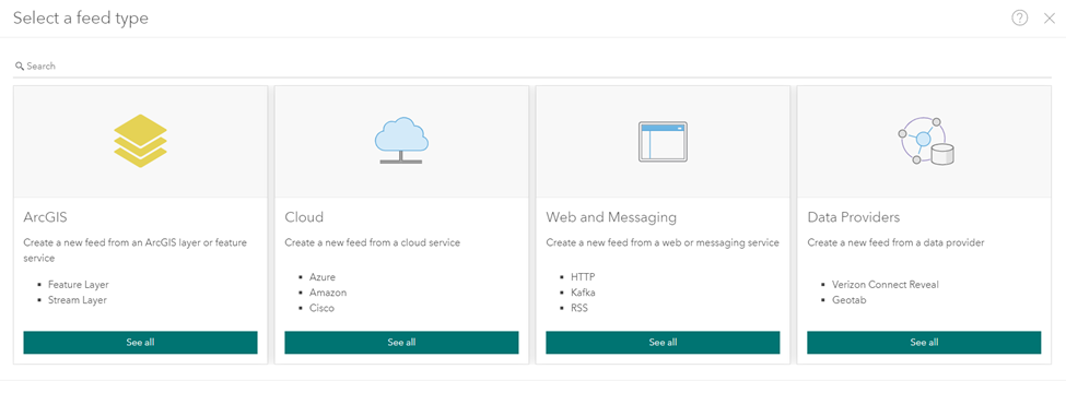
ArcGIS Velocity includes a wide-range of different feed types, for the PurpleAir API, we need to use the ‘Web and Messaging’ type.
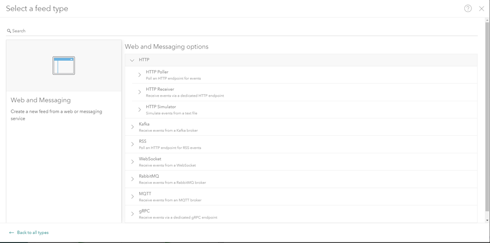
This feed type provides a lot of different options and it’s where you can configure requests to a wide-array of APIs.
To poll the PurpleAir API, we will use the ‘HTTP Poller’.
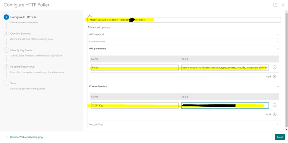
Since we have already know the parameters for our API request, we just need to put them in the right places in the Velocity UI. This includes the URL, the ‘fields’, and the API key.
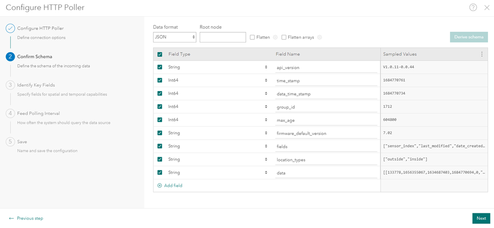
If the request worked, you’ll get a response back that looks something like this:
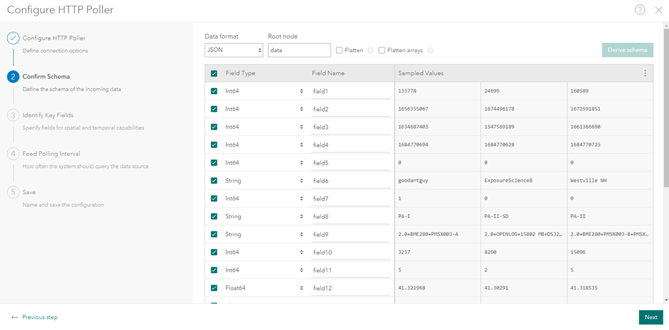
The one issue with this response, is that all of the data for the sensors is found in the ‘data’ field that was returned. This is a place where Velocity makes this really easy. All you need to do is enter in the ‘Root node’ (‘data’ in this case), and then click ‘Derive schema’ to update the field definition.
To make it easier to use your data, you can also provide field names that will be applied in the feature service.
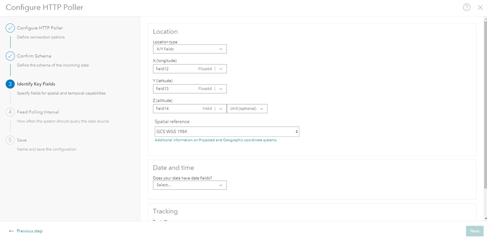
If you set names for your fields, it will be easier for you as you assign the key fields, notably the XY, datetime, and your unique ID.
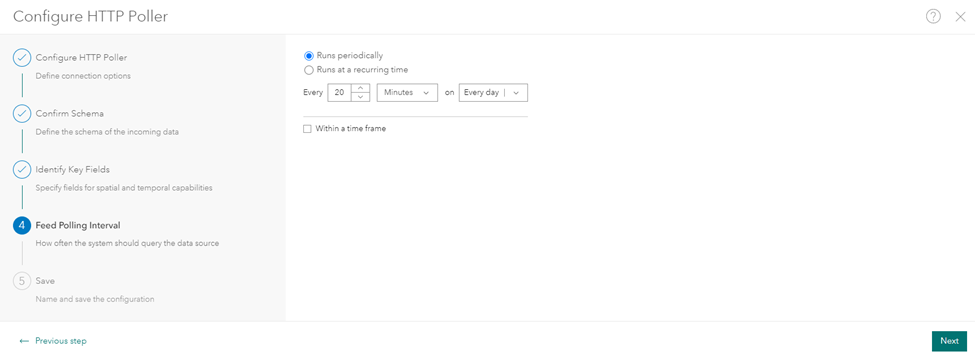
Then we set the interval to send the requests. Make sure that you don’t crush the API with requests! Keep the requests at something reasonable.
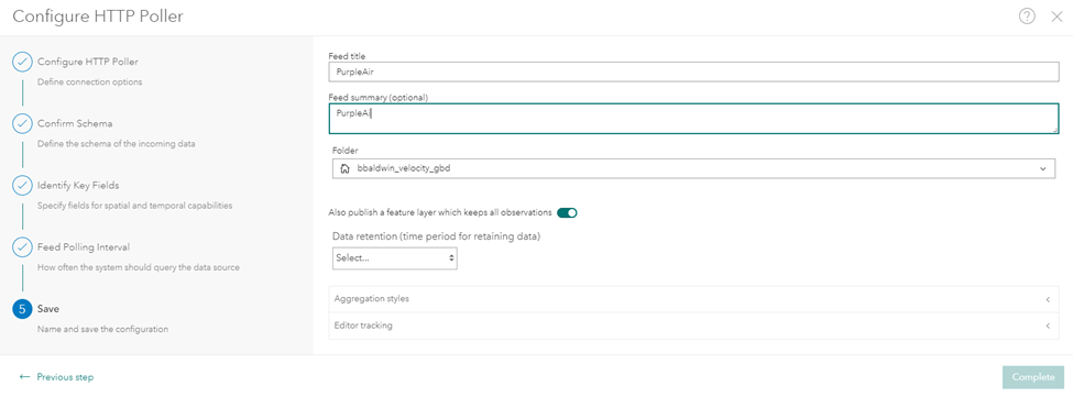
Lastly, give your feed a name and specify if you want to create a feature layer to host all of the observations.
Let’s Map this Stuff!
The last step is simply building out an ArcGIS Dashboard to display all of your data. In my example, I combined the real-time data with some additional layers from the Living Atlas to provide more context.
The one spot that I have been tripped up before, is getting the serial chart to display historical values.
Here's a short video that shows some of the settings.
That's it! Thanks again to the PurpleAir team for their great documentation and API. Check out their API documentation here: PurpleAir API. As always - if you have any questions, or if you get something built out, I'd love to see it.
You must be a registered user to add a comment. If you've already registered, sign in. Otherwise, register and sign in.
-
Administration
80 -
Announcements
80 -
Career & Tech Ed
1 -
Curriculum-Learning Resources
259 -
Education Facilities
24 -
Events
73 -
GeoInquiries
1 -
Higher Education
599 -
Informal Education
281 -
Licensing Best Practices
93 -
National Geographic MapMaker
33 -
Pedagogy and Education Theory
226 -
Schools (K - 12)
282 -
Schools (K-12)
275 -
Spatial data
35 -
STEM
3 -
Students - Higher Education
247 -
Students - K-12 Schools
129 -
Success Stories
36 -
TeacherDesk
1 -
Tech Tips
122
- « Previous
- Next »
