Turn on suggestions
Auto-suggest helps you quickly narrow down your search results by suggesting possible matches as you type.
Cancel
- Home
- :
- All Communities
- :
- Industries
- :
- Education
- :
- Education Blog
- :
- Mapping BioBlitz Field Data in ArcGIS Online
Mapping BioBlitz Field Data in ArcGIS Online
Subscribe
2157
0
03-31-2016 11:59 PM
- Subscribe to RSS Feed
- Mark as New
- Mark as Read
- Bookmark
- Subscribe
- Printer Friendly Page
03-31-2016
11:59 PM
I recently had the opportunity to advise, create, and teach a mini-course to support an NSF-funded project aimed at university students who are underrepresented in STEM, fieldwork, and geotechnologies. This mini-course was in conjunction with Colorado State University, the National Park Service, and the national BioBlitz 2016 initiative.
As I describe in the workshop syllabus, the goals in my portion of the project were to help the university student participants to: (1) Learn what GIS and spatial analysis are and why they matter to society and why they are relevant to this project; (2) Learn how to upload, symbolize, and classify their field-collected data and other data into a web based mapping platform (ArcGIS Online); (3) Learn how to spatially analyze their own field-collected data and other data in ArcGIS Online; and – (4) Learn how to create presentations and web mapping applications, including multimedia maps and storymaps, to communicate the results of their research.
After watching Penn State's Geospatial Revolution Trailer and my Why Get Excited about Web Mapping video, we discussed why GIS is a key part of research, education, and society in the 21st Century. We then worked with my vegetation data that I collected on vegetation types collected with iNaturalist mobile smartphone app and the data that the students had collected during that same week at Bandelier National Monument in New Mexico. We then brought the data into ArcGIS Online, displayed the data by setting styles and popup properties for the insect, plant, and animal species they had documented, created heat maps, walk- and drive-time areas, calculated routes to re-visit the sample points, and created maps showing hot spots. They used the trace downstream tool, created riparian zone buffers around streams, and calculated the number of observations in the riparian zones.
We also worked with some test soil pH data from North Dakota into ArcGIS Online with some additional tools. We mapped elements in the soil (such as Zn, Pb, K, Ph), created map notes, summarized points within specific parameters, and added statistics such as lead--parts per million. We created a new hosted feature layer from the original CSV file so that we could filter the data, selecting points, for example, where the lead parts per million was at least 200. We then calculated a Hot Spot analysis and interpolated a surface of pH values based on that attribute.
Once the analysis was finished, we created web mapping applications, starting with my web maps, apps, and story maps presentation and creating multimedia map notes from my own New Mexico fieldwork at 36, -106 and 35, -106 and 34, -106, but we spent most of our time together in hands-on mode building the storymaps based on their own fieldwork. We focused on creating a Map Tour Storymap, a Side Accordion storymap, and a Map Journal storymap. We then discussed and compared these multimedia maps, and discussed skills learned and how and when to apply them in this BioBlitz project and beyond.
The tools and data within ArcGIS Online supported and complemented the project very nicely, and some of these same techniques can be used by the thousands of people who are expected to participate in the national BioBlitz 2016 initiative in a few months. I look forward to seeing the students' final projects.
How might you and your students be able to map your own field-collected data using these tools and techniques?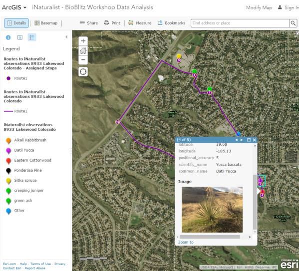

Some of the field data collected in iNaturalist mapped in ArcGIS Online.

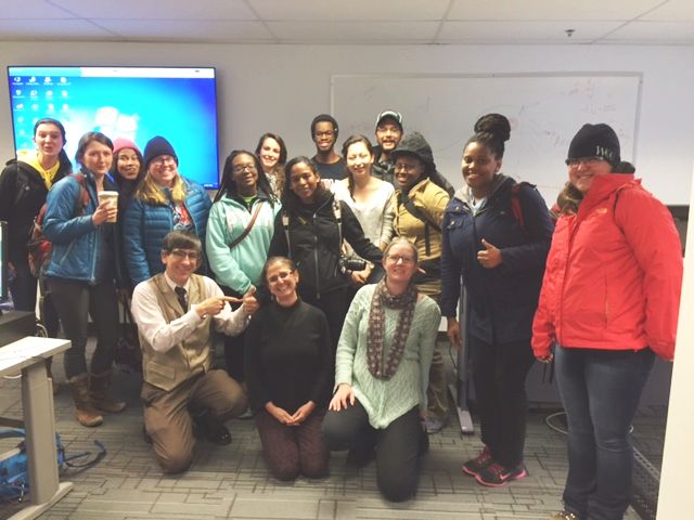
- Some of the university student participants and instructors of the BioBlitz workshop at Colorado State University. The students represented at least 10 universities in the USA and internationally.
You must be a registered user to add a comment. If you've already registered, sign in. Otherwise, register and sign in.
About the Author
I believe that spatial thinking can transform education and society through the application of Geographic Information Systems for instruction, research, administration, and policy.
I hold 3 degrees in Geography, have served at NOAA, the US Census Bureau, and USGS as a cartographer and geographer, and teach a variety of F2F (Face to Face) (including T3G) and online courses. I have authored a variety of books and textbooks about the environment, STEM, GIS, and education. These include "Interpreting Our World", "Essentials of the Environment", "Tribal GIS", "The GIS Guide to Public Domain Data", "International Perspectives on Teaching and Learning with GIS In Secondary Education", "Spatial Mathematics" and others. I write for 2 blogs, 2 monthly podcasts, and a variety of journals, and have created over 6,500 videos on my Our Earth YouTube channel.
Yet, as time passes, the more I realize my own limitations and that this is a lifelong learning endeavor: Thus I actively seek mentors and collaborators.
Labels
-
Administration
90 -
Announcements
88 -
Career & Tech Ed
1 -
Curriculum-Learning Resources
288 -
Education Facilities
24 -
Events
78 -
GeoInquiries
1 -
Higher Education
620 -
Informal Education
286 -
Licensing Best Practices
102 -
National Geographic MapMaker
44 -
Pedagogy and Education Theory
243 -
Schools (K - 12)
282 -
Schools (K-12)
311 -
Spatial data
40 -
STEM
3 -
Students - Higher Education
261 -
Students - K-12 Schools
149 -
Success Stories
45 -
TeacherDesk
1 -
Tech Tips
130
- « Previous
- Next »