Examining Cities using 3D Globes
- Subscribe to RSS Feed
- Mark as New
- Mark as Read
- Bookmark
- Subscribe
- Printer Friendly Page
Examining Cities with 3D Globes. In this activity, let's examine four 3D globes to examine population past, present, and future, considering population distribution and pressures in different regions of the world.
What are 3D globes and scenes? Because we live in a 3D world, it makes sense that there is increasing interest in modeling the world using GIS in 3D—the land surface, under the oceans, inside buildings, or along a streetscape in a city, and even for 3D representations of traditional 2D data such as to visualize proposed new developments, determine which areas of Melbourne will be in building shadow at certain times of day, study population (as you will examine in this activity), distance to transit routes, bicycle races, realistically rendered buildings on satellite image basemaps in Wellington, or even the view from the Melbourne Star observation wheel! The Government of Queensland, for example, created Queensland Globe that allows citizen access to hundreds of spatial data layers on the state’s roads, property and land parcels, topography, mining and exploration, land valuations, natural resources (vegetation, water, soil, and others), and more.
The following 3D globes were created with JavaScript, Python, and HTML—the same tools that are powering much of the GIS that people are using on a daily basis. 3D scenes and globes are web mapping applications: As applications, cannot alter them in any way, but they are incredibly useful in education. Indeed, you can build your own 3D scene in ArcGIS Online.
Investigating the world’s 27 largest cities using a 3D globe. Examine the following 3D globe of the World’s biggest cities: https://ralucanicola.github.io/JSAPI_demos/cities-globe/ This was created by my amazing colleague, Raluca Nicola.
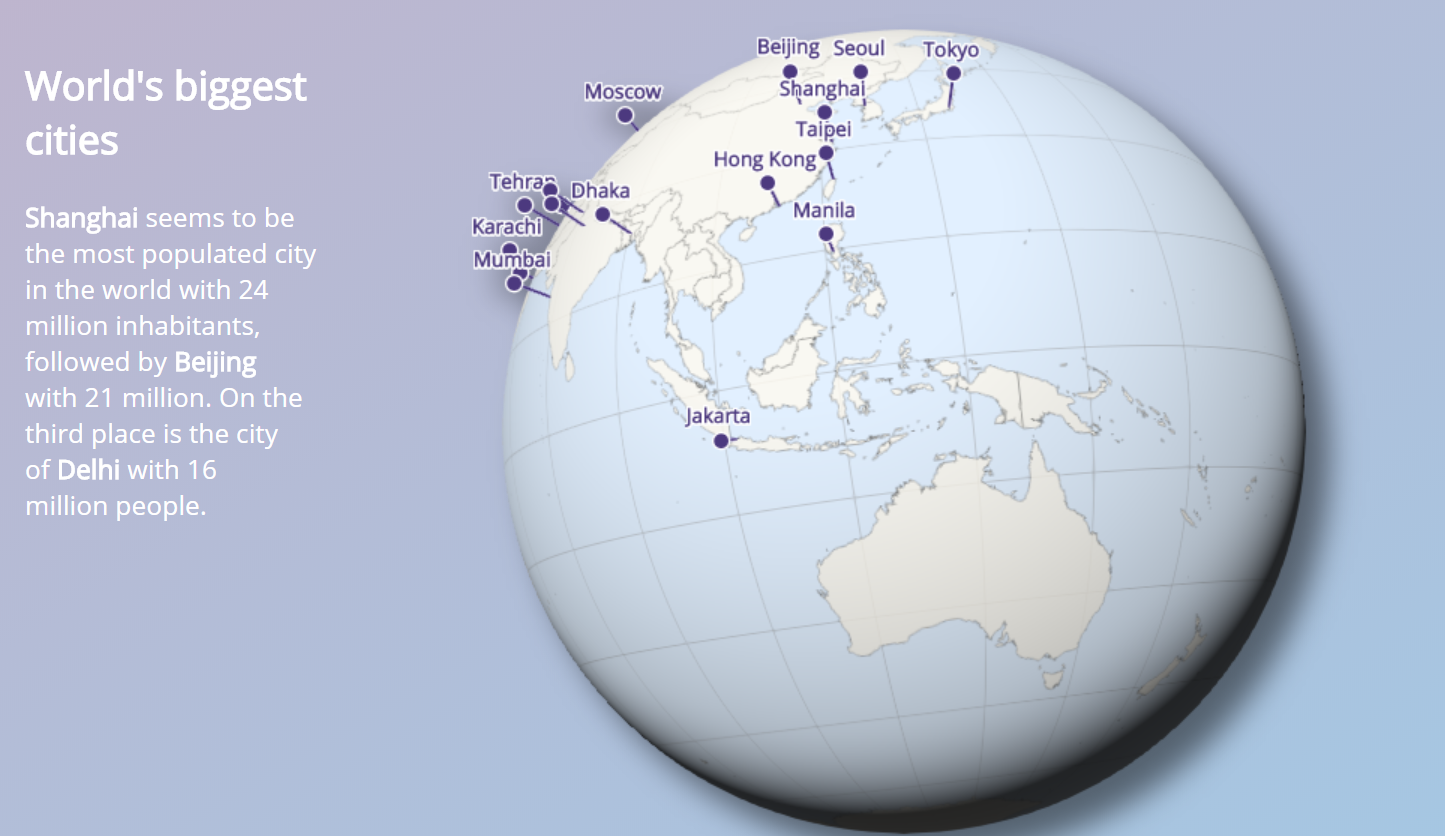
What do you notice about the pattern of these cities? How many of these are along coasts? What are the implications of these coastal cities? How many are in the northern vs the southern hemisphere? The eastern vs the western hemisphere? The data for this globe uses metropolitan population rather than the central city or incorporated area alone. Does it surprise you that none of the world’s 27 largest cities on this list are in Australia? Which is the closest city on this globe to Australia? To where you live?
Investigating the 600 largest cities of the world. Examine the following 3D globe that contains the 600 largest world cities from 2015, from United Nations data:
http://www.arcgis.com/home/webscene/viewer.html?webscene=b1d6e89b250a4d72990312befd7bffa5
In this globe, the cities are symbolized as graduated symbol—the size is based on the city population. Click on a few cities and note past, present, and future population for each. Pan and tilt the globe so that Australia and southeast Asia are visible. Which 5 cities in Australia made the “list of 600” major cities?
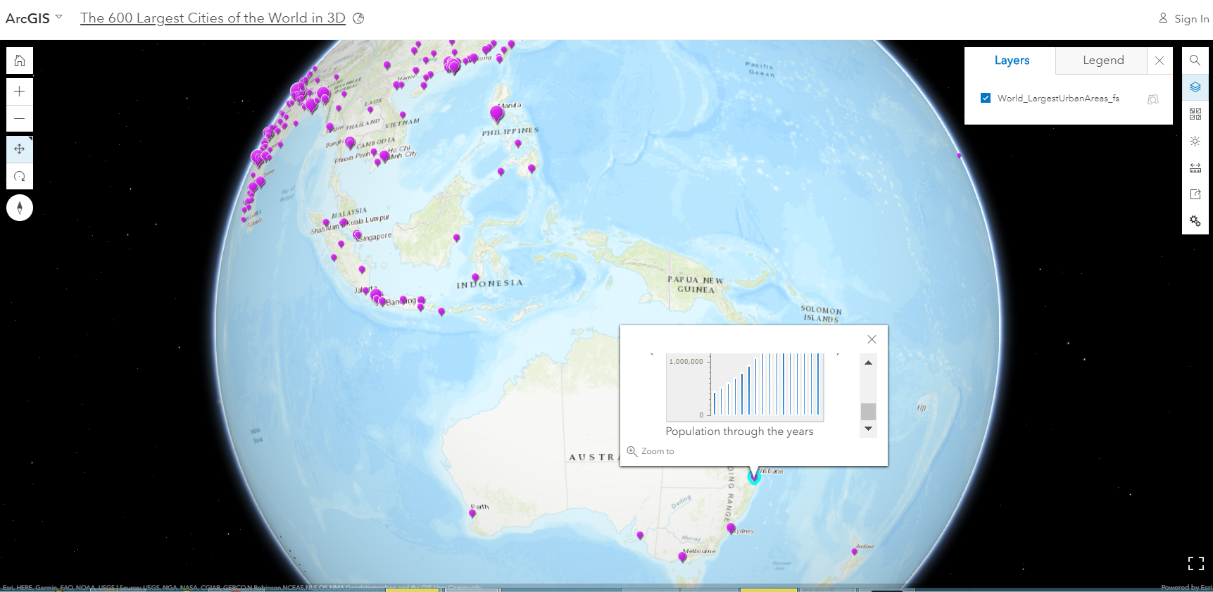
Click on Brisbane and hover over the resulting histogram, analyzing change over time. Based on your knowledge of global population trends, find a city where the population is increasing less rapidly by percentage than for Brisbane. Find a city where the population is increasing more rapidly by percentage than for Brisbane. Name 3 reasons for differing rates of growth of city populations.
This 3D globe contains hundreds more cities than the first globe that you examined above. One purpose for comparing the two globes in this activity was to bring up key points when you are teaching with GIS: (1) Deciding how much data to examine is important. More data is not always better. In our increasingly information saturated “big data” world, one of your goals in using GIS is helping students understand how dependent their analysis is on the amount of and the quality of data. Sometimes, too much data is confusing and causes essential points to be overlooked. (2) You can customize how much data you will use in your maps and globes, such as through filtering and symbology, as you have already begun doing. You can also customize most everything about these digital maps and globes: For example, the presence or absence of the popups and the information displayed in each popup is just one of the dozens of things that can be changed.
Investigating global population using a 3D globe. Not all cities are created equal, or course, in size, area, land use, commerce, economics, or a variety of other attributes. Furthermore, the above 3D globe of the “top almost makes it seem that there are no cities in Australia (or New Zealand, for that matter). Another way of representing data is not by points but by a mesh, or grid. Elevation, slope, temperature, and other continuously changing variables are often represented this way. In a GIS, points, lines, and polygons are referred to as vector data, while grids are referred to as raster data. Here, let’s represent population through gridded data, but project the grids into “cylinders” that extrude above the surface of the Earth. Examine the following globe, again from Raluca Nicola: https://ralucanicola.github.io/JSAPI_demos/world-population/
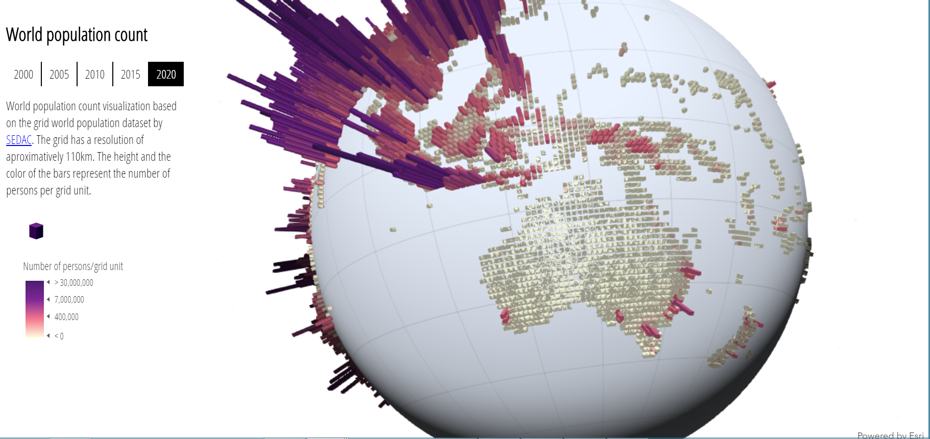
How does this change your perception of world population? This globe uses data from the NASA Socioeconomic Data and Applications Center (SEDAC) hosted by Columbia University, from 2000 to 2020. Change the years on the globe and discuss three changes you observe about Australia and southeast Asia, and compare it to another region of the world. Which regions are experiencing the most rapid population increase? Why?
Understanding global population using filtering and a 3D globe. Examine the following globe: https://ralucanicola.github.io/JSAPI_demos/world-population-2020/ This allows for visualizing world population in 2020 with a dark themed cartography, and also with a filter tool. Rotate the globe and observe the patterns.
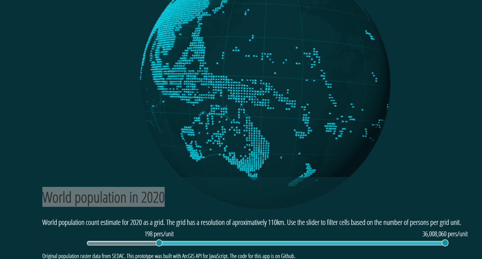
You may have already used the filter tool with some 2D maps in ArcGIS Online, so you know that filtering is a way of selecting, or reducing in volume, the data you are analyzing. In the screenshot above, the filter is at 198 persons per unit. According to the metadata, the grid has a resolution of approximately 110 km. Thus, each grid cell is 110 km x 110 km, or 12,100 square kilometers. Move the filter tool and observe how lower population areas are filtered out, or invisible. Now, pan to different points around the world, making observations about global and regional patterns of population. What is the value at which only half of Australia is visible? Conversely, what is the value at which only half of Japan is visible? Why are the values different? How does this 3D globe help you understand population distribution differently from the biggest cities globe or the gridded population globe?
Understanding global population of the past using a 3D globe. We can also examine historical data using 3D globes. For example, see this Cassini map from 1790 rendered as a globe: https://ralucanicola.github.io/JSAPI_demos/cassini-globe/
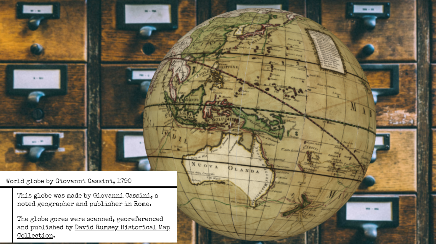
Based on your observations of this globe, where were the world’s largest cities and most populous regions in 1790? Thinking about where the map was made and by whom, does it make sense that most of Australia has no details filled in? What might have Cassini known about the Aboriginal People living in Australia at the time, if anything?
Digging Deeper with the Coding Behind GIS. There is growing demand for workplace professionals who understand how to create the mapping tools that you have been using in this module. These tools are largely created with HTML, CSS, JavaScript, and Python code. The code behind the globes you explored in this activity is shared; for example, examine the code for the globe showing the world’s biggest cities here: https://github.com/RalucaNicola/JSAPI_demos/tree/master/cities-globe.
One way of introducing coding behind GIS is through the set of ArcGIS developer tutorials, here: https://developers.arcgis.com/labs/ Through many of these tutorials, students can see the code in the left panel that runs a web map on the right panel, adjust the code , and see the results of the adjustment to the web map on the right. The code might add a scale bar, a popup box, or a legend, or the ability to zoom and pan or add data, and so on.
I confess, I love all of the above globes. Explore them and let me know what you think!
You must be a registered user to add a comment. If you've already registered, sign in. Otherwise, register and sign in.
-
Administration
89 -
Announcements
85 -
Career & Tech Ed
1 -
Curriculum-Learning Resources
280 -
Education Facilities
24 -
Events
77 -
GeoInquiries
1 -
Higher Education
616 -
Informal Education
284 -
Licensing Best Practices
102 -
National Geographic MapMaker
39 -
Pedagogy and Education Theory
239 -
Schools (K - 12)
282 -
Schools (K-12)
302 -
Spatial data
39 -
STEM
3 -
Students - Higher Education
257 -
Students - K-12 Schools
142 -
Success Stories
44 -
TeacherDesk
1 -
Tech Tips
125
- « Previous
- Next »