Turn on suggestions
Auto-suggest helps you quickly narrow down your search results by suggesting possible matches as you type.
Cancel
Creating Cartograms in ArcGIS
Subscribe
10144
0
02-25-2016 09:59 PM
- Subscribe to RSS Feed
- Mark as New
- Mark as Read
- Bookmark
- Subscribe
- Printer Friendly Page
02-25-2016
09:59 PM
Cartograms, because they distort our expected view of mapped variables, are wonderfully rich tools for teaching and research. They allow us to see relationships and trends that may not be evident in a typical choropleth map. A distance cartogram shows relative travel times and directions within a network. More common is an area cartogram, a map in which some variable is used instead of the land area in each polygon to determine the size of that polygon. I remember using graph paper to make rectangular area cartograms as an undergraduate (though I realize I am dating myself). Today, one can use Web GIS and desktop GIS to create cartograms. For example, nearly 700 variables can be mapped on www.worldmapper.org, and the data can be downloaded as Excel spreadsheets and analyzed within ArcGIS.
Let's say you wanted to dig deeper and make your own cartograms, with the ability to do further analysis within a GIS environment. You can use the cartogram geoprocessing tool that my colleague Tom Gross at Esri created. How can a GIS, which focuses on accurate spatial representations of features, be used to create cartograms? Download the tool and find out! The tool also includes step-by-step instructions and a sample set of data.
Once you install the cartogram tool, you simply run it to create the cartograms. An intuitive interface allows specifying input and output. You can even distort your base layers (such as the imagery shown below) so that your cartogram can include these as reference layers. I did this for cities, a 30-degree world grid, and a satellite image of the Earth to see these reference layers overlaid on my cartogram.
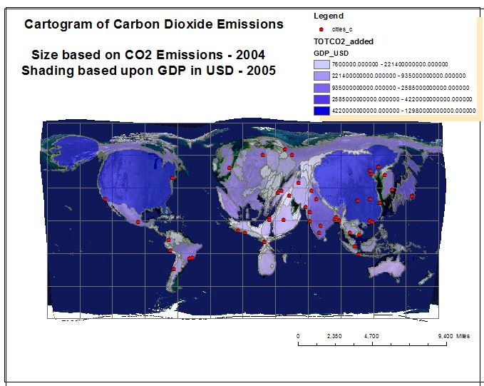
In this example, I chose to map the 2015 population by country. Then, I mapped the total CO2 emissions by country in 2004, in millions of metric tons, from the US Energy Information Agency. What patterns do you notice?
The cartogram map layer has to be written into a geodatabase, but otherwise, the tool has few restrictions. I am very pleased cartographically with the results, and the methodology of how these cartograms are generated is well documented: These are Density-Equalizing Cartograms using methodology developed by Mark Newman and Michael Gastner at the University of Michigan.
What other variables and at what other scales could you map and analyze as cartograms?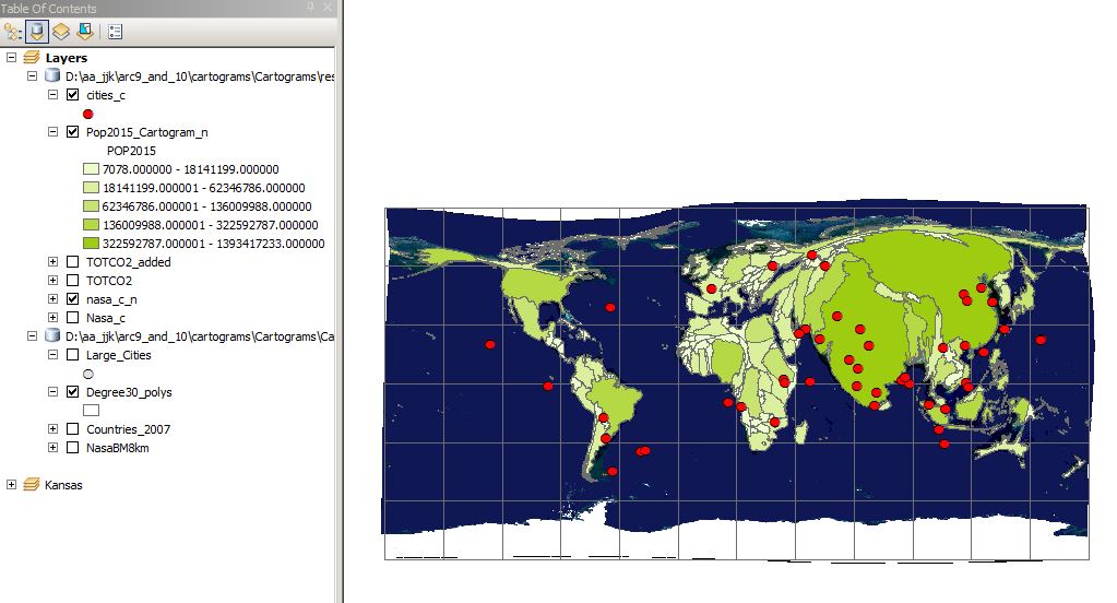
Let's say you wanted to dig deeper and make your own cartograms, with the ability to do further analysis within a GIS environment. You can use the cartogram geoprocessing tool that my colleague Tom Gross at Esri created. How can a GIS, which focuses on accurate spatial representations of features, be used to create cartograms? Download the tool and find out! The tool also includes step-by-step instructions and a sample set of data.
Once you install the cartogram tool, you simply run it to create the cartograms. An intuitive interface allows specifying input and output. You can even distort your base layers (such as the imagery shown below) so that your cartogram can include these as reference layers. I did this for cities, a 30-degree world grid, and a satellite image of the Earth to see these reference layers overlaid on my cartogram.
In this example, I chose to map the 2015 population by country. Then, I mapped the total CO2 emissions by country in 2004, in millions of metric tons, from the US Energy Information Agency. What patterns do you notice?
The cartogram map layer has to be written into a geodatabase, but otherwise, the tool has few restrictions. I am very pleased cartographically with the results, and the methodology of how these cartograms are generated is well documented: These are Density-Equalizing Cartograms using methodology developed by Mark Newman and Michael Gastner at the University of Michigan.
What other variables and at what other scales could you map and analyze as cartograms?

Cartogram of World Population in 2015.

Cartogram of C02 emissions in 2004, as a Map Layout.
You must be a registered user to add a comment. If you've already registered, sign in. Otherwise, register and sign in.
About the Author
I believe that spatial thinking can transform education and society through the application of Geographic Information Systems for instruction, research, administration, and policy.
I hold 3 degrees in Geography, have served at NOAA, the US Census Bureau, and USGS as a cartographer and geographer, and teach a variety of F2F (Face to Face) (including T3G) and online courses. I have authored a variety of books and textbooks about the environment, STEM, GIS, and education. These include "Interpreting Our World", "Essentials of the Environment", "Tribal GIS", "The GIS Guide to Public Domain Data", "International Perspectives on Teaching and Learning with GIS In Secondary Education", "Spatial Mathematics" and others. I write for 2 blogs, 2 monthly podcasts, and a variety of journals, and have created over 6,500 videos on my Our Earth YouTube channel.
Yet, as time passes, the more I realize my own limitations and that this is a lifelong learning endeavor: Thus I actively seek mentors and collaborators.
Related Articles
Creating Cartograms in ArcGIS
JosephKerski
Esri Alum
1 Kudos
0 Comments
Creating Cartograms in ArcGIS
JosephKerski
Esri Alum
3 Kudos
0 Comments
Labels
-
Administration
89 -
Announcements
85 -
Career & Tech Ed
1 -
Curriculum-Learning Resources
280 -
Education Facilities
24 -
Events
77 -
GeoInquiries
1 -
Higher Education
616 -
Informal Education
284 -
Licensing Best Practices
102 -
National Geographic MapMaker
39 -
Pedagogy and Education Theory
239 -
Schools (K - 12)
282 -
Schools (K-12)
302 -
Spatial data
39 -
STEM
3 -
Students - Higher Education
257 -
Students - K-12 Schools
142 -
Success Stories
44 -
TeacherDesk
1 -
Tech Tips
125
- « Previous
- Next »