Turn on suggestions
Auto-suggest helps you quickly narrow down your search results by suggesting possible matches as you type.
Cancel
- Home
- :
- All Communities
- :
- Industries
- :
- Education
- :
- Education Blog
- :
- Analyzing Food Expenditures at Home vs. Away from ...
Analyzing Food Expenditures at Home vs. Away from Home
Subscribe
664
0
06-29-2017 12:17 AM
- Subscribe to RSS Feed
- Mark as New
- Mark as Read
- Bookmark
- Subscribe
- Printer Friendly Page
- Report Inappropriate Content
06-29-2017
12:17 AM
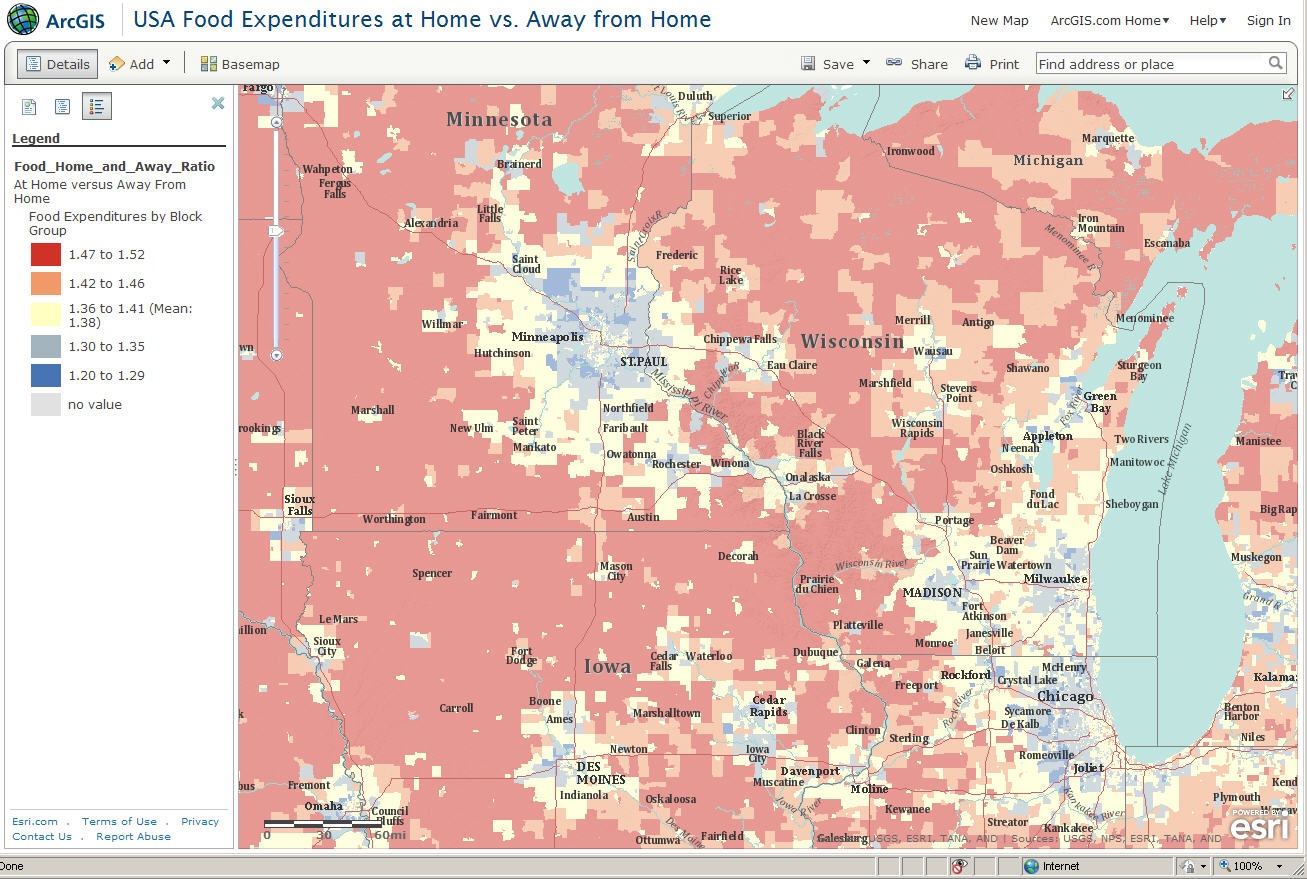
Think about two ways you can consume food – at home or away from home. Think about how often you eat at home versus away from home. Food purchased in grocery stores and eaten “at home” is generally less expensive than food purchased and eaten in restaurant. Do you think that the ratio of food expenditure at home vs. away from home varies by country? If so, how and why would it vary? Do you think there is a geographic pattern of the ratio within the USA, by region or even by neighborhood?
A new lesson in the ArcLessons library invites you to think spatially using common experiences of food purchasing and consumption, to analyze the relationship of food purchasing versus median age and household income, and to learn how to use ArcGIS Online as an analytical tool.
The lesson uses a standard web browser to access the food expenditure map on ArcGIS Online. The food data represent just two of the hundreds of variables available in the Esri Consumer Spending database. Esri combined the 2005-2006 Consumer Expenditure Surveys from the Bureau of Labor Statistics to estimate these spending patterns.
I wrote the lesson around 10 focal points, including “scale matters,” national patterns, urban vs. rural, patterns within cities, famous foods and cities, university towns, retirement communities, areas with low population density, median age, and median household income. To compare these last two variables to food expenditures requires the addition of two additional layers, which is easily done in ArcGIS Online. The ability in ArcGIS Online of comparing different variables across space is a valuable educational tool.
The web GIS map displays a ratio of the average annual household expenditure on “food at home” to “food away from home.” Areas in red represent areas where households spend noticeably more at home, while blue area households spend noticeably more away from home. Households in an “average” area tend to spend $1.38 on food at home for every $1.00 on food away from home. This ratio of 1.38 does not mean that food at home is more expensive; it means that more money is spent for home consumption of food than money is spent away from home. In other words, most people eat at home more frequently than they eat away from home. Where the ratio approaches 1:1 represents areas where an equal amount of money is spent on food at home versus away from home. Red areas are above this average, blue areas are below this average, and yellow areas are near the average.
Why do many metropolitan areas contain neighborhood where the ratio is high, surrounded by a suburban ring where the ratio is low, surrounded by rural areas where the ratio is high again? Why do rural areas in Nevada and Utah seem to have a lower ratio than rural areas elsewhere?
What spatial patterns of food expenditures can you discover using this Web GIS resource? What implications do these patterns have?
-Joseph J. Kerski, Esri Education Manager
You must be a registered user to add a comment. If you've already registered, sign in. Otherwise, register and sign in.
About the Author
I believe that spatial thinking can transform education and society through the application of Geographic Information Systems for instruction, research, administration, and policy.
I hold 3 degrees in Geography, have served at NOAA, the US Census Bureau, and USGS as a cartographer and geographer, and teach a variety of F2F (Face to Face) (including T3G) and online courses. I have authored a variety of books and textbooks about the environment, STEM, GIS, and education. These include "Interpreting Our World", "Essentials of the Environment", "Tribal GIS", "The GIS Guide to Public Domain Data", "International Perspectives on Teaching and Learning with GIS In Secondary Education", "Spatial Mathematics" and others. I write for 2 blogs, 2 monthly podcasts, and a variety of journals, and have created over 6,500 videos on my Our Earth YouTube channel.
Yet, as time passes, the more I realize my own limitations and that this is a lifelong learning endeavor: Thus I actively seek mentors and collaborators.
Labels
-
Administration
57 -
Announcements
65 -
Career & Tech Ed
1 -
Curriculum-Learning Resources
225 -
Education Facilities
24 -
Events
59 -
GeoInquiries
1 -
Higher Education
556 -
Informal Education
272 -
Licensing Best Practices
63 -
National Geographic MapMaker
25 -
Pedagogy and Education Theory
205 -
Schools (K - 12)
282 -
Schools (K-12)
227 -
Spatial data
28 -
STEM
3 -
Students - Higher Education
240 -
Students - K-12 Schools
114 -
Success Stories
33 -
TeacherDesk
1 -
Tech Tips
92
- « Previous
- Next »
