- Home
- :
- All Communities
- :
- Products
- :
- ArcGIS StoryMaps
- :
- ArcGIS StoryMaps Questions
- :
- Re: How to remove white space at the top of storym...
- Subscribe to RSS Feed
- Mark Topic as New
- Mark Topic as Read
- Float this Topic for Current User
- Bookmark
- Subscribe
- Mute
- Printer Friendly Page
How to remove white space at the top of storymap
- Mark as New
- Bookmark
- Subscribe
- Mute
- Subscribe to RSS Feed
- Permalink
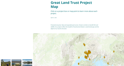
I can't figure out how to get rid of a big blank space on my story map. I have a map tour block in grid view, but the grid blocks that are associated with the map points start showing up about halfway down the side of the map. I want them to be flush with the top of the map so that it's all visible without having to scroll down. How do I get rid of this extra blank space? It doesn't seem like there are any extra blocks that can be deleted. I've included a photo.
- Mark as New
- Bookmark
- Subscribe
- Mute
- Subscribe to RSS Feed
- Permalink
This space is by design because the story is a scrolling page. If there wasn't any space there, as soon as the tour block locks into place the first row of places would start scrolling away. The space is there as a sort of buffer to ensure readers have a good experience and don't miss any places in the tour.
This is currently how the tour works, but there may be other treatments we could explore. If this is something you'd like to see changed, I'd invite you to please share your thoughts on our ideas board along with your ideas/preferences for how you'd like the tour to work (reduce the space, offer a choice to show or hide the space for a particular story, visual prompt for readers, some other idea, etc.) so others can vote and weigh in on this and we can consider the feedback and have options to adjust how this works in future updates.
Lead Product Engineer | StoryMaps
- Mark as New
- Bookmark
- Subscribe
- Mute
- Subscribe to RSS Feed
- Permalink
Please allow an option for the blank space to be hidden. Rarely do my projects want a cover, so when we use the current workaround of hiding it with url parameters, it looks like the project failed to load properly because the sidecar content is half cut off. It's not intuitive for my end users to scroll and go looking for the data I'm trying to present. I miss the classic templates where everything was right there on one page (series, shortlist) as people want instant results and may click away if it looks like they have to work to find the info.
An alternative is to allow a web map to be displayed on the side-by-side cover design.
This is the closest idea I could find: ArcGIS Storymap has a lot of white space between s... - Esri Community and would tackle the same issue: controlling blank spaces in the sidecar
- Mark as New
- Bookmark
- Subscribe
- Mute
- Subscribe to RSS Feed
- Permalink
Is there an option to hide this space now? In my storymap there is a big space between the title and starting text and it just looks really odd.
- Mark as New
- Bookmark
- Subscribe
- Mute
- Subscribe to RSS Feed
- Permalink
No solution yet, unfortunately... I'm trying to build our election results in story maps again 2 years later and it's still an issue. It makes it look like the app failed to load properly and hides some of the content. I bet users will just navigate away if it doesn't look good.
If we either had an option to 1) align content to the top of the side car or 2) always center it in the side car (so you're scrolling underneath it still but it stays floating and centered in your view) that would be great.

