- Home
- :
- All Communities
- :
- Products
- :
- ArcGIS Pro
- :
- ArcGIS Pro Ideas
- :
- Remove or displace overlapping chart labels
- Subscribe to RSS Feed
- Mark as New
- Mark as Read
- Bookmark
- Follow this Idea
- Printer Friendly Page
- Mark as New
- Bookmark
- Subscribe
- Mute
- Subscribe to RSS Feed
- Permalink
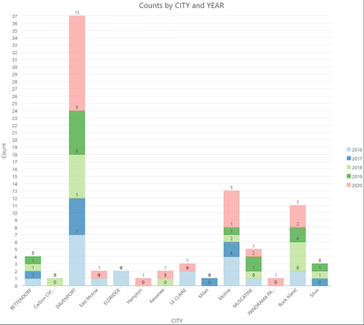
When creating charts that display stacked values, I find that sometimes the stacked values are small enough to result in the label from 2 different segments overlapping each other (see below example). It would be good if the chart either hid the lesser value automatically, or offset the different values to show both without conflict (bottom example).
Solution 1 - Displaced labels
Solution 2 - Hidden Label
Whilst this isn't really an issue when purely analysing data, when displayed in a map layout for exporting and sharing, it's not very cartographically pretty.
Yes! I and a colleague were just discussing this! As well as being able to change the placement of labels so that they are within the bar of a stacked bar, vs having the label of the data being in the bar "above" its data.
Agree with you...why do I even need the 0s on my chart? Not seeing an option to turn them off; they're drawn right on top of where the actual values are. Ridiculous that this was pointed out a year and a half ago and is still a problem in 3.0. If I took that long to fix things, I'd be fired.
You must be a registered user to add a comment. If you've already registered, sign in. Otherwise, register and sign in.


