- Home
- :
- All Communities
- :
- Products
- :
- ArcGIS Online
- :
- ArcGIS Online Questions
- :
- Re: 1 step pop-up in Web App Builder
- Subscribe to RSS Feed
- Mark Topic as New
- Mark Topic as Read
- Float this Topic for Current User
- Bookmark
- Subscribe
- Mute
- Printer Friendly Page
- Mark as New
- Bookmark
- Subscribe
- Mute
- Subscribe to RSS Feed
- Permalink
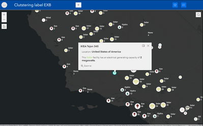
Is there a way to configure pop-ups in a web app to be like the pop-ups in a map viewer? So that it doesn't just provide the title, and the user has to click on the arrow to get the complete pop-up.
Map viewer shows the complete pop-up on the first click, and it'd be great if the web app behaved the same way.
Thanks
Solved! Go to Solution.
Accepted Solutions
- Mark as New
- Bookmark
- Subscribe
- Mute
- Subscribe to RSS Feed
- Permalink
It absolutely has to do with screen size.
From this page:
Control when to turn on mobile layout
The app supports two styles of layout based on the screen size. One is for desktop and one is for mobile devices. When either the height or width of a screen display is less than 600 pixels, the mobile layout applies automatically. However, this can result in unexpected behavior when the app is embedded in a website, for example, when the pop-up in the website is in the mobile layout style. To control the layout style, use mobileBreakPoint=<pixel number>. For example, you can remain in desktop style until the screen size is less than 300 pixels, as shown below:
http://<your portal url>/apps/webappviewer/index.html?mobileBreakPoint=300
Have a great day!
Johannes
- Mark as New
- Bookmark
- Subscribe
- Mute
- Subscribe to RSS Feed
- Permalink
Can you use Experience Builder?
- Mark as New
- Bookmark
- Subscribe
- Mute
- Subscribe to RSS Feed
- Permalink
Thanks @RussRoberts , we haven't used Experience Builder before, but will try it out
- Mark as New
- Bookmark
- Subscribe
- Mute
- Subscribe to RSS Feed
- Permalink
I believe that has something to do with the size of the screen, too, doesn't it? My WAB popups look normal enough when I have my app fullscreen, but get the version pictured in your post when the window gets down to tablet size and smaller.
Kendall County GIS
- Mark as New
- Bookmark
- Subscribe
- Mute
- Subscribe to RSS Feed
- Permalink
Thanks @jcarlson, it does work at 90% zoom on my desktop browser, but yeah as you mentioned in cell phones and tablets, it's the version I posted. Having the pop-up become full screen if you want to view the complete information isn't ideal. I've just experimented with Experience Builder on a cell phone, and that works better.
- Mark as New
- Bookmark
- Subscribe
- Mute
- Subscribe to RSS Feed
- Permalink
It absolutely has to do with screen size.
From this page:
Control when to turn on mobile layout
The app supports two styles of layout based on the screen size. One is for desktop and one is for mobile devices. When either the height or width of a screen display is less than 600 pixels, the mobile layout applies automatically. However, this can result in unexpected behavior when the app is embedded in a website, for example, when the pop-up in the website is in the mobile layout style. To control the layout style, use mobileBreakPoint=<pixel number>. For example, you can remain in desktop style until the screen size is less than 300 pixels, as shown below:
http://<your portal url>/apps/webappviewer/index.html?mobileBreakPoint=300
Have a great day!
Johannes
- Mark as New
- Bookmark
- Subscribe
- Mute
- Subscribe to RSS Feed
- Permalink
Thanks @JohannesLindner! That worked

