- Home
- :
- All Communities
- :
- User Groups
- :
- Experience Builder Tips and Tricks
- :
- Blog
- :
- The DIY Widget Controller - Part II: The Secret Co...
The DIY Widget Controller - Part II: The Secret Controller
- Subscribe to RSS Feed
- Mark as New
- Mark as Read
- Bookmark
- Subscribe
- Printer Friendly Page
Three Buttons for the Pages under the URL,
Seven for the Views in their Section homes,
Nine for Widgets doomed to close,
One for the link on an external site
In a Sidebar where a hidden Widget Controller lies.
One set of Buttons to rule them all,
One set of Buttons to find them,
One set of Buttons to bring them all,
And in a Header bind them,
In a Sidebar where a hidden Widget Controller lies.
- J. R. R. Tolkien, probably, the books are really long and often quite boring.
Picture a project with a Widget Controller in the Header. From this one set of Buttons, you could jump from Page to Page in a project, change Section Views, open and close Widgets and Sidebars and link to external webpages.
... But they were all of them deceived, for there wasn't a Widget Controller in the Header, it's a set of Buttons.
A while back, I made a DIY Widget Controller. It was complicated to set up and probably not worth the effort. Today, I thought of a better way to pull off this trick and some more ways it could be used. The trick is just use a Widget Controller after-all. You may still want to use the self-changing Buttons from that post to add even more refinement. Note: we are building in ArcGIS Online. Older versions of Enterprise will not have all of these options. I'm too lazy today to figure out how far back this build is viable for.
Widget Controllers are cool and all, but they aren't without issues and almost all of them can be fixed by hiding your Widget Controller and replacing it with Buttons. Here are some of the problems we can fix this way:
- Buttons placed in a Widget Controller don't just do what the Button should do, instead they pop-out a Button in the Widget Panel. So, they don't really work well for making links or controlling Section Views.
- Widget Controller Buttons are icon only. The title of the Widgets can be added below the button with the Label option, but these titles are frequently cut-off.
- Limited style options.
- Only three sizes of buttons, unusably tiny, tiny and acceptable but still a little small.
- Only two shapes of buttons, circle or square with rounded corners.
- No borders around buttons.
- All the buttons must have the same style, so no thematic coloring buttons.
- All the buttons must be next to each other in a vertical or horizontal line.
- All Widgets must float next to the Widget Controller or open at the same Fixed location.
Do you want to give this a try? Alright, let's make some Buttons that control a Widget Controller. For this build, I will be making basically just a standard Widget Controller, but with larger buttons that have a border around them. They will be neatly lined up, single-color, circular, icon-only buttons. But if you want to mix in some normal Buttons amongst your Widget Controller Buttons, or have radically different styles and for each Button, that's your choice.
Starting from a blank layout, I will add a Sidebar Widget and make it Full Size. Into the Collapsible side of the Sidebar, I'll add a Widget Controller and throw a few Widgets inside it. You must used the Fixed Widget Panel Arrangement for this build, but if you want your Widgets to open in different locations, you could use multiple Widget Controllers. The Always Open side will contain the actual application. I'll put a Full Size Map Widget here to fill the space. The Widget Controller is now set up, so we don't need to look at it again. In the Sidebar Settings Panel, set Resizable to off, the Default State to Collapsed, click that Collapse Button to close the Sidebar, and then turn off the Collapse Button so the user can't open it.
Now, we build the counterfeit Widget Controller. Add a Flow Row Widget and in its Style Tab set the Width and Height to Auto. Add a Button Widget to it.
In the Button Settings Panel, delete the Text and pick an appropriate Icon. All of the Icons for Experience Builder Widgets are in the Brand And Logos page of the Icon Picker. Hint: there's a sneaky dropdown menu in the Icon Picker. Look carefully.
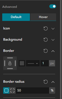
To make our icon bigger, turn on Advanced, open the Icon dropdown menu and type in a number. I went with 30px. Maybe a little too big for most applications, but its not outrageous. I changed the color to white using the box next to the size input and then opened the Background dropdown to set the Fill to blue.
In the Border dropdown, I set the color to a dark gray, picked a single line from the dropdown menu and set the thickness to 1px. You may not be able to see this border, but your brain does. Good borders are usually barely visible. To make it a circle, open the Border Radius dropdown and make it 50%.
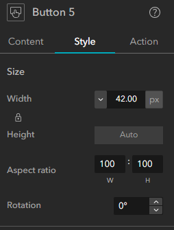
In the Style Tab, Lock the Aspect Ratio at 100:100 and set the Width. I like the way 42px just barely cuts off the corner of the icon. It looks very dynamic to me.
Finally, in the Action Tab, add a Button Click > Widget Controller > Open Widget > Your Widget Action. (If you want this Button to link to something, that's in the Content Tab under Set Link.)
Edit: The June 2025 ArcGIS Online Update introduced the Toggle Widget Action, probably a better choice for this build.
Ugggh, that was a lot of work, do I have to do that for every Widget in my Widget Controller? Nope, hit the Duplicate Button. All you need to change is the icon and the target for the Action.
And we've got a set of Buttons that look a lot like a Widget Controller and work a lot like a Widget Controller but give you way more control over the design than a Widget Controller. And you can mix in a normal Button that will act like a Button, too.
...Until a hobbit throws your computer in a volcano, in a complex allegory for hubris and greed by someone who claims not to like or use any allegory or symbolism.
You must be a registered user to add a comment. If you've already registered, sign in. Otherwise, register and sign in.
-
ArcGIS Dashboards
1 -
ArcGIS Enterprise
1 -
ArcGIS Experience Builder
5 -
ArcGIS Online
1 -
Embed
1 -
Menu
1 -
Search
1 -
section
1 -
views
1


