- Home
- :
- All Communities
- :
- Industries
- :
- Education
- :
- Education Blog
- :
- More Power for Your GIS Analysis through Joining F...
More Power for Your GIS Analysis through Joining Features to ArcGIS Online
- Subscribe to RSS Feed
- Mark as New
- Mark as Read
- Bookmark
- Subscribe
- Printer Friendly Page
Because the problems that GIS analysts work on such as biodiversity loss and water quality do not stop at disciplinary or political boundaries, the ability to connect the map or attribute table that you are working on to another map or table in the same geodatabase or another geodatabase is powerful. One way of doing this is to join features. This has been a core function and a chief argument for the use of GIS for decades. But with the advent of ArcGIS , including its Join Features tool along with data layers in the Living Atlas of the World, the ability that you have at your fingertips for joining features just became a lot more powerful. I first saw a demonstration of this at the Esri User Conference from my colleague Jennifer Bell and I thought, "this is a fantastic capability for educators... and people in other sectors of society."
Why is this so incredible? In the past, to join your data to another data set, you had to spend some time downloading and formatting that data set; sometimes you had to add additional fields and populate them, before that data set was usable in your GIS. But the bottom line is that you now have access to data sets in the cloud, for example, in the Living Atlas of World. And, similar to the capabilities included in the Enrichment tool, these data sets do not have to be on your own device or in your own geodatabase to use them!
Additionally, you now have the capability of making choropleth maps from tabular data using the Join Features option. Let’s say you have a CSV (comma separated value) table containing data for a set of polygons, such as ZIP codes in a state, or US states, or world countries. If you add that table to ArcGIS and make a map out of it, your result will be a set of points, one for each record in your table. If your table represents world countries, your map will show one point in each country. This is a useful exercise if you are teaching about geocoding in a GIS course but not so useful if your goal is to obtain a choropleth map on specific variables for your desired set of polygons. In the past, your choices at this stage would be to use Esri Maps for Office to turn your table into a set of polygons in ArcGIS , or to use ArcMap or ArcGIS Pro to join your table to a table associated with an existing shapefile or geodatabase. But now you can also use ArcGIS to create a choropleth map!
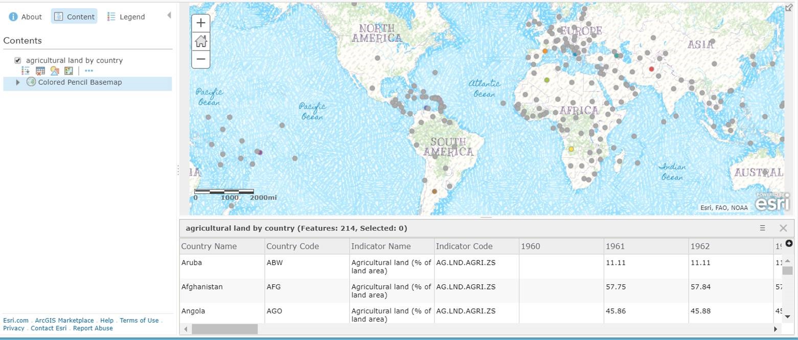
How can you do this? You can do this via the Join Tables tool and by accessing the Living Atlas of the World. First, log into your account in ArcGIS . Then > Map > Modify Map > Add Data. Add your spreadsheet. Need a spreadsheet? The World Bank has a wide variety of data sets by country in tabular form. Indicate the field (such as country code) for your place-based table, and the result will be a set of points, similar to that below (shown on the colored pencil base map, which I love):
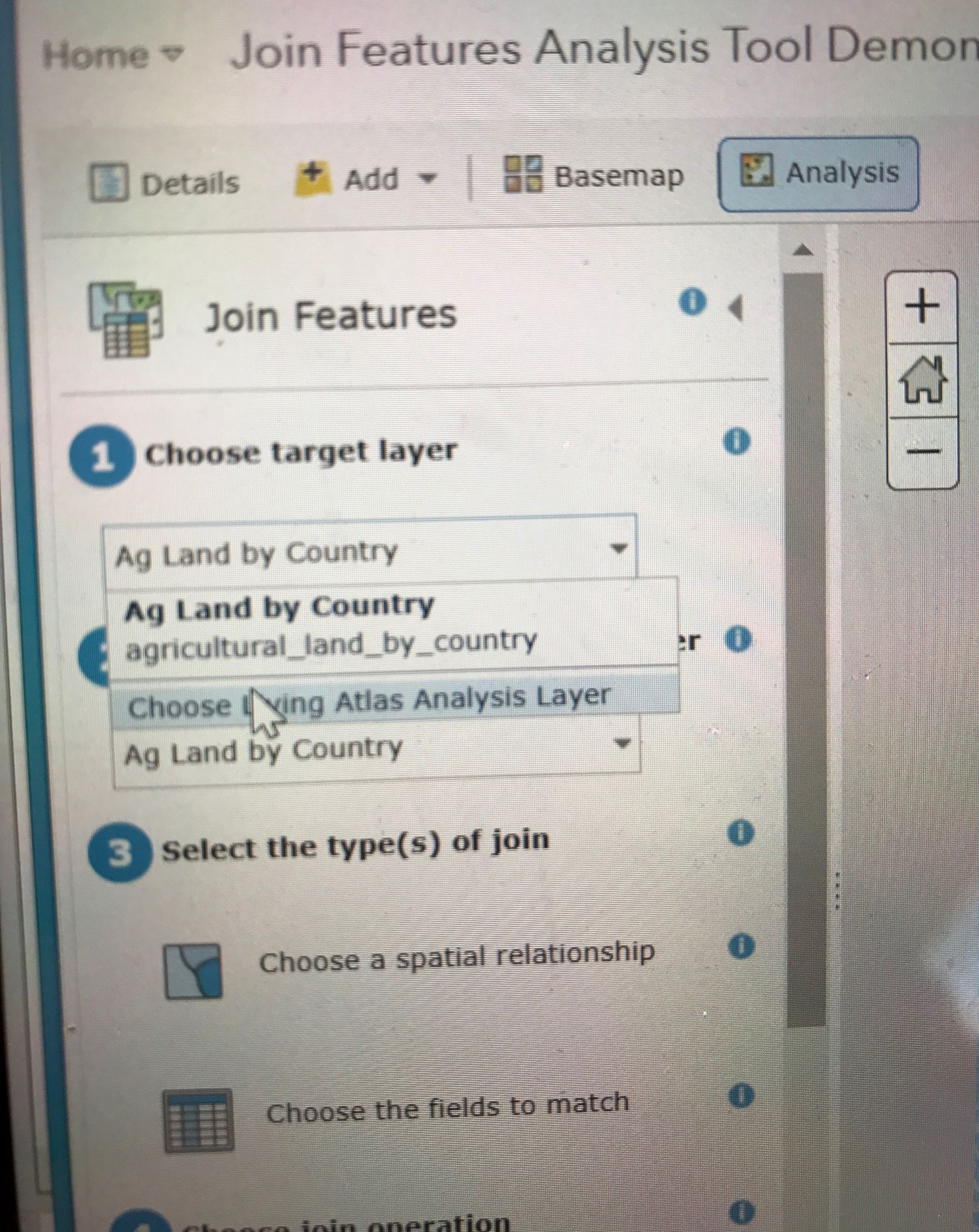
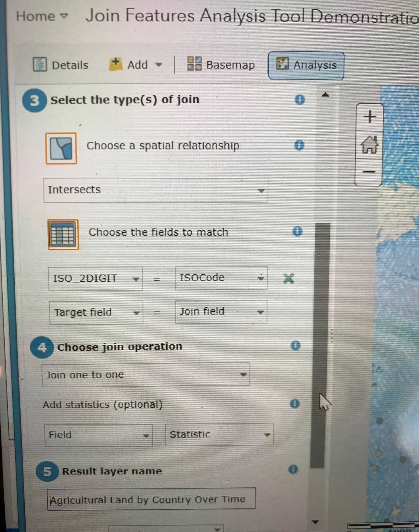
That is all good, but now for the really exciting part: To make a choropleth map by country of this same data: Perform Analysis > Join Features, on step 1, select Choose Living Atlas Analysis Layer, and for step 2, choose your table, which now resides in ArcGIS as a layer, and join on a common field. In this example, I had no common field, so I first had to add a field in Excel for the 2 digit ISO country code and populate that field with the code. Why? Because the ISO 2 digit code did not exist in the World Bank table. This is a good example of knowing your data and what you need to sometimes do to enable joins to take place.
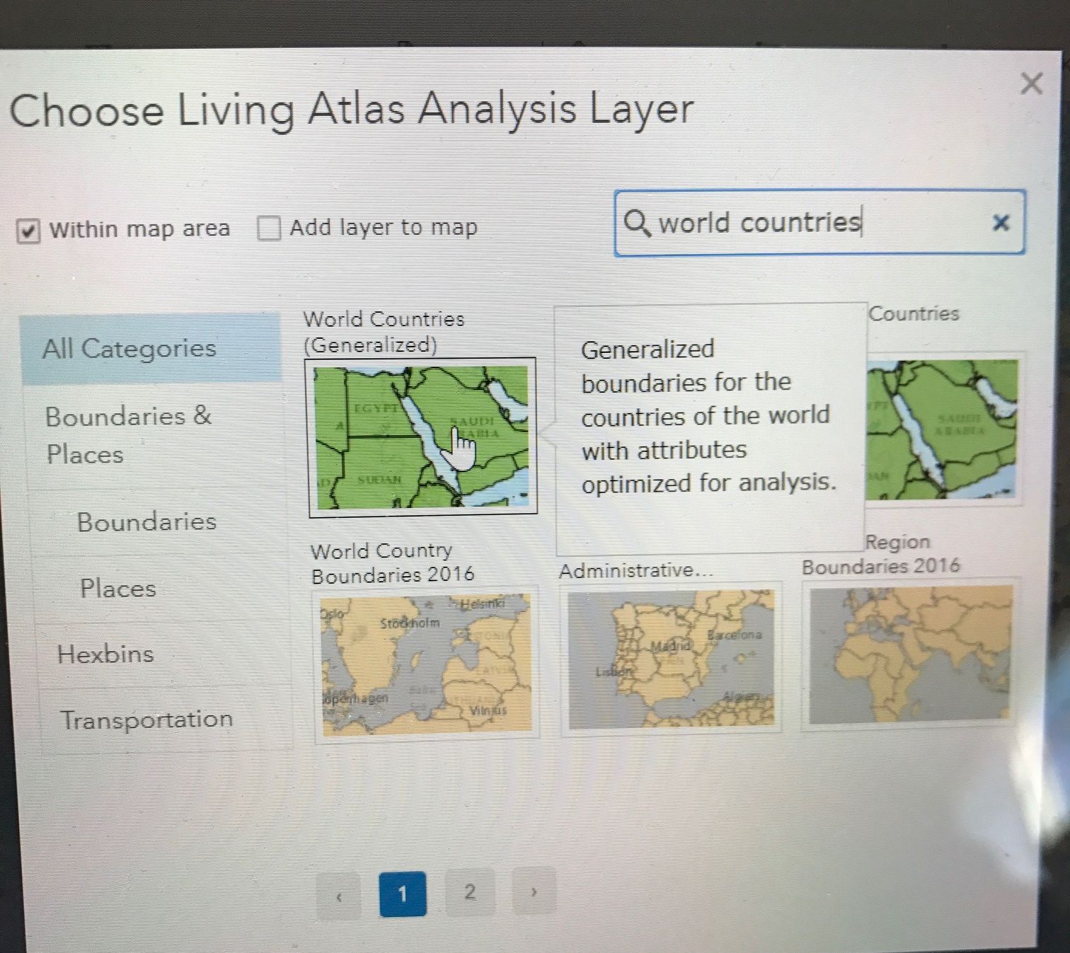
While running the Join Features tool, select the Living Atlas, search for World Countries, and choose World Countries, as shown below:
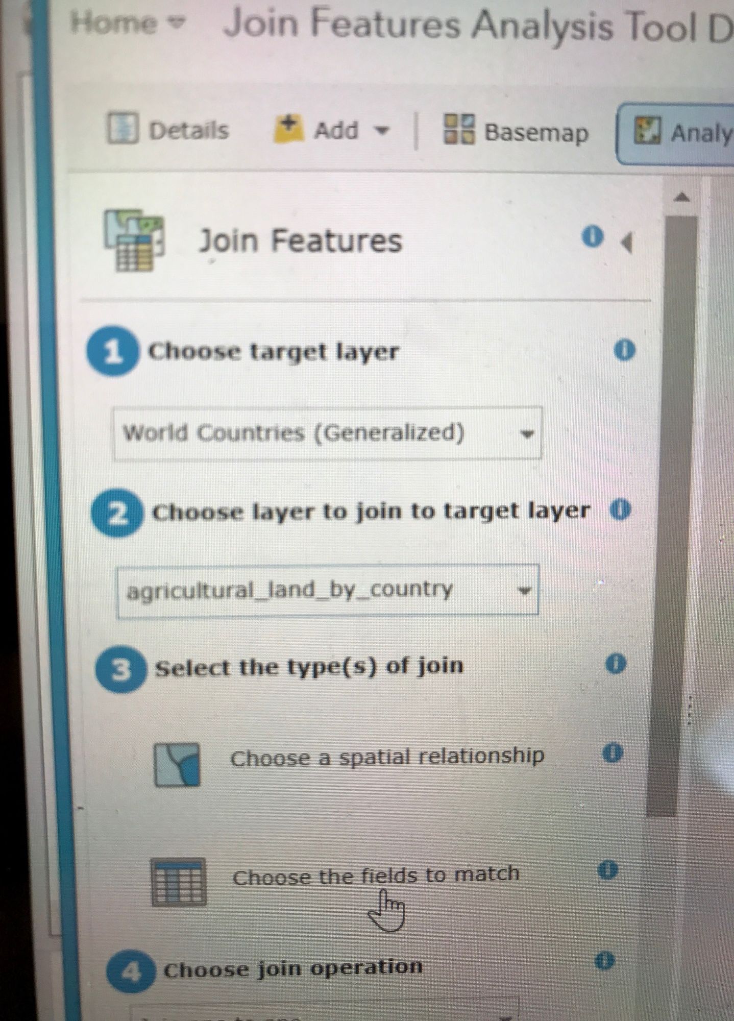
Therefore, you are joining your agricultural land table (#2) to the World Countries (Generalized) from the Living Atlas, as shown below:
Indicate the fields that will serve as your join fields, as I have done below. I will be joining on the 2 digit ISO code. When possible, join on a code rather than names (of cities, countries, and so on) due to spelling differences, which will adversely affect your match rate.
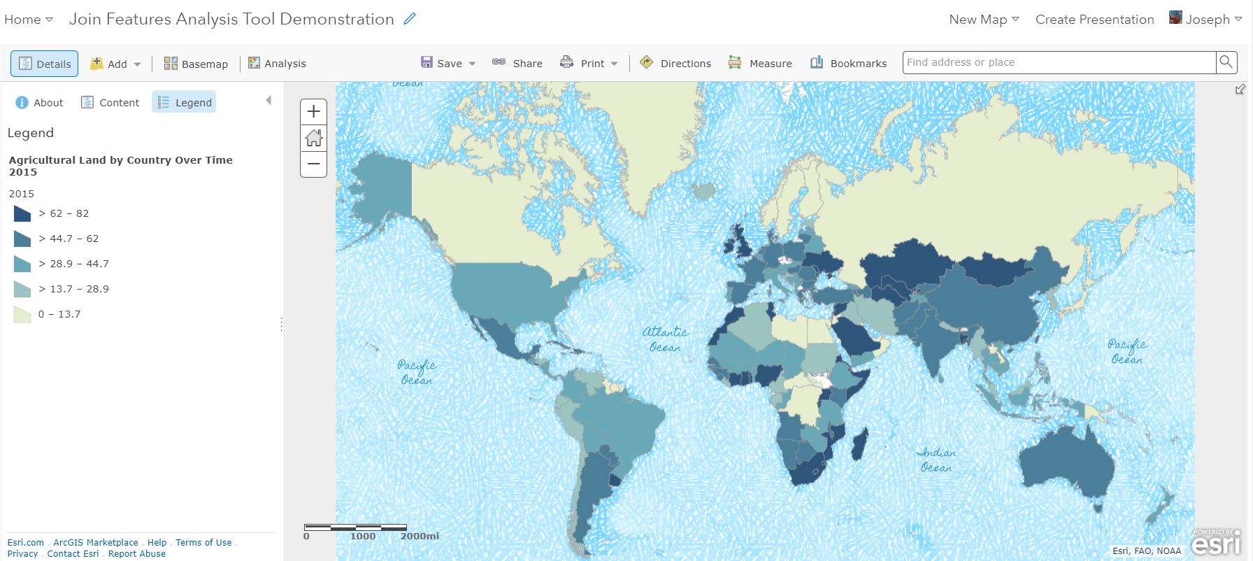
The result is a map joined to your original table! Now, with the map at your fingertips, you can map any of your table attributes, such as agricultural land by country for 2015, as I have done below.
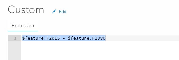
Now let's dig a little deeper. Since we are working with agricultural land over time, we can create a custom Arcade expression that will allow us to visualize changes around the world. I created a custom expression below, subtracting the 1980 percent agricultural land by country by the percent in 2015, as shown below. Since the data are already in percent, there was no need to multiple by 100 (again, knowing your data is key!):
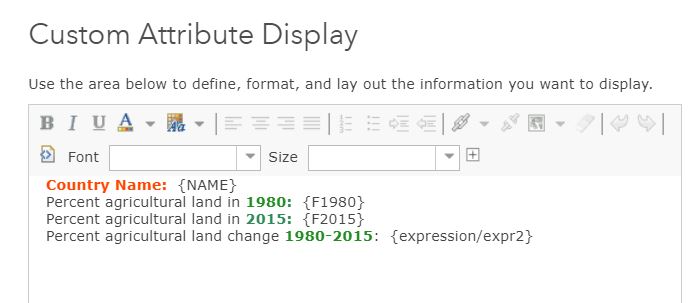
I also want the popup to display the change over time, and so I will add the same expression shown above to the popup custom attribute display, as shown below:
The resulting map and popup are shown here. What patterns do you notice? Why the big increase in Saudi Arabia, for example? You could zoom in, change the basemap to imagery, and investigate the new center pivot irrigated fields in the middle of that country. You could pan over to Brazil and examine fields reclaimed from wetlands and rainforest. You could examine urban spawl in the USA and elsewhere as part of your investigation into why agricultural land has declined in many areas of the world. Because I believe a data set like this is valuable to teach many core themes in environmental science, economics, and physical and cultural geography, I have shared the table here.

For more information about the Living Atlas, explore it here. For more information about the Join tool in ArcGIS , examine this document.
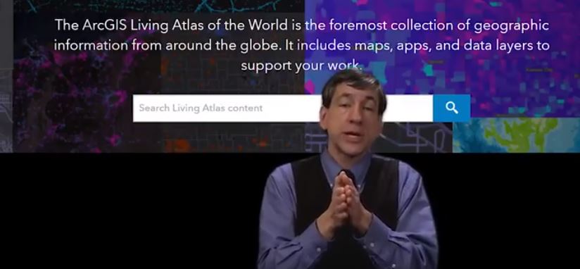
I have created a video on this topic, here: While this is really a paradigm-changing workflow, I used a simple example to hopefully get the point across: https://youtu.be/TjFZh7UbLZk
You must be a registered user to add a comment. If you've already registered, sign in. Otherwise, register and sign in.
-
Administration
90 -
Announcements
86 -
Career & Tech Ed
1 -
Curriculum-Learning Resources
284 -
Education Facilities
24 -
Events
77 -
GeoInquiries
1 -
Higher Education
618 -
Informal Education
285 -
Licensing Best Practices
102 -
National Geographic MapMaker
41 -
Pedagogy and Education Theory
241 -
Schools (K - 12)
282 -
Schools (K-12)
306 -
Spatial data
39 -
STEM
3 -
Students - Higher Education
258 -
Students - K-12 Schools
145 -
Success Stories
44 -
TeacherDesk
1 -
Tech Tips
127
- « Previous
- Next »