Select to view content in your preferred language

Beautify That Homepage!: Creating a unique look and feel for your organization

45739
127
07-24-2017 04:21 PM
BrianBaldwin
Esri Regular Contributor
28 127 45.7K

UPDATE: 1/6/2022 Well, this blog had a really good run, but it's nearly 'retired' by this point. ArcGIS Online has an updated homepage editor that does not support custom code (which is basically all this blog describes). So, this blog is still relevant for installations of ArcGIS Enterprise that do not have the new homepage (older versions of Enterprise), but that's about it. If you are looking for resources on styling the NEW homepage, the help documentation has some good resources: https://doc.arcgis.com/en/arcgis-online/administer/configure-home.htm

We frequently get questions from customers about how to to style their ArcGIS Online/Portal homepages, similar to the demonstration sites that we designed for our Electric and Gas sites. This blog is going to walk through the way that we styled our homepages, as well as providing all of the source code and imagery.


Westerville Homepage

Westerville Power & Light Homepage, our fictitious electric utility demonstration site. 


Currently (as of July 2017) the ability to customize and configure an ArcGIS Online/Portal homepage feels pretty limiting. Yet, the fact that ArcGIS Online/Portal lets you override the default CSS, apply your own styles, and link out to external content gives you the ability to start with a completely blank slate. Rather than simply hiding all elements and starting from scratch, you can restyle many of the elements that already exist, which I will be walking through in this post.


First things first, please go and download the included CSS/HTML that was attached to this post. Also, brief caveat that I am no web designer by trade, so this CSS could certainly be improved upon syntactically (feel free to roll your eyes at any point while looking at the samples). Lastly, I prefer to use a 3rd party app (Notepad++) because as the script is pasted into ArcGIS Online/Portal, all formatting is removed.


So, let's start with a blank slate:
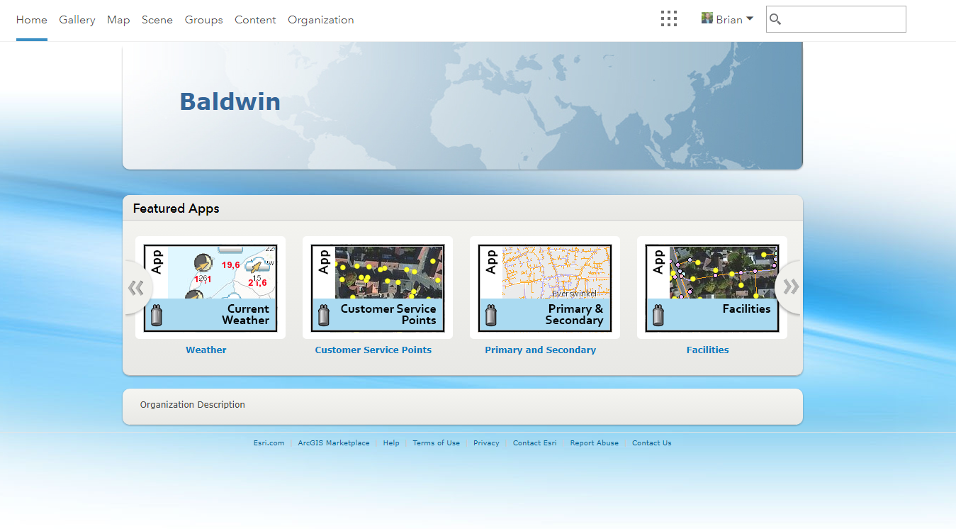
 

Start


This is what pretty much every organization homepage starts out looking like. Eek. So, how do we make this look better? Honestly, with a couple of code snippets and images, it takes about 5 minutes.


After you open the attached .ZIP file, you will find 2 HTML files: Organization Description and Banner. The sections are titled for the sections of the ArcGIS Online/Portal settings that this code can be pasted into. The standard homepage is composed of roughly 3 different elements: 1 - Top Banner, 2 - Featured Content, and 3 - Organization Description. Open up the file titled Banner.html and we will work on styling Top Banner, Featured Content, and the background.
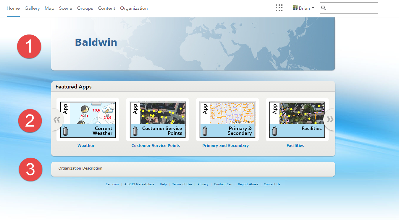
 

Sections


If you are looking at the 'Banner.html' code, the first thing you will note is the ability to override many of the Esri default styles. Everything in the <style> section is pretty much overriding defaults.


#bottomContent  {
    background: none;
    box-shadow: none;
    border-bottom: none;
}

#bottomContent #organizationSection .top-nav {
    border-bottom: none !important;
}
‍‍‍‍‍‍‍‍‍‍‍‍‍‍‍‍‍‍‍


A lot of these declarations are just overriding the box shadows, etc that Esri applies to elements. Play around with the Chome or Firebug Developer tools, and you can look at all of the default elements to see what other elements you may want to tweak. For example, you could hide the entire FeaturedMaps element and create a fully custom page if you so desired. 


In the code, the last two elements you will see in the <style> section are the #topBanner and #resback. For both of these, you can see that we are simply applying a background image to the DIV and then placing the element. #topBanner is placing the header banner image and #resBack is placing the background image at a fixed position.


In ArcGIS Online, navigate to My Organization, Edit Settings, Home Page, and set the Background Image to No Image. Then, set the Banner to 'custom design', click the code view icon, and paste in the Banner.html contents.
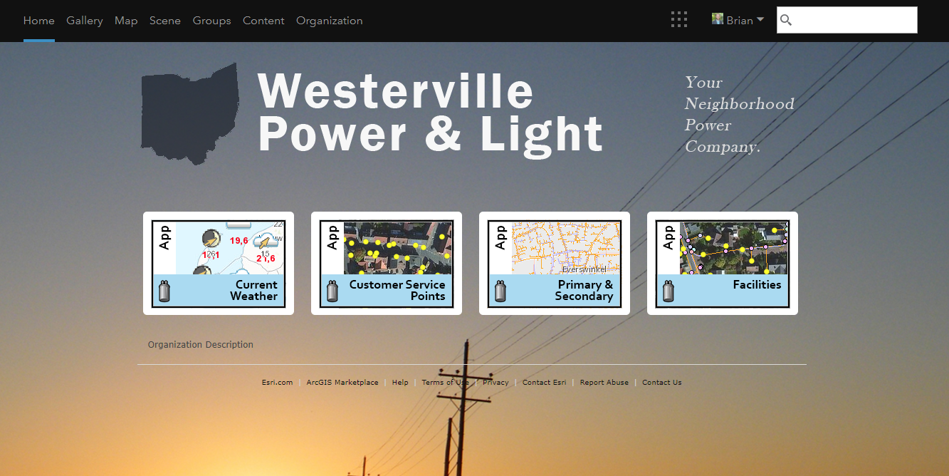
 

Banner


Looks pretty good already!


Now, on to the Organization Description. Open up the OrganizationDescription.html file. All of the styles associated with this file are just applying style to custom DIV elements that we can paste into the Organization Description. So, rather than just using text, we can create custom content and styles in this space.


What we are doing here, is just taking some basic images and applying a little bit of CSS style to get a rounded corner and a hover on a mouse over. All of these images then link out to ArcGIS Online content in the organization, or any other content you may want to link to. I have also seen folks embedding StoryMaps, Dashboards, and other content directly into the Organization Description. You can get as creative with this section as you want!


.customContent {       
     margin-bottom: 35px;
    text-align: center;     
}        

.groupItem img {
     background-color: rgba(119,119,119,.8);
     -webkit-border-radius: 5px 5px 5px 5px;       
     border-radius: 5px 5px 5px 5px;
     padding: 8px;
     margin: 0 10px 0 10px;          
}

.groupItem:hover img {       
     background-color: rgba(210,224,255,.4);
     opacity: .95;   
}        ‍‍‍‍‍‍‍‍‍‍‍‍‍‍‍‍‍‍‍‍‍‍‍‍‍‍‍‍‍‍‍‍‍‍
<div class="customContent">       
     <p class="groupItems">       
          <a class="groupItem" href="" target="_blank" title="Distribution">   
               <img alt="Distribution" src="distribution.png" />    
          </a>       
          <a class="groupItem" href="" target="_blank" title="Transmission">   
               <img alt="Transmission" src="transmission.png" /> 
          </a>       
          <a class="groupItem" href="" target="_blank" title="Generation">   
               <img alt="Generation" src="generation.png" /> 
          </a>          
     </p>  
</div> ‍‍‍‍‍‍‍‍‍‍‍‍‍‍‍‍‍‍‍‍‍‍‍‍‍‍

Now, take all of the OrganizationDescription.html code and navigate to Organization, Edit Settings, General, Organization Description, click the code icon, and paste everything in. After you hit save and go to Home, you'll end up with this great finished product:
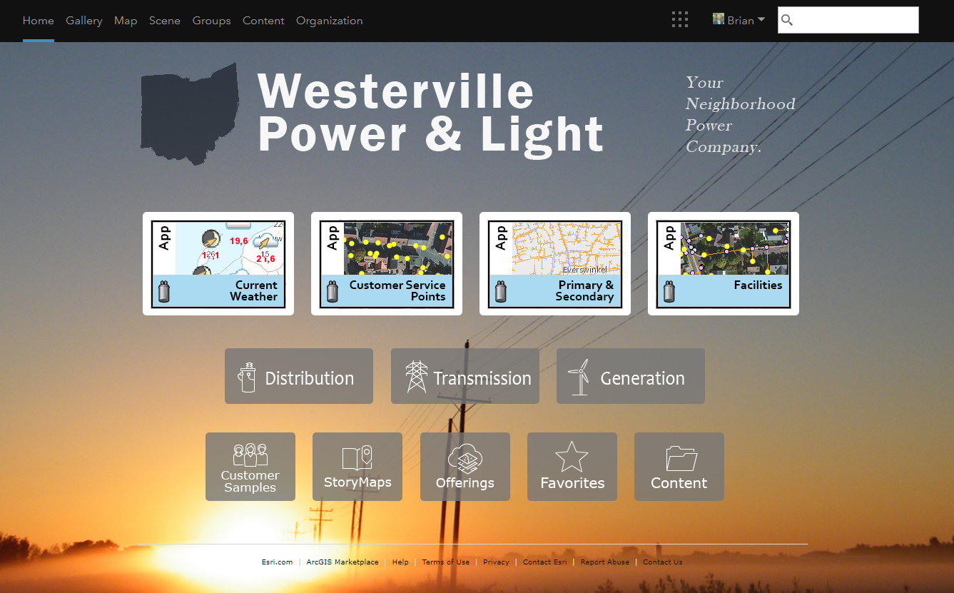
 

Done


If anyone comes up with some great examples, please feel free to post them in the comments! I would love to see what people come up with. 


Shout out to Bernie for the initial #resBack code sample.

127 Comments
RyanHefley
Occasional Contributor

Brian,

Thank you so much for this blog post! I am trying to recreate it to understand better just how everything works. I do have a question though, and it has been a while since I have messed with HTML/CSS but attached is two screen shots. I would like to see our logo be fixed at the top left hand corner. If you look at the image you will see what I mean, but however when I resize the window, the logo goes with it. How do I fix this?

Also attached is my code. It is the exact as yours. 

Thanks

<style>
#header, #webmap-header {
    background-color: #111;
}

.galleryNode .galleryLabelContainer {
color: #fff !important;
display: none;
}

.prevButton {
display: none;
height: 0;
}

.nextButton {
display: none;
height: 0;
}

.galleryBackground {
     height: 160px;
}

#matrixLayout {
    box-shadow: none;
}

#featuredMaps {
    background: none;
    box-shadow: none;
    border-bottom: none;
     /* height: 0 !important; */
     /* display: none !important; */
}

#featuredMaps #fHeader {
    background: white;
    box-shadow: black;
    border-bottom: white;
    h2.galleryTitle: ' ';
    height: 0px;
}

#featuredMaps #fHeader h2 {
    font-size: 0px;
}

.esriItemLinks a, .esriItemLinks a:link, .esriItemLinks a:hover, .esriItemLinks a:active, .esriItemLinks a:visited {
    color: #111;
}


#bottomContent  {
    background: none;
    box-shadow: none;
    border-bottom: none;
}

#bottomContent #organizationSection .top-nav {
    border-bottom: none !important;
}

.top-nav{
     border-bottom: 0 !important;
}

.top-nav-link {
     color: #999 !important;
}

.esri .footer, .esri .center .footer {
    border-top: none !important;
}

#topBanner {
     right: 0;
     bottom: 0;
     background: url(https://gis.aecc.com/pics/PortalWebsite/logo_header.png); 
     border-radius: 0px 0px 10px 10px; 
     width: 330px; 
     height: 135px; 
     margin-top: 0px; 
     -moz-border-radius: 0 0 10px 10px; 
     -webkit-border-radius: 0 0 10px 10px; 
     -o-border-radius: 0 0 10px 10px;
}


#resetBack {
    position: fixed;
    right: 0;
    bottom: 0;
    min-width: 100%;
    min-height: 100%;
    width: auto;
    height: auto;
    z-index: -100;
    background-image: url(https://gis.aecc.com/pics/PortalWebsite/background.jpg);
    background-size: cover;
    z-index: 0-100;
}
</style>
<div id="topBanner"></div>
<div id="resetBack"></div>
RyanHefley
Occasional Contributor

Right after I added my comment, I finally figured it out. For other users whom may have the same issues, attached is my code block to have your logo at the top left hand corner

#topBanner {
     position:fixed;
     left:0;
     top:20;
     background: url(https://gis.aecc.com/pics/PortalWebsite/logo_header.png); 
     border-radius: 0px 0px 10px 10px; 
     width: 330px; 
     height: 135px; 
     -moz-border-radius: 0 0 10px 10px; 
     -webkit-border-radius: 0 0 10px 10px; 
     -o-border-radius: 0 0 10px 10px;
}
BrianBaldwin
Esri Regular Contributor

Thanks for the comments and including some screenshots! Site looks great! I think every time I post questions to a forum anywhere, I end up figuring it out 10 minutes later as well.

RyanHefley
Occasional Contributor

Hello Brian,

Once again I have another question. Before I posted this one, I have looked and tried many things. Attached is a screen shot, I am trying to figure out why when I hover over my next button or previous button the image sorda wants to duplicate itself. Any idea of what i could do to fix this? Another thing that is in question is the Featured Maps and Featured Maps header. I would like that color to become transparent where you can see what's in the background. But also have the maps in full focus. I am providing my code to show you what I have. The RGBA does not work. However, if i were to do opacity it works, but it also makes the maps also transparent. 

Thank you so much, 

I am really learning what it takes to make an outstanding looking portal.

<style>
#header, #webmap-header {
    background-color: #111;
}

.galleryNode .galleryLabelContainer {
color: #fff !important;
display: none;
}

.prevButton {
     display: fixed;
     width: 44px;
     height: 72px;
     left: 10px;
     background: url('https://gis.aecc.com/pics/PortalWebsite/galleryprev_green.png');
}

.nextButton {
     display: fixed;
     width: 44px;
     height: 72px;
     right:10px;
     background: url('https://gis.aecc.com/pics/PortalWebsite/gallerynext_green.png');
}

.galleryBackground {
     height: 160px;
}

#matrixLayout {
    box-shadow: none;
}

#featuredMaps {
     background-color: rgba(119,119,119,.45);
    filter: alpha(opacity=30); /* For IE8 and earlier */
    box-shadow: none;
    border-bottom: none;
     height: 210px !important;
     display: fixed !important;
}

#featuredMaps #fHeader {
    background-color: rgba(119, 119, 119, 0.65);
    box-shadow: black;
    border-bottom:none;
    h2.galleryTitle: 'Maps ';
}

#featuredMaps #fHeader h2 {
    font-size: 20px;
}

.esriItemLinks a, .esriItemLinks a:link, .esriItemLinks a:hover, .esriItemLinks a:active, .esriItemLinks a:visited {
    color: #111;
}


#bottomContent  {
    background: none;
    box-shadow: none;
    border-bottom: none;
}

#bottomContent #organizationSection .top-nav {
    border-bottom: none !important;
}

.top-nav{
     border-bottom: 0 !important;
}
.top-nav-link:hover img {       
     background-color: rgba(210,224,255,.4);
     opacity: 1;   
}       

.top-nav-link {
     color: #999 !important;
}

.top-nav-link:hover {       
     background-color: rgba(210,224,255,.4);
     color:white;
     opacity: 1;   
}       

.esri .footer, .esri .center .footer {
    border-top: none !important;
}

#topBanner {
     position:fixed;
     left:0;
     top:20;
     background: url(https://gis.aecc.com/pics/PortalWebsite/logo_header.png); 
     border-radius: 0px 0px 10px 10px; 
     width: 330px; 
     height: 135px; 
     -moz-border-radius: 0 0 10px 10px; 
     -webkit-border-radius: 0 0 10px 10px; 
     -o-border-radius: 0 0 10px 10px;
}


#resetBack {
    position: fixed;
    right: 0;
    bottom: 0;
    min-width: 100%;
    min-height: 100%;
    width: auto;
    height: auto;
    z-index: -100;
    background-image: url(https://gis.aecc.com/pics/PortalWebsite/background.jpg);
    background-size: cover;
    z-index: 0-100;
}
</style>
<div id="topBanner"></div>
<div id="resetBack"></div>
RyanHefley
Occasional Contributor

This is what I mean about when I set Featured Maps Opacity. It even makes the maps transparent. But this is the look and feel I would like. But to have the Maps not transparent. And also not the "Map Gallery" text to be transparent. 

#featuredMaps {
     background: gray;
     opacity: .3;
    box-shadow: none;
    border-bottom: none;
     height: 210px !important;
     display: fixed !important;
}

#featuredMaps #fHeader {
    background-color: rgba(119, 119, 119, 0.65);
    box-shadow: black;
    border-bottom:none;
    h2.galleryTitle: 'Maps ';
}

#featuredMaps #fHeader h2 {
    font-size: 20px;

Also, I noticed that the gallery Title is not named 'Maps' like I have set. Instead it's the default name

BrianBaldwin
Esri Regular Contributor

I was out at a conference all week, are you still running into the same problems Ryan?

RyanHefley
Occasional Contributor

I am sadly. I have tried everything I can think of, and have even tried to look up helpful CSS code on the internet. I can make it transparent fine. I just don't want the maps and text to be transparent as well! Haha

BrianBaldwin
Esri Regular Contributor

You were on the right track with the RGBA values that I think you were playing around with earlier. The problem with Opacity in CSS, is that it affects all child elements, so that's why it is making all of those map items (Gallery) become transparent as well. If you picture it like a waterfall, you applied the opacity to featuredMaps and then everything downstream gets that applied to it as well. Unlike some other styles, you can't override it, so you get stuck with opacity.

So, the thing you can do is something like this:

background: rgba(219,219,219,.3);

Then, put that onto both the #featuredMaps and #featuredMaps #fHeader CSS elements.

I just tested and it should work to get you the look you want.

RyanHefley
Occasional Contributor

Brian, THANK YOU SO MUCH!!! This is EXACTLY what I have been looking for! When doing the RGBA i was not adding it to multiple elements, but rather one!! This is the look and feel I was desiring!  

BrianBaldwin
Esri Regular Contributor

Awesome! Glad it helped Ryan!

ShannonMartel__CLTW_
New Explorer

This is a great example! I really like it but I was curious how do you put the map/application name back in under the icon's image in the gallery?  Thanks!

BrianBaldwin
Esri Regular Contributor

Are you referring to each of the icons for the items? If so, these are created by using a Photoshop template that I built out. Then, I just update the thumbnail icon for each app/map to get a nice standard look and feel.

ShannonMartel__CLTW_
New Explorer

Screen image

I am referring to the once below the thumbnail image. I use thumbnail images that do not have the application name on them.  thanks!

BrianBaldwin
Esri Regular Contributor

Ahh, gotcha. All you need to do to get the title text back would be to edit the 'Banner.html' code and go to this line:

.galleryNode .galleryLabelContainer {
color: #fff !important;
display: none;
}

Then you just need to remove ".galleryLabelContainer", and then the labels will appear. Or, break it into 2 parts like this:

.galleryNode {
color: #fff !important;
display: none;
}

.galleryLabelContainer {
color: #fff !important;
}

ShannonMartel__CLTW_
New Explorer

Thank you!!

AdelaideZumwalt1
Frequent Contributor

Thank you for this post! We were able to beautify our homepage as well last year and we couldn't have done it without your help. 

BrianBaldwin
Esri Regular Contributor

Looks awesome! Thanks for sharing the results!

KyleWikstrom
Frequent Contributor

Is there any Esri documentation that states that putting CSS into the Banner and Description configurations is supported? It appears that the <style> tag is preserved in these configurations, unlike a web map popup where it is parsed out, and the browsers do process the style information. However, this is not formally allowed by the HTML5 specification, as far as I've learned. So, it will work but is technically broken, and there is no guarantee it will work in the future when new versions of browsers are released. Can you share your thoughts or considerations on this?

We're considering the risk. vs. reward.

This is still super cool, and kudos! Thanks!

KyleWikstrom
Frequent Contributor

It look like my colleague has found this. It appears that the latest HTML5 specification (5.2), <style> tags are allowed within the body.

https://www.w3.org/TR/html52/document-metadata.html#the-style-element

BrianBaldwin
Esri Regular Contributor

Thanks for finding that reference Kyle, very cool. I spent a little bit of time trying to answer the question, but planned on returning to it (because I didn't find a good answer on first look). This is great to know and when I put this together, I honestly didn't know that it was HTML compliant, but I really appreciate you clearning this up.

Post a screenshot of your site if you guys end up putting something together!

Jordyde_Jong
Emerging Contributor

Hi!

Thanks to this amazing blog post, I managed to change the home page of the organization that I am currently having an internship at (despite my little knowledge of HTML and CSS). At the moment, it looks like this:

I am more than happy. However, I have tried everything I could to have the banner at the far left of the page and make it scroll out of view when scrolling down. Currently, it stays on the top left, but doesn't scroll out of view:

I tried to change the position from fixed to relative, but that places the banner towards the middle of the page. Does anybody know how I can fix this? My code is: 

<style>
    #header,
    #webmap-header {
        background-color: #eb001e;
    }

    .galleryNode .galleryLabelContainer {
        color: #fff !important;
        display: none;
    }

    .prevButton {
        display: none;
        height: 0;
    }

    .nextButton {
        display: none;
        height: 0;
    }

    .galleryBackground {
        height: 160px;
    }

    #matrixLayout {
        box-shadow: none;
    }

    #featuredMaps {
        background: none;
        box-shadow: none;
        border-bottom: none;
        /* height: 0 !important; */
        /* display: none !important; */
    }

    #featuredMaps #fHeader {
        background: none;
        box-shadow: none;
        border-bottom: none;
        h2.galleryTitle: ' ';
        height: 0px;
    }

    #featuredMaps #fHeader h2 {
        font-size: 0px;
    }

    #bottomContent {
        background: none;
        box-shadow: none;
        border-bottom: none;
    }

    #bottomContent #organizationSection .top-nav {
        border-bottom: none !important;
    }

    .top-nav {
        border-bottom: 0 !important;
    }

    .top-nav-link {
        color: white !important;
    }

    .esri .footer,
    .esri .center .footer {
        border-top: none !important;
        display: none;
    }


    #topBanner {
        position: fixed;
        left: 0;
        top: 20;
        align-content: left;
        background: url(https://www.mupload.nl/img/0udkulrgegq0d.png);
        background-size: contain;
        background-repeat: no-repeat;
        border-radius: 0px 0px 10px 10px;
        width: 960px;
        height: 200px;
        max-width: 90%;
        max-height: 90%;
        -moz-border-radius: 0 0 10px 10px;
        -webkit-border-radius: 0 0 10px 10px;
        -o-border-radius: 0 0 10px 10px;
    }

    #achtergrond {
        position: fixed;
        right: 0;
        bottom: 0;
        min-width: 100%;
        min-height: 100%;
        width: 100%;
        height: auto;
        z-index: -100;
        background-image: url(https://www.mupload.nl/img/piaks3f.jpg);
        background-position: right;
        background-size: cover;
        z-index: 0-100;
    }

    
    #bottomContent {
        display: block;
        
    }

</style>
<div id="topBanner"></div>
<div id="achtergrond"></div>

Thanks!

Jordy

EricMoody
Occasional Contributor

Great article!!! Glad i happened across it, as i had been putting off trying to make our Home Page a little better than the default. I followed the Banner code, adding our own images where needed, and it comes out pretty good. When I add the Featured Content bar in, it seems to come in too high.

Also, it looks like the stock "footer" information is pushed up to just below the Featured Content. Should this be normal??? Hoping to get back into it and add the Organization Description code and see if that pushes things around on the page... Any thoughts would be appreciated!

HelenCole1
New Member

Please help - am I going mad?

First thanks so much for this post, it is brilliant and I'm starting to make some real headway with our GIS Portal front page (Enterprise v10.6.1).

However, and no matter what I try its just not working, how do I get rid of the box-shadow on the thumbnails (I'm convinced I'm missing a ";" somewhere but cannot see for looking!). 

Any advice gratefully received.

Many thanks

Helen

BrianBaldwin
Esri Regular Contributor

Helen, it looks like the element that you want to modify is called: .galleryThumbnail

There are a couple things you can mess around with to get the look you want...

So, in your code, create a new CSS element called:

img.galleryThumbnail {

}

Within that, you can now shape the icons to look however you want them to. If you just want to get rid of the dropshadow, it's really a background image with a border that we add on to each item. So, you could drop them both and then just end up with the picture by using this:

background: none !important;
border: none !important;

Here, we are just telling the element to ignore the background URL that we had and also to remove the border.

Or, if you want to get a little fancier with how the icon looks, you could re-style the border and round the corners a little bit like this:

border: 3px solid #000 !important;
border-radius: 5px;
background: none !important;
padding: 0px !important;

Take either of those with the 'img.galleryThumbnail' tag, and you will be good to go.

BrianBaldwin
Esri Regular Contributor

You end up getting it to work? You could send your CSS over and I could take a look..

BrianBaldwin
Esri Regular Contributor

It end up working Jordy? Long delay! Assuming you probably got it working...

HelenCole1
New Member

Brian, thank you so much! Worked perfectly (and I'm quite glad it wasn't just a missing ";")! I'll have a play with the rounded corners and other elements too.

Thanks again!

EricMoody
Occasional Contributor

Sort of... ended up making the top banner a little smaller, so it doesn't run in behind the Featured Content.

BrianBaldwin
Esri Regular Contributor

Looks good!

Nicole_Ueberschär
Esri Regular Contributor

I am very happy that I found this post! 

I managed already to change a lot but I am stuck with the navigation bar. 

I managed to move it below the banner to match the organizations' website design, changed the color and the font style. Now I would like to move it a bit towards the center of the page so the menu would start at the same position as the banner. But I don't seem to find the right div class to change this. 

Furthermore, the search field is very long. Is there a way to reduce the width. I was able to change the bottom line of the search field but the width is not applied.

Last but not least: I would also like to change e.g. the color of navigation bars from the default blue to the green of the organization. Would (Can ?) I do this also from the home pages configuration page or how can I achieve this?

Edit: one more question: when I "squeeze" my browser window to be smaller than the default 1024 pixel I get the accordeon menu which is fine, but next to it it says "ARCGIS":


In the mobile layout I have the correct name of the site but if I switch to full website view then I also get the ARCGIS here. Is this a bug or where would I change this (if possible)?

Thank you!

BrianBaldwin
Esri Regular Contributor

Glad to hear that the blog has been helpful! 

1) For the search bar, I would suggest trying this CSS class to try and override the size:

.esri-header-inlineSearch

You could then create a "max-width: 60%;" or something similar to ensure that the search bar stays a little smaller.

2) For the ArcGIS thing, this is an element that appears when the size of the screen gets smaller, but you can just hide this element if you want

.esri-header-brand-text

If you use this class, you could then insert something like: "display: none;" and it will just hide it.

3) For the color of the navigation bars throughout the rest of the site... that's a tough one. All of the CSS and HTML that we are tossing into these sections are really just overriding settings on the homepage. Currently, there is no good way that I know of to override settings througout the rest of the organization. This could certainly be a good 'Idea' to log in our ideas site.

The other thing you could do, is you could use Hub to create 'custom' pages of content for users so that the themes/colors/branding match the organization that you are trying to mimick. Then, the organization landing page could be the launching off point to these more tailored 'sites' that provide the apps/maps users might need, with the specific styling that you want to match.

4) Lastly, if you include an image or screenshot of the issue you are having with the menu/banner items, I might be able to understand how to help. It was hard to visualize the issue that you are having. 

Nicole_Ueberschär
Esri Regular Contributor

Thank you for your feedback so far!

Regarding your point 4), here is the header as it looks at the moment (I don't want to show he client's banner here yet ;-)): 

I would like (or at least I would like to try how it looks like) the menu to start horizontally together with the banner and the content of the page (marked with the red line). But I don't seem to find the right style to address. 

Thank you!

BrianBaldwin
Esri Regular Contributor

Thanks for the feedback Nicole. I played around with this for a little bit and the best I could do was this element:

.esri-header-wrap


You could grab this element and push it left, or add a padding, etc. Honestly, I was unable to find a really seamless fix.

JeroenStegeman1
New Member

This is an GIF of what I did for the company I do my internship at. Thank you very much for posting this blogpost

BrianBaldwin
Esri Regular Contributor

Looks great! Love that background image, it really makes the buttons/content pop.

AdelaideZumwalt1
Frequent Contributor

Looks great! 

xander
by
Occasional Contributor

look great. can you share your code?

AdelaideZumwalt1
Frequent Contributor

Organizational Description:

<style>
    .customContent {
        margin-bottom: 35px;
        text-align: center;
    }
    .groupItem img {
        background-color: rgba(119, 119, 119, .9);
        -webkit-border-radius: 5px 5px 5px 5px;
        border-radius: 5px 5px 5px 5px;
        padding: 8px;
        margin: 0 10px 0 10px;
    }
    .groupItem: hover img {
        background-color: rgba(0, 150, 148, .9);
        opacity: .95;
    }
</style>
<div class="customContent">
    <p class="groupItems">
        <a class="groupItem" href="https://uecoop.maps.arcgis.com/home/webmap/viewer.html?webmap=2bd2eec657684e74a3cb1c1cc53c1e0f" target="_blank" title="Field Map">
            <img alt="Field Map" src="https://uecoop.maps.arcgis.com/sharing/rest/content/items/d73b15bf734242d4bb806bbf26cfb23e/data" />
        </a>
        <a class="groupItem" href="https://uecoop.maps.arcgis.com/home/group.html?id=48bce920d40d41e5b1c9303da5d0923a#overview" target="_blank" title="OPERATIONS">
            <img alt="Operations" src="https://uecoop.maps.arcgis.com/sharing/rest/content/items/e7531fc232a44fa6bd21b743252fa3a4/data" />
        </a>
        <a class="groupItem" home="" href="https://uecoop.maps.arcgis.com/home/group.html?id=bf4029a107a342b0a0633418db90a5a8#overview" target="_blank" title="ENGINEERING" uecoop.maps.arcgis.com="">
            <img alt="Engineering" src="https://uecoop.maps.arcgis.com/sharing/rest/content/items/fb9e53244d5d4fd1b3eb30468e71bb33/data" />
        </a>
        <a class="groupItem" href="https://uecoop.maps.arcgis.com/home/group.html?id=9bbc1284baac404e83ed5feae51f87fb#overview" target="_blank" title="ACCOUTING">
            <img alt="Accounting" src="https://uecoop.maps.arcgis.com/sharing/rest/content/items/00810ace54064ac881d3a1765e4576e7/data" />
        </a>
    </p>
</div>
<div class="customContent">
    <p class="groupItems">
        <a class="groupItem" href="https://uecoop.maps.arcgis.com/home/group.html?id=9388739ead844e8bb5fab27beddc17d1#overview" target="_blank" title="Member Services">
            <img alt="Member Services" src="https://uecoop.maps.arcgis.com/sharing/rest/content/items/72d5ba486b5f4cb1b8596ffcc148cc7c/data" />
        </a>
        <a class="groupItem" href="https://uecoop.maps.arcgis.com/home/group.html?id=a104b13f31d94e37a54271fb9af482a3#overview" target="_blank" title="HES">
            <img alt="HES" src="https://uecoop.maps.arcgis.com/sharing/rest/content/items/04b32bf19f26448aad3323c58fa90cab/data" />
        </a>
        <a class="groupItem" href="https://uecoop.maps.arcgis.com/home/webmap/viewer.html?webmap=d82def0c401e4edea5644713e1db9a6b" target="_blank" title="Contractors">
            <img alt="Contractors" src="https://uecoop.maps.arcgis.com/sharing/rest/content/items/d60bbfee81d449548472323b910ba6c8/data" />
        </a>
        <a class="groupItem" href="" target="_blank" title="Misc Projects">
            <img alt="Misc Projects" src="https://uecoop.maps.arcgis.com/sharing/rest/content/items/e4fe0cfa3b4747c2ac27b40baf23800b/data" />
        </a>
    </p>
    <p class="groupItems"><font color="#ffffff" size="2"><br /></font>
    </p>
    <p class="groupItems"><span style="color: rgb(255, 255, 255); font-size: small;"><br /></span>
    </p>
    <p class="groupItems"><span style="color: rgb(255, 255, 255); font-size: small;"><b>Questions, comments or concerns?</b> </span>
    </p>
    <p class="groupItems"><span style="color: rgb(255, 255, 255); font-size: small;">Email: DL_GIS@umatillaelectric.com or call (541) 564-4397.</span>
        <br />
    </p>
</div>

Banner: 

<div><style>
#header, #webmap-header {
    background-color: #111;
}

.galleryNode .galleryLabelContainer {
color: #fff !important;
display: none;
}

.prevButton {
display: none;
height: 0;
}

.nextButton {
display: none;
height: 0;
}

.galleryBackground {
     height: 200px;
}

#matrixLayout {
    box-shadow: none;
}

#featuredMaps {
    background: none;
    box-shadow: none;
    border-bottom: none;
     /* height: 0 !important; */
     /* display: none !important; */
}

#featuredMaps #fHeader {
    background: none;
    box-shadow: none;
    border-bottom: none;
    h2.galleryTitle: ' ';
    height: 0px;
}

#featuredMaps #fHeader h2 {
    font-size: 0px;
}

.esriItemLinks a, .esriItemLinks a:link, .esriItemLinks a:hover, .esriItemLinks a:active, .esriItemLinks a:visited {
    color: #FFFFFF;
}


#bottomContent  {
    background: none;
    box-shadow: none;
    border-bottom: none;
}

#bottomContent #organizationSection .top-nav {
    border-bottom: none !important;
}

.top-nav{
     border-bottom: 0 !important;
}

.top-nav-link {
     color: #999 !important;
}

.esri .footer, .esri .center .footer {
    border-top: none !important;
}

#topBanner {
     background: url(https://uecoop.maps.arcgis.com/sharing/rest/content/items/064d467006d9444598f6172af1ab54b7/data); 
     border-radius: 0px 0px 10px 10px; 
     width: 1000px; 
     height: 160px; 
     margin-top: 35px; 
     -moz-border-radius: 0 0 10px 10px; 
     -webkit-border-radius: 0 0 10px 10px; 
     -o-border-radius: 0 0 10px 10px;
}

#resetBack {
    position: fixed;
    right: 0;
    bottom: 0;
    min-width: 100%;
    min-height: 100%;
    width: auto;
    height: auto;
    z-index: -100;
    background-image: url(images/back.jpg);
    background-size: cover;
    z-index: 0-100;
}
</style>
<div id="topBanner"></div>
<div id="resetBack"></div>
</div>
ChrisRoberts2
Frequent Contributor

Great Blog .... thanks for all the info thus far.

Just wondering is it possible to set something up to cycle through a series of background images?

BrianBaldwin
Esri Regular Contributor

I have seen some examples of it, but have not implemented it myself. You could easily do it though, with some of the great examples of CSS/HTML image slideshows found throughout the web. Good example can be found here, rather than colors for the background, you could easily insert images: CSS Slideshow

by Anonymous User
Not applicable

This blog has been SO helpful!

But is there a way to make the borders around the featured maps change color when the mouse hovers over them?

I tried to apply the same concept from the organization description part where the image changes when the mouse hovers but it's not working 

Thanks, 

Katie

LindsayAazami1
New Contributor

Love this blog, it's been so helpful in redesigning our homepage. I have icons for my featured maps that have no background how do I get rid of the gray box around and behind my icon so that it's there on it's own?

The lighter blue is the background.

Nicole_Ueberschär
Esri Regular Contributor

Hi Lindsay, did you try to remove the background in an editor like Gimp or photoshop and then save it as png?

LindsayAazami1
New Contributor

Hi Nicole, the images are PNG's with no background or fill in the middle, its just the dark blue outline. I made the PNG of the icon the thumbnail for my web apps and these are the ones in the featured gallery here. I wanted to find a way to remove the grey box around/ behind the icon when it's viewed on the home page.

The only other solution I have is to straight up remove the gallery all together and put the icons as links in the description.

Nicole_Ueberschär
Esri Regular Contributor

Ah sorry, I misunderstood what you want to have removed.

JadeDuckworth
New Member

That looks amazing - I am having issues with building our page & was hoping you could help. Would you be willing to share your code? 

As a beginner coder, I am having difficulties with or the feature maps, I cant figure out the following: 

- how to get the image to pop up when hovering over with a mouse 

- how to get the (next/previous) page arrow buttons to be a full circle than a half circle & to stay visible at all times on the outside of maps 

- auto format size that background image fits everyone's different sized monitors on their desk. 

I would appreciate any type of help everyone, my head is going bonkers! 

Jade 

DanielMunoz
Regular Contributor

I'm not sure what I'm doing wrong, may be  someone can give me some tips, I'm not trying to do anything fancy yet I'm just trying to incorporate some code. For starters I don't have a code button but I have a view html source button, if i type some text and click on the bold icon it does it, then I can click on the html button and I see that the code is correct < b> text </b>, so then I copy and paste from notepad the text with the style tags thinking that is going to keep the html code but i get this

any suggestions?

Nicole_Ueberschär
Esri Regular Contributor

This looks for me like you went back to the normal editor mode when pasting your style. Make sure the code button is active when pasting your code: 

Zach_Robinson
Occasional Contributor

Hi Nicole, I'm having the same behavior as Daniel. I'm posting before/after screenshots showing how I pasted the code when the code button was active but then switching to rich text shows everything in the <style> tags. The <div> tags function properly. 

Brian Baldwin

BrianBaldwin
Esri Regular Contributor

Zach - I am seeing the same behavior as well... let me reach out to the development team to see if there was an update that recently affected the ability to insert HTML, beyond just CSS style information.

About the Author
Brian works as a Lead Engineer at Esri to support customers in Education. Brian has worked as a lecturer in GIS, supported non-profits through his community planning work, and honestly just loves working with users to help solve their geospatial quandaries!