- Home
- :
- All Communities
- :
- Products
- :
- ArcGIS Pro
- :
- ArcGIS Pro Questions
- :
- Re: Can dates used for the axis of a multi-year li...
- Subscribe to RSS Feed
- Mark Topic as New
- Mark Topic as Read
- Float this Topic for Current User
- Bookmark
- Subscribe
- Mute
- Printer Friendly Page
Can dates used for the axis of a multi-year line series chart be formatted (e.g., MMM dd)?
- Mark as New
- Bookmark
- Subscribe
- Mute
- Subscribe to RSS Feed
- Permalink
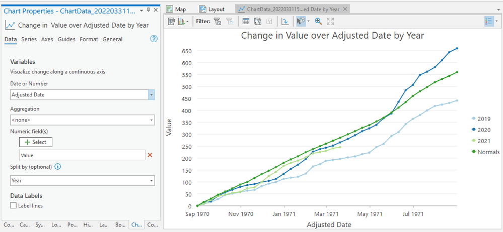
Multi-year line-series charts are important to the group I work for. In Desktop, these kinds of graphs could be created since the option was there to use another attribute for the labeling along a given axis (i.e., use a numerical or date field to plot the data, but label it with human-friendly text). In Pro, as you can see in the attached example, I can create a line-series chart and use a date field for the x-axis. I'm stuck, however, with the date format provided, and I don't see a way to change it. With Arcade, python, Pro SDK, etc. ... I'd work with anything if there's a way. Thank you, cg.
- Mark as New
- Bookmark
- Subscribe
- Mute
- Subscribe to RSS Feed
- Permalink
Temporal profile chart—ArcGIS Pro | Documentation
This topic shows other date formats for the x-axis.
... sort of retired...
- Mark as New
- Bookmark
- Subscribe
- Mute
- Subscribe to RSS Feed
- Permalink
Thanks for the reply. Yes, I'd seen this in doing some investigation into my issue, but this appears to be for charts pulled from multidimensional or mosaic dataset data. In my situation the data is pulled from an non-spatial RDMBS and just associated with features in the map. Also, I forgot to mention, when plotting shorter time intervals along the x-axis I do see changes in the format of the dates (e.g., the year disappears when plotting a few months). However, I can't see a way to control that myself. I've tried going into the tabular data, prior to charting, and adjusting the format there first. That works nice for viewing the data in tabular view, but it is not then conveyed to the chart when plotting it. As mentioned a user could get around this w/ ArcGIS Desktop and the substitute label/column capability, but I can't seem to find an analog in Pro.
- Mark as New
- Bookmark
- Subscribe
- Mute
- Subscribe to RSS Feed
- Permalink
For graphing inside Pro, perhaps your options are limited. For outside, there are numerous python-supported packages, like Matplotlib, but not for the casual user, but useful if you need to develop graphing tools
... sort of retired...
- Mark as New
- Bookmark
- Subscribe
- Mute
- Subscribe to RSS Feed
- Permalink
Thank you again for your time, efforts, and ideas w/ this. I appreciate it. I've actually made an add-in for Pro that uses some other charting APIs (e.g., Live Charts and ScottPlot). In other situations I've used Matplotlib and Bokeh to solve problems. With this issue, however, the Pro charting route would really seal the deal for me if I could just figure out this date formatting. It seems like one can format numbers along the axis, but, for whatever reason, I can't seem to do the same for dates. The Pro charts are nice and dovetail nicely into layouts, workflows, etc..
