- Home
- :
- All Communities
- :
- Products
- :
- ArcGIS Online
- :
- ArcGIS Online Questions
- :
- Workarounds for creating a map using bar (column) ...
- Subscribe to RSS Feed
- Mark Topic as New
- Mark Topic as Read
- Float this Topic for Current User
- Bookmark
- Subscribe
- Mute
- Printer Friendly Page
Workarounds for creating a map using bar (column) chart symbology?
- Mark as New
- Bookmark
- Subscribe
- Mute
- Subscribe to RSS Feed
- Permalink
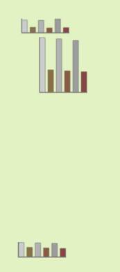
Does anyone know of a workaround or solution to how I could create this type of map on AGOL with bar (column) chart symbology, so that I can add it to an ArcGIS Dashboard?:
I know I could just create some individual bar charts in Dashboards, but I really want to show these charts according to their locations.
I am working with a feature class that is in my local .gdb . I am displaying 6 fields in the bar charts.
- Mark as New
- Bookmark
- Subscribe
- Mute
- Subscribe to RSS Feed
- Permalink
I found where you can create charts using Map Viewer - here's a screen shot. Plus there is some good information in this link that might help https://learn.arcgis.com/en/projects/get-started-with-map-viewer/arcgis-online/index.html#create-a-m...

- Mark as New
- Bookmark
- Subscribe
- Mute
- Subscribe to RSS Feed
- Permalink
Short of publishing a Map Image service, I don't know that this sort of thing is actually possible without getting into some custom coding.
The closest you might be able to come is having 6 copies of the same layer, each with a graduated size symbol based on the relevant attributes, and with the symbol's position adjusted. But I doubt it's going to look anything close to what you want.
Kendall County GIS
- Mark as New
- Bookmark
- Subscribe
- Mute
- Subscribe to RSS Feed
- Permalink
This functionality has been posted in ArcGIS Ideas:
Chart Symbology in ArcGIS Online Map Viewer - Esri Community
Please upvote the idea by "kudo-ing" it as popular ideas upvoted by the community tend to be considered by the Product team for future releases.
Best regards,
Kanin
If this answer solved your question, please mark it as "Accept as Solution" to help others who have the same question.
- Mark as New
- Bookmark
- Subscribe
- Mute
- Subscribe to RSS Feed
- Permalink
Thank you @RobinDiSalvo1 , @jcarlson , and @Kanin for the prompt responses! @RobinDiSalvo1 is that for displaying charts in the Pop-Ups? @jcarlson thanks for that idea, I think that would of worked if I didn't have to display 2 different data sets for 3 different years (the 6 fields I'm working with). @Kanin I just upvoted that idea, that should definitely happen.
I came across this Story Map showing how to use Map Notes to display images users create of their bar charts (they used Excel and PowerPoint in this example).
Yesterday, I was able to display a bar chart next to my locations using the method above, however the bar chart (image) was still kind of blurry and a bit too small even though I had selected the largest size it could be displayed at. But I thought it would make do for now, however today when I checked my map again, the bar charts (images) are now not displaying. I think my connection to the imagery was cut off by my work's server/internet security settings as you have to upload the images to one's Content Folder then create a connection to it using the image's link...

