- Home
- :
- All Communities
- :
- Products
- :
- ArcGIS Online
- :
- ArcGIS Online Questions
- :
- Re: Legend for items symbolized by "types and size...
- Subscribe to RSS Feed
- Mark Topic as New
- Mark Topic as Read
- Float this Topic for Current User
- Bookmark
- Subscribe
- Mute
- Printer Friendly Page
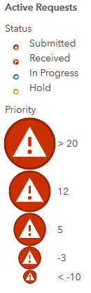
Legend for items symbolized by "types and size" includes unreadably tiny symbols
- Mark as New
- Bookmark
- Subscribe
- Mute
- Subscribe to RSS Feed
- Permalink
- Report Inappropriate Content
I'm putting together a webmap of project data, and have point data symbolized by type and size. The legend that AGOL makes for this separately shows the array of types (project status) and the range of sizes (project priority). Great in theory, except the part that shows types reduces the symbol sizes so much you can't make out anything except colour. I've already adjusted the sizing properties so that the minimum size is clear and readable, but that doesn't seem to affect the way the types are shown in the legend. My example is below. Is there any way to set the type symbols to a more reasonable size in the legend?
Solved! Go to Solution.
Accepted Solutions
- Mark as New
- Bookmark
- Subscribe
- Mute
- Subscribe to RSS Feed
- Permalink
- Report Inappropriate Content
HI Nick,
Thanks for bumping this question. We are doing some work to better support multi-scale symbology for the future but unfortunately it isn't available currently. The image above looks like its a bug. Would you be able to get in touch with tech support or log a bug through this form? https://support.esri.com/report-bug?email=bug_form_triage@esri.com
Thanks,
Kelly
- Mark as New
- Bookmark
- Subscribe
- Mute
- Subscribe to RSS Feed
- Permalink
- Report Inappropriate Content
You can specify the size of symbols and the range in change styles.
This is outlined in this story map (about 75% way through)
https://www.arcgis.com/apps/Cascade/index.html?appid=cc8ed7ffcd5a4e329cdc552d6856abe4
Or on this help page:
Style numbers—ArcGIS Online Help | ArcGIS
I'd suggest starting by setting your minimum size for the lowest priority and something reasonable for the highest priority.
-Kelly
- Mark as New
- Bookmark
- Subscribe
- Mute
- Subscribe to RSS Feed
- Permalink
- Report Inappropriate Content
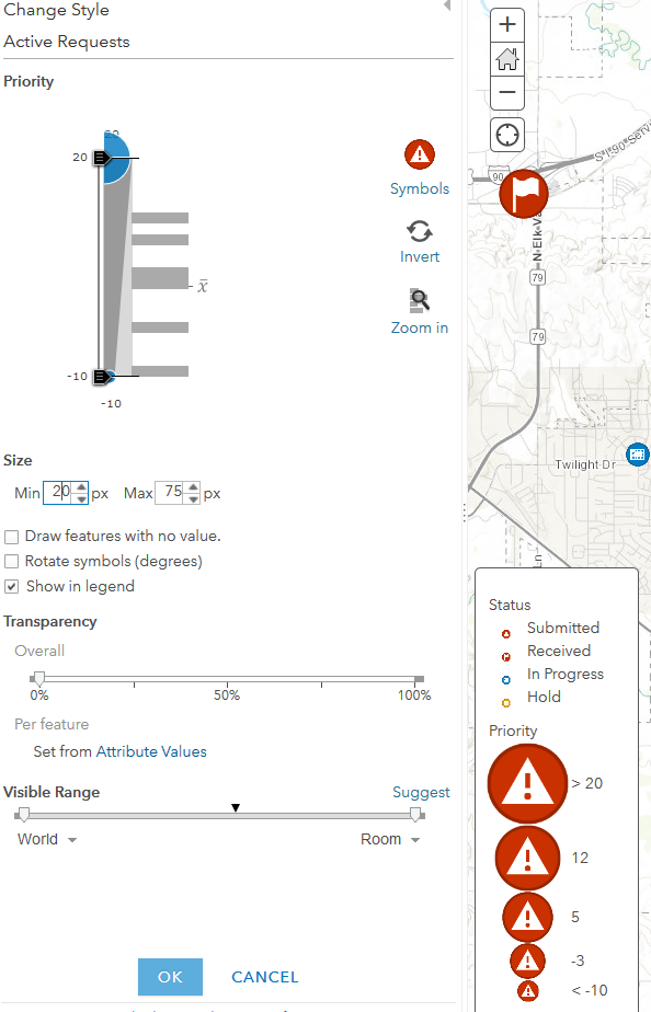
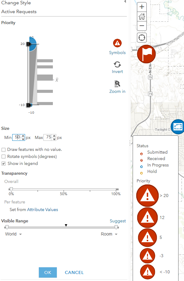
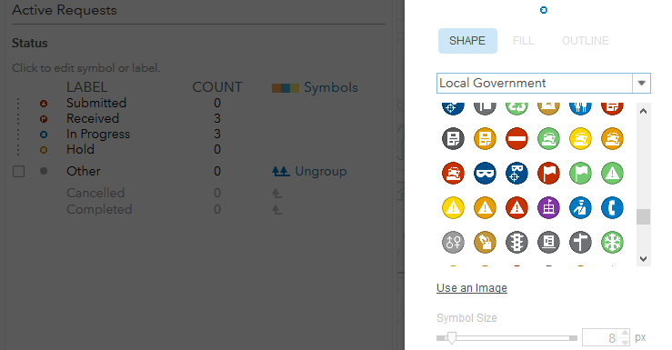
I've done that, and the symbols appear as expected on the map. It's the legend itself that has the tiny symbols. As you can see from the two screenshots below, setting a minimum size affects the size part of the legend ("Priority"), as well as the points in the map, but does nothing to change the type part of the legend ("Status"). The symbols representing the different statuses are stuck at 8 pixels in the legend, and I can't find any way to adjust that (third image).
- Mark as New
- Bookmark
- Subscribe
- Mute
- Subscribe to RSS Feed
- Permalink
- Report Inappropriate Content
Bumping this question in the hopes that someone has a solution. It's very frustrating how unreadable these symbols are in the legend. The tiny symbols are also what get used in the list widget of Operations Dashboard, further limiting the public-facing options for data symbolized in this way.
It happens with any data I try symbolizing by "Types and Size." No matter what options are set for the the size variable, the types--as represented in the legend, not the map--default to 8px in size and seemingly cannot be changed.
- Mark as New
- Bookmark
- Subscribe
- Mute
- Subscribe to RSS Feed
- Permalink
- Report Inappropriate Content
HI Nick,
Thanks for bumping this question. We are doing some work to better support multi-scale symbology for the future but unfortunately it isn't available currently. The image above looks like its a bug. Would you be able to get in touch with tech support or log a bug through this form? https://support.esri.com/report-bug?email=bug_form_triage@esri.com
Thanks,
Kelly
- Mark as New
- Bookmark
- Subscribe
- Mute
- Subscribe to RSS Feed
- Permalink
- Report Inappropriate Content
Thanks for the information--I'm looking forward to the future symbology improvements! I've just submitted a bug report as per your suggestion.