- Home
- :
- All Communities
- :
- Developers
- :
- JavaScript Maps SDK
- :
- JavaScript Maps SDK Questions
- :
- Re: Size of attributeInspector window consistently...
- Subscribe to RSS Feed
- Mark Topic as New
- Mark Topic as Read
- Float this Topic for Current User
- Bookmark
- Subscribe
- Mute
- Printer Friendly Page
Size of attributeInspector window consistently too small
- Mark as New
- Bookmark
- Subscribe
- Mute
- Subscribe to RSS Feed
- Permalink
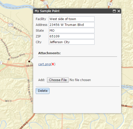
In my Editor widget, the height and width of my attributeInspector window seems consistently too small. There are scrollbars for both height and width.
Should I be changing the style of the esriPopup? It doesn't seem like I should have to.
I don't have a lot of styles set on this. None of the styles provided in the documentation seem to control the height/width of the entire contentpane.
    .esriPopup.light .contentPane, .esriPopup.dark .contentPane {
      padding: 0 1em 1em 1em;
    }

    .atiLayerName{
      display:none;
    }

    .title{
      font-weight: 600;
    }

.esriPopup .titlePane, .esriPopup.light .titlePane, .esriPopup.dark .titlePane {
    background-color: #cbddeb;

padding: 5px 0 0 5px;
    font-size: 1.1em;
    font-weight:bold;
}
I commented all these, but still I have scrollbars.
- Mark as New
- Bookmark
- Subscribe
- Mute
- Subscribe to RSS Feed
- Permalink
Tracy,
Can you post a link to an example that uses the same popup as yours?
- Mark as New
- Bookmark
- Subscribe
- Mute
- Subscribe to RSS Feed
- Permalink
The current project contains secure information I can't use as an example. It happens to contain one field name that's quite a bit longer than the rest. I wonder if that has anything to do with it.
The attributeInspector window is just a little too short and needs a vertical scroll to show the Delete button. It doesn't have a horizontal scroll, maybe because the field names are generally shorter?
- Mark as New
- Bookmark
- Subscribe
- Mute
- Subscribe to RSS Feed
- Permalink
How about .esriAttributeInspector?
- Mark as New
- Bookmark
- Subscribe
- Mute
- Subscribe to RSS Feed
- Permalink
Modifying .esriAttributeInspector made the frame containing the field names input etc be larger, but not its outer frame. This meant even more scrolling to see the entire content.
- Mark as New
- Bookmark
- Subscribe
- Mute
- Subscribe to RSS Feed
- Permalink
Tracy,
Based on your other questions, I think we are trying to make the same app.
- Mark as New
- Bookmark
- Subscribe
- Mute
- Subscribe to RSS Feed
- Permalink
My other twist is that my data is address based. I'm sure I'll get stuck once I attempt to add a feature, not by a click, but entering an address.
I was just using attribute inspector and an edit toolbar by itself before. I thought I'd give the Editor widget a shot, since it doesn't seem to have as much set up. Not that that will help in the long run, if I can't get it to do what I want.
- Mark as New
- Bookmark
- Subscribe
- Mute
- Subscribe to RSS Feed
- Permalink
I have two apps doing what you want.
I have the geoform for input and then a dgrid/editor widget for update/editing.
- Mark as New
- Bookmark
- Subscribe
- Mute
- Subscribe to RSS Feed
- Permalink
Try changing the contentPane height.
| .contentPane { |
That should work.

- Mark as New
- Bookmark
- Subscribe
- Mute
- Subscribe to RSS Feed
- Permalink
I ended up changing the one really long field name from Regional_Supervisor to just Supervisor. That took care of the width without having to explicitly set a style for it. The height I still had to hard code before it looked right to me.