- Home
- :
- All Communities
- :
- Developers
- :
- JavaScript Maps SDK
- :
- JavaScript Maps SDK Questions
- :
- mobile support not working on js api 4.x
- Subscribe to RSS Feed
- Mark Topic as New
- Mark Topic as Read
- Float this Topic for Current User
- Bookmark
- Subscribe
- Mute
- Printer Friendly Page
- Mark as New
- Bookmark
- Subscribe
- Mute
- Subscribe to RSS Feed
- Permalink
hey, I'm using the esri github "js-api-resources" to kickstart creating a new app.
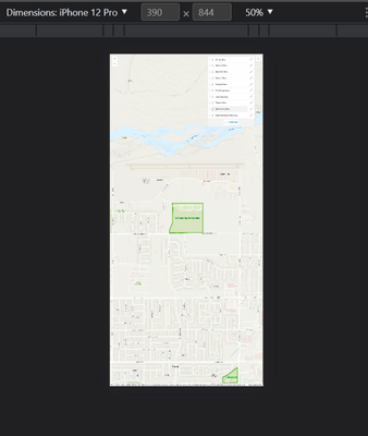
the photo is an unchanged build but the mobile support is missing(?).
the web-samples and live builds seem to work (same css). anything im missing or should change? this is the webpack sample "straight out of the box".
example from a the build after running(not supported):
npm i
and
npm run start
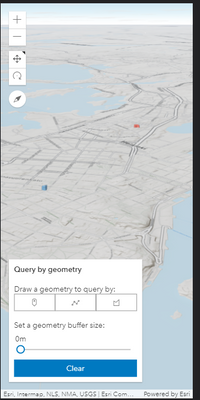
example from a live sample:
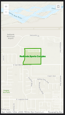
example from the esm-cdn folder(and what i expected to get):
Solved! Go to Solution.
Accepted Solutions
- Mark as New
- Bookmark
- Subscribe
- Mute
- Subscribe to RSS Feed
- Permalink
@litchokay we were able to reproduce this, it's because the webpack sample doesn't set the HTML viewport.
In the webpack sample under /public/index.html try add this:
<meta name="viewport" content="initial-scale=1,maximum-scale=1,user-scalable=no">
- Mark as New
- Bookmark
- Subscribe
- Mute
- Subscribe to RSS Feed
- Permalink
Hi @litch I'm unable to determine what's going on from the screen shots. Are all three screenshots taken using the iPhone 12 Pro simulator mode? That phone has a native resolution of 2532 x 1170 at 460ppi which can make UI elements look really small when running in simulation mode in a desktop browser.
- Mark as New
- Bookmark
- Subscribe
- Mute
- Subscribe to RSS Feed
- Permalink
hi @AndyGup ,
the screenshot is just an example, the problem persists in every mode,
when working from the webpack build mobile support is non-existent.
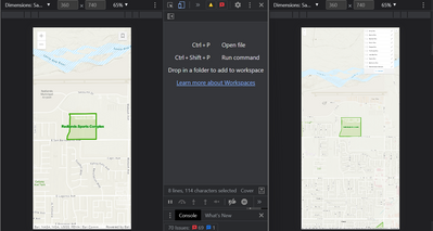
heres a side to side of webpack and the esm-cdn folder:
both should hold the same code and look the same unsimulated,
i tested examples on a production server too, the problem is happening on the phone (non simulated).
- Mark as New
- Bookmark
- Subscribe
- Mute
- Subscribe to RSS Feed
- Permalink
@litchokay we were able to reproduce this, it's because the webpack sample doesn't set the HTML viewport.
In the webpack sample under /public/index.html try add this:
<meta name="viewport" content="initial-scale=1,maximum-scale=1,user-scalable=no">


