- Home
- :
- All Communities
- :
- Developers
- :
- JavaScript Maps SDK
- :
- JavaScript Maps SDK Questions
- :
- Re: Dojox line chart - what can I do to keep from ...
- Subscribe to RSS Feed
- Mark Topic as New
- Mark Topic as Read
- Float this Topic for Current User
- Bookmark
- Subscribe
- Mute
- Printer Friendly Page
Dojox line chart - what can I do to keep from markers from getting cut off?
- Mark as New
- Bookmark
- Subscribe
- Mute
- Subscribe to RSS Feed
- Permalink
My data has multiple years worth of information for each polygon. The layers in the service are named so the last 4 characters are always the year. I'm using an identify on the center of the polygon. This is my results handler
         function getStatsHandler(results){//formats the results for line chart, then generates it
              stats.length = 0;
              yearList.length = 0;
              rateList.length = 0;
              var year;
              domConstruct.empty("chartDiv");
              for (i=0;i<results.length;i++) {
                var lyrResult = results;
                itemLength = lyrResult.layerName.length;
                yearPos = itemLength - 4;
                year = lyrResult.layerName.substr(yearPos, 4);
                var rate = lyrResult.feature.attributes.RATE;
                yearList.push({value: i+1, text:year});
                rateList.push(parseFloat(rate));
               };
               rateList.sort(function(a,b){return a-b});
               var maxVal = rateList[rateList.length -1];
               maxVal = Math.round(maxVal);
               var axisMax =  (parseInt(maxVal/10)+1)*10;

          var lineChart = new Chart2D("chartDiv", {
            title: currentCounty + "</br>" + title + " Rates" ,
            titlePos:"bottom",
            titleGap: 12,
            titleFont: "normal normal normal 13pt Arial",
          });
          lineChart.addPlot("default", {
            type: "Lines",
            markers: true,
            hAxis: "x",
            vAxis: "y"});
          lineChart.addAxis("x", {
            title:"Rates by Year",
            titleOrientation:"away",
            labels: yearList,
            font: "normal normal normal 9pt Arial",
            majorLabels: true,
            minorTicks: false,
            minorLabels: false,
             microTicks: false });
          lineChart.addAxis("y", {
            title:rateNote,
            vertical: true,
            fixLower: "major",
            fixUpper: "major",
            min: 0,
            max: axisMax,
            minorTicks: false,
            minorLabels: true});
            //{vertical: true, min: 0, max: axisMax});
          lineChart.addSeries("Series 1", rateList, {
              stroke: { color: "red", width: 2 }
          }
      );
           var tip = Tooltip(lineChart, "default", {
              text : function(o) {
                var yr = yearList[o.x].text;
                var yrList = parseInt(yr) - 1;
                return ( yrList +'<br>' + o.y );
              }
          });
          lineChart.render();
         }
Everything works in this code except for the cropped markers. Even the online examples for line charts look to have this problem too, but I'm hoping for a workaround anyway.
Solved! Go to Solution.
Accepted Solutions
- Mark as New
- Bookmark
- Subscribe
- Mute
- Subscribe to RSS Feed
- Permalink
I figured it out! If you increase the length of the x Axis slightly, it won't cut the point off. I did this in my example by adding 0.5
| var xAxisMax = years.length + 0.5; //extends the X axis so it doesn't crop off the point | |
- Mark as New
- Bookmark
- Subscribe
- Mute
- Subscribe to RSS Feed
- Permalink
Hey, I'm in the same situation and I liked the solution, but didn't understand where did you use that xAxisMax variable; could you show? Thanks
- Mark as New
- Bookmark
- Subscribe
- Mute
- Subscribe to RSS Feed
- Permalink
I don't think I've touched this since I posted it, but in my code it looks like I added right after the line where I set the xAxis
var axisMax = (parseInt(maxVal/10)+1)*10;
var xAxisMax = years.length + 0.5; //where years is the array holding the data from my identify, extends the X axis so it doesn't crop off the point
Then you add one more parameter in the X axis definition of the lineChart:
lineChart.addAxis("x", {
max: xAxisMax,
title:"Rates by Year",
titleOrientation:"away",
....
In my post, I have data by year, so 'years' is the name of my array. You'll need to study your data to determine what variable you have to work with.
- Mark as New
- Bookmark
- Subscribe
- Mute
- Subscribe to RSS Feed
- Permalink
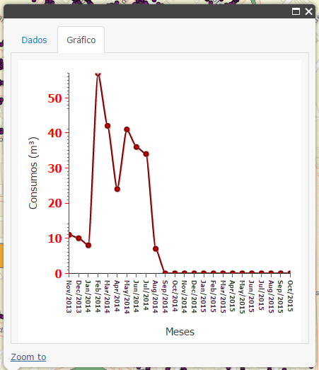
I have data by month/year and tried to add +0.5 to max too, but didn't work very well. See before and after prints:
Before:
After:
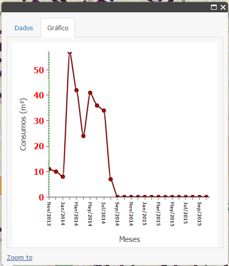
See that the first marker is still cropped and the top y axis one (value above 50) is too (this one I know that is not solved with max in x axis).
- Mark as New
- Bookmark
- Subscribe
- Mute
- Subscribe to RSS Feed
- Permalink
I think you can calculate the maximum value of the y axis too. Have you tried another constant besides 0.5? That was a value that worked for me, but your range of values might require something different.
Here are the links I used when I was doing my research:
| A Beginner’s Guide to Dojo Charting with AMD, Part 1 of 2 | Blog | SitePen
| Dive Into Dojo Charting Again | Blog | SitePen
Maybe you'll find something useful.
- Mark as New
- Bookmark
- Subscribe
- Mute
- Subscribe to RSS Feed
- Permalink
Thanks Tracy, I got it working with the explanation of Scaler in your first link 
- Mark as New
- Bookmark
- Subscribe
- Mute
- Subscribe to RSS Feed
- Permalink
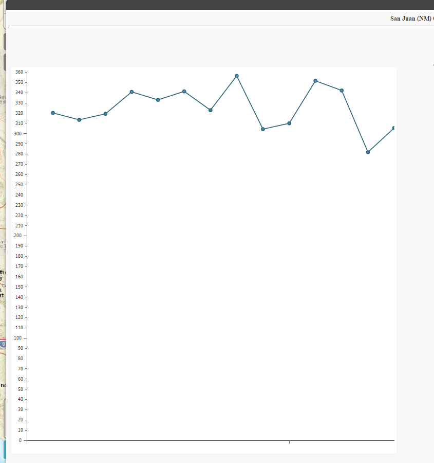
The graphic looks right, but are those the correct values on your Y axis? They're nothing like your original numbers.
There seems to be quite a lot you can do with this chart object, but almost no documentation to go along with it.
- Mark as New
- Bookmark
- Subscribe
- Mute
- Subscribe to RSS Feed
- Permalink
Hey Tracy, yes, they are correct. My data are dynamic, so I calculated max similarly the way you did, with some gap to avoid the cropping.
I agree with your comments about documentation, I felt lack of updated explanative docs with rich samples.
- Mark as New
- Bookmark
- Subscribe
- Mute
- Subscribe to RSS Feed
- Permalink
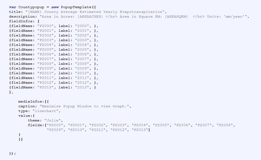
Is it possible to do this with Media Infos in the popup template? I'm trying to add an x-axis to my data.
I have a counties layer with different years of data. Please advice!
Here are some snips of my results.
Thanks for all your help!