- Home
- :
- All Communities
- :
- Developers
- :
- JavaScript Maps SDK
- :
- JavaScript Maps SDK Questions
- :
- Re: Display a line chart in the popup window for a...
- Subscribe to RSS Feed
- Mark Topic as New
- Mark Topic as Read
- Float this Topic for Current User
- Bookmark
- Subscribe
- Mute
- Printer Friendly Page
Display a line chart in the popup window for aggregated representation ( Binning )
- Mark as New
- Bookmark
- Subscribe
- Mute
- Subscribe to RSS Feed
- Permalink
Hello everyone, In the following example, we will discuss aggregated representation :
https://developers.arcgis.com/javascript/latest/sample-code/featurereduction-binning/
Suppose we have a Date field in our initial layer. Is it possible to have a histogram displayed when we click on a rectangle, showing the monthly evolution?
Thanks for your help.
- Mark as New
- Bookmark
- Subscribe
- Mute
- Subscribe to RSS Feed
- Permalink
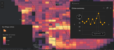
Yes. This is possible. You need to query the features within the bin and create a column chart representing however you partition the data. This sample demonstrates how to query features inside a bin using Arcade: https://developers.arcgis.com/javascript/latest/sample-code/featurereduction-binning-arcade-summary/
In the popup, click one of the arrows next to the pie chart to see a similar visualization using a line chart. This chart displays the number of crimes that occurred in each month within the bin.
This blog also steps you through the process: https://www.esri.com/arcgis-blog/products/arcgis-online/mapping/how-to-summarize-aggregate-data-usin...
- Mark as New
- Bookmark
- Subscribe
- Mute
- Subscribe to RSS Feed
- Permalink
Hello @KristianEkenes ,
Thank you for your response. I tried to follow the same methodology, particularly to retrieve the data reported in January with the code below, but it gives me an error. Do you have any idea where the problem might come from?
- Mark as New
- Bookmark
- Subscribe
- Mute
- Subscribe to RSS Feed
- Permalink
Yeah, I see the issue, but it's a bit of a confusing one... It's in the where clause of the Filter function. That where statement is a SQL where, and doesn't allow Arcade functions. So this bit:
"DATE_HEURE > Date(2023-05-01)"Needs to change to:
"DATE_HEURE > '2023-05-01'"
Then it should work...
Here's an example: https://codepen.io/kekenes/pen/NWOJapJ?editors=100
