- Home
- :
- All Communities
- :
- Products
- :
- ArcGIS Experience Builder
- :
- ArcGIS Experience Builder Questions
- :
- Re: Experience Builder Chart - Bugs and Feature Re...
- Subscribe to RSS Feed
- Mark Topic as New
- Mark Topic as Read
- Float this Topic for Current User
- Bookmark
- Subscribe
- Mute
- Printer Friendly Page
Experience Builder Chart - Bugs and Feature Request
- Mark as New
- Bookmark
- Subscribe
- Mute
- Subscribe to RSS Feed
- Permalink
I'm really excited about the new chart feature in Experience Builder! But I am running into problems with them that I believe are bugs. I have several bar charts in different views/sections. All showing very similar data just grouped by theme. Each one is set up exactly the same way and should behave the same way, but I'm finding 2 issues:
1. I set the color of the bar symbol in the builder (for example a dark blue) to the same color in all of the charts. But when I view the preview/published version some of the charts arbitrarily decide to use a different, light blue. I've even reset all the colors to the default thinking that maybe it could be an issue with the custom color but the default is not even the same color?
2. In the preview/published version Some of the charts will randomly glitch out and just show the text smashed together along the axis (see screenshots). This seems very random and it happens to different charts at different times. Sometimes re-loading the app fixes it or a new chart will be glitched out.
And I have two feature requests:
1. Default font for the chart is Arial but the Experience Builder "default" is Avenir Next. It's a pain to change all the fonts for all the labels/charts to match the rest, it should just use the same as the rest of the app by default.
2. I would like to be able to re-name the category labels for the charts to be more friendly. The underlying data has short truncated names with underscores. I don't want to change the underlying data, just how it is presented to the user. For example, I have a bar called "iscore_wo_" but I'd like it to say "Without Broadband" in my chart.
- Mark as New
- Bookmark
- Subscribe
- Mute
- Subscribe to RSS Feed
- Permalink
I am having the exact same issue. Help!!
Did you ever find a solution?
- Mark as New
- Bookmark
- Subscribe
- Mute
- Subscribe to RSS Feed
- Permalink
This is happening to mine as well.
- Mark as New
- Bookmark
- Subscribe
- Mute
- Subscribe to RSS Feed
- Permalink
I put in a bug for this last month. I have gone back and forth so many times with Esri reps in showing them how to repro with steps/video and what the issue is that they finally bugged it. I guess because I bugged them so much.......so let's just hope that when the new release comes out, planned for Dec 7, that the fix is in it.
#BUG-000144250 When edits are made to the min/max value axis and color in the Chart Widget, the changes are not applied in the preview/publish view unless the Category Axis Label is selected.
#BUG-000144249 When altering the fields in the Chart widget in ArcGIS Experience Builder, the color reverts back to the default blue color.
- Mark as New
- Bookmark
- Subscribe
- Mute
- Subscribe to RSS Feed
- Permalink
- Mark as New
- Bookmark
- Subscribe
- Mute
- Subscribe to RSS Feed
- Permalink
I see that the fix for this has now been implemented, which is good news. However, I am having a similar issue with donut charts and haven't been able to find a workaround. When editing, the donut chart usually shows up with the colors I selected (red and green), but occasionally reverts to what I assume are the default colors (soft blues) on load. Changing the color to something different then changing it back fixes this in edit mode.
However, on previewing or viewing the app the chart almost always (but not every time) reverts to the blue "default" colors. The correct colors will flash for a second and then appear to get "covered up" by the blues. Wondering if anyone else has had this issue or any similar issues persisting after the bug fix.
- Mark as New
- Bookmark
- Subscribe
- Mute
- Subscribe to RSS Feed
- Permalink
I also occasionally experience the issues others have raised, mainly with buggy loading sometimes not populating all the charts (all populate on some loads, some are blank on other loads under the same settings), and colors loading the defaults despite different specifications in Experience Builder. These issues usually resolve on a refresh. Edge as a browser seems to be particularly buggy across multiple ESRI products (Survey123, Ops Dashboards, Experience).
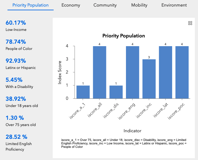
Another issue I am having is with the y-axis labels, particularly when the data is filtered to a smaller subset. There are repeated labels which looks pretty funky (0,1,1,2,2,3,3,4,4 in the graph below). Anyone else have this issue or know how to resolve?

- Mark as New
- Bookmark
- Subscribe
- Mute
- Subscribe to RSS Feed
- Permalink
I was able to work around the funky y axis by adding digits to that display. Adding the .5 for example.