- Home
- :
- All Communities
- :
- Products
- :
- ArcGIS Experience Builder
- :
- ArcGIS Experience Builder Questions
- :
- Re: Do charts support dates as a category?
- Subscribe to RSS Feed
- Mark Topic as New
- Mark Topic as Read
- Float this Topic for Current User
- Bookmark
- Subscribe
- Mute
- Printer Friendly Page
Do charts support dates as a category?
- Mark as New
- Bookmark
- Subscribe
- Mute
- Subscribe to RSS Feed
- Permalink
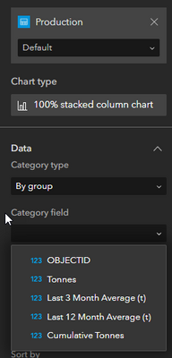
When I add a chart and connect to the data I can only select text fields as a category at the moment:
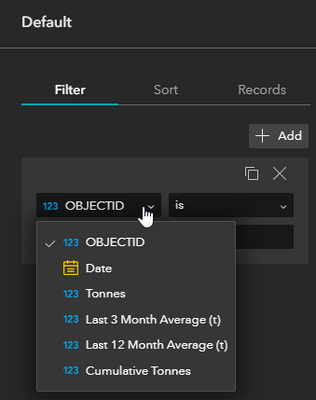
When I look to filter the data I can definitely see the date field:
- Mark as New
- Bookmark
- Subscribe
- Mute
- Subscribe to RSS Feed
- Permalink
Hi @Wei_Ying , I have tried this in Experience Builder, my date field is supported as a category field, but on the date axis, the same date appears multiple times and there are no dates on the axis where there I have no data for that date (please see attached image; the axis skips April) .
I need the date axis to be a continuous set of dates without duplicates or gaps, like in Dashboard charts when you select the 'Parse dates' option. Is there a way to do this?
- Mark as New
- Bookmark
- Subscribe
- Mute
- Subscribe to RSS Feed
- Permalink
Hi @kawakawa4 ,
Thanks for your feedback!
Can you share how you set the time intervals?
If you are seeing multiple same date, it might because you are using interval that smaller than a day, say hour, minute. Also, if you didn't see date that have no data, you may check the option "Empty bins" that how you treat bins with no data.
Would you mind share your settings together with a view of your data attribute, so we can take a look.
Thanks,
Wei
- Mark as New
- Bookmark
- Subscribe
- Mute
- Subscribe to RSS Feed
- Permalink
Hi @Wei_Ying , thanks for your reply. I was trying the 'Empty Bins' options but they weren't working, until I changed 'Statistics' from No aggregation to Sum. Working well now. thank you.
- Mark as New
- Bookmark
- Subscribe
- Mute
- Subscribe to RSS Feed
- Permalink
Hi, I know this post is slightly old now and your reply is over a year ago but just wondered if there is any view to adding the ability to parse dates within the bar graph and allowing for splits at all? This is all possible in the Dashboard App (which i'm trying to migrate onto EB). I have graphs which show a total number per month which is then split into status', i'm only able to accomodate total count for the layer when using the line graph. Examples attached below. I believe the splitting of charts will be possible with the AGO update this week but still won't then be able to split via month like the line graph below...thanks!
- Mark as New
- Bookmark
- Subscribe
- Mute
- Subscribe to RSS Feed
- Permalink
Hi @James_Shreeve ,
Appreciate for your feedback! That is a good suggestion! I have logged your requirement and will investigate with the team and work on it. Though parse date is not available for bar chart yet, the split-by is supported now in the Feb release. Please let us know if that works for you.
Thanks,
Wei
- Mark as New
- Bookmark
- Subscribe
- Mute
- Subscribe to RSS Feed
- Permalink
Hi @Wei_Ying ,
Thank you for your reply, the splitting of the data is now available with the new AGO and this seems to work fine. Although I have noticed that the Y axis doesn't seem to wrap text so some of the text is missing off sometimes, a small thing I guess in the grand scheme of things.
Being able to parse the dates is still something needed for me to be able to use EB charts fully rather than relying on the Dashboard app. Oh and the gauge chart type not being available either. Not being able to parse dates means the values currently showing on my above line/area graph isn't representative of the number of sites per month.
Thanks again,
James
- Mark as New
- Bookmark
- Subscribe
- Mute
- Subscribe to RSS Feed
- Permalink
This was an improvement but to my mind it would still be useful for bar/column charts to be able to use date fields to create columns of totals by year, month or week etc. They can look better than line/area graphs for some data. Very fiddly workarounds required at the moment to get text strings of dates displaying in the right order on bar charts...
- Mark as New
- Bookmark
- Subscribe
- Mute
- Subscribe to RSS Feed
- Permalink
Is there any plans for treating date fields at dates in a chart? The current limitation I am running into is not being able to bin years in a bar chart. In a line or area graph I am able to do so but the data visualization would be more impactful in a bar chart.
TIA
- Mark as New
- Bookmark
- Subscribe
- Mute
- Subscribe to RSS Feed
- Permalink
Hi @JustinH in the recent November 2024 ArcGIS Online release, Chart widget has support time parsing when using a date field in bar or column charts. Please check out and let us know if any issue. Thank you!
- « Previous
-
- 1
- 2
- Next »
- « Previous
-
- 1
- 2
- Next »


