- Home
- :
- All Communities
- :
- Products
- :
- ArcGIS Experience Builder
- :
- ArcGIS Experience Builder Questions
- :
- Re: Alignment Issues with Widget Controller
- Subscribe to RSS Feed
- Mark Topic as New
- Mark Topic as Read
- Float this Topic for Current User
- Bookmark
- Subscribe
- Mute
- Printer Friendly Page
- Mark as New
- Bookmark
- Subscribe
- Mute
- Subscribe to RSS Feed
- Permalink
Hello,
I am new to Experience Builder and I am having trouble getting a widget icon aligned properly in the widget controller. The widget controller consists of a single filter widget. The icon for the filter widget is aligned in the center of the controller but it does not display when the controller is resized below 100px. Is there anyway to get the icon aligned on the left of the controller?
Using Experience Builder Developer Edition 1.8. Including two pics that illustrate the issue.
Solved! Go to Solution.
Accepted Solutions
- Mark as New
- Bookmark
- Subscribe
- Mute
- Subscribe to RSS Feed
- Permalink
Hi @JamesMadden1 - unfortunately, this is the current behavior due to a known tech limit. We will log it in for a future discussion but not sure when a solution will be provided.
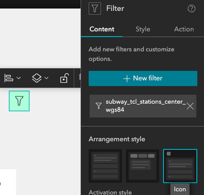
However, if you are using only one stand-alone Filter widget, maybe it is possible to utilize the Icon arrangement style, as a workaround:
This way, you can add the background color and then style it using Auto to center-align the icon button. Hope it helps.
- Mark as New
- Bookmark
- Subscribe
- Mute
- Subscribe to RSS Feed
- Permalink
Tonghui,
Thanks for the helpful info. I've actually developed a custom group filter widget that works like WAB's " but with a simplified UI. We are trying to mimic WAB's Plateau theme with a search bar, layer list and filter up in the panel on the right-hand side of the app. We were able to get a similar UI in Experience Builder but we had to use a sidebar on the right with a layer list, search bar up on the top right and filter off on the left with the general map controls. The alignment issue we were having was when we tried to dock the filter icon up in the fixed panel on the right with the search tool. The attached image illustrates the issue. Notice how the widget controller overlaps with the search tool in order to get the filter icon to display.
