- Home
- :
- All Communities
- :
- Products
- :
- ArcGIS Experience Builder
- :
- ArcGIS Experience Builder Ideas
- :
- Allow Bar Chart Custom Color by Value in a Field
- Subscribe to RSS Feed
- Mark as New
- Mark as Read
- Bookmark
- Follow this Idea
- Printer Friendly Page
Allow Bar Chart Custom Color by Value in a Field
- Mark as New
- Bookmark
- Subscribe
- Mute
- Subscribe to RSS Feed
- Permalink
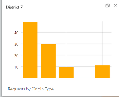
Please allow us to customize the colors of bar charts based on values in a single field. Right now, if we choose a field that houses all the categories associated with the features, we only get the option of a single color.
If we create a bar chart using multiple fields, each fields can apparently have a color but that doesn't work well for the way most categorical datasets are configured.
This issue has been posted about previously:
Bar Chart widget - Color and Label - Esri Community
Is there an option to change bar chart colours? - Esri Community
- « Previous
-
- 1
- 2
- Next »
Here to say... we should definitely have control over the bar chart colors + labels in the pop-ups within Map Viewer. Can't tell anything by this... hover over for label doesn't make sense.
I was trying to recreate the symbology that one of my colleagues produced in a Dashboard using the same dataset in Experience Builder. It would be great if the options available to customize charts in Dashboards were available in Experience Builder.
Hi @NeilPennanen_dnr thank you for your comments. Consider additional Idea kudo over here ... https://community.esri.com/t5/arcgis-online-ideas/color-and-label-configuration-for-charts-in-map/id...
This is a great suggestion. Otherwise you have to get a creative with how you display the datasets and adds extra work from a data management point of view.
In circle diagrams the option to change colours within the same attribute is available and in bar or column charts this option is not available. Can't imagine why this would pose a technical challenge as a feature for the experience builder.
Definitely support this. The same chart options that are in Dashboard should be in Experience Builder, with the ability to control colors & labels high up on the priority list.
The bar graphs are definitely lacking functionality. ESRI says Experience Builder is replacing Web App Builder. If so, we should be able to do the same thing in Experience Builder that we could easily do in Web App Builder.
Having different color bars in bar chart categories is such a basic function. It's very hard to understand why it was overlooked, particularly when it was possible previously. Why would one take away features and capabilities people have already built into their workflows with a new release? Isn't the point to add functionality?
Not sure how Experience Builder has been around for so long without this functionality. Pretty disappointing.
It would be great if the chart inherited the legend color for each categorical value automatically like it does in ArcGIS Pro when that category is already symbolized on the map.
You must be a registered user to add a comment. If you've already registered, sign in. Otherwise, register and sign in.
