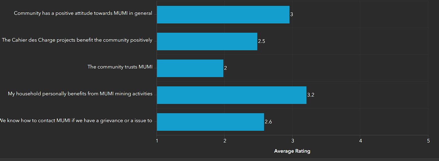
Instead of having three blue bars, is there an option where I can change each bar to different colours?
Click on Series, then click the Edit icon next to the series name. You'll see a Symbol section which will enable you to change the bar color.
However, this will only work for the entire series. It appears your chart is configured to show the values per field, and that will consider the fields as separate items in the same series.
Without reshaping your data, I don't know that you can get individual items in a single series to be colored differently.
Hi Josh, thanks for your response.
So in order to get different colours, I would need each field to come from a different data source?
From what I'm seeing, the colors are by field which would mean you would have to create a dataset that looks like this:
Pop2006, Pop2013, Pop2018
Count2006, Count2013, Count2018
Instead of simply being able to have a count and color for different categories in a single field. This is a big frustration and not very database-management friendly.
Yeah quite annoying, hopefully they bring this functionality into a future update!
Please give this idea kudos here: (2) Allow Bar Chat Custom Color by Value in a Field - Esri Community
Is there a way i can set this graph to show diffrent colors based on the values, i.e if the rating is 2 then the color changes to red and if the rating is 3 then the color changes to yellow?
kindly note that this graph has a filter based on village number
Signed in members can post, follow updates, and more. New here? Register a free account.
Find useful guides, FAQs, and documents to help you navigate and make the most of Esri Community.