- Home
- :
- All Communities
- :
- Products
- :
- ArcGIS Dashboards
- :
- ArcGIS Dashboards Questions
- :
- Re: Sort Dashboard Legend?
- Subscribe to RSS Feed
- Mark Topic as New
- Mark Topic as Read
- Float this Topic for Current User
- Bookmark
- Subscribe
- Mute
- Printer Friendly Page
Sort Dashboard Legend?
- Mark as New
- Bookmark
- Subscribe
- Mute
- Subscribe to RSS Feed
- Permalink
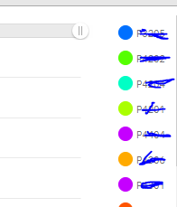
I have a dashboard that contains a time series for sample locations. The legend lists the location ids in no order that I can see. I would present an image, but the data is very sensitive.
There is simply no order. The unique ids are separated by color and if you are wondering which location the dark pink line represents, you just need to scan up and down the legend until you find it. Same for the turquoise line, the orange one, etc... Extremely awkward.
Is there a way to get the legends in dashboard time series charts to sort?
Thank you,
Randy McGregor
- Mark as New
- Bookmark
- Subscribe
- Mute
- Subscribe to RSS Feed
- Permalink
I can sort lists, detail panes, almost everything except the legend items in the chart.
Thank You,
Randy McGregor
- Mark as New
- Bookmark
- Subscribe
- Mute
- Subscribe to RSS Feed
- Permalink
"Since the contents of your web map determine the contents of the legend element, the order in which layers appear in the web map reflects the order in which they appear in the legend element."
- Mark as New
- Bookmark
- Subscribe
- Mute
- Subscribe to RSS Feed
- Permalink
Thanks Rickey,
It's not the map legend. Sorry. I wasn't clear - It's the dashboard legend - the list of charted locations, which changes depending on selection.
There is only one map layer - the sample results layer. The dashboard creates a legend on the fly for each unique location id, because a line graph is made for each selected location (split by = "Location ID"). I obscured the ids, but this is an example and they are not sorted in any logical way and I don't seem to have any control over it.

- Mark as New
- Bookmark
- Subscribe
- Mute
- Subscribe to RSS Feed
- Permalink
is it sorted by objectid?
- Mark as New
- Bookmark
- Subscribe
- Mute
- Subscribe to RSS Feed
- Permalink
Good guess. I don't know. I see no way to tell it how to sort.
- Mark as New
- Bookmark
- Subscribe
- Mute
- Subscribe to RSS Feed
- Permalink
Can you open the data in another map and see if it is ordered by objectid?
What chart are you using?
- Mark as New
- Bookmark
- Subscribe
- Mute
- Subscribe to RSS Feed
- Permalink
If I discovered they were sorted based on object id, what would I be able to do with that information?
- Mark as New
- Bookmark
- Subscribe
- Mute
- Subscribe to RSS Feed
- Permalink
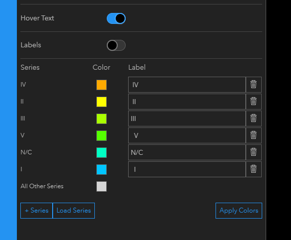
I have a similar issue. We have a text values, Site Index, and I'd like I to be at the top, then II, but what I get is below. Any suggestions??
Thanks.
keith

- Mark as New
- Bookmark
- Subscribe
- Mute
- Subscribe to RSS Feed
- Permalink
I have seen no way of dealing with this, nor have I heard anything. This is either a bug or an oversight. It would be nice if someone at ESRI could at least comment on this. An unsorted legend is awkward.