- Home
- :
- All Communities
- :
- Products
- :
- ArcGIS Dashboards
- :
- ArcGIS Dashboards Questions
- :
- Re: ArcGIS Dashboard Serial Chart for temperatures...
- Subscribe to RSS Feed
- Mark Topic as New
- Mark Topic as Read
- Float this Topic for Current User
- Bookmark
- Subscribe
- Mute
- Printer Friendly Page
ArcGIS Dashboard Serial Chart for temperatures from multiple weather stations
- Mark as New
- Bookmark
- Subscribe
- Mute
- Subscribe to RSS Feed
- Permalink
I have two weather stations which put data into a single hourly table. I am trying to graph minimum and maximum temperatures for both weather stations on a single serial chart. The table has a row for TempMin and TempMax and a column for station_name. I am unable to redo the table to have TempMinSt1 and TempMinSt2, etc..
Is there any arcade expression that could easily do this? I'm not a developer, so arcade is totally new to me.
When I try to use the choices available in the Dashboard I can either show a series for each weather station for one of the fields - min or max. Or I can show min and max for one station.
Any ideas? I've been trying to mess around with arcade, but I'm not sure which functions to use - filter, groupby, etc..
Thanks!
RyanE
- Mark as New
- Bookmark
- Subscribe
- Mute
- Subscribe to RSS Feed
- Permalink
Do you have a link to the data source, if it's public? You may be able to use the built-in options if you configured it properly, but it's hard to say without more details.
If it needs to be done in Arcade, there's a lot of flexibility in how that's done. Do you just envision a min and max line for each station?
Kendall County GIS
- Mark as New
- Bookmark
- Subscribe
- Mute
- Subscribe to RSS Feed
- Permalink
Unfortunately it isn't a public weather station. But, Yes, I do just envision a min and max line for each weather station.
However, like you said I think I figured it out with the built-in options. I still have a question though...
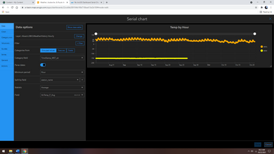
The serial chart is displaying like I want with each station as a series (the yellow station is not currently active hence the -153F temp). But I've had to choose a statistic option for the AirTemp_F_Avg field - I chose "average". If I choose Min, Max, Avg, or Sum, it appears to simply display the values from the table, but when I look at the table the values are not exactly the same (eg. 41.8 vs 41.95 at 0000 on 8/27). When I click through Min, Max, Avg, or Sum the values do not change, which makes me think those statistics aren't doing anything, but then why the difference with the table.
Any idea what's happening? Are these the correct settings that I'm looking for?
- Mark as New
- Bookmark
- Subscribe
- Mute
- Subscribe to RSS Feed
- Permalink
The statistics would matter if you chose a different time period. Choosing "Day" would then apply whatever statistic across all records for the given day and give you a single point.
Hard to say why the table would show slightly different values, though. If you have multiple values per hour, it may be that it's truly giving you an average.
Kendall County GIS
