- Home
- :
- All Communities
- :
- Products
- :
- ArcGIS Dashboards
- :
- ArcGIS Dashboards Ideas
- :
- Multiple series on a Grouped Values chart
- Subscribe to RSS Feed
- Mark as New
- Mark as Read
- Bookmark
- Follow this Idea
- Printer Friendly Page
Multiple series on a Grouped Values chart
- Mark as New
- Bookmark
- Subscribe
- Mute
- Subscribe to RSS Feed
- Permalink
Charts sometimes need to be displayed using one value axis and two categories. An example would be values such as "Employment" and categories such as a month and a state. The chart is built normally using the categories from the "Grouped Values"
A list (of states) can is then added to the dashboard and an action tied to the serial chart to enable a filtered display of data from the second category in addition to the time series.
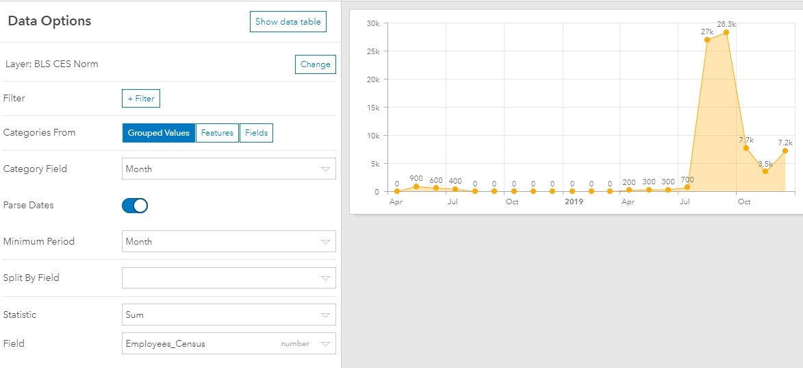
Importantly, with the "Grouped Values" option selected, the sum of the values axis is displayed when there is no selection in the list. In other words, if not state is selected, the sum for all the states in the serial chart data source for each month is displayed.
However, If two-series need to be displayed on a serial chart, then the "Categories from Features" option is used.
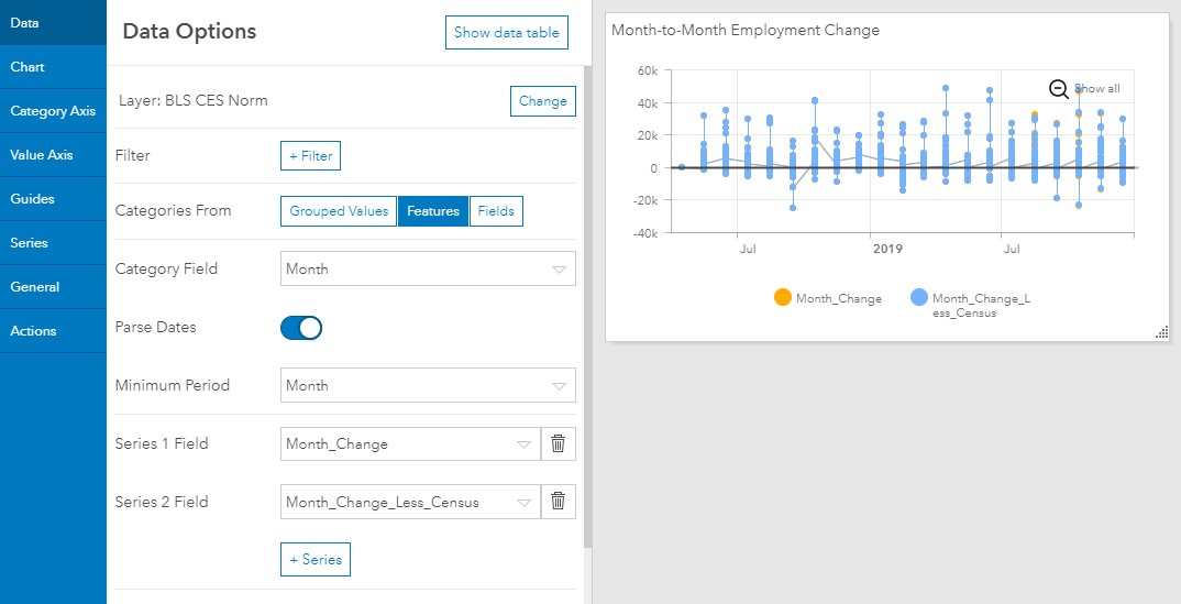
As is visible in the image above, when the "Categories from Features" is used, the chart displays values for all the categories (states) simultaneously. Ideally, the serial chart would display the sum of the values axis for the Month category, not the value for each state.

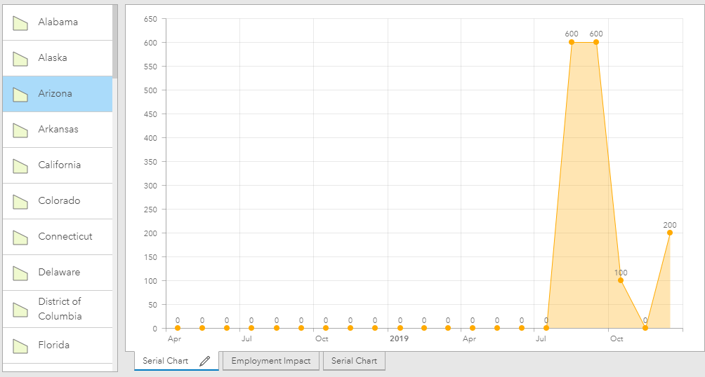
When a state is selected in the list, thereby filtering the values to just a single state, the chart renders as desired.
Two separate but similar proposals which could fix the behavior)
- Provide the option to use more than one series on a chart configured with "Grouped Values"
- When using the Categories from features, provide an option to display either one of these two mutually exclusive configurations - the sum of features values or each category (the current default behavior)
This would be a great enhancement to Dashboards series!
Dear ArcGIS Dashboards, ArcGIS Dashboards Beta
please consider adding this functionality to new Dashboards. Now in COVID time, this is quite missing functionality. In our case, we are not able to display a history of confirmed cases, deaths and recovered in one line-chart.
These attributes must be aggregated via DataField, and because for Aggregated values you can use just one statistic field, we must use several charts to display all these values.
Please consider adding option to have more statistic fields also for aggregated data.
Thank you.
Regards,
Vladimir
Hi Tim,
Thanks for your post. Could you provide more info on your data model? It would help in assessing this request.
Based on the charts you included, I'm wondering if your data might be in the following format.
| State | Date | Value_SourceA | Value_SourceB |
| California | 1-Apr | 50 | 45 |
| California | 2-Apr | 60 | 54 |
| California | 3-Apr | 70 | 63 |
| California | 4-Apr | 80 | 72 |
| Nevada | 1-Apr | 35 | 31 |
| Nevada | 2-Apr | 42 | 37 |
| Nevada | 3-Apr | 49 | 44 |
| Nevada | 4-Apr | 56 | 50 |
If so, it might work to restructure your data. In the following format, we can leverage the "Split By" capability in the "Categories from Grouped Values" configuration.
| State | Date | Value | Source |
| California | 1-Apr | 50 | A |
| California | 1-Apr | 45 | B |
| California | 2-Apr | 60 | A |
| California | 2-Apr | 54 | B |
| California | 3-Apr | 70 | A |
| California | 3-Apr | 63 | B |
| California | 4-Apr | 80 | A |
| California | 4-Apr | 72 | B |
| Nevada | 1-Apr | 35 | A |
| Nevada | 1-Apr | 31 | B |
| Nevada | 2-Apr | 42 | A |
| Nevada | 2-Apr | 37 | B |
| Nevada | 3-Apr | 49 | A |
| Nevada | 3-Apr | 44 | B |
| Nevada | 4-Apr | 56 | A |
| Nevada | 4-Apr | 50 | B |
You would choose Categories from the Date field with a grouping period of Day. The statistic would be Sum on the Value field. Choose the Source field for the split by field. The chart would sum the values for each day (across all states) and have two series (or how ever many unique values in the source field): A and B. When a state is selected in the list, it would apply a filter action to the chart and you'd see data for only the selected state.
Dear David Nyenhuis, I don´t know what is Tim Kuhn´s case, but to clarify ours see please below.
One of our examples:
Table with columns - county code, confirmed, recovered, deaths, datum, region code
Then we have numbers for each county and day. We have 77 counties in 14 regions.
Date is a category. And we would like to display timeline chart with sum of confirmed, recovered and deaths in each day (three lines/series in one chart). We have grouped values by date field, and there is a limit, that we can display just one statistic field and not more, that´s a limit. So, we must create more charts for each value.
See attached screen.
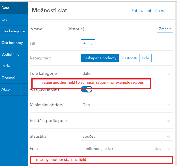
At best we would like to make within the same chart another 3 series of sumamrization based not one but two columns Region and Confirmed, Region and Recovered, Region and Deaths.
But this seems to be also above this idea, while dashboaed can´t make more statistic summarization based on one field. David Nyenhuis should we make another idea, or could be this merged with this idea?
Hope this helps to narrow the issue.
Thank you,
Vladimir
@TimKuhn2 I think you can achieve what you were after using the render when filtered improvements made to our actions framework a while back. A modified data structure (as per @DavidNyenhuis1 ) might be a good idea too as a multi-series serial chart for the Grouped Values case is achieved using data that is structured a certain way.
@VHolubec It's usually best to submit separate ideas when they are similar but not quite the same. A workaround for your use case (multiple statistics) might be to use a data expression that aggregates your data and calculates multiple summary statistics. Then, when configuring the serial chart you can use the Features option and add multiple series (one per each summary statistic).
Hi @patrickb,
Mea culpa. Yes the FeatureSet it very powerful tool and I am happy to have it in Dashboards and it can solve a lot, but at least for not-much-experienced users it could be quite complicated to make a desired FeatureSet.
And since the FeateureSet is immutable the user needs to make a whole new definition of the FeatureSet - and so cannot "edit - add new-field/re-calculate" the field in the FeatureSet loaded from the layer - and it leads to quite complex Arcade expression - but it´s for another Idea - about some more streamlined Feature Set creation.
Have a great day.
You must be a registered user to add a comment. If you've already registered, sign in. Otherwise, register and sign in.