- Home
- :
- All Communities
- :
- Products
- :
- ArcGIS Dashboards
- :
- ArcGIS Dashboards Blog
- :
- Author beautiful dashboards in your browser with O...
Author beautiful dashboards in your browser with Operations Dashboard for ArcGIS
- Subscribe to RSS Feed
- Mark as New
- Mark as Read
- Bookmark
- Subscribe
- Printer Friendly Page
Operations Dashboard for ArcGIS is an app that enables you to monitor, track, and assess your assets and daily operations. We’re delighted to announce that we just refreshed our beta for the next generation Operations Dashboard app. This beta empowers you to make visually stunning dashboards that enable operational decisions at a glance, all within your web browser. Sign up for the Operations Dashboard beta program and check out the beta through Esri’s Early Adopter site.
Highlights of the new capabilities are:
Author and share dashboards, all within a web browser
You can now create a dashboard from scratch and share it with users, all from your web browser. There is no need to download and install anything locally. This new web architecture means Operations Dashboard is more closely integrated with your ArcGIS organization.
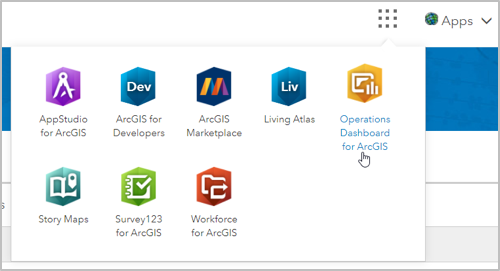
For example, now you can launch Operations Dashboard from the ArcGIS Online app switcher, as shown above. You can also browse for and manage your dashboards within your ArcGIS organizational content, in addition to the new Operations Dashboard homepage, as shown below. You can also start creating dashboards from the homepage. These enhancements make working between Operations Dashboard and your ArcGIS organization seamless and easy.
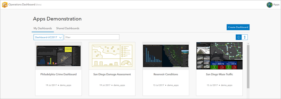
Create beautiful dashboards
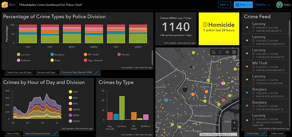
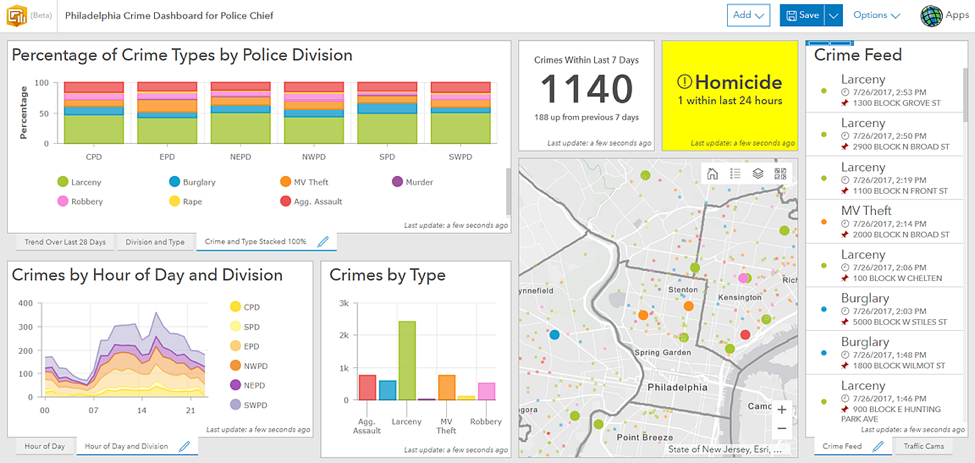
You can easily create stunning information products with this beta. Each visual element you add to a dashboard includes attractive and intuitive default style options. However, if you need more control over the look and feel of your dashboards, there are many configuration options to play with. You can adjust font sizes and colors, as well as use rich text, custom icons, and HTML symbols in your visual elements. You now have the option to display the last update time on each visual element, which improves situational awareness by informing users how current the data is. In addition, this release includes a redesigned dark theme, shown below, that makes your dashboards pop in dimly lit rooms. Simply put, you now have the power to create the dashboard best suited to your organizational needs.
Leverage the latest web map capabilities
You can now include map elements in your dashboards that take advantage of all the powerful new web map functionality, such as heat map renderers, stream layers, and vector basemaps. You can also use Arcade expressions to enhance map labels and symbology. In short, you can now include more clear, useful, and attractive maps in your dashboards.
Create advanced charts
This beta offers many sophisticated charts of various types and styles to include in your dashboards. Click through the images below to see the new charting capabilities.
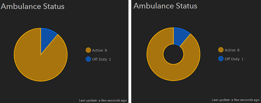
You can easily make more types of charts in this beta. For instance, you can transform a pie chart into a donut chart just by adjusting the chart’s inner radius setting. You can also make an area chart by increasing the opacity of the area underneath a series in a line chart, as shown in the next image.
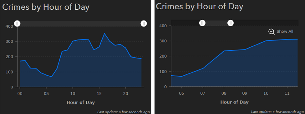
Time-series data can now be visualized on line and area charts, as shown in the area chart above. You can also enable a scrollbar that allows you to only display times that you’re interested in, such as between 6 PM and 11 PM, as shown in the image at right above. In addition, you can filter data shown in your chart (and the indicator element) by common time periods, such as “within the last 7 days” or “within the last month.” Date-parsing along the category axis is also supported, as shown in the next image.
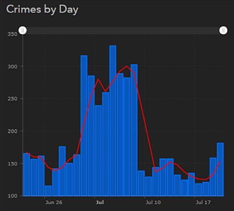
You can create various multi-series charts, or charts with more than one data set, for your dashboards. The above chart has two series and each series is a different type. One series is a bar chart, and the other series is a line chart. This can be useful when you want to compare exact values with a rolling average, as shown above.

This chart is another example of a multi-series chart, except each series is of the same type: bar chart. This chart was created by splitting the category field by another field. This is helpful when you want to see the composition of your data. In the above example, you can see the number of service calls from certain districts, distinguished by whether the calls were made during the evening, day, or midnight shifts.
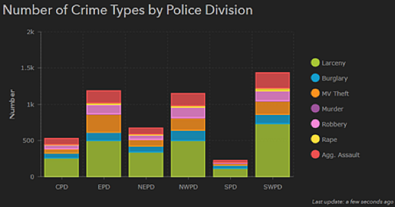
Another way to show data composition is to have stacked charts, like the one above. These are useful for making comparisons between data segments.
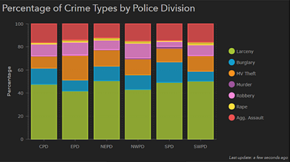
To display the relative differences between components of data categories, you can also make 100% stacked charts, like the one shown above.
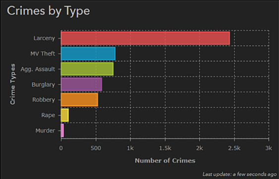
This beta includes more ways to customize the appearance of your charts. You can make the orientation horizontal, increase label sizes, enable metric prefixing on the value axis, include axis titles, specify the order of values on the category axis, and alter the outline and opacity of data values and grid lines, as shown in the chart above. You can also stagger the placement of labels, as shown in the next image.
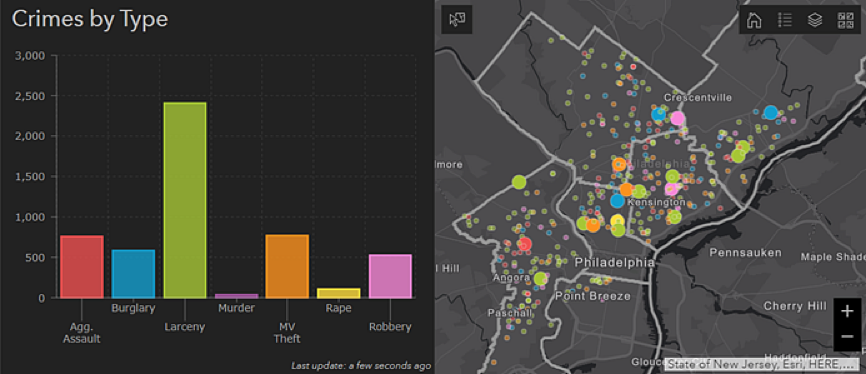
You can now match the colors in your charts with the colors of your map symbols, as shown above. You can also match the colors of map symbols with symbols in other elements, such as feature lists.
Use the enhanced indicator element
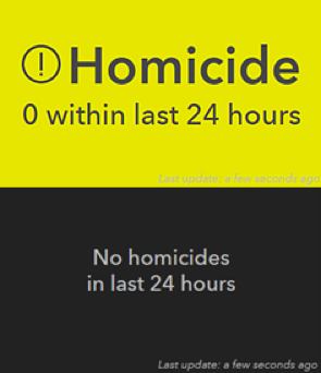
The new indicator element merges the capabilities of the Summary and Indicator widgets in operation views, and includes additional functionality that makes it easier to understand the status of an asset or operation. The new indicator supports conditional formatting, which causes its appearance to change based on your data. For instance, if you want to easily tell whether a homicide has occurred, you can configure the indicator to turn bright yellow when the number of homicides is more than zero, as shown in the image to the top right. Conversely, you can configure the indicator to turn black when no homicides have occurred, as shown in the image to the bottom right. The indicator can also better facilitate comparisons, by showing how a current measurement or value compares to a historical measurement. Last, the indicator has greatly enhanced aesthetics, with more options to customize text and add pre-made or custom icons, as shown in the top right image.
This beta update represents a huge step forward in the evolution of Operations Dashboard, but over the next few months, we will continue to offer more functionality. We will provide more options to interact with your data, refine the dashboard authoring experience, develop highly responsive map tools, and add more data visualizations. We are aiming to release the first official version of the new web experience in QA of 2017, to coincide with the ArcGIS Online update planned for that month.
To use the new capabilities described here, and ensure that we continue to make the next generation of Operations Dashboard useful and exciting for your organization, check out the beta on the Early Adopter Site. We look forward to seeing your questions, comments, and ideas.
Sincerely,
The Operations Dashboard Dev team
You must be a registered user to add a comment. If you've already registered, sign in. Otherwise, register and sign in.