- Home
- :
- All Communities
- :
- Developers
- :
- Python
- :
- Python Questions
- :
- Scatter plot of two rasters
- Subscribe to RSS Feed
- Mark Topic as New
- Mark Topic as Read
- Float this Topic for Current User
- Bookmark
- Subscribe
- Mute
- Printer Friendly Page
- Mark as New
- Bookmark
- Subscribe
- Mute
- Subscribe to RSS Feed
- Permalink
Xander Bakker and Dan Patterson , Kindly your cooperation is highly appreciate.
I have two raster file, i want to perform Scatter plot of those raster . I found one code that is written by Dan Patterson
Below code
from matplotlib import pyplot as plt
xs = [1,3,2,5,6,4] # Which fomart of data i have to give here?
ys = [3,2,1,5,3,2]
plt.scatter(xs, ys)
main_title ="My first graph"
plt.title(main_title, loc='center') #loc is either left, right or center
plt.minorticks_on()
plt.tick_params(which='major', direction='in', length=6, width=2)
plt.tick_params(which='minor', direction='in', length=4, width=2)
plt.show()Earlier Dan suggest to someone convert those raster to arrays. I followed the same but could not solve it. How to process tiff to array.
how do i execute two raster in X and Y axis. I have tiff images.
Branched from Perform Raster Calculation from Multiple Sub-folder Using ArcPy
Solved! Go to Solution.
Accepted Solutions
- Mark as New
- Bookmark
- Subscribe
- Mute
- Subscribe to RSS Feed
- Permalink
Follow Neil's and Xander's advice. A plot like that is going to show nothing more than a scaled down version. Calculate the statistical parameters of both variables and summarize in tabular form. This is a classic example of a graph adding nothing to the analysis or presentation. In fact, the association between the variables is better shown in mapped form since the spatial dimension is explicit.
Is this a requirement for some project? If so, gently suggest to the proponent that better means of examining the relationship are available.
- Mark as New
- Bookmark
- Subscribe
- Mute
- Subscribe to RSS Feed
- Permalink
you have to plot them separately as rasters not as a scatter plot, you can convert a raster to rows and columns and plot those as a scatterplot, so I am not sure what you want to do specifically. What does your data look like now?
- Mark as New
- Bookmark
- Subscribe
- Mute
- Subscribe to RSS Feed
- Permalink
I would normally not do this on the entire raster or rasters but create a random subset of them using Create Random points and then use Sample.
Then just use the graphing tools inside ArcMap.
- Mark as New
- Bookmark
- Subscribe
- Mute
- Subscribe to RSS Feed
- Permalink
Thank you. I want to do on cell by cell basis. I have two different parameters of raster data, so one parameter i want to plot in X axis and another one Y axis to make it relation between two parameters.
How do i convert it in row and column format. can i convert it in ASCII format?
Data is tiff format same as which we got from our above scrip suggested by xander_bakker
- Mark as New
- Bookmark
- Subscribe
- Mute
- Subscribe to RSS Feed
- Permalink
Reply from Dan Patterson
before you go off into a side tangent of graphing and trying to 'correlate', 'predict' or extrapolate see...
Geographically Weighted Regression (GWR)—Help | ArcGIS for Desktop
Only if you are working with interval/ratio and there is some real predictive behaviour between the two variables. Looking for correlations, relationships between two variables via a magical statistical test is overused. But if you are looking for an association then the above and other substitutes will save a flurry of activity in the wrong direction
For nominal data... Combine—Help | ArcGIS for Desktop gives you the basis for tests of Association such as the chi-squared test. And at worst it gives you a tabular output for discussion
Make your intent clear and specific... otherwise people with keep throwing suggestions out that will meet vague goals ... not necessary specific ones.
- Mark as New
- Bookmark
- Subscribe
- Mute
- Subscribe to RSS Feed
- Permalink
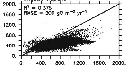
Thank you. I am not getting your points. i am trying plot two variable of raster like this ...
- Mark as New
- Bookmark
- Subscribe
- Mute
- Subscribe to RSS Feed
- Permalink
Reply from Dan Patterson
If the rasters aren't huge convert to points, then Ordinary Least Squares (OLS)—Help | ArcGIS for Desktop I think the report allows for a graph
- Mark as New
- Bookmark
- Subscribe
- Mute
- Subscribe to RSS Feed
- Permalink
Xander Bakker, Dan Patterson , I moved total conversion from there to here. Please cooperate with us. Sorry for the inconvenience cause.
- Mark as New
- Bookmark
- Subscribe
- Mute
- Subscribe to RSS Feed
- Permalink
Dan Patterson, As your last comment we have huge data point. number of columns and rows 2737, 2025 respectively. So whats is the best way to plot those raster.
- Mark as New
- Bookmark
- Subscribe
- Mute
- Subscribe to RSS Feed
- Permalink
I think the suggestion by Neil Ayres is an option you should look at. Use Create Random Points—Help | ArcGIS for Desktop , followed by Extract Multi Values to Points—Help | ArcGIS for Desktop to graph the two variables (rasters) together in a scatter plot.
The alternative is using numpy to access the pixel values and create a resulting table with the combination of the values for each cell. In your case that would be over 5.5 M records, which might yield errors.