- Home
- :
- All Communities
- :
- Products
- :
- Mapping
- :
- Mapping Questions
- :
- Re: I can't get graduated symbology on the attribu...
- Subscribe to RSS Feed
- Mark Topic as New
- Mark Topic as Read
- Float this Topic for Current User
- Bookmark
- Subscribe
- Mute
- Printer Friendly Page
I can't get graduated symbology on the attribute i want
- Mark as New
- Bookmark
- Subscribe
- Mute
- Subscribe to RSS Feed
- Permalink
I'm almost done with a humongous project except I'm just stalled on one certain point.
I want to cut and paste the screenshots of my work, but I can't do it on here. Can someone help me out via email?
I just have one problem, and I've gotten so far on my own.
My email's okonheim@comcast.net
Solved! Go to Solution.
Accepted Solutions
- Mark as New
- Bookmark
- Subscribe
- Mute
- Subscribe to RSS Feed
- Permalink
Orrin, I told you how to do what your asking: "right click the layer in the table of contents, select copy, past it in to your table of contents, and then change the symbology of the copied layer as described in the help file." I don't really know how else to describe it to you. Yes, you can have multiple attributes of one layer displayed by copying and pasting the layer again into the table of content and having different symbology for each copy. Of course you can have county names as well as percentages. The software is actually incredible versatile and powerful if you know how to use it.
- Mark as New
- Bookmark
- Subscribe
- Mute
- Subscribe to RSS Feed
- Permalink
You can save your screenshots and insert them as images using the Insert Image button on the toolbar:
This way you are much more likely to get help.
- Mark as New
- Bookmark
- Subscribe
- Mute
- Subscribe to RSS Feed
- Permalink
OK, so here's a category that I want to insert: The percent difference in population change for counties in Oklahoma
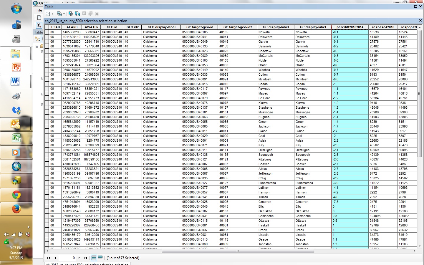
I did this by merging a census-downloaded spreadsheet of county change to excel and merging it with a shape tiger file of oklahoma counties:
So, I'm trying to do symbology, so I can shade the counties in Oklahoma based on % population differential, but here's where I run into problems. The field perdiff20102014 appears in the value field here....
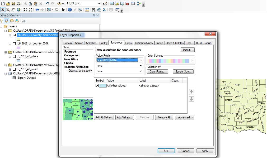
But when I get to color ramp to do different classes....this happens:
ALAND and AWATER are the only two options for the color ramp. Those are two variables from the original dataset and not the one I joined it with.

Any ideas?
- Mark as New
- Bookmark
- Subscribe
- Mute
- Subscribe to RSS Feed
- Permalink
The values...although appearing numeric...are left-justified like text...why is that? colour ramps etc are better suited for continuous data and not text
- Mark as New
- Bookmark
- Subscribe
- Mute
- Subscribe to RSS Feed
- Permalink
As Dan astutely points out, the values are left aligned indicating that the data is text and not numeric. This has most likely happened when it was imported from Excel. You can quickly check the field type by right-clicking on the field header in the attribute table and selecting ‘Properties’.
If all of the values in the field are numeric you can easily convert them back to numbers:
1. Add a new field to your data:

2. Calculate the field values from your text field:
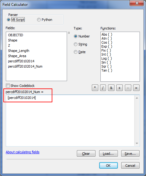
This should bring all of your values across into the new field and you should notice that the values are right-aligned numbers.
3. Now try to apply your symbology again and the new numeric field should appear as a value option.
- Mark as New
- Bookmark
- Subscribe
- Mute
- Subscribe to RSS Feed
- Permalink
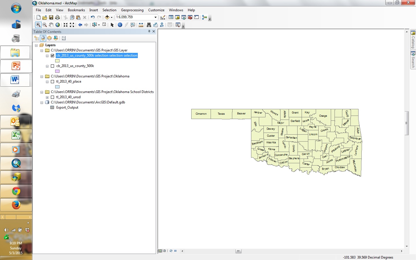
Thanks I'm getting closer. The problem is that while I now have numerical values and can adjust the color scheme with classes, when I go back to the main menu, it doesn't let me do that.

Apparently, it did the graduation anyway, but the graduation should be green if it's negative and red if it's positive, so a negative vs positive change can be discerned. Also a minor detail, but a state like Oklahoma should be on landscape view.
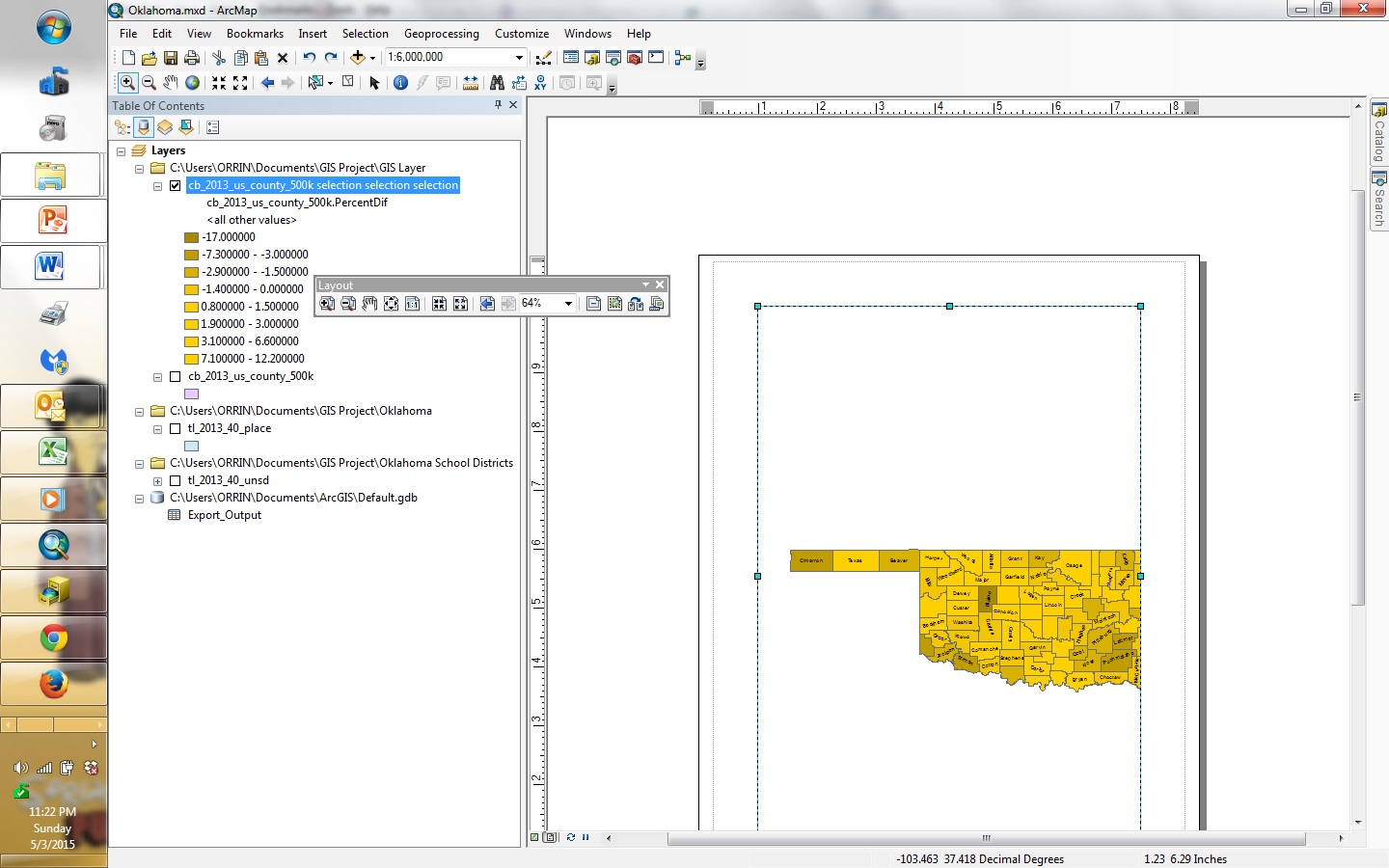
It doesn't let me flip unfortunately:

- Mark as New
- Bookmark
- Subscribe
- Mute
- Subscribe to RSS Feed
- Permalink
Is it possible to put two or more variables on the same map as well?
For example, can I also put a pie chart showing fiscal budget on the same map?
- Mark as New
- Bookmark
- Subscribe
- Mute
- Subscribe to RSS Feed
- Permalink
If the fiscal budget data is in another layer, simply change the symbology of that layer as described in this help file: ArcGIS Desktop . If it's in the same layer, then right click the layer in the table of contents, select copy, past it in to your table of contents, and then change the symbology of the copied layer as described in the help file.
- Mark as New
- Bookmark
- Subscribe
- Mute
- Subscribe to RSS Feed
- Permalink
Sorry, I forgot to say... these instructions are for putting pie charts as symbology.
- Mark as New
- Bookmark
- Subscribe
- Mute
- Subscribe to RSS Feed
- Permalink
How come you are symbolizing by multiple attributes? Don't you just want to do it by quantities and then pick your percent difference field as the value? You should be able to pick any color ramp you want by clicking the arrow by the color ramp and choosing a ramp in the drop down.