- Home
- :
- All Communities
- :
- Global
- :
- Europe
- :
- GeoDev Germany
- :
- GeoDev Germany Blog
- :
- Are You New to GTFS Data? Here's Everything You Ne...
Are You New to GTFS Data? Here's Everything You Need to Know
- Subscribe to RSS Feed
- Mark as New
- Mark as Read
- Bookmark
- Subscribe
- Printer Friendly Page
We all love open data!
And we love them even more if we can turn them into meaningful maps faster than I can put my make-up on.
So, it was clear that, as soon as Berlin shares their GTFS data on their open data portal, magic will happen.
The General Transit Feed Specification (GTFS) is a standardized data format for storing public transit routes, stops, and schedules. GTFS data is used in Google Maps transit trip planning. What can you do with GTFS data, you ask? Here are a few examples of applications you can build based on this type of data:
- Trip planing and maps
- Timetable
- Data visualizations
- Accessibility
- Real-time transit information
GTFS Data is GIS Data, so you can use this data to visualize the public transit system, perform spatial analysis, reveal patterns, identify hot spots and white spaces, conduct time-based analysis and get powerful insight.
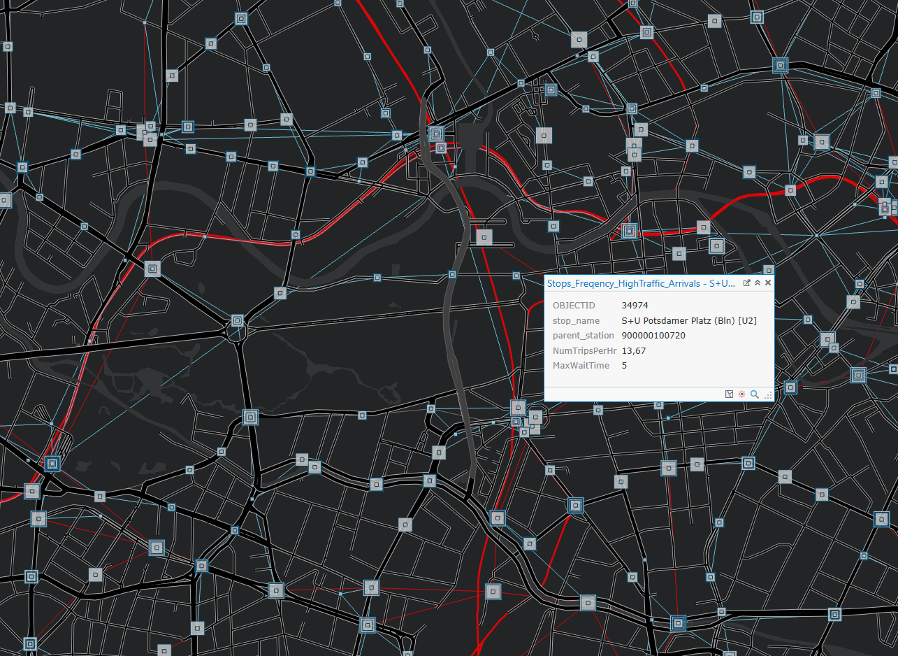
Based on the Berlin Transit Open Data, I used ArcGIS Pro to answer following question: how many trips per hour are there at the stops on a Monday morning between 6 A.M. and 9 A.M. and what is the maximum wait time for this time window?
I started off by downloading the Display GTFS in ArcGIS Toolbox that Melinda Morang created. Using this tool, I was able to visualize my GTFS open data and discover the public transportation network and stations from Berlin and the surroundings. Given a geodatabase path, all you have to do is run the scripts and it automatically creates feature classes for both transit routes and stops.
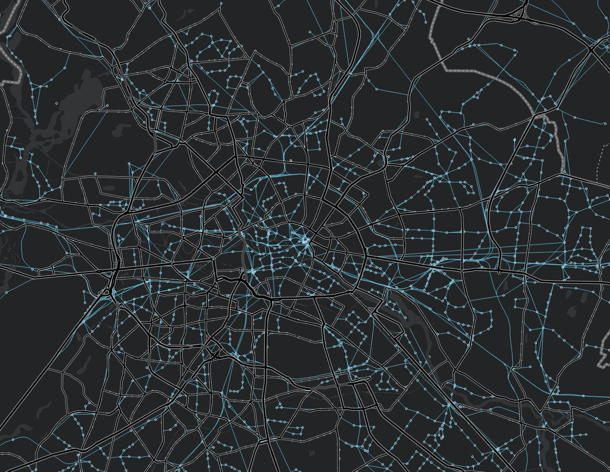
To better understand my data, I categorized my transit shapes based on the type of route (e.g. bus, tram, metro).
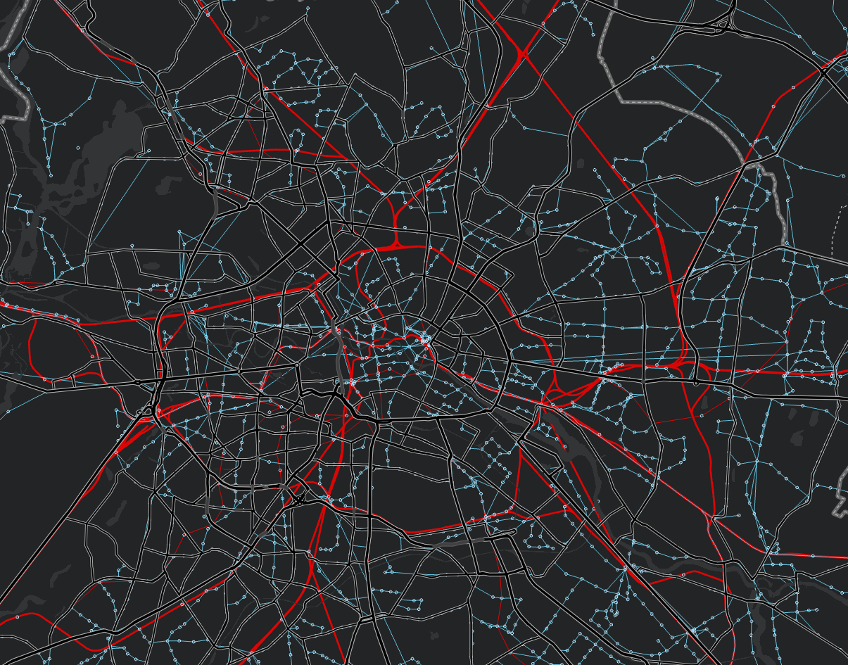
But this level of insight was not quite enough, so I decided to use some more tools Melinda developed. After downloading the BetterBusBuffer Toolbox, I ran the Count High Frequency Routes At Stops Script and got some amazing results. In the picture down below, the rectangles represent the trip frequency per hour for a typical Monday morning.
To get a better understanding of the waiting times at the bus and train stations in Berlin, I just adjusted the symbology to MaxWaitTime. I then blended out the stops where the waiting time was greater than 60 min. and got the following results:
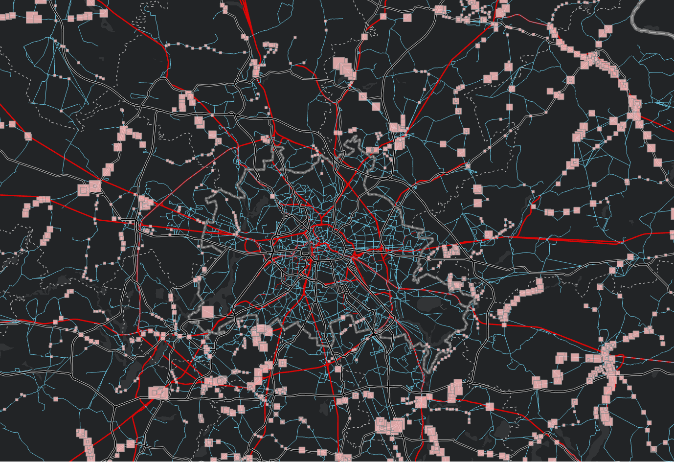
As you can see, inside of the MP of Berlin, there are no rectangles. This means that the next step in analysis should focus on reducing the waiting times in the rural areas around Berlin, for the public transportation segments going to downtown Berlin.
Feel free to download the rest of the transit toolboxes to unlock The Science Of Where and create the Maps That Change The World!
If you any questions about this blog entry, you can reach me under this e-mail.
You must be a registered user to add a comment. If you've already registered, sign in. Otherwise, register and sign in.