- Home
- :
- All Communities
- :
- Services
- :
- Esri Training
- :
- Esri Training Matters Blog
- :
- Visualizing Time in ArcGIS: Make a Web Map
Visualizing Time in ArcGIS: Make a Web Map
- Subscribe to RSS Feed
- Mark as New
- Mark as Read
- Bookmark
- Subscribe
- Printer Friendly Page
In a previous post, we covered how to add data to ArcGIS Pro, prepare it for your project needs, time-enable the layer, then share the layer as a time-enabled web layer to an ArcGIS Online organizational site.
This post takes you through the steps to create a web map featuring the time-enabled web layer.
Ready? Let's get started.
- Go to www.arcgis.com and sign in to your ArcGIS Online organizational account.
- In My Content, right-click the web layer and add it to a new map.
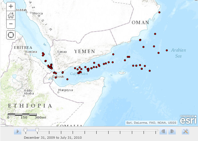
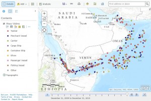
You can immediately see that the web layer is time-enabled because a time slider displays at the bottom of the map viewer.
On the map, only the points from a specific time span are displaying.
- In the Contents pane, click the ellipsis button under the layer's name, then click Disable Time Animation. All the layer's points now display on the map.
Each point represents a hostile act against a maritime vessel between 2010 and 2015 in subregion 62, which includes the Gulf of Aden and Arabian Sea (the data is from the U.S. National Geospatial-Intelligence Agency's Maritime Safety Information Portal).
Configure Pop-Ups
When making a web map, you need to decide what information users should see when they click a feature on the map.

Currently, all layer attributes display in the pop-up. Some field names are cryptic or irrelevant to the general audience this map is intended for.
You can configure the pop-up to be more user-friendly.
- In the Contents pane, click the ellipsis button under the layer name, then click Configure Pop-up.
The pop-up title is currently set to display the layer name followed by the incident reference number. Unless you're familiar with the data, this information isn't easy to understand.
In the Pop-up title box, delete the existing content, then click the plus sign to see the fields list. Click {DateOfOcc}.
Next, configure the pop-up content.
- Under Pop-up Contents, click the down arrow next to Display and choose "A custom attribute display." Click Configure.
- In the Custom Attribute Display dialog box, click the plus sign and add the {Victim}, {Desc1}, {Desc2}, {Desc3}, {Desc4}, and {Desc5} fields. Add a space between each field.
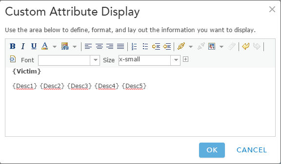
- Select {Victim} and click the bold button. Add an extra paragraph return after the {Victim} field.
- Click OK, then Save Pop-up.
Now the pop-up presents focused information (incident date, victim, and details) that is appropriate for a general audience.
Rethink Layer Styling
On the map, all the incidents are represented with the same symbol. This makes incident distribution easy to see, but suppose you want to communicate more about the piracy victims.
For example, were certain types of vessels targeted more frequently? Were some vessels victimized more frequently in specific years or was the "victim type frequency" consistent throughout the six-year span of the data?
To answer these questions, your first step is to symbolize the incidents based on the Victim attribute. The ArcGIS Online smart mapping feature makes this easy.
- In the Contents pane, click the Change Style button under the layer name.
- Choose to show (symbolize by) the Victim attribute. The suggested drawing style is Unique symbols. This is what you want. Click Options.
The legend in the Change Style pane contains many classes (unique symbols). Why? Because the incident data contains lots of variations on victim type (one example: tanker, chemical tanker, oil tanker). For this map, these type distinctions aren't important.
The map will be easier to interpret if you categorize similar vessel types using one term. One way to accomplish this is to edit the layer's attribute values.
Standardize Attribute Values
Victim values could have been edited in ArcGIS Pro before the shapefile was shared as a web layer. However, it's usually wise to keep source data as-is and make a project copy. Most organizations have standard procedures governing how GIS data is edited. Because this web layer was shared to My Content, editing the attribute values won't affect anyone else's work.
- Cancel out of the Change Style pane. In the Contents pane, click the Filter button under the layer name.
- In the Filter dialog box, click the Edit tab, build the expression "Victim contains Tanker," then click Apply Filter.
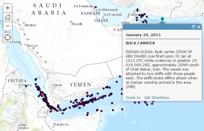
The map now shows only incidents where the victim was a type of tanker.
- In the Contents pane, click the Show Table button. Only records that meet the filter expression criterion are shown in the table, and they are selected.
- Mouse over the Victim field name, click the gear icon, then click Calculate.
- In the expression box, enter 'Tanker' (in ArcGIS Online, text values are enclosed in single quotes). The expression reads Victim = 'Tanker'.
- Click the Validate checkmark button to make sure your expression is valid, then click Calculate. Note: There's no undo on table edits.
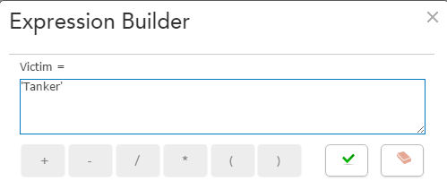
Now all the Victim values for the filtered records are Tanker.
- Click the down arrow next to Table Options, then clear the selection.
- In the Contents pane, click the Filter button, then click Remove Filter.
Repeat the "filter, calculate values, clear selection, remove filter" steps to create eight Victim classes: Tanker, Merchant Vessel, Carrier, Cargo Ship, Container Ship, Dhow, Passenger Vessel, and Fishing Vessel.
- For more information about working with tables in ArcGIS Online, see this help topic.
Symbolize the Points
Now that you've standardized the victim values, you can symbolize the layer using unique symbols.
- In the Contents pane under the layer name, click the Change Style button.
- In the Change Style panel, choose the Victim attribute, choose to style by unique symbols, and click Options.
You can change the color, size, and shape of individual symbols or all of them if desired. You can also adjust symbol transparency. The default settings are fine for this map.
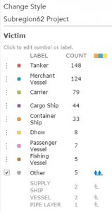
There are three remaining victim types that don't fit into the standard categories. You can move them into the Other class by selecting their row, then dragging the row down below Other.
- Click OK, then Done.
Time-Enable the Map
- Click the ellipsis next to the layer name in the Contents pane and choose Enable time animation.
- Play the time animation. You can use the forward and back buttons to manually progress through individual time spans, or play the full time animation automatically.
- Click the wrench icon next to the time slider, then click "Show advanced options."
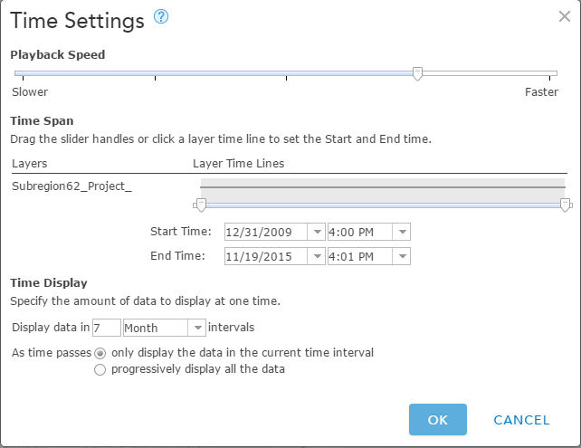
You can adjust settings including the time span duration, start and end times, playback speed, and more. For this map, the time settings are fine.
- In the Contents pane, rename the layer to Piracy Victims.
- The web map pop-ups, symbology, and time settings are now configured, so save the map.
And there you have it. This web map can be shared as-is or featured in a web app or story map.
Related training:
- Would you like to learn more about working with the ArcGIS Online map viewer? Check out these training options.
Related post:
You must be a registered user to add a comment. If you've already registered, sign in. Otherwise, register and sign in.
-
ArcGIS Desktop
28 -
ArcGIS Step by Step
46 -
Class Resources
25 -
e-Learning
64 -
MOOCs
31 -
Software Demos
11 -
Technical Certification
17