- Home
- :
- All Communities
- :
- Products
- :
- Data Management
- :
- Data Management Questions
- :
- Stretched raster histograms issues.
- Subscribe to RSS Feed
- Mark Topic as New
- Mark Topic as Read
- Float this Topic for Current User
- Bookmark
- Subscribe
- Mute
- Printer Friendly Page
Stretched raster histograms issues.
- Mark as New
- Bookmark
- Subscribe
- Mute
- Subscribe to RSS Feed
- Permalink
I am trying to use the stretched color option with a topography raster. I have a color bar that I painstakingly make in arc and I am basically trying to set values of the topography equal to certain colors using the histogram. The problem (I think) is the histogram doesn't have a break where I need it - it has a -40 then jumps to 19. I want a break at 0 so sea level will align with my shift from blue to green in my color bar. So is there a way to set these values? Or is there just a better way to do this altogether?
I would use classified color, however it doesn't seem to have a way of ramping the color between the bounds. Its just a single color for a range, and with only a maximum of 32 intervals it doesn't look very good.
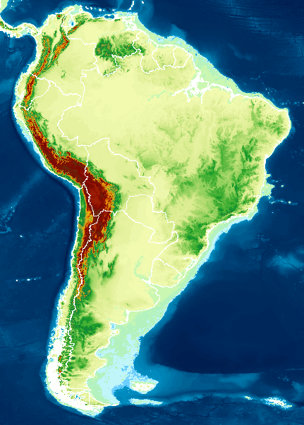
Here is a picture of my best result using stretched. You can see the areas on the coast that are green.
- Mark as New
- Bookmark
- Subscribe
- Mute
- Subscribe to RSS Feed
- Permalink
Did you try to Drag points in the histogram ?
Just go to symbology > choose Custom type in stretch > open Histograms. and drag points.
(also you can add point when you click in none points area)

- Mark as New
- Bookmark
- Subscribe
- Mute
- Subscribe to RSS Feed
- Permalink
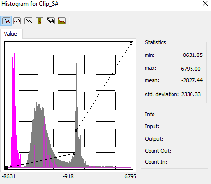
Yeah I've been messing with that - that's what I am talking about when I say it jumps from -40 to 19. Here you can see the two points in the middle are at -40 and 19, and there is nothing in between them no matter how slow I move my mouse.
I will say I don't really understand what this histogram is doing, so maybe there is a better way. I don't really understand what the y-axis is on this. What I am wanting to do is stretch the negative values within the blue portion of my color scale, and the positive values within the rest. But again I need the zero to be distinct.
Here is my histogram and my color scale if it helps at all.

- Mark as New
- Bookmark
- Subscribe
- Mute
- Subscribe to RSS Feed
- Permalink
As with any histogram, Y-axis is the count (or sometimes percentage) for the values on the X-axis. You need to be in a manual mode of classification to fine-tune. Of course, one alternative would to produce a feature class of the ocean (aka a big rectangle, erase the continent) and just overlay it over the top of the raster. You could set a transparency that would fuzzify the land-water border and set a polygon colour of your liking. Don't forget, you may get it looking perfect onscreen, so save it... your final task will be to get it to print exactly the same, good luck with that 
- Mark as New
- Bookmark
- Subscribe
- Mute
- Subscribe to RSS Feed
- Permalink
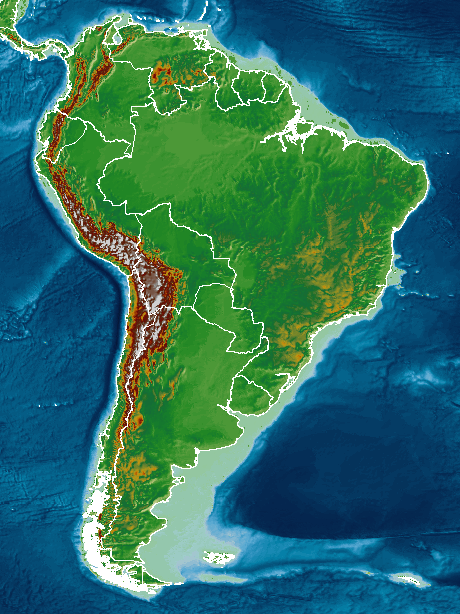
That's a clever solution. But I think I got it good enough by messing with the Image Analysis tool and just slightly changing the gamma value. Here is my (hopefully) end product, at least as far as the color bar is concerned. It isn't perfect, but then again it never is.
- Mark as New
- Bookmark
- Subscribe
- Mute
- Subscribe to RSS Feed
- Permalink
Have you thought of splitting into two complimentary datasets (one for elevation above sea level and the other for bathymetry below sea level) with Null values that are colored transparent? Then you could symbolize each half the way you want, with a clear divide. Alternatively, you could probably generate two complimentary layers to view the same full dataset, but each with symbology for just one half, and transparent for the other half.