- Home
- :
- All Communities
- :
- Products
- :
- ArcGIS Web AppBuilder
- :
- ArcGIS Web AppBuilder Questions
- :
- Re: Collapsible headings within About widget?
- Subscribe to RSS Feed
- Mark Topic as New
- Mark Topic as Read
- Float this Topic for Current User
- Bookmark
- Subscribe
- Mute
- Printer Friendly Page
- Mark as New
- Bookmark
- Subscribe
- Mute
- Subscribe to RSS Feed
- Permalink
Is this a thing? Our About widget has a lot of information in it and it would be great to have each section be under collapsible headings that users can expand when they want to. If not, could someone get me started on the files I'd have to edit and code I'd have to use (ie dojo or regular javascript)? Thanks!
Solved! Go to Solution.
Accepted Solutions
- Mark as New
- Bookmark
- Subscribe
- Mute
- Subscribe to RSS Feed
- Permalink
Emily,
There is nothing in the OTB widget for this but there is some simple code and CSS that can be added to the widget to allow for this:
In the About Widget.js add (lines 23 - 36):
_resizeContentImg: function () {
html.empty(this.customContentNode);
var aboutContent = html.toDom(this.config.about.aboutContent);
html.place(aboutContent, this.customContentNode);
// single node only(no DocumentFragment)
if (this.customContentNode.nodeType && this.customContentNode.nodeType === 1) {
var contentImgs = query('img', this.customContentNode);
if (contentImgs && contentImgs.length) {
contentImgs.forEach(lang.hitch(this, function (img) {
var isNotLoaded = ("undefined" !== typeof img.complete && false === img.complete) ? true : false;
if (isNotLoaded) {
this.own(on(img, 'load', lang.hitch(this, function () {
this._resizeImg(img);
})));
} else {
this._resizeImg(img);
}
}));
}
}
var coll = document.getElementsByClassName("collapsible");
var i;
for (i = 0; i < coll.length; i++) {
coll[i].addEventListener("click", function() {
this.classList.toggle("active");
var content = this.nextElementSibling;
if (content.style.maxHeight){
content.style.maxHeight = null;
} else {
content.style.maxHeight = content.scrollHeight + "px";
}
});
}
},In the css/style.css add:
/* Style the button that is used to open and close the collapsible content */
.collapsible {
background-color: #495666;
color: #ffffff;
cursor: pointer;
padding: 12px;
width: 100%;
border: none;
text-align: left;
outline: none;
font-size: 15px;
border-bottom: 1px solid white;
}
/* Add a background color to the button if it is clicked on (add the .active class with JS), and when you move the mouse over it (hover) */
.active, .collapsible:hover {
background-color: #70849b;
}
/* Style the collapsible content. Note: hidden by default */
.content {
padding: 0 18px;
max-height: 0;
overflow: hidden;
background-color: #f1f1f1;
transition: max-height 0.2s ease-out;
}
.collapsible:after {
content: '\02795'; /* Unicode character for "plus" sign (+) */
font-size: 13px;
color: white;
float: right;
margin-left: 5px;
}
.active:after {
content: "\2796"; /* Unicode character for "minus" sign (-) */
}In now add this text to the About widget settings like you would using the widget normally except that you need to click the "View HTML Source" button last button on the left of the first row
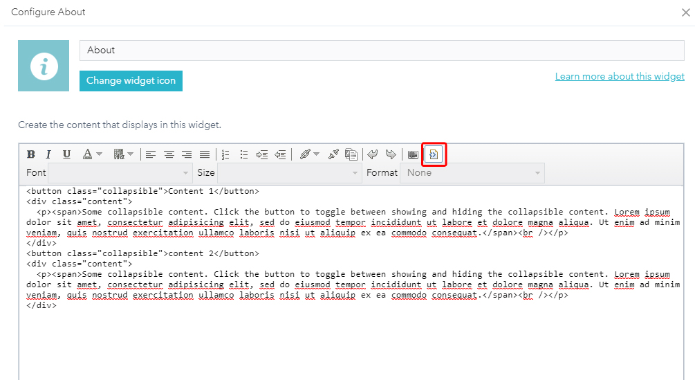
<button class="collapsible">Section 1</button>
<div class="content">
<p><span>Some collapsible content. Click the button to toggle between showing and hiding the collapsible content. Lorem ipsum dolor sit amet, consectetur adipisicing elit, sed do eiusmod tempor incididunt ut labore et dolore magna aliqua. Ut enim ad minim veniam, quis nostrud exercitation ullamco laboris nisi ut aliquip ex ea commodo consequat.</span><br /></p>
</div>
<button class="collapsible">Section 2</button>
<div class="content">
<p><span>Some collapsible content. Click the button to toggle between showing and hiding the collapsible content. Lorem ipsum dolor sit amet, consectetur adipisicing elit, sed do eiusmod tempor incididunt ut labore et dolore magna aliqua. Ut enim ad minim veniam, quis nostrud exercitation ullamco laboris nisi ut aliquip ex ea commodo consequat.</span><br /></p>
</div>- Mark as New
- Bookmark
- Subscribe
- Mute
- Subscribe to RSS Feed
- Permalink
Emily,
There is nothing in the OTB widget for this but there is some simple code and CSS that can be added to the widget to allow for this:
In the About Widget.js add (lines 23 - 36):
_resizeContentImg: function () {
html.empty(this.customContentNode);
var aboutContent = html.toDom(this.config.about.aboutContent);
html.place(aboutContent, this.customContentNode);
// single node only(no DocumentFragment)
if (this.customContentNode.nodeType && this.customContentNode.nodeType === 1) {
var contentImgs = query('img', this.customContentNode);
if (contentImgs && contentImgs.length) {
contentImgs.forEach(lang.hitch(this, function (img) {
var isNotLoaded = ("undefined" !== typeof img.complete && false === img.complete) ? true : false;
if (isNotLoaded) {
this.own(on(img, 'load', lang.hitch(this, function () {
this._resizeImg(img);
})));
} else {
this._resizeImg(img);
}
}));
}
}
var coll = document.getElementsByClassName("collapsible");
var i;
for (i = 0; i < coll.length; i++) {
coll[i].addEventListener("click", function() {
this.classList.toggle("active");
var content = this.nextElementSibling;
if (content.style.maxHeight){
content.style.maxHeight = null;
} else {
content.style.maxHeight = content.scrollHeight + "px";
}
});
}
},In the css/style.css add:
/* Style the button that is used to open and close the collapsible content */
.collapsible {
background-color: #495666;
color: #ffffff;
cursor: pointer;
padding: 12px;
width: 100%;
border: none;
text-align: left;
outline: none;
font-size: 15px;
border-bottom: 1px solid white;
}
/* Add a background color to the button if it is clicked on (add the .active class with JS), and when you move the mouse over it (hover) */
.active, .collapsible:hover {
background-color: #70849b;
}
/* Style the collapsible content. Note: hidden by default */
.content {
padding: 0 18px;
max-height: 0;
overflow: hidden;
background-color: #f1f1f1;
transition: max-height 0.2s ease-out;
}
.collapsible:after {
content: '\02795'; /* Unicode character for "plus" sign (+) */
font-size: 13px;
color: white;
float: right;
margin-left: 5px;
}
.active:after {
content: "\2796"; /* Unicode character for "minus" sign (-) */
}In now add this text to the About widget settings like you would using the widget normally except that you need to click the "View HTML Source" button last button on the left of the first row
<button class="collapsible">Section 1</button>
<div class="content">
<p><span>Some collapsible content. Click the button to toggle between showing and hiding the collapsible content. Lorem ipsum dolor sit amet, consectetur adipisicing elit, sed do eiusmod tempor incididunt ut labore et dolore magna aliqua. Ut enim ad minim veniam, quis nostrud exercitation ullamco laboris nisi ut aliquip ex ea commodo consequat.</span><br /></p>
</div>
<button class="collapsible">Section 2</button>
<div class="content">
<p><span>Some collapsible content. Click the button to toggle between showing and hiding the collapsible content. Lorem ipsum dolor sit amet, consectetur adipisicing elit, sed do eiusmod tempor incididunt ut labore et dolore magna aliqua. Ut enim ad minim veniam, quis nostrud exercitation ullamco laboris nisi ut aliquip ex ea commodo consequat.</span><br /></p>
</div>- Mark as New
- Bookmark
- Subscribe
- Mute
- Subscribe to RSS Feed
- Permalink
(Sorry about the late response, just got back from break)
This code works great! Thanks so much for your time on this, I really appreciate it!