- Home
- :
- All Communities
- :
- Products
- :
- ArcGIS Web AppBuilder
- :
- ArcGIS Web AppBuilder Questions
- :
- Can I fix the labelling of a pie chart in AGOL?
- Subscribe to RSS Feed
- Mark Topic as New
- Mark Topic as Read
- Float this Topic for Current User
- Bookmark
- Subscribe
- Mute
- Printer Friendly Page
Can I fix the labelling of a pie chart in AGOL?
- Mark as New
- Bookmark
- Subscribe
- Mute
- Subscribe to RSS Feed
- Permalink
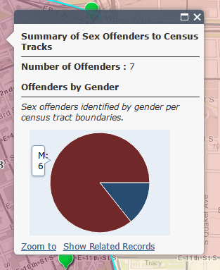
As you can see... the RED part of the pie chart has this tiny, broken pop-up bubble with a "M:6" which is SUPPOSED to render as 6 Males. It looks like crap?! Is there anything I can do to adjust this?
Here is the official sandbox location of the map: ArcGIS Web Application
Any help would be appreciated.
Solved! Go to Solution.
Accepted Solutions
- Mark as New
- Bookmark
- Subscribe
- Mute
- Subscribe to RSS Feed
- Permalink
Brain,
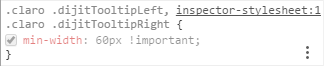
Well that supper short field name is an issue. The one thing I have come up with is to set the min-width of the tooltip:
Add this rule to your themes style.css:
.claro .dijitTooltipLeft,
.claro .dijitTooltipRight {
min-width: 60px !important;
}
- Mark as New
- Bookmark
- Subscribe
- Mute
- Subscribe to RSS Feed
- Permalink
Brain,
Well that supper short field name is an issue. The one thing I have come up with is to set the min-width of the tooltip:
Add this rule to your themes style.css:
.claro .dijitTooltipLeft,
.claro .dijitTooltipRight {
min-width: 60px !important;
}
- Mark as New
- Bookmark
- Subscribe
- Mute
- Subscribe to RSS Feed
- Permalink
I placed this in every style.css file in the map folder and got nothing... I'm so confused by the layout of the styles locations. I assumed that the WAB would only create a folder for the used version of a theme. I have a color folder for each styling of the themes... so confused.
- Mark as New
- Bookmark
- Subscribe
- Mute
- Subscribe to RSS Feed
- Permalink
But if I force it in Chrome to the inspector stylesheet? Works like a charm...
- Mark as New
- Bookmark
- Subscribe
- Mute
- Subscribe to RSS Feed
- Permalink
Apparently, I needed to double check my cache. It's that kind of day... the changes weren't making it through cache.
I wish there was a 100% way to guarantee that you were loading a FRESH version of a page.
I've tried every extension for Chrome and Firefox with VASTLY mixed results depending on the way I hold my tongue when I click the button... *facepalm*