I think someone else had posted this but I cannot find it.
I was one of the people that asked for the tapable area to be larger for radio buttons back in v2 or early v3. It was way too picky for large hands.
But now it seems the area is too big. We are having lots of issues with users accidently tapping while scrolling. When they happens on a question that runs a large relevant they lose everything they just collected.
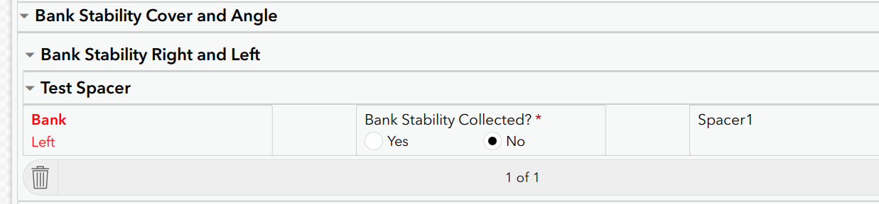
Even when a user taps miles away from the word it still gets it.

I tried to get it smaller but even when going vertical you can still tap all the way out here.

One idea then was to use hidden instead of relevant so at least they do not lose all their collected data. But the issue then becomes all of these blank records when they do want a No.

Is there anyway to cut down the area around No here? Can they be looked at by the team? I am thinking a margin around the entire form that does not trigger taps. This way scrolling is ok and you do not tap accidently with a thumb while holding or going something else. Maybe even a visible scroll bar would do it.
One idea was to create a blank grid cell next to it. Would still need something in there like intentionally left blank. The big issue on this form though is this section is already a repeat in a group, so another group would make it triple nested. This looks weird and takes up lots of space.
If anyone has any ideas let me know.
Thanks